Pages

Thursday, May 29, 2014

DRIVEN TO ABSTRACTION


I've been reading Felipe Fernández-Armesto.  His book "Civilizations" is a favourite.  In some ways he reminds me of Fernand Braudel who I discovered many years ago, and who made a lasting impression, but I think he has less belief in the march of progress, which is not surprising for someone almost 50 years younger (my age).  He tends to focus more on detail and tries to resist the grand abstraction that explains everything.

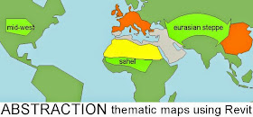
But abstraction is an essential tool of thought.  We use it constantly in design, problem solving, science. For my presentation at RTC Auckland last year I prepared some highly abstracted maps: diagrams of long distance trade.  They were thrown together in my sister's apartment a couple of days before the event in an attempt to set a historical context in a very visual way, and to. use Revit as my pencil.


This was leading up to a discussion of 3 HQ office buildings.  I was trying to show how Revit can be used as a research tool and how studying famous buildings in their social context can open all kinds of fascinating cans of wormies.   The response was mixed.  Some were excited by a broader vision than your average Revit class.  Others were thinking "this is not relevant to my job".
 
I started with Casa del Fascio a remarkable early vision of abstract modern architecture.  I tried to link this to the reunification of Italy; conjure up a vision of idealism betrayed, a brilliant young architect cut off in the prime of life.  Moments in History.


But reading Armesto & comparing him to more deterministic thinkers like Jared Diamond, my mind cries out for diagrams.  Armesto is a word smith, my approach is more visual.  But the questions are similar.  How are we to interpret the very different histories of civilizations around the world ?  What is a civilization anyway ? Can we cast off these notions of "more advanced" & "primitive" that stubbornly cling to our minds ?  Aren't the achievements of the Inuit & the San (who have civilized some of the most hostile environments available) just as remarkable as Han China or Renaissance Europe ?

So I started to think of 3 great swathes of grassland.  North America, Eurasian steppe, The Sahel.  Different histories.  How to represent this as a series of abstract diagrams.

My view is that BIM needs to be more than a highly focussed management/production tool.  That is "progress trap" thinking, blindly charging down the slope of bigger, better, faster. Even sustainability is framed in mass consumption terms: how many LEED points can we accumulate ?  I'm not knocking assessment systems like LEED.  But I am saying that BIM needs to become an all-purpose drawing tool, a pencil of choice, something that designers pick up and use without a second thought.  That's why I make a point of using Revit to draw maps of the world, or to assemble scrapbooks of images, or to draw my own versions of Jared Diamonds ideas about world history and perhaps infuse them with a little of Armesto's scepticism.


A kestrel for a knave.  Recently I downloaded a movie called Kes from YouTube. This is the environment I grew up in, long gone.  Coal mines (gone) the headmaster's cane (gone) thick yorkshire accents (fading)  Looking at a woodcut my dad did years ago when he was training to be a teacher, reminds me that the medium you choose can force a certain level of abstraction upon you.  Which can be a good thing.  Think of Escher who also used woodcuts.  Using Revit to draw maps can force you to step back and think about the bigger picture.  Embrace your limits.


For me films like Kes and the very different Brassed Off are a heavy dose of nostalgia. A raw slice of the simpler world of my childhood.  Kes portrays the poignancy of a young boy living in a dead end world, bored and frustrated, discovering a connection with nature, temporary relief from life under the thumb of his bullying older half brother.  Incisive commentary on the progress trap we call the Industrial Revolution.   Can't help thinking he would have been better off as a hunter-gatherer.


But way back in 1969 there was the unprecedented excitement of a film being made in our home town.  Unbelieveable.  Not just a film though: a kitchen sink drama with a distinctly left-wing edge to it.  Check out Ken Loach on Wikipedia.  He's had an interesting career.  I'm not saying I agree with his stance on every issue.  Why would I?  But in my late teens I was becoming politically aware and Kes made a big impression on my rising sense of injustice.  I guess I was still under the illusion that life was supposed to be fair.  For the next decade or so it seemed like I belonged to whole generation of young people who were going to change the world.  It felt great: young and full of hope, ideas, energy.


Abstract art.  For me in the 1960s it represented an awakening.  Something remarkable that had happened before I was born.  Partly a reaction to photography which had undermined the traditional role of the artist.  Partly a reversion to the primitive, emotional roots of art.  Partly the opening of a new door, a new room, full of possibilities. 


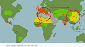
So back to my maps.  Abstract diagrams of ideas about deep history.  I like the way that Revit forces a certain level of simplicity and abstraction upon me ... compared to a programme like Photoshop or Illustrator, for example.  This diagram is about the sahel, a grassland region that hosted several very impressive kingdoms, civilisations to rival contemporary european states.  But here's the difference.  Europe participated in long distance trade networks via the grasslands of the Eurasian steppe, exchanging ideas, technologies and domesticate species over thousands of kilometres and connecting to cultures as diverse as Arabia, India & China.  The Sahel by contrast was trapped between desert & jungle.  Remarkably the successive kingdoms formed trade links across the Sahara with the Islamic world of North Africa.  But this was never going to be as prolific as the constant stream of disruptive technologies that galloped across the Eurasian Steppe highway.


So grasslands played a big role in Eurasia & the Sahel.  What about the new world.  Something different going on there.  What we think of as the big "civilisation" events happened along a relatively thin belt running North-South and well away from the major grassland regions of the Mid-West and the Pampas.  Jared Diamond uses this to help explain why Europe developed the Guns, Germs & Steel that helped them overthrow the Aztecs & the Incas so easily.  Domesticated plants & animals transfer much more easily across and East-West route than a North-South axis. 


Let's take another look at the old world & some of the major trade routes over land & sea that generated wealth & stimulated ideas.  It's easy to see how the mainstream of history passed Africa by.  But why did Europe & China at opposite ends of the East-West spectrum become the two richest and "most developed" zones.  And why did Europe become so "driven", so competitive, so focused on military technologies.  You can bet that geography played a big role, but that's a discussion for another day.


Since we have the map in "flatenned 3d" we might as well take a perspective view.  Maybe drop in a highly abstracted version of the Himalayas forming the southern boundary to the steppe highway.  How do you know how far to simplify?  Well you don't really.  It's all a question of thinking aloud, looking for an image that resonates, sparks off interesting questions.


So drawing is a way of exploring ideas.  Modelling and drawing are both aspects of the same age-old tradition of visual thinking.  In my view BIM belongs to this same tradition and can be put to work in a remarkable variety of ways.  Which brings me to my final "map of the day".  This is an overview of the last 10 thousand years of human history.  If you regard that period as a race, then Europe won by a mile, and now we are all paying the price, galloping along to the same tune, caught up in the same progress trap.


But let's not be over pessimistic.  Maybe if we keep drawing diagrams in our heads and searching for a better understanding of where we are, and how we got here ... well just maybe we can turn it all around and find a way of sharing things more equally, conserving our resources, tolerating our differences.  That would be a nice diagram to construct.


Thursday, May 22, 2014

TUBULAR BELTS

Some time last year we were doing a quick design for a pedestrian link, kind of a glorified footbridge.  You can guess what software the guys used.  It wasn't Revit.  But the question came up ... "how would you approach a quick concept like this in Revit"


First solution was a tube lofted from a series of ellipses.  Wanted to wrap it in a birds nest of random diagonals. Doesn't help that the surface is in 2 halves.

One way to deal with that is to leave a little gap at the bottom of the tube.


The diagonals are going to be multi-point adaptives that snap to nodes on the divided surface.


With a bit of experimentation, this approach delivers something quite interesting, but not quite as random as I'm looking for.


So let's try something different.  Void tube inside a solid tube will give me a tube with thickness to the walls.  Not hard to set that one up.  Then we have a void extrusion in the form of a giant comb.  Nudge the lines around to create a variety of random effects.


Join two or 3 of these sliced and diced tubes together to create the second option.  There is potential here, but I am not looking to complete the exercise. just a quick exploration of possibilities.


So next we go for a square tube.  The framing is going to be based on two point adpative components.  Nice and simple.


Generic Model Adaptive.  Place 2 points, make them adaptive.  Select, spline through points.  Check "Is Ref Line". Set the active workplane to the horizotal plane of this ref line.  Draw 4 ref lines.  Equalise.  Width parameter.


Add an angle parameter for the end line.  Select the loop.  Create an extrusion. Load the component into the square tube.  Place and repeat.  Play around with the possibilities.


I decided that it would be interesting to contrast the random diagonals with a regular islamic mushrabiya pattern.  I've shown how to do this before.


So it was just a quick exploration, but I delivered some interesting images to stick up on the notice board in the office, just to show that Revit has potential for early design work.  Hope it sparks of some ideas in your head too.


Sunday, May 11, 2014

VISUAL WORKAROUNDS

A couple of workarounds that came up by accident in the office recently.

I was doing some renders at short notice.  It's a sizeable villa in a big garden with lots of trees.  One of my standard tricks for making renders pop out is to combine a render with a shaded view.  Because of all the trees I decided to use "realistic" instead of "shaded". 
It had never struck me before, but it seems that trees in a realistic view don't cast shadows. 


One of the keys to good presentation images is composition.  It helps a bit if you have some experience of painting landscapes.  Think about how the shadows fall, the balance of the composition, framing the view.  Screw your eyes up and see the pattern of light and dark.  In a painting you can cheat a bit with the shadows.  With a rendering you need an object in order to cast a shadow.


Shadows can help to liven up a boring foreground and enhance the framing of a view.  The actual trees in the view were not giving me the shadows I wanted so I decided to put a big tree behind the camera so it would cast an angled shadow across the foreground.  Using an OOTB RPC tree this worked for the renders, but not for realistic mode.  In the final combined image the shadows were too pale.


Planting families have an option in the "Other" properties.  You can base the render appearance of "Third Party" or on "Family Geometry".  With an RPC tree, "Third Pary" means the RPC image.  By switching to "Family Geometry" and modelling some geometry in the family you can create a family that casts shadows in realistic mode. 


I decided to simply mimic one of the RPC objects that shows up in shaded views.  If you want this geometry to scale up and down with the height of the tree, it needs to be double nested.  In other words, open up the family called "Deciduous Base" and put your extrusions in there.  Of course the RPC object doesn't exist in this nested family, so you can't trace over it.  I made my extrusions in the RPC family and copy-pasted them into the Deciduous Base.  It turns out that the ref planes in an RPC family don't have names, so if you want to draw in an elevation view, you need to name the ref planes first so you can set the workplane of the view.


Ultimately I elaborated on the default form so as to create a more interesting shadow.  It might be useful to have a small collection of these families.  Apart from their use in creating fake shadows,


The other thing about realistic view is that some materials just come out too dark.  Chrome for example interprets as almost black.  If you want to do the trick of combining 2 types of image ... the black is a pain.  I discovered a way around this by accident. One of my stone materials was not showing up properly in Realistic mode. I was getting a flat colour instead of the bitmap texture.
After a while I realised that it was because surface pattern was set to a solid colour.  I had never noticed this behaviour before, not sure if it is a deliberate feature, but it came in useful.  It provides an easy way to overcome the dark appearance of shiny metals in realistic mode. 


It can also help with glass.  You might want realistic mode elevations that show glass as a shade of blue-gray, but in the renders you might want relatively clear and transparent glass.  The surface pattern trick will sort this one for you also.


While I'm sharing visual trickery I might as well mention this courtyard view.  It's set to realistic but the ambient light has been cranked right up so all the walls and furniture etc get burnt out and the presence of greenery in the heart of the house is emphasised.  To get the effect I wanted, I also had to make tweak the surface transparency of the window glass.  Sadly you can't do this in visibility graphics using the glass subcategory.  Those subtleties are not available for sub-categories, it's all greyed out.


I tend to feel that the Factory has over-emphasised photorealism at the expense of more stylised & artisitc modes of visualisation.  But there are workarounds if you are prepared to make the effort. 
I already mentioned combining different types of image.  You can take this further by using masks to control the transparency of different layers.

By the way I find it a bit annoying that transparent objects don't cast shadows.  I have a "Default Planting" material which is set to grey-green with 50% transparency.  This looks much better than the opaque battleship grey that you get out of the box.  Would be nice if they cast  a 50% shadow though.


Just to finish off, I should mention that I gave Lumion a run around the block on this project.  In the end we didn't use any of the images, but there is no doubt that it has a lot going for it, especially the way that it handles landscape objects.


Thursday, May 1, 2014

GHERKIN RINGS

This work is about 6 months old.  It can be regarded as a supplementary exercise, partially related to my more recent Gherkin studies.


The aim was to make an abstracted version of the Gherkin floor plate, highly parametric and configurable.  A form-finding tool to help you get your head around what happens when you rotate each successive floor by some angle or other.

This is all done in the standard family editor, no massing or adaptives.  I started out with a component with 6 arms (representing 6 lettable floor areas) and a variable outer radius.


Stack this up and vary the radius according to the position in the stack and you get something like a christmas tree, depending on how extreme you make the numbers.

Or it can look a bit more sensible.


At this stage, my parameters were looking something like this. Quite messy.  But the idea was to use some simple formulas to derive the offset & radius of a given ring from its position in the stack.


That was in the parent model.  The nested child looked like this. linking parameters through to instance parameters so I can place a whole bunch of these stacked rings in a project and play with them.

After a while it had cleaned up to something like this.  Now the N parameter is also driving a rotation angle.


Flushed with success I decided to vary the number of arms (or the number of voids, it amounts to the same thing.  So the nested family becomes a disc with a radial array of voids.


The voids themselves are sweeps based on a loaded profile.  The profile has 3 parameters which can be linked up so that they can also be driven from instance parameters in the stack.


I still have an inactive parameter in there for the number of floors.  I was hoping to figure out how to hook this up eventually, but it didn't happen.  The rings are just stacked up manually and given numbers by user input.


I guess it would be easy to do automate this with Dynamo, but I haven't crossed that bridge yet.  But I have got a family that is pretty flexible and can be layed out in a systematic manner to illustrate the permutations possible.
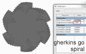


After that I made my stacks a bit taller and looked at some extreme cases.  By now I had made my floors much thicker so that they represented the entire habitable space, rather than just the floor slab.  This makes it easier to visualise the atrium spaces that spiral up and to see the little wedges of floor and ceiling that intrude into the atrium space, assuming that the side walls of remain vertical, as indeed they are in the Gherkin.


I decided it would be interesting to wander around my little city of stacked gherkin rings, so I exported to DWF and took a little walk using Design Review in perspective mode.


That's it really.  Nothing spectacular, but I enjoyed myself and it's something that could be taken further one day, perhaps with a bit of help from Dynamo.  I am trying to develop the idea of simplified abstract versions of a design concept that you can play with, much like we used to cut up pieces of carboard and fiddle around with them.

If you're interested, you can download the family from here  ....  actually it's not quite ready and I want to go home for the weekend, so maybe I'll upload the family on Sunday.  If that sounds confusing remember that we have a Friday/Saturday weekend :-)