Pages

Tuesday, October 28, 2014

TICK TOCK (AKA THE LAST POST)

Counting down to submission and as always there is not enough time to do pursue all the ideas that jostle for my attention.  It's been another roller coaster ride and immensely rewarding for me. Thanks again to Zach for hosting this competition.

I must also thank Arezoo who has been helping me to assemble a design report, to package up my adventure in the form of a book which will form the main part of my submission.  For this post I will be taking snapshots from that report.  I don't have time to continue recording my process step-by-step.  Something had to give.  So let's cut to the chase.


Our brief calls for a Museum of Urbanisation & Domesticated Species (MUDS), to be built deep amongst the virgin desert dunes of the UAE.  Here we will celebrate, contemplate, cogitate the solemn mystery of how we gave up our wanderings and settled in mud brick boxes, packed together beneath the sun.


The pumpkin is a domesticated vegetable species, belonging to a family that ranges from tiny "patty-pans" to sagging giants, transported to competitive events by tractor & trailer.  It provides a suitable symbol for the way we have made ourselves dependent upon agriculture, co-evolving with plant and animal species to the extent that neither we nor they can survive without the agri-business conglomerate which holds the world's ecosystems in its vice-like grip.


And so, in the tradition of Boullee and Ledoux, our building is built around a set of representational symbols: firstly the bulging lobes of a giant pumpkin, bursting with fertility, pregnant with the seeds of uncontrolled growth; secondly the crescent, a slice of forbidden fruit cut out to satisfy our bottomless appetites by the mother-goddess eve.  (Environment Virtually Engulfed)


The importance of the inbuilt layout capabilities of BIM software is often overlooked.  Two dimensional “design spaces” have enormous potential that is constantly exploited in every architect or engineers’ office around the world.  It is hard to imagine design professionals holding a conversation without pencil and paper to hand.
Combining images with orthographic views.  Rapidly scaling to life size and drafting over with notes and construction lines.  These collage techniques, reminiscent of the early work of Picasso and Braque, can be immensely informative and save a good deal of abortive work if conducted at an early stage.  2d BIM.  All good.


The gallery floors form a cascading sequence of curves sliding down next to an inclined plane of glass.  (Solar treatment to be considered later but probably inspired by the musharabiya concept)  A staggered array of escalators links the floors together in a continuous sequence


The appendices normally contain the latest set of drawing sheets, a coordinated set of plans, elevations and sections as required by the contract for the stage in question.  In this case the drawing sheets date from the time when the massing family was fully parametric, just before the pumpkin eyebrows and other “modernizing” elements were added.
 
Primarily they record a staged exercise in comparative design options.  Nine versions of the design are laid out and systematically analysed in a 3x3 matrix.
 
On one axis:       Number of segments                     8, 9 & 10

On the other:    Overall size                                         Small, Medium & Large


Time to turn the dome into a pumpkin.  We will consider the parametrics involved in this exercise during the next section.  Here we focus on the double dome strategy.  There are multiple justifications for this.  It is in fact a time honoured way of resolving the conflict between internal and external requirements that occurs in almost all domed buildings. 

Structurally this approach is very beneficial creating adequate depth for a well triangulated supporting framework.  Thermal performance will  be enhanced, and voids always come in handy wherever mechanical services are involved as they surely will be here.


Our software tools can generate camera views quite effortlessly.  For someone who has been through the process of laboriously constructing perspectives by hand it is embarrassingly easy.  But blending digital outputs and processes to create an evocative image requires the human touch: experience, skill and a fair sprinkling of intuition.

Technical wizardry is only as good as the creative thinking that it enables.
This perspective image is helping us to think about the spatial relationship between the research facilities in the basement, and the display and event space above, between the ground plane and the underside of the bowl.


Moving on.  How does the building feel at closer quarters, a visitors approach?  What is the drama of the welcome experience ?  We envisage planting: crop research beds, fruit trees, date palms; perhaps a series of long slow ramps leading down to the basement (not modelled)  Parking and transport facilities have yet to be considered.


On reflection though we decided that our building was developing a case of schizophrenia.  The lower levels have a decidedly modern feel.  Dressing up the dome with traditional frills just isn’t going to work.


Also, we don’t have a face

If we want that face, it will have to be highly abstracted.  Think African masks.  These made a major impact on modern artists like Picasso.  Perhaps we can kill two birds with one stone.  (Modernity & Facial Recognition)


In the hands of renaissance men like Durer and Leonardo the pencil was a potent tool of discovery that allowed them to range freely between domains that we now call science, art and technology.  The ability to construct virtual worlds using lines that converge at points on the horizon line must have been as game-changing in its day as the advent of BIM has been for us.

On this page we display some of the parametric gubbins working behind the scenes to create alternate versions of the auditorium bowl, plus a larger image of the world beneath that bowl.  This is not a final presentation image, but rather a tool for thinking.  In that sense it is no different from the dialogue boxes next to it.


The cable cars that take our visitors from the rim of the bowl to the syringe-like viewing capsule have not been modelled.  They remain in the flat world of 2d drafting and paste-up: “sketched in outline”.  But the capsule itself is lofted from doric-pumpkin profiles, a throw-back to the original 2011 submission.  Welcome back old friend, appearing for the first time as a 9-pointed star and gratifyingly easy to recreate from scratch.


So much for the report extracts.  If you want more you'll have to buy the book ... or maybe just download it for free in a couple of days :-)

I'm going to sign off now with a rather strange image.  I think I have been pushing the boundaries of what conceptual massing can handle.  For example I started to get messages about "too many edges".  Even more strange, in some of my camera views strange artefacts appear.  The repeater components for my double-dome truss loom like apparaitions, displaced from their proper location in 3 dimensional space.  You can see several of these skeletal ghosts in the image below.  Interestingly enought, it only happens in realistic mode.


So that's it.  I will be submitting later today.  Hope you enjoyed the ride half as much as I did.  Downloads of the final product will become available some time soon.

Cheers guys.


Thursday, October 23, 2014

PLAYING TO THE GALLERIES

So first of all, I'm in the competition.  I have a concept that is strong enough, it's definitely a pumpkin, it conjours up the spirit of Etienne Boullee, it's parametric, and I'm having fun.
At the time of writing this, I have one long weekend plus 2 or 3 normal ones to flesh it out.  So what's the plan?  Where should I focus my energies.

The central theme is use of BIM for concept design.   So don't get sidetracked into resolving minor details or showing off Revit trickery.  We have been striking a balance between highly parametric massing families and quick "manual" adjustments, using whatever is most appropriate to current design concerns.  Let's continue along that road.

Goals ? 

1  I want some compelling images of the gallery spaces within the pumpkin slices that form the base. All we have at present is a schematic section through the lift cores. Need to develop the gallery spaces themselves.


2   We should probably develop the ground plane.  Are we going to have crops growing down here, domesticated species on display ?  How do I make that not boring ?  How do we represent it in a BIM way ?  Should we be developing the idea of a basement as hinted at in the octagonal iteration?


3  The interior of the dome/auditorium.  How can we make this more convincing, more dramatic ?  At the moment it's just a ridiculousy huge volume.  What can we do develop this, beyond just adding frills?

4  The question of scale remains.  Have we settled on a final size?  How do we justify the height of the dome ?(effectively dead space)  Isn't there an exercise to be done, creating a fully parametric family that will generate a full range of design alternatives for the client to review ?

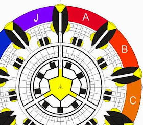
I've shown off a couple of my final images from this session.  How did I get there ?  I like to do drafting in Revit.  There is this strange myth that BIM has to be 3d.  Sometimes 2d is the fastest way to explore an idea.  Hence my exploration of 9-sided geometry at ground & basment levels.  Circular corridors can be very disorienting, so I'm thinking in terms of colours that tell you which segment you are in.


To develop the gallery spaces I decided to bring in a single segment an place real walls & floors.  Better perhaps to try this out as a side study first.  By chance my single segment came in with a rather small width in relation to its height and depth.  An interesting (if unintended) demonstration of the parametric capabilities of this family.


Next problem.  Walls steadfastly refused to be placed "by face".  I know from experience that walls will successfully attach to much more complex surfaces.  Perhaps the problem lies in the sharp points at the ends.  I added small voids into the rig to clip these off and hey-presto, walls work.  Maybe I will


I had this idea of curving the front edges of the floors so that the gap between floor & sloped glazing varies.  I'm forgetting about the musharabiya for the moment.  Just treat is as a plane of glass.  You don't want to start editing the boundaries of floors generated from mass faces, so I borrowed an idea from my Gherkin studies: shaft openings.


I also had it in mind to use escalators to connect the different levels together.  My mental picture of this was flawed.  Escalators turned out to be rather large in relation to the segments themselves.


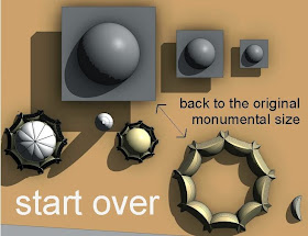
So I made a new copy of the base family and increased the radius.  Turns out that I am back to roughly the same size as the largest version of the "circle in a square" from my first post.  Why didn't I just stick with that size all along ?  I'm not sure, but there has been no harm in moving up and down the size spectrum, exploring the impact on different aspects of the project.


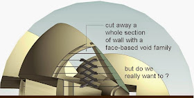
I have a problem at the intersections.  The walls cross over and create boxed in spaces.  How to cut away the unwanted portions ?  It can be done with a face-based void family.  Not very elegant.  You have to keep adjusting the shape, reloading, adjust again ... kind of like flying blind. 


Then it struck me.  I don't want to cut away huge sections of this curved wall.  That would compromise the structural integridy of the concrete shell, which has a log of work to do.  I just need punched holes at each floor level to take people through the crossover zone and on to the next gallery.


For a while I did try putting the elevators into the crossover sections between galleries, but this seemed to lack the drama of riding an escalator next to a huge inclined plane of glass. 


So I came up with a scheme for up escalators on one side of the crossover and down escalators on the other side.  I quite like the way that the sequence of 4 escalators step back in 2 directions as you proceed from level to level. Kind of a cascading effect.


I also came up with a scheme for scooping light down the back edges of the galleries.  Once again it's a cascading sequence of curved voids that twist their way up the inside skin of the pumpkin segment.  Could be rather nice.


For this set of studies I am treating the inclined plane as a curtain wall.  The musharabiya screen will be revisited later (hopefully)  For sure we want to have heavily filtered light entering the galleries, otherwise there will be huge glare problems.

At this point I got the idea of having a double-skin dome.  This is after all a very ancient idea that is utilised in many of the most famous domes, from Wren's St Paul's to Brunellechi's Duomo in Florence.  Part of the idea is to create an appropriate scale inside and out, but also there could be climatic benefits in a desert setting, and perhaps we can use the space between in some way.


I set about rendering this larger project and in comparing images discovered that the proportions had changed, subtly perhaps, but definitely for the worse.  Remember that the various bits and pieces are not yet connected together into one humungous parametric super-family.  This is for speed and agility in the first place, but it also means that these little differences in relationships keep cropping up.  I regard this as a positive, because it makes me think harder about the proportions of each element.


So this has been a good exercise.  We're not going to get a fully resolved design in the time avaliable, but it's been very rewarding to take a first bite at some practical issues.  There are service floors assigned to the lower levels of the segment.  Triangular volumes with orange floors.  Also a couple of whacking great beams to handle the considerable span.  A grid of columns can rise from these beams to support the gallery floors.  You can also see the light scoop at the back in the next image.


This study has focussed on one segment out of nine, so I set up part plans for that corner and dragged them into a 3x3 matrix on a sheet.  For extra drama I exported this as a jpeg and inverted the colours.  I like the way that the geometries shift as you move up through the space.


I also set up a part section where the galleries meet the lift core and fleshed this out with some 2d drafting and graphics.  You can just see the beginnings of the great auditorium bowl in the top right of the image.  This view also begins to capture the drama of walking under the flat arch of one of the gallery segments and heading for the undercroft beneath the bowl.


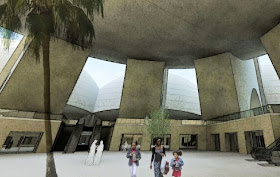
You can see that I've populated portions of 2 floors with people and display cases.  This was in order to do my interior shots: the one at the beginning of this post, and the other coming up now, capturing the cascading curved edges next to the inclined plane of glass.


So what about that space sandwiched between the domes ?  That's going to be really useful for structure methinks.  But also we might be able to devise some kind of funicular or cable-car system to take people up to a viewing platform.  Dramatic views across endless desert.  That could work.


One last image to close the post.  I decided to bring in the great pyramid as a test of scale.  Turns out that we are in the same ball park, just slightly bigger.  Also this made me realise that the you could read pyramidal construction lines into the whole composition.  I think that's a decent weekend's work.  


Actually it was rather a long weekend.  This was all done over Eid, basically the first few days of October.

Two weeks later and I have one weekend left for the final touches.  By Monday I will have enough material for 3 or 4 posts, but barely time to write up one.  So the plan is to have one more post describing the process and focus more of my attention on the final product, which will take the form of a "Design Report".

It's been a lot of work, but immensely rewarding. 

One last push.
 

Sunday, October 19, 2014

BATTLE OF THE BULGE

It's time we got the pumpkin bulges going.  I had a pumpkin dome last year, but I want to try rebuilding it from scratch with a slightly different approach.

I call this my "pumpkin slice rig".  Basically we build the wedge again, but this time as a rig.  It's a point world revolve from plus 20 to minus 20.  Make it glass and untick "visible".  Now it's a rig.


I made a new subcategory of mass called "construction lines" and set them to red.  I can use model lines for construction because we aren't going to use them directly in any "create form" operations.


Create radiating lines in sets of 3.  These will host profiles, each based on 6 points.  Effectively cross sections through the outer shell of the dome/egg.


Two points define the middle of the curve, hosted on the middle red line.  One at the end, the other set in a fixed distance.  The NCP for this second parameter is reset to "segment length". And controlled by a parameter called "thickness".


I don't know why I started to build a bowl, when it's supposed to be a dome. No big deal, just had to rehost the end points onto the upper curve.  To create the bulge, the points on the two side spokes have to be pushed further in.  So I have another length parameter called "curve".  Add "curve" and "thickness" together to set the position of the inner side points (CT).

When you are happy with everything, set the red lines to not be visible.  Leave it to the end because they will grey out.


At this point I just loaded the family directly into the project and made a circular array.  Wanted to check it out before attempting the furter complications of nesting and repeaters.


Set up a view from the indside.  Looks a bit bare perhaps, not sure what I can do about that.  I decided to make the dome white. Going for something of a tent effect.


Something tricky was going on with the array.  Not sure why.  I identified a reference point that had not picked up its NCP parameter correctly, but that didn't fix the issue entirely.


I decided to move right along to the next stage: a nested repeater dome ...  using the double nesting trick again.  Mass into GMA into mass repeater.  There's probably a better way, but for now this did the job.

All the funny alignments went away.  Maybe mass families just work better with repeaters than with vanilla style manipulations within the project environment.  I'll keep an open mind on that one.

I added a rib down one edge of the dome segment family, with a radius parameter that bounces down all the way to the project.


I also decided to try rotating the dome so the seams line up with the lift towers.  That seemed to work and set me off on adding a bit of articulation to the cores.  A vertical groove and an egg-shaped finial.

I'm happy now.  The concept is hanging together.  The connection to Boullee is there, but we have a genuine pumpking, complete with bulge factors.  There is a definite middle eastern feel, but also modern.  Perhaps a hint of sci-fi even.


I wanted to try an lattice texture on the cresent-shaped faces of the base, but this proved a little difficult.  You can get curtain panels to cut nicely at the edges in the nested families,


but by the time they come through to the project they are spilling over the edges.


The compromise for the moment is to set the edges to "empty".  Which it is for my final render for this post.  The variation in texture is definitely worth having.


Wednesday, October 15, 2014

SCHEME DESIGN


The clock is ticking, and as with any design project we have to stop buggering about at some point and make some firm decisions.  This is my design concept.  Pumpkin wedges, facing outwards, arrayed around the base of an elevated pumpkin.  Let's move on from concept to scheme design.

I think the next step will be to firm up on the scale and on the number of wedges.  Scale has two parts: overall scale, and relative scale of pumpkin to wedges.  This may be a fantasy, but there has to be a whisper of truth.  All good dictatorships know this.  Mask your lies with with the thinnest of veils of righteousness.  What am I talking about ?  The design must be informed to some extent by functional and structural considerations.  We need not be too strict, but without this element, it is not design at all, just wishy-washy day-dreaming.

3 things at the back of my mind.  I would like to bring more light into the bowels of the earth (the space under the bowl).  That bowl needs more convincing structural support.  We need a more convincing circulation plan.

But first let's rebuild the pumpkin wedges in point world.  They need to be masses if we are to play with floor plates and areas (ie test the scale) and the repeater concept will probably be a more robust way of making a scalable base.


So I'm going to use a box rig, but the wedge itself will essentially be built off a rectangular rig (the bottom surface of the box).  The rest of the box will be hosting the void cut.


I just need one formula, which expresses the height in terms of an angle.  (Tangent = Opposite over Hypoternuse ... ie Height over Width)  The length of the box (D because it was originally conceived as Depth) controls the length of the pumpkin wedge, which is a revolve.


The profile of the revolve is hosted on ladder rungs in the time honoured manner of my rectangular rigs.  Like any respectable revolve it has a start angle and an end angle.  Start angle is zero, end angle is a parameter.  I'm sure you can figure out what's going on from the pictures.


I made this as a mass family, then hosted it into a Generic Model Adaptive (GMA).  The GMA can act as a repeater component, also by nesting I can play around with the orientation of the pumpkin slice.  This is important because I have yet to find a foolproof way of ensuring that components will orient themselves in a repeater exactly as I would like.  Nesting allows me to go back and host my slice on a different reference plane.  It this case it needed to stand up on end, which is after all the orientation it had before it was sliced out of the pumkin and tossed to the ground.


In the master base family, I create a circle with a radius parameter.  Turn this into a repeater (actually the original model-line circle will also be retained as a separate object)  Host a slice, fiddle around till I get the orientation right, and repeat.

Now I can vary the length of the slices and the number of components to very easily play with different base configurations.  I chose to load this into a project and separately insert my egg family (the auditorium).


That way the base can be selected separately when creating mass floors.  Immediate feedback on the kind of useable area I can expect.


For the moment let's keep the number of slices constant at 9.  That number seemed to work well last time and it makes for an unsual geometry.  To create a gap between egg and slices, I will need alternative support for the egg (it no longer touches the slices)  I also need vertical circulation so let's start very simply with a series of rectangular lift cores. This is the second time I have come across wierd behaviour when takin a section through the exact centre of a revolve.


I was surprised by how quickly reducing the egg size spoils the overall composition. I don't want the slices to be too dominant.  Everything else should appear to be subsidiary and supportive to the egg/pumpkin.  Of course part of the problem has to do with placing the camera too close.  The nearer you approach, the more dominant will be the base, and the more the auditorium dome will recede as you look up at it, ever more steeply.

So I used a more distant camera to judge the relative sizes of the elements.  2 or 3 iterations produced an acceptable result.  Also this exercise justified my decision to keep the elements separate rather than try to do everything via on monstrous parametric family.  Keep it simple.  Focus on design.  Get the job done.


Looking at the section I decided to bring back the spokes idea from the octagon scheme, but make them more organic: a huge lunging arch.


Once again some drafting in section view helped me to think things through and quickly generated an image that could be used in design meetings.  We have accepted the idea of drafting for construction details.  Totally counter-productive to model screws in 3d.  Doesn't the same principle apply to early design.  Why try to model every detail of a concept that may get the chop next week ?


A similar approach applies to further comparisons of scale.  In my first post I looked at monumental scale via simplified massing models.  This was an appropriate approach at the time, but right now I want to put my auditorium in context and think about banks of seating.

So I dragged jpegs into my section, duplicated the view, dragged in some more.  How about Garnier's Paris Opera or Adler & Sullivan's Chicago Auditorium. The point is that Revit contains an embryonic Desk Top Publishing capability.  Personally I would like to see this side of the programme enhanced.  It would certainly appeal to designers.  Don't we want designers to be more involved in BIM ?


By doing the 2d, touchy-feely stuff within the BIM software it's easy to switch back to 3d.  So I created an in-place revolve, just 40 degrees with some embedded void extrusions.  Then I arrayed these around in a circle.  Quick and dirty, generate some images, stand back and reflect.


Want some plans ?  Now the automation of BIM comes into play.  And what do you know ...  the results are reminiscent of Boullee & Ledoux.  That same monochrome, figure/ground feel seems to have found its way into my pumpkin by osmosis.

This gave me a real kick and drove me on to work up some image-processed renders.


Do I have to justify these ?  Is there something un-BIM-like in spending an afternoon overlaying layers and applying artistic filters to what is essentially a static image, divorced from the intelligent model ?

Well I would love to see these kind of capabilities integrated into BIM authoring software.  But I don't see that happening any time soon.  In any case it sometimes help to take a break and do something different.  I've compared this before to playing a guitar song on piano.  Always throws up fresh ideas, new interpretations.


Notice the Albert Speer spotlights in my night shot.  Cathedral of light in the desert.

The Mirage version began as an attempt to reveal the inner workings using transparency and layering, get a feel for the relationship of the crypt to the dome above.


Sometimes it's good to spend the time layering up people and trees to flesh out an image.  Sometimes it's OK to keep things raw.  Just add some textural effects and express the drama of the space.  There are no fixed rules in the world of design.  Are BIM managers so fond of their rules that they can't get along with designers ?  I really hope not.  It's all about team work and we need to pull down the existing barriers, not erect new ones.


The final image is very, very simple, and almost monochrome, but I love it to death.  Somehow it evokes the cool grandeur of one of Boullee's magnificent etchings.  I'm starting to enjoy this.