I'm going to tackle a couple of Escher compositions. Take a break from the animals for a while. The first one is called "Another World" ... in a way it's all about XYZ coordinates, which way is up, an interesting challenge.
We start with an archway family. Chance to show off my Tuscan column. Haven't finished the post that this came from yet, it's an improvement on my previous efforts. Probably not as good as the ones in Paul Aubin's new book, but it will do :-) It has to be face-based so it can turn upside down.
Face-based means void extrusions rather than cut openings. Just make sure they're deep enough. The original has some half-size arches, otherwise you run out of sides. I was too lazy for that, but maybe it's an opportunity to give it my own twist also.
I've added an arch that we're looking through instead. Where the archways meet at the corners I have 2 columns coexisting in space. I could have used a visibility parameter to hide one, but didn't seem to be necessary.
I'm using a spiral from one of my previous posts in lieu of the hanging hunting horn. Something to give a sense of gravity. In my case it's some kind of pendant/wind chime thing. This one had to be adaptive cos that's the way the spiral was made.
My birds weren't ready, so Im going with another Escheresque object, a silvered globe. Nice reflections.
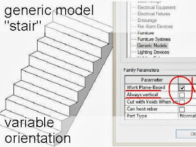
The stairs are generic model families. Check "work plane based" & uncheck always vertical.
To emphasise the other-worldliness of the scene, Escher created a lunar landscape with galaxies and whatnot against a black sky. I'm going with a hubble image for the sky and I made a nice generic crater family that can be scattered around in different sizes.
Just look at all those equality constraints beavering away, keeping it proportional Face based again of course. Allows me to curve the surface of the planet away towards the horizon.
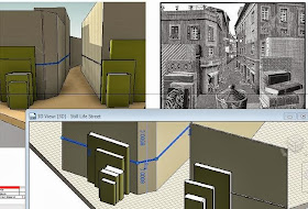
I won't pretend it's a finished work yet, but I certainly had fun, so let's try another. This one's all about scaling, the Still Life Street.
Some very interesting challenges here. Scaleability in different forms. Work plane issues with the inclined books. How to make a family that easily rotates into different positions as a book does when casually placed in groups on a table. Materials. The book scales differently in different directions. OK but how to map the materials also. And the scaling of materials eg wood grain to make the lilliput world convincing.
That's technical stuff. But what about the artistic issues ?
And WTF does this have to do with pumpkins or halloween or Zach's competition ?
There are definitely themes in common with my previous pumpkin work. Imaginary worlds, surreal juxtapositions, dualities and ambiguities. The duality thing is rather central to the whole spirit of the competition. It's a pumpkin, no it's a face, no maybe it's something architectural.
As for halloween, well it's not exactly horror, but it's a little bit eerie, disorienting. Illusions, bringing inanimate objects to life (that's witchcraft right ?) It's a bit Harry Potter as well, walking through walls to get to platform 9 3/4 or whatever.
Am I just copying Escher or am I learning more about his intentions ? Is it a research exercise ? Is it becoming an independent work of art in a small way ? He plays with textures, and this interplays with his craft, the engraving technique is always a central theme in his work. Opportunities to express and explore the nature of engraving, which is very different from a pencil sketch or ink and wash. 1937 so it's in the build up to the second world war. His world was about to change dramatically for the worse.
The multiple perspectives belong to the fifties. A world turned inside out Faceless people wandering around. The skull in the eye from 1946. Lizard dragons crawling off the paper and back again from 43. Similar theme with mirror and griffins from 46 Looking at himself in a glass ball 1935 Another world is from 47. is that the first of his multiple viewpoints pieces
Is there any pattern ? What about the techniques ? Does he drift into mezzotint and lithography later on, dally for some years and then return to his roots ? Or is it more nuanced, choosing the technique for the project ? Some of the thoughts that drift through my mind as I labour away.


This whole series of Escheresque Revit is inspiring and mind expanding. Keep pushing....
ReplyDeleteNice job Andy!
ReplyDeletePiranesi Prison Series next! We build 3d physical models of these in college :)
http://en.wikipedia.org/wiki/Giovanni_Battista_Piranesi
http://hss.adelaide.edu.au/philosophy/inconsistent-images/piranesi/
Thanks guys. The Piranesi suggestion is quite beguiling. Hadn't thought of that before. Not sure I can fit it into the coming weekend though :-)
ReplyDelete