Saturday, May 13, 2023

GHERKIN BLUES


Flashback to 2014. The Gherkin was one of three office buildings I set about analysing with my BIM pencil around this time.

At some point I was asked about sharing my work with a group of students and started producing worksheets with a step by step approach, partly to understand what I had done.


These petered out at some point but still it was a great example of learning by doing, using Revit to probe a building or built tradition that you wish to understand better.

I still think this is a much undervalued activity. It's my favourite "hobby" and I can't quite understand why more people aren't doing it.

Then again there are lots of things I don't understand so... (tails off into silence)


It's been a while, but I got the impulse to play as I came into the room from watching the sunset.

Nothing special, just the first idea that came into my head and building around that. Quite laid back as you would expect from the context.

I should do more of these quick impulsive takes. Better than going so long between music uploads. 🙄🤔😁


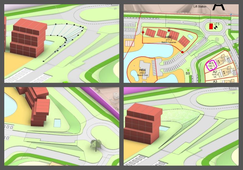
Some day job stuff for a change. I've been working on this project for a while, using Revit for Masterplanning. Quite a large project, coastal resort.

The scheme steps down to the beach. Slopes between platforms are quite easily handled with in-place sweeps. Roads and plots are treated as floors.

It's all broad-brush stuff although I do have a way to bring in geometry from the individual buildings without blowing things up. Visible at fine detail level.

Anyway this post is about landscape slopes between curved, sloping roads and adjacent platforms. Here i use Point World (conceptual massing) to create ruled surfaces. Then "wall by face" to create an object that is visible when massing is turned off.

Difficult to get everything perfectly smooth and seamless, but it's acceptable and I can use my favourite tool with views on sheets, schedules, coordinated tagging etc.


Coming in from the balcony last night after enjoying the sunset, my attention settled on the guitar. Dialled up a chorus setting, for no particular reason. Started messing around, felt good, threw on a shirt, put my phone in the stand...

It's a one shot recording, pretty loose, fragments of vocals rather than worry about getting all the words right or even being sure what the song is. Ostensibly it's hovering around a Robert Johnson theme.

Music is therapy, it's analogous to the visual sphere perhaps but also quite different. After a day trapped inside Revit, music and physical exercise are cathartic. Tilting the balance back into harmony and rhythm.


Monday, May 8, 2023

SHOPHOUSE DETAILS

 I made a bit of a meal of this for various reasons but got there in the end... And the festoon motif is scalable via the double-nested Planting hack.


That makes for more levels of nesting than we might normally prefer. Generic Models for the base level components. Then two levels of Planting family and finally a wall-hosted GM with the frame moulding. Surprisingly it doesn't seem to affect performance. 😳

Now I have it set up, should be easy enough to insert different designs at the base level. Maybe I will try a couple more tomorrow.


I am not a plasterer, though I dabbled a bit in my youth. Whatever your chosen medium, as an artist you strive to understand its potential, "what it wants to be"

So there is the nature of the object or activity that you wish to represent, and the nature of the medium. How can you blend these two in some kind of synergy? How can you bring out the beauty, the energy, the inner tension of both?

As promised I have created a second wall panel, inspired by an example seen in Singapore last month. It was much easier second time around. I have focused on the silhouette and ignored the subtlety of texture and as-relief modelling.

This is Revit. The approach is to capture the location, size, material and quantity of each component within a building. Further information will be given in the specification and details via a code embedded in the object and tagged on relevant sheets.

Elements should be recognisable but not over-detailed. The main model is not the place to explain how to make each sub-component. We just want to capture something of their essence and understand how they fit together.

It's not a commercial project. This is my personal research into "the Way We Build" in different times and places. That's my lifelong passion, and my BIM pencil has become the mainstay of my explorations.


The long weekend has been great. Had a very special meal at my local Syrian restaurant. Also made good progress on two of my BIM pencil explorations.

I posted a final image (for now) for the Elizabethan ceiling diversion. Today I want to tie up the shophouses for another week.


Cue Enscape3d my indispensable real-time rendering buddy. I had to spend a couple of hours this morning on materials. This is my best yet attempt at getting a flat surface to render as if it was a set of horizontal louvres.

Another thing this image collage reveals is that the internal layouts are lagging behind as I spent the last couple of weeks on facade elements. Floor plan is rather sparse.

Step by step.


It's not a true render, but Realistic mode in Revit gives a very useful intimation of how texture maps and bump maps are going to perform.

In this case I use the same image for both and set a different tint to correlate with the colour used in the framing. So very easy to generate the three materials I needed for the current shophouse model.


For many years I have been using a material with a parallel lines hatch to represent louvres on doors and ventilation panels. It's a simple lightweight solution compared to modelling each louvre blade in 3d.

The weakest link in this approach has been rendered views. So this is a useful step forward. First square = my previous bump map. I just added a dark grey bar to emphasise the depth drop, then gave the whole thing a fuzzy granular texture.

It's still very mechanical of course, but I'll take it.


Sunday, May 7, 2023

CEILING PATTERN

Yesterday I installed Revit 2024. Looking forward to investigating some of the new features, but early this morning I was intrigued by a ceiling pattern posted by Philip Gaches.

I was struggling to grasp why it is different in the X and Y directions. Rule no one: "if you want to understand something, draw it yourself." So I set about familiarising myself with the new/tweaked icons by setting up this pattern over a larger area in a drafting view.

It's abstracted into heavy lines for the mouldings, ignoring the enrichments for the moment. Another day I might create two ceiling based components to implement this in 3d, then go on to tackle the leaves, etc.

Fascinating pattern. Deceptively simple. Thanks Philip.


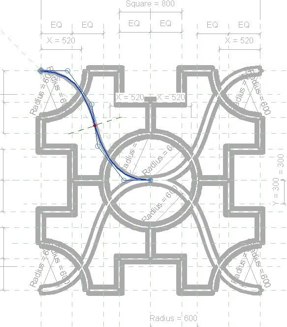
Further development of the ceiling pattern I posted a few days ago. Parametric version. You can vary the module and the circle radius.

The "expected" radius is one quarter module. It looks a bit crazy if you deviate too far from that so I am showing "slightly larger" and "slightly smaller" than expected, in two different module sizes.

This is done in Revit using model lines, and the "secret sauce" is a spline (for the S shaped link) In case you don't know, a spline curve will maintain it's shape when the two ends are stretched. So by constraining those ends to reference planes I get a predictably gentle S curve when the family is flexed.

Credit to Philip Gaches for the original design. Dmitriy Karpovich for encouraging me to experiment with a parametric version and David Wood for making the "expected case" more explicit.

Looks more complicated than it really is in Family Editor 🙄


"That pattern" again.

As I started to replace the model lines with solid sweeps I realised that there is another way to look at this. You can take a spline from each corner to the centre, giving a smoother overlapping effect.


In the process, the "eyes" lose their strict symmetry, which I quite like, to be honest. More like a human eye in fact.

The next step is supposed to be bears' heads and thistles. Interesting challenge to abstract those symbols into native Revit forms.

The afternoon beckons, day one of the EID break.


Final post for today. Ran out of steam for the thistles. Maybe tomorrow.

Camera view this time, with a bit of post processing to soften the image a bit, give it the human touch.

I have no idea where I can use this ceiling. Maybe I need to attempt a "typical timber-frame house" of the Elizabethan period. But not right now.

I should have a quick go at some thistles then back to the shophouses.


Lots of shortcomings in this Revit model, but for now it's time to move on.

I never intended to go beyond a quick drafting sketch of the basic pattern, but it's turned into an enjoyable and multi-faceted exploration.

First there was the parametric aspect: making the module and circle radius independently resiseable. Then two rounds of fine tuning the underlying geometry. Conversion of model lines to sweeps turned out to be fairly straightforward. Using simple extrusions and revolves to represent bear and thistles likewise but fun. Need to add a bit of trickery so some of the leaves appear to be draped over the mouldings. Another time.

Giving the model a certain natural irregularity is a difficult challenge in Revit, I made a small start in this iteration. Also added simple post-processing of the exported image to fake it.

Back to the shophouses I think.