Pages

Wednesday, April 26, 2017

FUNNY FIREPLACE

I recently received a message from Robin Deurloo, who lives in the Netherlands and is one of those who made an effort to contribute to the modelling stage of Project Soane. He had received a request to model a fireplace design which is in a vaguely classical style and was struggling a bit with one element.  He thought of me, and reached out.


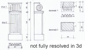
I guess lots of people who find themselves "modelling" on the basis of someone else's "design" face these kind of issues.  The sketches he was working from are somewhat tentative/ambiguous.  That's in the nature of quick design sketches really.  In this case there are inherent contradictions between the different orthographic views, and quite frankly, it suggests a fairly shallow understanding of classical principles... But the general intentions are clear enough, and both Robin and his client have made genuine requests for help, so I decided to have a go.


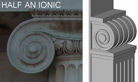
The problem area is the scroll.  My own feeling is that you would never use a scroll quite like this. It seems somehow incomplete and disconnected from the rest of the design. Scrolls tend to follow and "S" shape with one side larger than the other, and assume the function of brackets (at least symbolically)  Also the Scroll as drawn is something of an Escheresque impossible object. The projecting portion and its background merge into each other as you follow the curve around. 

So my own free interpretation of the intentions are shown above.  I'm ashamed to admit that I had never drawn a spiral by the "proper method" before.  I've always fudged it in my impatience.  Considering that I wrote the foreword to Paul Aubin's excellent book "Renaissance Revit" some 3 years ago, this is quite an admission.  So I reached over for Paul's book and constructed a rig of centre points that gradually work their way around, moving inwards as they go.  The scroll as shown in the sketch didn't have so many turns, so I adapted the results with a larger centre circle.


That gave me a filled region which I can edit, and copy the sketch into another context.  You can use the sketch from a filled region to make an extrusion by copying from sketch mode and pasting into sketch mode. And you can select all the lines in a sketch and scale them up and down to your hearts content as long as none of the segments become too short.


Now it is fairly common for spirals to project further out as they wind in towards the centre, and the sketch provided implies this.  I have ignored this for the moment.  You would need to create a swept blend, probably using a spline that approximates the curve of the spiral.  I'm not quite convinced that the relative widths of the various components has been properly thought through in this design, so I decided to keep things simple, at least until the proportions have been resolved.


For the same reasons, the fluting on the extrusion below the scroll is not curved in cross-section.  The whole composition is rather squared off and crude, but that's OK.  I am simply presenting an analysis for discussion.  This is as close as I can get to the design sketch while maintaining a coherent 3-dimensional language.  From here you could go on to discuss further adaptations and embellishments.  Personally I would be inclined to either accept this solution, or rethink the whole thing rather radically, but that's just me.


You can download my little family HERE, and if you look carefully, you'll see an embedded Detail Item that illustrates the setting out of the spiral.  This is not 100% as Paul's meticulously explained method.  I lost patience when it came to the inner spiral and reverse-engineered an approximation, but it's close, and you can scale this to a variety of applications with reasonable success.
I have interpreted this scroll as half an Ionic Capital (rather than an incomplete and upside down bracket) but there many other ways of using scrolls.  The classical language of architecture is remarkably flexible.


Personally I am a little squeamish about designing modern buildings in a classical style: it rarely comes off in my view.  But I get a huge amount of pleasure from researching buildings of the past using Revit, and if nothing else, this exercise has proved to me once more how remarkable Paul Aubin's book is, as a hands-on learning experience.  If you have it, give it another shot.  You probably found it hard work first time around, but it really repays the effort of repeated study.  If you missed it first time around, then go and grab a copy.  Fantastic value

Wednesday, April 19, 2017

BIRTHDAY TOYS

I didn't really get any for my birthday (toys), but I have been playing with a couple of add ins, and of course the new features of Revit2018 have been announced. (no comment)


During BiLT Asia, I met lots of interesting people, including founding members of Enscape3d and Flux.io. I've had my eye on both of these initiatives for some time now, but talking to people intimately involved with the development of a project always helps to push it towards the top of the priority stack.

Thomas Schander from Enscape 3D was kind enough to offer me a six month license to use with Project Soane, having loaded up the model on the system at their booth with quite impressive results.  I haven't got very far yet, indeed I haven't even got around to registering my license, but I think it's going to be very, very useful.


The first shot is a two-point perspective of the Doric Vestibule, looking East towards the loggia which is highlighted by light streaming in from the Waiting Room Court on the right hand side.  I've turned the fog up, so you can see the shafts of light streaming in from the half-round windows at high level.


Next up is a view looking back at that open-sided loggia from at the South-West corner of Waiting Room Court. The virtual dust particles are still hanging thick in the air, so although you can see straight through the accountants office to Printing Court beyond, the effect is not very striking.  When we first tried the model out on the Enscape Stand we got a view from the Governor's Office window with the Printing Court positively glowing in the distance.  So far I have failed in my attempts to recreate this effect, but it's early days.


By accident, I slipped through the wall to the right, through some waiting rooms and into the Central Lobby of the Directors Parlours, an area that I worked on quite intensively towards the end of 2016 and beginning of 2017. This wide-angle shot gives quite a nice impression of the space with low, narrow corridor coming in from the Entrance Lobby, the high level lighting and central groin vault.

I also exported a panorama from this space. I downloaded a freeware viewer called Panorado which works fine, but I couldn't figure out how to embed it in a blog post.  Maybe there's a way to upload these to a gallery.


OK, I knew this really ... lots of links to 360Cities in Google Earth and it's easy enough to set up an account.  So here are some links:

https://www.360cities.net/image/project-soane-par-04-centre-hall
https://www.360cities.net/image/project-soane-wrc-01-open-sided-loggia
https://www.360cities.net/image/panorama-lct-00-lothburycourt

And then of course I went back to Enscape and realised it's got a built in Gallery function, which is much easier.  But it expires with the license, so 360Cities is also useful to have.  Here's a link to Enscape, it won't last long though because it was created with a 14 day trial.

http://panorama.enscape3d.com/view/m6w6s4vp/

And then a couple of days later I realised that Google Photos has a built-in conversion feature, I had uploaded one of the panoramas to Google Drive, hoping to see it as a panorama.  Doesn't quite work like that, you have to go to the Assistant which then redirects you to a web link.  But you do get a message at some point telling you that your panoramas have been processed.

It's early days yet, but Enscape is definitely giving me a much deeper understanding of the quality of space and light in Soane's masterwork.  That's quite surprising, given how well I thought I new the model.  I guess virtual reality trumps an architects normal ability to visualise what it's going to be like in a space.  And for sure it will help in setting priorities as we raise the level of detail across the model.


So what about Flux?  Well all I've done so far is play around with the Site Extractor. Getting data directly into Revit doesn't work, you need to go via Dynamo, or in my case I used AutoCAD (oh no!)  I started with Whitehall (current Project Soane work) then tried a couple more flattish places (Robie House, Lever House) before realising I needed a hill.  Le Corbusier's chapel at Ronchamp is on a hill, so I grabbed that, then I thought about the work I did on Palladio's Villas back in 2014.

How time flies.  Did a couple of posts about this just over a year ago.

http://grevity.blogspot.ae/2016/01/palladio-for-dummies.html

http://grevity.blogspot.ae/2016/02/learning-from-gazotti.html


So I grabbed the site for Villa Barbaro which is built on rising ground leading up towards the foothills of the alps.  By then I had set up a starter file with appropriate layer presets for the data keys that Site Extractor grabs for you from open source maps. I've dispensed with using the topography surface because I couldn't get that to generate a topo surface in Revit.  Contour lines work fine, so no need anyway.


I created a CAD links file where I can generate topo surfaces in the right place without contaminating the main file with CAD nonsense.  Copy from there and Paste Aligned to Same Place.


I had to copy over some sub regions before deleting the original topo surface (that I built rather laboriously, estimating heights from Google Earth.)  It was way out of course, but that's all part of the extended learning curve (approaching 3 years now, since I started exploring Palladio's bag of urban design tricks.)


The tree families had been set up to host themselves on surfaces, so they auto adjust, but the buildings and floors needed manual tweaking. I opened this post with a shot of Behzad Meskini who has been doing lots of really interesting things with Revit (and Inventor).  I attended his session at BiLT Asia and among other things, gained renewed enthusiasm for the "Modify Sub Elements" tool for floors.

Nothing very new here, but I had overlooked the ability to grab horizontal lines and stretch them up and down.  This makes sloping roads (ramps) a lot easier to handle.  No variable layers checked in the floor type so the whole floor slopes (rather than getting thicker)


One thing that had put me off the Sub Element tool was all those diagonal lines that show up when surfaces get slightly twisted.  It's nice when you want it, but in this case I don't.  Easy enough to turn them off (and you can set up a View Template of course.)  So that was Villa Barbaro moved forward significantly with a couple of hours work.


This villa has a natural spring at the back which has been built in to a terrace up at the main floor level.  Ground floor facing the road is next level down.  It all makes sense now.  One day I will model this villa properly, including the stairs that rise up from the side wings up to the main level.  Already looking good though.


The whole study model is pretty crazy, over 100km across, but it's also very lightweight and agile.  Largely because all the villas are created as families.  Originally I had started doing the studies side by side in a rectangular space, but I was getting confused about where they all were on the map. So I moved them around so they were in roughly the right relative direction.  Pretty soon the ones close to Vicenza started moving to the correct distance apart so they didn't overlap.  Then it was a short step to putting them all in roughly the right place.


So I decided to do one more. 

Villa Rocca Pisani isn't actually by Palladio, but Vincenzo Scamozzi inherited Palladio's mantle and completed / extended several of his projects.  Also, it's dome is a probable source for England's best known "Palladian Villa": Chiswick House.  William Kent was involved in this project, one of the generation of English architects that preceded Soane and a notable contributor to the Whitehall area I have been looking at recently, along with my Project Soane collaborators.


I thought I had taken reasonably accurate heights from Google Earth, but it turns out my previous work was way out.  The hill rises at least twice as high above the adjacent plane (town of Lonigo)

In this case, I have a rather big topo surface representing the remnants of a ridge extending from the alps, down past Vicenza.  So I cut out a square hole in order to merge in the new topo.  We are not working to millimetre accuracy here.  Discrepancies of 10m are not going to be a big problem over of more than a kilometre.


The data coming is clearly approximate anyway, but it's much better than what I had before, and really helps in terms of what we are doing here.  It's a hands-on research project, aiming to uncover fresh insights into Palladio's work in context.

Click on the surface with the sub regions first when merging, or they will disappear. That's important!  But in this case I had to copy-paste the roads from old to new (in sketch mode)  Also there were points in my old surface, close to the edge of the rectangle, that resulted in crazy distortions.  Just delete these for a smoother effect.


I wanted to test adding a second set of data from an adjacent rectangle.  The villa is on a local high spot on ground that continues to rise from the plain, up into the mountains beyond. It worked fine, but aligning the two areas in 3d space is a manual task, which I did in Autocad.


Site Extractor just brings the data in relative to zero in Autocad each time.  No real-world position recorded.  That's fine.  Also the two sets of data don't match perfectly.  This stuff is fine for concept studies, don't expect it to work like survey data.


I included an overlap zone so as to make alignment easier to judge, so I had to trim this off before merging.  This is where clicking first on the topo with the sub regions comes into play.

Even after trimming tight along the edge there was quite a bit of turbulence.


All I did here was to delete points in a zone all along the edge strip, which disguises the discrepancy, smooths out the contours.


Here's the overall picture. 

Rising ground with a local high spot overlooking the town below in the river valley.


I was tempted to carry on adding more topo and working up the sheet, fleshing out the context, adjacent agricultural fields etc.  But this is not the time to return to my Palladio studies, I have to get back to Project Soane.  Flux site extractor works.  I've got my head around it, I know what to do next time I need to grab some topo, roads, rivers, approximate building footprints. 

All good, and thanks to Javier and Karl for taking the time to talk to me in Singapore.


Saturday, April 15, 2017

UP THE MALACCA STRAITS

Soane operated at the tipping point of the industrial revolution, witnessed the birth pangs of the modern world. He began his career seeking the favour of aristocratic patrons, but through his work with the directors of The Bank helped to define the modern conception of the commercial / professional architect. The RIBA was founded shortly after his retirement and received it's royal charter in the year of his death.


It has taken me 40 years longer than my contemporaries (from the class of '72) to get around to joining this club, which to be fair is no longer quite the elitist institution it was once felt to be.  Still feels a bit odd, to be honest, I guess I will never quite shake off those anti-establishment blues.


Soane was under constant pressure to design more economically and in some ways this drove him to develop the innovative simplifications and abstractions that we tend to value in his work.  I guess it has become one of the obsessions of the modern architect to somehow cut through the fog of tradition, revealing solutions that increase functionality while reducing cost. 


Measurement as currency is an interesting idea: systems of common units that allow us to compare and exchange disparate elements, modular components like bricks, getting paid by the hour, coins and bank notes.  These are fundamental to civilisation, urban life, that whole giant progress trap with all its mixed blessings.  Do we want to continue down this road, constantly measuring our worth in dollars and cents? Can we really compute the value of life?  Do we like Soane's round-arched brick mode because it's cheap (ROI), or because ... well it's HOT!


I am fresh from a weekend in George Town on the island of Penang, hence the images.  It's named after King George III, the ruling monarch for much of Soane's life.  It was founded by the East India Company, a private corporation, like the Bank of England which also acted as a proxy for the state in many ways.  That was 1786, two years before Soane's appointment by the Bank and the beginnings of England's successful bid to challenge the Dutch dominance of the Spice Trade.  This was a company that had already made vast profits from the cotton trade, tapping into ancient traditions of urbanism and long-distance trade all across South East Asia, the Indian Ocean, and up the Arabian Gulf.


All across this region there is a hybrid urban culture: Chinese building forms fused with the classical traditions so dear to Soane, and blending over time into Art Deco and ultimately mainstream modernism. Soane loved to collect, measure, catalog, compare.  Perhaps his rise to prominence from a humble background was only possible because of England's aggressive policy of commercial and military expansion.  Francis Light, who founded George Town was the illegitimate son of an English aristocrat, as were so many of Europe's colonial adventurers.  It's fascinating that the ruling elite was so adept at incorporating talented commoners like Soane, and tainted offspring like Light, into its schemes.


So I turned 66 the other day.  Two thirds of the way to 99, (on the off-chance that I make it.)  Eating healthy has become an obsession and I am horrified by the food that gets dished up at conferences like BiLT Asia that followed on from my Penang visit.  It's nobody's fault in particular.  The hotel offers healthier food, but at a cost. The conference organisers work to a tight budget.  You can get healthy if you ask for it, but that's not really solving the problem.  More like bribing off the more vocal protesters so as not to have to change the system for the masses.  It's no secret, obesity is one of our biggest health problems. Sugar is far worse than tobacco, but we let supermarkets sell it aggressively to the under fives, right by the till.


George Town offers a taste of times gone by: simpler, more communal, messier, more open, less sanitised, less politically correct, looser.  Are we headed for a world beyond work?  What will "competitive edge" and "goal driven" mean in the age of driverless cars and robot factories when we get paid a basic living wage for two days of "community service" per week?  And what will that mean for BIM?  Why are we so focused on production, production, production, when we have a thinking tool at our disposal that combines visual richness with embedded intelligence and structured information?  Why can't we use it to think about the lost values encoded in our urban histories?


What if the world beyond work is the age of the BIM pencil?

That's the kind of future I want to see: a world where Return on Investment is measured in Insights per Week, rather than Dollars per Hour.

So anyone out there want to do an open-source collaboration modelling Chinese Shop Houses in Revit?