Pages

Thursday, October 22, 2020

HANDY ANDY


Here is a sketch I did on my phone using Autodesk Sketchbook Pro and PIXLR.  It’s a reinterpretation of Escher’s “Drawing Hands” … updated for the digital era.


Back in July I did a post about physical modeling and drawing.  The pandemic has given me the opportunity and the stimulus to balance my virtual work with some traditional work.   

https://grevity.blogspot.com/2020/07/a-sketch-in-time.html

This work continues.  I did some plasticine modeling of a gargoyle.  This is very loosely based on the “dragon-spouts” of Notre Dame.  I was intending to use photogrammetry to convert this to a mesh and insert it into a family.  But that part never happened. 

Armature   It’s all a bit haphazard but it was fun to do a bit of practical problem-solving in the real world.  Note the creative use of a microphone stand to suspend the gargoyle in it’s normal horizontal position, with the ability to rotate, raise & lower without touching the plasticine itself.


Around the same time I did a couple of quick sketches on my phone.  Some use of layers and post-processing here, but trying hard to remain fast and intuitive.

On the left is “forest scene” it’s loosely based on a couple of pictures by my dad that made an impression on me as a teenager.  The idea is to work very quickly and without much planning, laying down marks that give the illusion of distance and depth.  A forest that recedes in a tangle of overlapping lines.  Vertical trees and horizontal grown.  Interwoven stripes.

On the right the scene that greets me at the end of my 6am walk each morning.  Again it’s about the illusion of depth, and about abstraction.  Repetition and rhythm also.  Part of the allure is the vanishing point drifting around the corner as your eye is drawn into the space.


The next image is an attempt to repeat my water colour efforts in that previous post but within the virtual world “through the iPad glass”.  There is some back and forth between iPad and laptop here.  Playing with filters, transparency, and polygon fill to frame the composition.  Once again nothing is planned out.  Just start loose strokes of blue and green to define sky and ground, then insert bits of building in the accidental gaps.  Pause a moment to reflect, then dive in again. 


IMPROVISED TOWNSCAPE

One more take on the same theme.  Again purely digital.  This time the viewpoint is higher and the perspective is distorted.  David Hockney might call it “reverse perspective”.  Working with contrasts here: areas that are very loose, areas kept completely blank, and areas of intense texture and detail. 


REVERSE PERSPECTIVE

Back to modelling.  My dad was a potter and dabbled in clay sculpture also.  Well he was an art teacher, but a couple of times he created clay models of a bull which graced the shelves of our home and made quite an impression on me as a teenage boy.  So I thought I would have a quick go myself.

In retrospect I could have done with a bit of an armature to stop the legs from sagging ever downwards.  Maybe I need to get some wire.  As I remember, we used to use “pipe cleaners”: lengths of wired with a furry covering.  I had forgotten about that. 


POTTERING ABOUT

But I got to thinking about classical ornament again and the kind of freize that alternates a bull’s head and a festoon, draped from horn to horn.  Sir John Soane used this device at the Bank of England on Tivoli Corner.  I was inspired to create a highly abstracted version for Project Soane using the intersection of solid and void extrusions.

Picasso was also fond of the bull motif, famously combining bicycle seat and handlebars to evoke this symbolic form which has featured on the walls of buildings since the earliest towns and cities thousands of years ago


BUCRANIA

So I decided to model a head.  Once again just following my instincts.  No reference material, just work from memory & imagination.  I quite like the roughness of the early snapshots, but I was aiming for a more consistent finish.  Setting myself a goal.  Minimize the undercutting, aim for a simple, regular form with flowing lines.  I used the rounded end of a pencil to tap the surface for an orange peel effect.


PRACTICE PRACTICE PRACTICE

The shop didn’t have silicone rubber for the moulds, so I settled for Latex.  Works fine but required multiple coats to build up a decent thickness.  To keep the mould in shape while casting you need a plaster backing.  I did all that for the cornucopia I had modelled before and ran off a couple of plaster castings


MASS PRODUCTION

I went on to model a swag/festoon/garland, once again training myself by challenging my ability to improvise a form on-the-fly.  The whole point of these exercises is not so much the end products, but the activities themselves.  Engaging hand, eye & brain in an integrated way, focusing my attention on a physical object in the making like these miniature garlands.


LINKING MOTIF

So I’ve had a lot of fun playing at being an ‘ornamental plaster guy’.  Setting myself practical challenges with an artistic component.  Mixing up little bowls of plaster.  Sniffing the latex fumes.

Cast 3 heads, two swags, four little hanging garlands.  Line them up on a carboard backing and enjoy the surge of achievement.  My apartment is a workshop.  Proper little hobby.


 CLASSICAL ORNAMENT

Photos of MY hand and MY eye, carefully processed for maximum effect.  A cartoon-style drawing of a brain that I sketched on my iPad.  Put them together with a recycling symbol to represent what I’m doing with these exercises. 

That’s what they are.  Exercises for the hand-eye-brain feedback loop.  Training my inner artist/artisan.

By the way, my left hand has an unusual feature … a continuous line that goes right across the palm.  The right hand is more conventional with two lines that miss each other and overlap in the middle. 

LEARNING BY DOING


Sunday, October 18, 2020

THE WELL-ADJUSTED CHURCH


We have published a new sheet set.  Still work in progress of course, but quite a step up from last time. I have started to add some images in the leftover spaces to link the BIM world to the everyday experience of buildings we inhabit.


MODEL + IMAGES

Considerable energy spent adjusting dimensions based on information received from site.  Difficult to spot the difference without doing an overlay, but some details make more sense now, like the quoins at the short return where the porches abut the nave. 


LOOK AGAIN ... & AGAIN

On the ground floor the pews have been developed a bit further.  Still some uncertainty here, and there have been changes in modern times, particularly in the area of the choir and pulpit.  Step one is to model the fit-out as it was in Hawksmoor’s day, as far as that is known.  Then we can look at showing modern schemes as options.

The external stone steps at the main entrance, were shown as curved in the original reference plan that I had scanned from a book that I bought many years ago.  But they are not.  This and other discrepancies in that hand-drawn plan have now been corrected. 


CLOSER TO THE TRUTH

The columns were inserted from my standard classical library with some adjustment to the plinths.  These are double-nested planting families so that the height can be easily adjusted to suit the project.  Unfortunately, the planting category is not “cuttable” so you don’t see what you expect in plan views.  Normally you would see a symbolic representation in plan for trees etc.  Also the capitals I had were Corinthian, which looks OK at first glance but the scrolls are rather different from the Ionic type used in Hawksmoor’s Composite order.  Note there is only one row of acanthus leaves, rather than the two tiers normally found in Corinthian (short in front, taller behind)


IONIC VOLUTES

The sheet set continues to develop in parallel with the model.  This is different to how we used to work when drawing by hand.  Typically, we would complete the drawings “sheet by sheet”.  Of course there was a certain amount of rework, and we might add annotations and dimensions across the whole sheet set as a secondary process. 

But with BIM. The sheets develop gradually, and much editing of the model is actually done “on the sheet” with multiple views visible.  There are those who forecast the end of drawing sheets, who want to build “directly from the model”.  That’s fine, but it would be very strange to only have a single 3d view.  Creating plans and sections with different visibility settings is part of the process of understanding how a building works.  Whether you are designing a new building, or interpreting a historical gem, well organized sheets are process of decision making and discovery.


IMPROVED STAIR SHEET

To solve the “cutting” issue with the round columns I nested them inside a Structural Column family.  Now they cut nicely in plan views.  The square pilasters require more effort, because they don’t have entasis, unlike the “standard versions” that I used as placeholders in my first roughing out.  So I rebuilt these, restricting the use of double-nested planting to the capitals only.  This family was copied and adapted to create the small partial pilasters that fit into the corners.

With the north and south porches now developed in detail, the stairs sheet has been updated.  There was space for a couple of photos, so I popped them onto the sheet to add a bit of real-life texture.


CATEGORIES: "CUTTABLE" or NOT

Ryan’s work on the organ and the altar piece are crucial to the overall impact of the model.  It’s beginning to come to life as a space where worship has occurred for almost 300 years.  If only we could be transported back inside St Annes one Sunday morning in say 1760 to observe the congregation, hear the organ and the hymn singing, note the appearance of domestic servants, warehouse labourers, ships captains, timber merchants, doctors & lawyers … did they sit in segregated fashion according to class and common culture? 

If only we could animate the model with people arriving through the 3 main entrances and taking their seats, pausing to chat, sharing in a common culture that has largely drifted into the mists of time.


IMAGINING THE PAST


Thursday, October 15, 2020

WILL IT SCALE?


Blog posts from early 2013

This was an exciting period for me.  I visited New Zealand for Revit Technology Conference, to stay with my sister in Auckland and to see something of that unique country.  Alfredo Medina came up to me at the RTC social, introducing himself and sparking a lifelong friendship.  I sat in on a couple of Marcello sessions, heckling him on the difference between Doric & Tuscan, but feeling totally inspired and motivated.  His scalable Tuscan column (based on a spline) got me going.  I was aware of basic spline behaviour (two ways of stretching the end point by using the TAB key) but I had never thought of using it to scale a profile, or a revolve sketch.  This was rather early in my journey into classical architecture and long before Project Soane took a hold on my life.

I stand by my conclusion at the time.  You can do classical architecture well, and you can do it REALLY BADLY.  Take the time to study and learn.  It is a very deep well of tradition.  If you are not to put in the hard yards, just leave it alone. 

https://grevity.blogspot.com/2013/06/spline-sailing.html


The glass onion arose from a challenge that cropped up at work.  It’s a good example of using “pick 3d edge” to create complex curves using the traditional family editor.  Probably I should go back to this and see if I can make it more fully parametric.  The last part is also interesting.  Using the rectangular rig to make parametric domes … a family of onion species with different proportions.  I think I should revisit this whole area.  

St Basil’s cathedral, Moscow … anyone?


https://grevity.blogspot.com/2013/06/making-glass-onions.html


And back to the Tuscan Column theme.  This is not my current approach to capturing the fundamental variety that is available using the Classical language, but it was an important step along that road. 

I really must get back to my column collection, and get it into shape for sharing, at least with a limited audience.  The whole range of Classical elements within Revit should be an established open source project.  Paul Aubin’s book was a huge contribution of course, but I think we could do a better job of extending this, developing robust content and sharing it widely.


https://grevity.blogspot.com/2013/06/tuscan-rig.html


I think “Flat People” are still useful.  Photoreal is great … but not always.  Sometimes you want a more stylised, line-art approach to the graphic presentation of an idea.  Early concept design for example.  You might not want to mislead the client into thinking your design ideas are more fully developed than they actually are. 

This is my second post on the topic and I had a couple of people share their collections, so I created some more, as I had promised. 

One thing that experienced users with a public presence can do is to create better content and make it freely available.”  Here, here! I’m still in favour of that.

And another quote from the end.  I’ve been saying this for a long time now.

“we should also strive to treat Revit like a pencil.  Just pick it up, let it become one with your hand, eye & brain, thinking about the vision you are trying to capture.  Let the tools become transparent.  Create.”


https://grevity.blogspot.com/2013/06/more-pancake-people.html


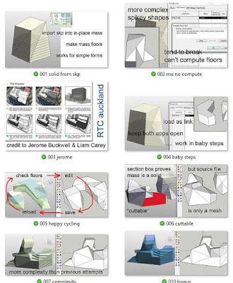
This is another “revisit”.  Spiky geometry that is easier to make in Sketchup than in Revit BUT tends to lose it’s ability to translate into a solid.  Mesh objects won’t support the “mass floors” feature which is so useful in Revit based early design.  I haven’t used Formit for some time, so I’m not sure if the conversion is more predictable or easier to handle using that route.  Another thing to get back to.

Maybe most people would use Dynamo and direct shape geometry these days.  Will have to talk to Daniel about that.


https://grevity.blogspot.com/2013/06/spikey-stuff.html


It seems like almost every post from this time-frame is something I want to explore further.  This is a variation of the rectangular grid.  This time a circular rig with radial spokes.  There is an exchange with Paul Aubin in the comments.  He has a very elegant method for modelling volutes in his book.  Currently my volutes are very abstracted and low-res.  Perhaps I could combine this rig with Paul’s approach to create a parametric volute generator.  Once again, maybe dynamo would do a better job.


https://grevity.blogspot.com/2013/06/spiral-rigging.html


Thursday, October 8, 2020

STAND IN LINE

 People are impressed by our model of the ceiling at St Anne’s Limehouse, but actually it’s a highly simplified abstraction of reality.  There is something about our system of perception that picks up simple cues and links them to memory traces, to “see” the complexity of life “in our mind’s eye”.

In many ways that is the true challenge of BIM. Come to think of it, that has been the challenge of drawing “for ever”.  What level of simplification is appropriate in the current situation?  The process we are following in our historical studies with BIM involves mapping out the building as quickly and simply as possible, then gradually adding layers of detail as we search to understand : what? why? how?


So this post is about the modillions (similar to Dentils, but scrolls rather than boxes)  Why are these “rows of teeth” so effective at articulating the junctions between horizontal and vertical surfaces? One answer is that they are memories of the rafter ends which remind us of the support system required to hold up any ceiling or roof. 

Let’s get down to the Revit stuff.  There is a family template called “line-based” which allows you to create arrays with two clicks.  Those two clicks define the ends of a line, and nested components can be arrayed along this line based on rules that you define.  In this case I decided to keep it very simple.  We have a nested element with a fixed size, and a parameter that sets the spacing, which I named “Module”.  (Model, Module, Modulus … isn’t language interesting)  There is a little equality trick here that I used to space the first element half a module away from the end point.  That sleight of hand means that “Length/Module” = “No of elements”.  Basically you divide the line into a number of spaces, and place an element at the centre of each space.


The trick involves defining a centre line between two parallel planes, then adding a third plane off to one side and “equalizing” that (so you end up with three halves!)  It’s something I discovered accidentally a while ago.

So it’s a very simple version of the line-based array, with just one variable called “Module”.  I made that a type parameter, you can name the types according to the different spacings.  With just two types, one 5% smaller than the other, I was able to fit the modillions to all the available lengths while equalizing the spaces at the corners (more or less)

This is called “balancing” in the trade: making small adjustments to the spacing so that the corners look “right”.


About 18 months ago (before Covid, and just before Notre Dame caught fire) I was exploring classical ornament (for the umpteenth time)  In this case I was focusing on using Revit’s simple approach to solid geometry to capture archetypal forms like “egg & dart”.  These are arrays, like the modillions, but there are no empty spaces. 

The amazing thing about systems like “classical ornament” or “the blues” is the infinite variety you can extract from what seems at first to be a very rigid set of rules.  There is something about these archetypal forms.  No matter how many times you “revisit” them, you can always find something new. 

So back in April 2019 I came up with three versions of “egg & dart”.  Then I went on to devise three variations on the “leave” theme.

As an aside, “leaf” “egg” “dart” … three elements to represent the vegetable & animal kingdoms, plus a man-made object.  Also that man-made tool is mineral based, and descended from the stone hand-axe that symbolizes our discovery of “technology”.


Going back another 4 years to some of my earliest attempts to create classical ornament, there was a set of insights that I called “row planting”.  As usual that is a play on words.  I had been interacting with other Revit bloggers, and between us we came up with various uses for “the planting hack”.  It’s a way of scaling up Revit geometry globally, something that is not available in other family categories. 

You put a “Planting” family inside a “Planting” family and the result will scale automatically based on the hardwired “Height” parameter.  I call it the “double nested” planting hack, because it relies in nesting Planting inside Planting.  In 2013 I applied this to various types of arrays: line-based families, railings and curtain walls.

That was a really fun period of experimentation.


For some reason, the acanthus leaf has become one of the most fertile sources of invention in classical architecture (and even in the Gothic, if you look carefully)  Revit geometry is far too simple to capture the 3 dimensional fluidity of this genre.  Or it would be, if not for the way our “mind’s eye” works. 

Picasso was very adept at distilling the essence of form.  He could capture a bull’s head or a female nude with half a dozen strokes of the paint brush in a matter of seconds.  There are some fascinating video clips of him painting on glass, filmed from the other side of the glass.

Maybe we can do something like this with the Revit solid geometry tools to capture the fluidity of acanthus.  I was inspired to have another go at this a couple of nights ago


There are three parallel sideways extrusions: solids.  Two of these are cut by void extrusions which run vertically.  Using the “Cut” and “Uncut” commands we can control which void cuts which solid.  Simple stuff, but remarkably effective.  Why? I guess it’s the “minds eye” metaphor getting busy again.

I went back to the 2013 work (which has evolved a bit in the intervening years) and double-nested this family into a line-based family. Because of the planting-hack scaling behaviour, you can create types based on the “module” parameter.  Now you have this amazing object which scales from a small carved detail on the edge of a wooden bookshelf, to a much bigger cast plaster enrichment, to an absolutely huge carved-stone external cornice.


The result of all this effort was an upgrade to work from different eras of my Revit blogging life, unified and standardised into 6 different versions of egg&dart plus 6 different versions of foliage/acanthus/leaf& dart.

This is now a system that can be expanded indefinitely with minimal effort.  You can take any Revit family (almost), change the category to “Planting”, rename it as “Inner” load it in at the bottom level of the nested stack.  Then you just have to adjust one scaling parameter “F” that compensates for the “Height to Width” proportions, so that the items in the array just touch each other (instead of overlapping or leaving gaps)

I did this 12 times in a couple of hours to create the library of classical enrichments shown below.


There is another little trick in there.  You can lock the “F” parameter buy typing a value into the formula field.  This will automatically control all the types, which is what you want.  I will also prevent people from messing with this parameter from within the project environment.  The only parameters you need to set in the project are “Module” and  “Stuff” (material).  You can use these to create as many types as you might need.

The other thing to mention is “standard naming conventions”.

At the bottom level, the planting family is always called “Inner”.  That way you can load a new family and it will automatically replace whatever was there before and maintain any linking (Material).  Next level up is always called “Module” (but you don’t really need to worry about this one.)

Material parameters are always called “Stuff”.  That’s just my own convention, based on choosing something simple and easy to remember.  These things are always made of a single material (I will cross the next bridge when I get to it)

The formula (H = Module*F) is used to control the hardwired “Height” parameter in the Module (by way of parameter linking) No need to mess with this.  It’s set up now and it works.  All you need to do is substitute a new family at the bottom level (Inner) and adjust F until the array works the way you want it to.

Download one sample family from here.  If you want more you can make your own

OR

Contribute to our work here at “The Way We Build” exploring history with BIM.  We are great believers in sharing, but not so much in encouraging free riders 😊


https://drive.google.com/file/d/1cJyGkX7fHa2XxUtQ0n_2ji13ViEQl0u5/view?usp=sharing


Thursday, October 1, 2020

WEEKLY BULLETIN

 Couple of weeks really.  Summarising progress and picking out some highlights for comment. 

I’m calling this a weekly bulletin as opposed to the “live stream” which is the more spontaneous posts that go out direct to LinkedIn and give a flavour of the work I am doing on that particular day.  First thing to mention is the site context, a linked file that has massing models for the locations around of all six of Hawksmoor’s London churches.  I did a bit of an update to this to clean things up and sort out some odd levels, plus extend a green surface down to the river.  I actually added a few building blocks in that area, dotted around so it doesn’t look so empty. 


I’m showing the canal (the Limehouse cut) but not the Limehouse Basin, because all those man-made docks were built much later. The wharfs and warehouses were directly on the river during the 18th century.  There is a small creek at Limehouse which would have been a handy docking location in Hawksmoor’s day.  That’s down past Narrow Street and a famous pub called “the grapes”.

Seems ages ago that I roughed out some timberwork in the roof.  I really don’t know what the roof structure was like when first built.  I think it’s been redone at least twice.  In particular, I am keen to understand what the four big columns are doing.  Are they providing a useful structural function?  If so, this implies that there are four main spans, all roughly equal and forming a rectangle around the circular centre piece of the plaster ceiling. 

The ceiling continues to impress me, the more I work on it.  I created a line-based family for the modillions: closely spaced, scroll-shaped brackets that emulate the ends of rafters.  I think that’s the origin of this as a decorative device: rafter ends carved shapes with scrolls and foliage.  I’m using a highly simplified abstraction of the archetypal form, but the overall effect is already quite rich.  I think there is a serious challenge here if we take the detail level any higher.  How to represent the richly decorated forms cleanly and convincingly at different scales (coarse, medium, fine)


Ryan has done a great job with the organ.  That’s his third (he did two for Notre Dame). I have roughed out the timber work of the galleries.  It’s not right, but it gives a good impression.  The pews are highly simplified and also not the right size and spacing.  We have new data so it’s on my list to give them a second pass.

Nick Fuller is a new volunteer on “the way we build”.  He’s started to tackle the windows, adding glazing bars and the triangular lay-lights that were added in modern times.  There was probably a more conventional opening section in this location before.  I guess the current design is a fire precaution, providing ventilation with a very simple self-closing mechanism in the case of fire to dampen down the air supply and give people time to escape.


While Nick is down to tackle most of the windows, I had to spend a little time improving the ones on the ground floor of the entrance elevation.  My first roughing out didn’t even have glass, and although there was a hint of a stone surround, with a semicircle over a smaller rectangle, I didn’t include a pediment.  So as reported to LinkedIn at the time I pushed this particular family up to the next level.  The timber sliding sashes I made for Project Soane came in handy for a bit of cannibalization.  These windows help to light double-storey stair-wells.  I made a first attempt at forming the south stair in wood.  The door to the spiral stair for the bell tower leads off the upper flight half-way up.  Started to think about how that works.

Every now and then I stop for half an hour or so and look around the model in the Enscape3d live window.  This is a great way of seeing your work with a fresh eye.  Also a good chance to take some screen shots.  You can slide the time of day around using the “U” & “I” keys.  I always keep a lookout for lighting effects that enhance the composition.  In this case a bit of a lens-flare/sun burst.  There are plaster ceilings below the timber of the galleries and the cross beams between columns and walls are boxed out in plaster also.  So we’ve got that happening in the model now.


It’s been an absolute pleasure having Rufus Frampton as a contact on the ground in Limehouse he has a long history with the church and to some extent with two more of Hawksmoor’s six.  He has provided very useful pictures of the stair halls.  Even better are the snapshots of plans drawn in the 1990s which give new insights into the spatial complexity of the spaces below the bell tower. 

I was able to bring jpegs into Revit views and scale them to match the model which is set to a blue-green wireframe representation.  These views were then arranged on a single sheet so it’s easy to jump between them and figure out what’s going on.  Some quite tricky half-levels and interconnections, solid sections of walling (the cores are modeled in place) and vaulted and domed spaces that interlock in section.  I had a great time figuring this out.


Rufus sent us some little video clips as a way to convey the narrow, curved spaces behind the organ that lead up short flights of stairs to an upper cross-passage that overlooks the circular entrance space (double height)  We don’t have those short stair flights yet, but the basic level changes are in the model now.  The overall size of this model is still a bit of a guesstimate, taken from Google Earth as shown in the previous post.  At some point, Rufus will give us some check dimensions.  To be honest I’m not in a big hurry to get these.  It will probably lead to a weekend of adjusting everything by a few percentage points. 

The North Stair was rebuilt after a fire around 1850 so it’s stone with cast iron balusters.  Instead of the door on to the spiral stair, there is an open archway and a stair up to the back of the organ.  Otherwise the layout is pretty much the same.

I hadn’t noticed before that the slot windows that show up on the outside of the bell tower reappear inside the stair lobby/ south porch.  Makes perfect sense of course, a bit of borrowed light definitely helps when climbing narrow stone stairs that seem to wind up endlessly.

I’m quite please with the way the two stair porches are shaping up in the model.  Much easier to understand their similarities and differences with a Revit model to hand.


We have no attempt to model the spiral stair treads yet.  I do have a family that we used on Notre Dame, just to give the impression without necessarily working out the exact runs and landing positions.  I would be intrigued to know if everything is built in stone, or if there is some brick fill in certain areas, maybe even rubble cores in the thicker portions.  The loft over the South Porch is entered via the spiral stair.  It seems that you go up a couple of treads on the stone stair, through a door onto a wooden landing, and down again to the loft floor level.  I have a vague memory of this, and it’s shown on one of the hand drawn plans.

The spiral seems to just keep going and the landings at doorways are placed outside the circle. Makes sense.


By coincidence one of my connections on LinkedIn shared some restoration work they have been doing which features classical columns.  There is a nice site photo of the brick core, as well as a shot of the in-situ silicone mould which they took in order to cast replacement capitals in the shop.  I guess these were done in two halves for fitting on site. 

This got me thinking again about the internal columns at St Anne’s which belong to the Composite Order and have plain shafts.  There are two basic types: round with entasis, and square pilasters which go straight up and down.


The shafts for the square pilasters are basic flat plastering jobs, but I’m intrigued to know how the round ones were done.  You can set up the profile in the workshop and “spin” a column casing in two halves.  But is there a way to spin a smooth shaft with entasis in-situ?  Seems like it would be quite cumbersome to set up, but what do I know?  I guess you would be able to tell by tapping the columns and listening for that “hollow” sound.  Can’t imagine that it would be possible to achieve a solid bedding throughout on such large castings.