I an recently back in Dubai after 2 glorious, eventful weeks in the UK. I'm going to review it backwards. Maybe that will shed fresh light on the experience, a bit like holding a picture upside down, or viewing it in the mirror.
The climax was a gig in Reading with my "schoolboy band", the core of the band being 3 of us who were at Barnsley Grammar School together in the 1960s. By coincidence I watched "8 days a week" on the return flight which was another way of reliving that startling decade. I did a short solo set at the beginning of the evening which went down really well. Great to be performing again.
I had spent a few days staying in Reading with my old friends Jo & Ian, practising during the days, talking in the evenings. I got to walk around the neighbourhood a bit more than I have before and enjoyed the red brick architecture with decorative banding. Clearly it is influenced by the nearby Reading School by Alfred Waterhouse, as well as local vernacular tradition. I would love to know more.
On the Friday morning I took the train into London to meet Jenni Muir of the Bank of England Museum. We had a very interesting chat about possible future collaboration, much of the time standing in front of a large framed copy of Gandy's painting of the Bank as a classical ruin.
Seeing it blown up to that size and sharing ideas with another well informed observer, I started to notice all kinds of things I hadn't really seen before. For example, there is some very useful information about the roofscape in the south-west corner of the Garden Court, including Soane's first floor addition. There are several drawings of this, but I couldn't work out how it related to the internal parapet/balustrade. Then there are the lanterns and chimney stacks above the rooms along Threadneedle Street. Very clearly shown in the "ruin painting", but obviously changed some years later, as one of the demolition photos shows.

So always there are these detective games to be played. In the painting there is no door leading into the governor's office and the window giving onto the corner of the waiting room court is altogether wrong. Poetic license I suppose. Elsewhere in the museum displays there are drawings and photographs that hint at design details that I had missed: a large chimney in the printing works, & the top storey of residence court, for example.
When I first started to model the outer screen wall almost 2 years ago, the parapet was a real brain-teaser. I think it was Cockerell who completely ruined the proportions by extending it upwards under instruction from his client. A demolition photo that I had not studied before seemed to suggest that Soane's original pedimented column caps were somehow hidden behind the new extended parapet. Eventually I realised that I had the viewpoint wrong, this was taken from Bartholomew Way, and the dome being demolished is Taylor's entrance vestibule.

I'm starting to think there must be a lot more demolition pictures and I'd love to study them. I've long been wondering whether the walkway around the battlements had an internal railing, or if the night guard just had to walk carefully whenever they passed an internal courtyard space. Nothing shown on the drawings, and demolition photos I saw at the museum suggest a simple stone shelf with no guarding to the inside. It would be helpful to engage a wider community of Soane enthusiasts on questions like this.
For the Board of Trade, Soane wanted to use the same version of Corinthian as he had at the Bank. (Temple of Vesta, Tivoli) His clients insisted on Jupiter Stator and he produced an interesting set of comparative drawings in his (unsuccessful) attempts to dissuade them. On this visit, I noticed that the two types of capital co-exist today in Threadneedle Street. The Royal Exchange opposite the bank boasts capitals of the Jupiter Stator type.
Soane argued that the smooth curves and elaborate entablature of Stator were appropriate to the size and scale of the original. while the simpler, more compact form of Vesta worked better for the sizes he needed at the Bank and the Board of Trade. For the moment I am just trying to get my head around these complexities of the classical style and the question of how to represent these elements in interpretative studies.
There's a lot to learn, and I'm enjoying the process of discovery as a by-product of serious modelling efforts based on diverse source material.
That morning, as I set off on the train from Reading to London, the tabloids were dominated by pictures of Jeremy Corby as a caring "man of the people" contrasted against Theresa May as "cold fish" defender of capitalism. That was a remarkable U-turn and almost as disconcerting to me as their previous oversimplifications and melodramatics. I guess my view is that life in the "Western World" is rather bland and civilised compared to most anywhere else, so people blow every small blip up into a minor crisis.
As for the tragic fire in London, I was relieved to receive from the RIBA a balance between solid practical design advice and a plea to reserve judgement while a proper investigation is carried out. I find myself pondering the fine line between idealist and idealogue. It's so tempting to stoke the fires of indignation when you have nailed your colours to a noble cause.
Multi-culturism is a hot topic these days and I've been watching a number of discussions on YouTube. Once again I am suspicious of polarised opinions and the false dichotomy of left-wing / right-wing. That categorisation seemed to make a lot of sense when I was younger, but just as my understanding of classicism has become ever more layered and complex ... well, I think the political issues of our day don't respond well to sweeping certainties.
I do feel that the enlightenment values that meant so much to John Soane are hugely valuable. They certainly imply an opening up to "other cultures" as is immediately obvious in the diversity of his own collections. But the museum is also a protected world. The richness of its contents is preserved within its boundaries and by the strict conditions of entry. I was interested to learn, during this visit, that he was in the habit of turning visitors away on rainy days (often by subterfuge) because he wanted people to see sunlight streaming through his wonderful daylight contrivances.

Before moving to Reading I had spent the weekend with family. I got the chance to see Salisbury Cathedral at last. Here is a building erected over a 38 year period some 750 years ago, and substantially intact. The balance between regularity and irregularity is therefore intentional, rather than being the result of pragmatic changes made by succeeding generations. I used to characterise Gothic as "organic" and Classical as "formal" but once again, this is far too simplistic. At Salisbury the overall scheme is very regular and symmetrical with variation confined to elements such as column capitals. This is worthy of Soane himself, as we will see, but the extent to which those capitals vary is rather greater than you would expect in a classical composition.

Salisbury itself was a walled city with several gates, some of which are still visible. Soane's Bank of England expresses this walled city idea in its overall form, a reference perhaps to the medieval guilds from which modern banking emerged. Everything I do on this blog, (from Project Soane to studies of Sash Windows, or reflections on the intersection of Art with digital technology), is an attempt to make sense of our history as a city-building species. Civilisation, Cities, Agriculture: it's an integrated package we've been living with for several thousand years now. That package has a down side of course: waste-disposal, disease, warfare. My grandson Jack had chicken pox while I was there, a classic example of the kind of species-jumping virus that helped Eurasians to conquer new worlds.

Salisbury was actually an afterthought to a farm open-day visit which gave Jack a chance to sit in a combine harvester and ride behind a tractor across rolling meadows, where free-range cows manufacture milk for city dwellers. Many of our domestic animals live in cages of course, raising yet more complex moral questions. Personally I don't eat meat (never have) but I do consume milk, eggs and fish. It was fun to watch the cows being milked on a giant, rotating machine.
Towards the end of our visit, my son spent time with Jack in the play zone, and drew a picture in the typical laconic style he developed as a child over 25 years ago. He works in the digital sphere and thinks of himself as a bit of a geek, but I've always been impressed by the fluidity of his visual imagination. Drawing is a way of thinking. To me it is one of the most fundamental underpinnings of BIM. I'm referring to drawing in the broadest sense: a way of attending more closely to the world around us.
That was Sunday. On Saturday we visited The Vyne, an Elizabethan mansion close to Basingstoke. Soane lived in the age of picturesque landscape gardens, when designers strove to emulate the wild and the natural. Elizabethans followed an earlier Baroque tradition when gardeners bent nature to their will and imposed formal geometries upon the plant kingdom.
Inside the house I was interested by the way some of the doors were constructed. These old buildings have thick walls. The door openings usually have "linings" which are framed and panelled in a similar way to the doors themselves. (unlike modern doors which tend to have solid frames) Looking at photographs of the Bank I noticed that doors are almost always on the side facing the photographer. How could this be? I've been wondering if they have doors on both sides with a gap between. That would help with soundproofing of course, which might be important in rooms where confidential discussions are held.
At the Vyne, there are openings with a normal door on one side and a pair of shutters on the other, that fold back into the lining. This is quite similar to the way shutters are built into the sash window linings (except for the position of the hinges) It's pure speculation at the moment, but I wonder if this idea was used by Soane at the bank.
I've recently become aware of a thing called HBIM (Heritage BIM) In a way it's a parallel strand to the kind of work I've been doing. It's the Commercial version of my "hobby" perhaps: day job v private passion. Of course that's an oversimplification again, a caricature. But there is a heritage to be preserved, much of it (like The Vyne) is open to the public, and why wouldn't you use a collaborative, BIM approach to the restoration and maintenance work.
I'm not sure how this has impacted on the current restoration work taking place at the Vyne, but luckily for us that work has been opened up to the public. There is a scaffolding "tent" spanning the whole building so that they can take the roof to bits, record what they find, and decide how to restore it. It's a complex structure built over many generations with different materials. Mostly it's a series of steeply pitched clay tiled roofs, but slate was also used , and some low-pitched sections were covered with lead. I really enjoyed seeing the diagonal boarding and the support for the raised joints between the lead sheets.

I spent most of the previous week in London, primarily pursuing Project Soane. On the evening after the general election I found myself strolling through "change alley": the narrow passages where modern finance took shape in fashionable new coffee houses. Tobacco, coffee, sugar, Spanish gold, stocks & shares: these are some of the factors that combined to overturn the world of medieval guild halls whose traces still remain in the City of London. Which brings us to the Bank. I've walked around the screen wall many times now, and I'm very familiar with what is Soane's and what has been simplified and juggled around by Baker.
But while I'm here I might as well take a few more photos. I decided to zoom in from afar to capture the Vesta/Tivoli capital "side on" and check the proportions of my current interpretation. Suddenly I noticed for the first time that the flower motif comes in different versions. I've spotted three. What's more some capitals have type A on the side and type B on the front. In the side rows of six columns, there is a symmetrical alternation of types. So is this Soane or is it a little joke inserted by Baker? Well Soane did use types A & B, that much is clear from pre-demolition photos. Tivoli Corner is all type B, and the centre block on Threadneedle street is all type A. (before and after in both cases) I'm pretty confident about the alternation of types in the side ranges of 6 as well, but the resolution in the printed versions of Yerbury's photos is not so great.

On the way to the Bank, I had taken another look at Walbrook Wharf. This is where one branch of the ancient watercourse entered the Thames, and there is still an outfall there, although I couldn't get down to look at it because it was high tide. Most of the water flow was diverted parallel to the Thames in Victorian Times, part of Bazalgette's sewage system. Further upstream Walbrook followed the original route of Princes Street and therefore still flows underneath the Bank, cutting the corner diagonally from the old Doric Vestibule entrance and heading towards St Margaret Lothbury.
Although the water borne sewage no longer flows into the Thames, much of the City's waste still floats down that way inside containers, neatly stacked on Barges.
Earlier in the day I had spent a morning at the Victoria & Albert Museum. First time to go inside. I'm usually so busy looking at the architecture of the streets that I don't get around to exploring the museums and galleries. I went to take a look at the architecture section. Saw some interesting, rather loose interpretations of Corinthian. Two of them are part of the building itself, so that's down to C19 free eclecticism. The others are from the height of the Italian Renaissance, demonstrating how inventive architects could be during that hallowed period.
At the conclusion of the Architecture section, there is a large drawing of St Paul's cathedral. Don't have a date for it, but the named collaborators were active about a hundred years ago. It's a cutaway isometric revealing the construction and seems to me once again to show how BIM is simply a continuation of earlier drawing traditions. I see BIM as a thinking tool and a way of opening ideas up to enable collaboration.
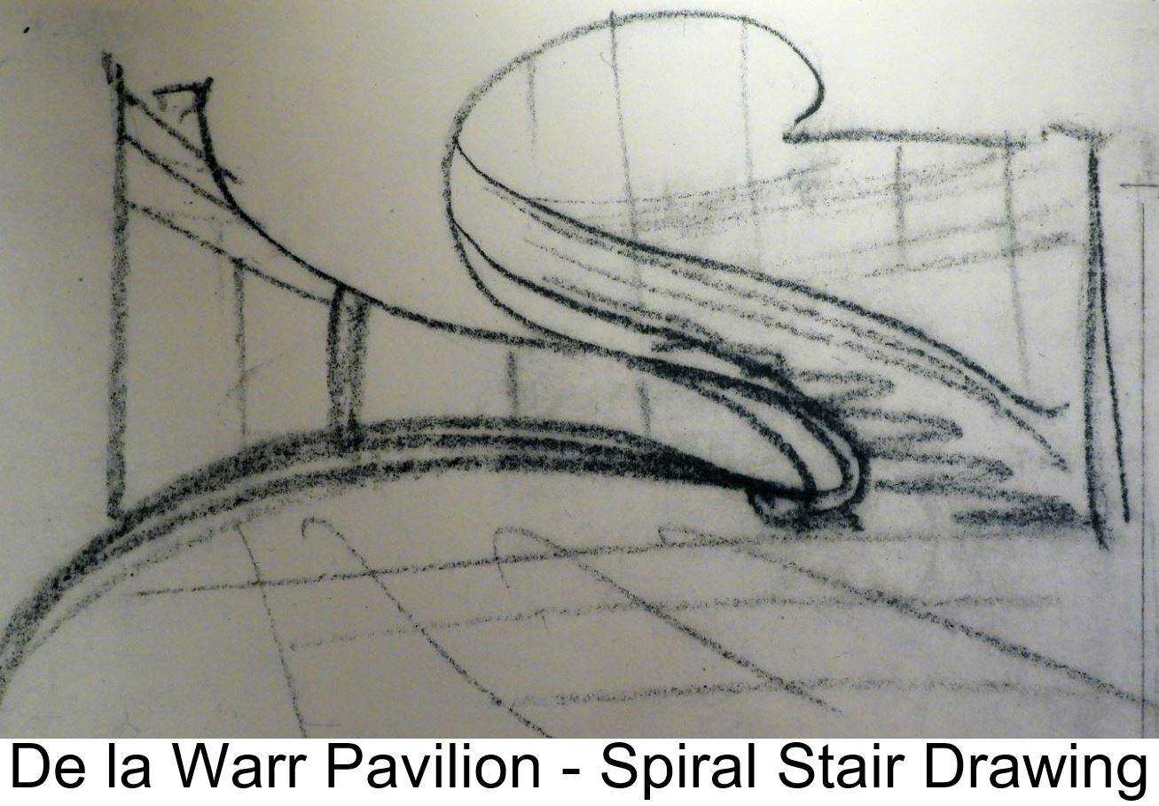
Earlier on there was a drawing by Eric Mendelsohn of the main staircase in his De la Warr pavilion. I'm for ever chasing this kind of expressive spontaneity using digital tools in a BIM context. There is a clear and present danger of "design" and "production" becoming confined to separate silos. I did start to model that building after visiting it 3 years ago to see how it had been restored. Yes modernism is also part of our heritage, and subject to another polarised debate. I guess I am arguing for less of the polemics and more serious, practical, hands-on research.

There's another spiral stair in the V&A. This one is solid oak, and originated in a town called Morlaix in Brittany. It comes from a type of house with a central hall (a common medieval feature) This one fell into disrepair, was removed from the house, acquired by a private collector and passed on to the V&A around 100 years ago. I was impressed by the huge solid sections of hardwood used in medieval construction in Europe. Imagine living in a world where you treat oak almost as we treat concrete today, a primary structural material.
The previous afternoon I had visited Pitzhanger Manor for the first time. You can't get inside because it's under renovation, but the public park behind is accessible. This used to be John Soane's "country estate". Here we have the romantic, picturesque, enlightenment landscape. Soane used random knapped flint occasionally in his work to evoke a rustic feel. It's found here in a playful bridge design and in the entrance gateway to the house.
Note also, yet another interpretation of the canopy dome that inspired the classic red telephone box. As chance would have it there is a modern reinterpretation of that design just across the street. Maybe we should design a mobile phone inspired by his starfish ceiling motif, as a twenty-first century continuation of that tradition: a Soane-Phone.

Pitzhanger is in Ealing. I took the district line out there after walking around Whitehall. I wanted to just deepen my connection to the area where the Board of Trade building was built, and to get better reference photos of Kent's Treasury. I already had quite good photos of his Horseguards. and of Scott's Foreign Office, which is nominally classical but somewhat Gothic in spirit. There are allegorical figures referencing the British Empire's civilising mission. I was drawn to the african mother and child with a banana plant and a hippo in the background. Easy to be flippant and condescending about the past. My intention is to engage a little more deeply with the subject matter, to keep probing and revisiting the sources.

The day began at Chelsea Hospital, a Wren project that Soane added to, though most of his contribution is now lost. There are fragments remaining, the most substantial, and best known being a stables block. Lots of interesting things here. His dramatic use of concentric arched recesses is much admired. I was drawn to the brick corbelled eaves, which I had also recorded at the Soane Museum. He used this idea many times during his career, yet another example of variations on a theme. It's amazing how inventive you can get with a simple idea. In music, I find myself endlessly revisiting the 12 bar blues and there always seems to be something fresh waiting to be found.

When I got back to Dubai I was moved to model this detail to get a deeper understanding. So far I've only done the Chelsea Stables version. I drew it out in elevation first (2d modelling) then used a simple parametric cuboid family to explore the modularity. It gets out of step with the Flemish Bond below, but hits the same spot every six brick lengths (in theory at least) The overall impression is of a highly abstracted version of a Doric entablature, vastly cheaper than the carved stone version of course. Mr Soane had quite a few tricks up his sleeve and a deep understanding of the building trades.

That was my second day in London. The first was devoted to the Soane Museum. I enjoyed two guided tours, a free walkabout with sketchbook in hand, and a very enjoyable second meeting with Sue and Frances, who work there. Members of the Heritage professions you might say, but very willing to engage with amateurs like myself. We had a very fruitful discussion, and I made lots of new observations, including the fact that Soane's window sashes don't extend at the corners to form "horns". This made me look closer at other older buildings, and I realised that horns must be a rather late development. The idea is to guard against splitting of the wood when the mortise hole is close to the corner and you are driving in a wedge to tighten up the fit of the tenon. I guess the older craftsmen were more confident in their ability to get things "just right".
I also noted how very delicate some of Soane's mouldings are, introducing an extra curve into the section of the glazing bars (muntins) for example. It's fascinating really how he ranges from highly abstracted and simplified to finely detailed and delicate. I think he really enjoyed exploring the full range of possibilities, not to mention agonising over what was appropriate in each particular circumstance.
That brings me to the first weekend of my stay, another family affair. We took a drive down to the coast, a place called Lepe, opposite the Isle of White. I was testing out my new camera and zoomed in on a couple of guys digging for shellfish. It strikes me that this is a link to our beachcombing ancestors who drifted out of Africa, all the way down the coast of India and island hopped to Australia. What kind of tools did they use to dig up the mud I wonder? What was it like to live in that world? Will humans still be around 70 thousand years from now, digging in the mud for food?
The current lock screen for my ageing but much loved green Windows Nokia is a photo from that weekend. I'm sleeping on the living room floor on an air bed, and Jack comes in to play with his grandpa, still spotty-faced but much more lively than the day before. That was a special moment for me.
Basingstoke is classic, post-war, English new-town planning: pedestrians segregated from traffic, ring road with roundabouts, semi-traditional housing in a variety of materials mixed in with apartment blocks, neighbourhoods clustered around schools, local shops and playgrounds. But it also has quite a deep history and walking into town with my son Joe on the first night, I was surprised to see how close he lived to a charming little "village square" with parish church and timber-frame housing clearly dating back to Tudor times. How English can you get? And how seemingly natural and unspoilt. Am I fooling myself?

In the course of my journey from Dubai I picked up some reading matter (as you do) The Economist was concerned about polarisation in British politics. Will Labour dive into this gaping hole and claim centre stage again? It didn't seem possible when I bought the magazine, but less than a month later things have changed quite dramatically. It seems as if they could, but do they want to? Or perhaps I should ask if they can find the unity of purpose to do something so sensible as appeal to the middle ground? Or maybe ... whether they can target the "average brit" without selling their souls? Melodrama raises its ugly head once more.
I have started to read an interesting history of consumerism. There's another tainted word. I think it's worth trying to understand the history. Most of us feel that we accumulate too much "stuff" and generate far too much waste. But our economy is based on growth and crude attempts to impose a new model seem to make things much worse. Can we evolve a more stable, sustainable economic model over time? Over to you Jack.
I've tried to describe this visit as part of ongoing attempts to study human civlisation using my "BIM pencil". Part of the fascination for me has been looking at something a second time, then a third and fourth time, gradually realising what a depth of history and understanding can be extracted from the source material by engaging with it over an extended period of time. So every time I go back to the Bank of England, or the Soane Museum, or to the City of London as a whole I am drawn deeper into this endlessly fascinating story.
Some links:
sash windows & horns
BIM pencil & de la war
Bank of England as a Ruin