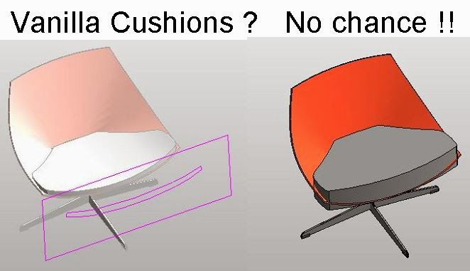
Sadly this is already more that a week old. Read on.
It's been a bit of a disastrous few days for me. Maybe that's putting a melodramatic spin on it, but firstly I am recovering from a very sore shoulder which seems to be a result of posture and mouse use. I actually spent the last day of the week trying to use my left hand. Interesting, but very clumsy.
It makes me realise how much of my time is spent in dialogue with a computer screen. It's been extremely wierd spending a three day weekend almost completely ignoring my laptop. Which brings me to the next catastrophe. The wonderful new laptop I received from HP as a reward for my work on Project Soane has suddenly stopped working. Fortunately I have my old machine and just about everything is backed up via OneDrive, but it still feels like a mortal blow.

One of the things I did with my left hand, was to make a task chair family. I came across this thing called the "Trinetic" which offered a download of drawings and images. I thought it looked quite sweet, and decided to remind myself how to convert a 3d mesh into a useable family via 3dmax (and Autocad) I had forgotten, but was able to follow my own post from early 2016. Basically it's all about hiding the edges of the polygons. be-gone-sharp-edges

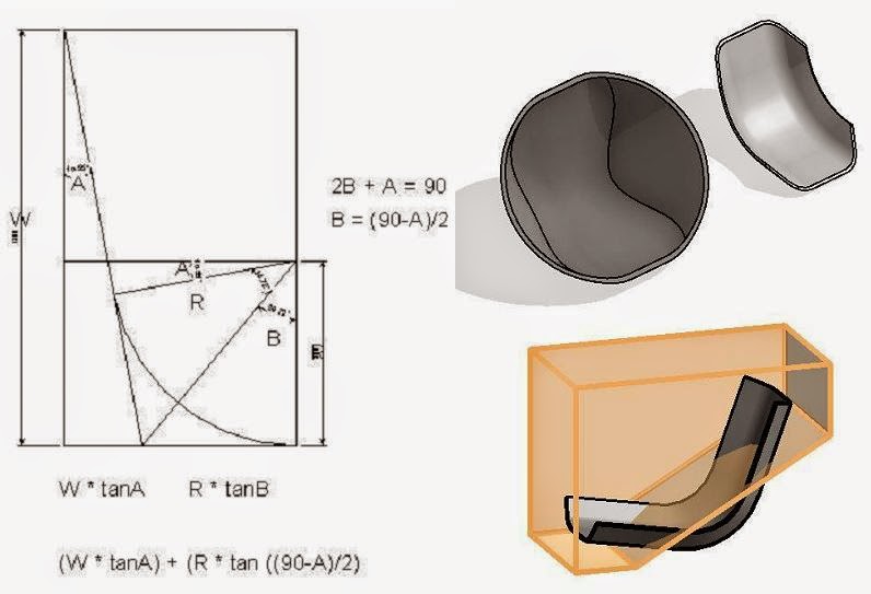
There will be the usual complaints about nested CAD, but I am over this now. You can't model something like this convincingly with Revit native geometry. It's not the kind of shape that those tools were designed to make. Here is a nice smooth version, all ready made, so let's use it. Solids are great for things that need to be sectioned. That doesn't apply to furniture. Mesh is the way everyone models this kind of stuff for visualisation, movies, etc. The minute you try to get half way to modeling these double curved shapes with native tools there's going to be lots of gymnastics cutting with voids and the file size will shoot up. Really, I love some of the stuff that has been done for people like Herman Miller, but looking through that again, there is nothing that comes close to the smooth flowing tapered curves of a chair like this.

Add to that the whole "cross-platform" debate and I just don't see the point of turning your noses up at mesh geometry. Revit can handle it. We know how to hide the edges. File sizes are very reasonable. So if someone has already done the modelling for you as a CAD mesh, gobble it up.
Having hidden the edges in 3dmax, exported to DXF2014 and resaved as DWG, I inserted the mesh into an RFA template. For the most part the geometry was already sorted into layers by material. I just had to put the wheels on to a different layer. The layer names weren't very helpful, so I renamed them in Object Styles, which is of course where you go (within the project environment) to apply materials.

Revit has this habit of creating a bunch of materials with dumb names (Render Material 0-0-255, etc) I like to delete all these. Then I usually apply some of the default materials to the layers, just to give some definition to the family, which will also show up in the thumbnail. I use the default materials because I believe in sharing with the global Revit community, and I don't particularly want to inflict my material naming conventions on everyone else. It's called being polite.

Here's how my cleanup process in Object Styles played out

The next point of controversy is the use of symbolics. I'll state my position once more. I like to be able to produce crisp linework on sheet sets. Maybe it's because I grew up drawing by hand, maybe it's because I think people respond better to visual communication that delights the senses. Look at web site design, advertising, company logos, product packaging. We have a sense of beauty and elegance, and we are subconsciously influenced in positive and negative ways. "Old Fashioned" ideas of draughtmanship and layout do matter, whether you are trying to sell a design to a client, or communicate intentions to a construction worker. So messy, fuzzy edges to furniture objects in my plans and elevations really bug me. They also bug senior management who don't need to have their negative prejudices towards BIM confirmed.

In short, I may be working left handed at the moment, but I don't want my families to look like they were drawn that way. So I have chosen to create crisp linework and masking regions in the 3 orthographic planes. Revit doesn't make it easy for me to differentiate between front and back elevations, but usually front will do fine.
Here I am going to agree with the CAD haters. There are 2D CAD files in the download, and it would save a bit of time to use these, but I want to have masking regions anyway, and I usually find that manufacturer drawings show too much fine detail for architectural purposes. I'm not going to be using these at a scale of 1:5. I want them to look right at 1:20 & 1:50. So I am redrawing and simplifying as I go. I have also introduced a certain amount of "coarse-medium-fine" differentiation. It's quite subtle, but might as well do it while I can.

But what about the 3d geometry? Do we need 3 versions? I suggest not. I hate the all-purpose boxes that are so commonly used. What's the point if you can't tell whether it's a chair or a WC? But it may be worthwhile using 3 simple extrusions to represent a generic task chair. Have that for coarse 3d views and the CAD import for medium and fine. Use symbolics in plan/section/elevation.

Finally I tried a quick render ... could this be another downside of meshes? Seems like the seat is distorting render bitmaps in rather strange ways. The back is fine, so maybe it's not meshes per se that are the problem. Might be worth exploring that a bit more some time. In any case it's only really an issue with large scale patterns like the striped fabric.
Anybody else want to help make families like this from available 3d CAD? Fancy a bit of crowd sourcing? Or maybe we could make some "collections" up ... like this one I assembled from an Italian furniture maker that I stumbled across. Seems to me that even half a dozen experienced Revit users willing to cooperate on something like this could significantly improve the range of content available online.

link to my version of the Trinetic chair
HERE
(sharing of this link should now be fixed)
By the way it's about 900kb which is much smaller than it would be if you tried to do this with Revit native geometry. even if you accepted lots of sharp edges where this is nice and smooth and rounded off.
Oh, and while we're here, Kak-Handed, or Cack-handed as some would have it, means left handed in the part of the world where I grew up, and my association comes to mean "incompetent"
On that note, here's a recent quote from a government minister in my home country of Zimbabwe, and I can assure you it was said in all seriousness.

It's been a bit of a disastrous few days for me. Maybe that's putting a melodramatic spin on it, but firstly I am recovering from a very sore shoulder which seems to be a result of posture and mouse use. I actually spent the last day of the week trying to use my left hand. Interesting, but very clumsy.
It makes me realise how much of my time is spent in dialogue with a computer screen. It's been extremely wierd spending a three day weekend almost completely ignoring my laptop. Which brings me to the next catastrophe. The wonderful new laptop I received from HP as a reward for my work on Project Soane has suddenly stopped working. Fortunately I have my old machine and just about everything is backed up via OneDrive, but it still feels like a mortal blow.

One of the things I did with my left hand, was to make a task chair family. I came across this thing called the "Trinetic" which offered a download of drawings and images. I thought it looked quite sweet, and decided to remind myself how to convert a 3d mesh into a useable family via 3dmax (and Autocad) I had forgotten, but was able to follow my own post from early 2016. Basically it's all about hiding the edges of the polygons. be-gone-sharp-edges

There will be the usual complaints about nested CAD, but I am over this now. You can't model something like this convincingly with Revit native geometry. It's not the kind of shape that those tools were designed to make. Here is a nice smooth version, all ready made, so let's use it. Solids are great for things that need to be sectioned. That doesn't apply to furniture. Mesh is the way everyone models this kind of stuff for visualisation, movies, etc. The minute you try to get half way to modeling these double curved shapes with native tools there's going to be lots of gymnastics cutting with voids and the file size will shoot up. Really, I love some of the stuff that has been done for people like Herman Miller, but looking through that again, there is nothing that comes close to the smooth flowing tapered curves of a chair like this.
Add to that the whole "cross-platform" debate and I just don't see the point of turning your noses up at mesh geometry. Revit can handle it. We know how to hide the edges. File sizes are very reasonable. So if someone has already done the modelling for you as a CAD mesh, gobble it up.
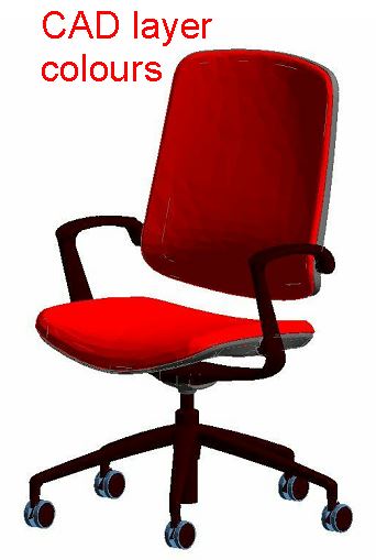
Having hidden the edges in 3dmax, exported to DXF2014 and resaved as DWG, I inserted the mesh into an RFA template. For the most part the geometry was already sorted into layers by material. I just had to put the wheels on to a different layer. The layer names weren't very helpful, so I renamed them in Object Styles, which is of course where you go (within the project environment) to apply materials.

Revit has this habit of creating a bunch of materials with dumb names (Render Material 0-0-255, etc) I like to delete all these. Then I usually apply some of the default materials to the layers, just to give some definition to the family, which will also show up in the thumbnail. I use the default materials because I believe in sharing with the global Revit community, and I don't particularly want to inflict my material naming conventions on everyone else. It's called being polite.

Here's how my cleanup process in Object Styles played out

The next point of controversy is the use of symbolics. I'll state my position once more. I like to be able to produce crisp linework on sheet sets. Maybe it's because I grew up drawing by hand, maybe it's because I think people respond better to visual communication that delights the senses. Look at web site design, advertising, company logos, product packaging. We have a sense of beauty and elegance, and we are subconsciously influenced in positive and negative ways. "Old Fashioned" ideas of draughtmanship and layout do matter, whether you are trying to sell a design to a client, or communicate intentions to a construction worker. So messy, fuzzy edges to furniture objects in my plans and elevations really bug me. They also bug senior management who don't need to have their negative prejudices towards BIM confirmed.

In short, I may be working left handed at the moment, but I don't want my families to look like they were drawn that way. So I have chosen to create crisp linework and masking regions in the 3 orthographic planes. Revit doesn't make it easy for me to differentiate between front and back elevations, but usually front will do fine.
Here I am going to agree with the CAD haters. There are 2D CAD files in the download, and it would save a bit of time to use these, but I want to have masking regions anyway, and I usually find that manufacturer drawings show too much fine detail for architectural purposes. I'm not going to be using these at a scale of 1:5. I want them to look right at 1:20 & 1:50. So I am redrawing and simplifying as I go. I have also introduced a certain amount of "coarse-medium-fine" differentiation. It's quite subtle, but might as well do it while I can.

But what about the 3d geometry? Do we need 3 versions? I suggest not. I hate the all-purpose boxes that are so commonly used. What's the point if you can't tell whether it's a chair or a WC? But it may be worthwhile using 3 simple extrusions to represent a generic task chair. Have that for coarse 3d views and the CAD import for medium and fine. Use symbolics in plan/section/elevation.

Finally I tried a quick render ... could this be another downside of meshes? Seems like the seat is distorting render bitmaps in rather strange ways. The back is fine, so maybe it's not meshes per se that are the problem. Might be worth exploring that a bit more some time. In any case it's only really an issue with large scale patterns like the striped fabric.
Anybody else want to help make families like this from available 3d CAD? Fancy a bit of crowd sourcing? Or maybe we could make some "collections" up ... like this one I assembled from an Italian furniture maker that I stumbled across. Seems to me that even half a dozen experienced Revit users willing to cooperate on something like this could significantly improve the range of content available online.

link to my version of the Trinetic chair
HERE
(sharing of this link should now be fixed)
By the way it's about 900kb which is much smaller than it would be if you tried to do this with Revit native geometry. even if you accepted lots of sharp edges where this is nice and smooth and rounded off.
Oh, and while we're here, Kak-Handed, or Cack-handed as some would have it, means left handed in the part of the world where I grew up, and my association comes to mean "incompetent"
On that note, here's a recent quote from a government minister in my home country of Zimbabwe, and I can assure you it was said in all seriousness.