Hastings is a small town on the South Coast of England. It has a multi-layered history including the famous Battle in 1066 that allowed the Normans to wrest control from a Saxon elite. Fishing still plays an active role in the local economy and makes its presence felt along the Eastern shoreline in the form of black, weather-boarded storage towers and working vessels drawn up on the pebble beach.

I have friends in Hastings who I have been visiting, off-and-on for over 20 years now. Nick and I know each other from architecture school circa 1970. He became an architectural journalist and I "dropped out", returning to my northern roots, training as a bricklayer and playing in a band. Towards the end of this phase of my life, Nick invited me to work on his latest project: a book about squatting.

We had both been involved in the squatting "scene" in London in the early 70s and I had a certain reputation for sketching and cartooning. I was to be the illustrator, his partner Caroline Lwin was the designer and he was Editor. Various people contributed a chapter each. Since then he has gone on to become well know in the Community Planning field, writing a handbook and maintaining a website on this topic.

I always enjoy spending a couple of days with Nick and his current partner Jane: relaxed atmosphere, delicious wholesome food and stimulating conversation. This time he reminded me about a book he had showed me before: "Harry the Pencil" based on a lifetime of hand sketching to support design development on an urban scale.

He also brought out another book, called "Design Thinking Drawing" by an Australian architect with a comparable talent for sketching birdseye perspectives, design diagrams, all kinds of images that support the design process. I was struck by the richness that can be conjured up by a few rapid strokes. Some of the drawings must have consumed huge numbers of man-hours, but others were rapid and impressionistic, but equally effective.

more examples here
I have been trying to revive my hand drawing skills for 3 or 4 years now, mostly be way of digital tools. I decided it was time to loosen up a bit more, to focus on “fast and fluid“, emphasise the raw energy of an intuitive sketching process. So I spent a morning in Nick and Jane’s living room, working up two views from Project Soane as rapid digital sketches.

Why would I degrade data-rich BIM models, lovingly rendered, into scribbled sketches? What are the positives here?
Audience Appeal: people react well to hand sketches. There's a warm and fuzzy feeling combined with a certain sense of admiration (I wish I could draw like that). It's a bit like playing a musical instrument.
Lack of Pretence: There is no confusion about whether it's a photograph of a real building. People are used to the idea that an artist's impression may take certain liberties. You don't have to worry too much if some aspects of the image are speculative, or that people will obsess about some minor detail.

I’m very happy with my progress. Two sketches in a morning that also contained a walk in the park and a fair amount of chit-chat. Pretty good progress, and I’m not ashamed to show them alongside the work I did almost 40 years ago at the height of my powers. The image below is from another section page for the squatting book. It was a spoof on a Heineken advert for a section that highlighted how squatters could actually help to raise the profile of a neighbourhood, injecting new life into old housing stock.

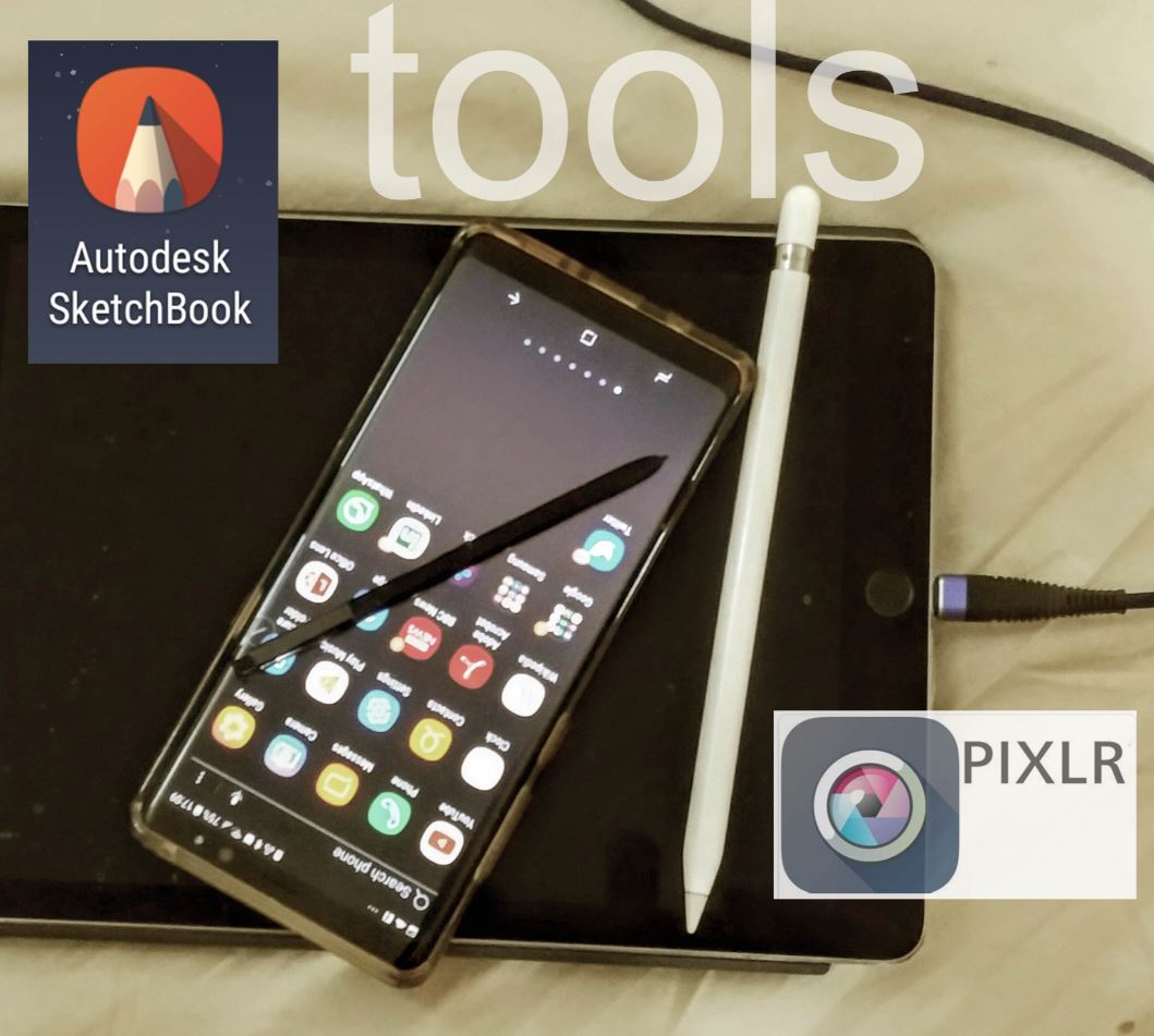
My digital toolkit has come of age. I’m showing the gear against a background of bed sheets because that’s where much of the work is done. I can take a break from sitting at my laptop, stretch out and look at the world from a different angle. We are mobile beings who settled down and built containers for our lives. Keyboard and mouse belong to that urbanised identity. Touch interfaces recapture something of the hunter-gatherer lifestyle. Just a thought.

Switching images between mobile devices via the cloud leads naturally to integration with the social world we all inhabit. My immediate family is spread at regular intervals from NZ to Florida, by way of Singapore, Dubai, UK. The more fluid my sketching becomes, the more likely I am to share family moments using that medium, it’s more personal and allows me to strip out irrelevant detail. Pretty much the same qualities that appeal when presenting design ideas or analyses of historic buildings. This next one is from a very special last morning with my grandsons during my most recent visit.

I’ve been dealing with a medical issue since just before Christmas. I couldn’t get the operation I needed in Dubai, so I returned to England for 3 weeks. The visit to Hastings was part of my recovery period. I didn’t get down to the old town this time. These sketches are based on pictures I took with my very first digital camera in 2002. I was visiting from Zimbabwe with my son who was on a gap year. Both of us were about to go through a series of changes though we didn’t know it.


When I got back to Dubai, I discovered that Harry’s book is available online.
harry_the_pencil
I’ve talked to Nick a few times about the potential of BIM to add something new to urban planning processes. But is it user-friendly enough? Think about the power of hand sketching to capture ideas quickly and win over the hearts and minds of local residents. How can we inject this kind of fluidity into BIM processes? I don’t think we quite know how to bridge that gap yet.

I remember spotting the chance to take a shot of a seagull, perched on a chimney, with the seafront in the distance. It seemed to capture something about layers of meaning and the richness of urban life (Hastings old town). The parallel world of birds and insects that make incidental use of our buildings. The all but obsolete technology of open fireplaces that stimulated the coal mining industry in England, making possible the industrial revolution. The pier in the distance, since burnt down and renovated in much simpler form, complete with salvaged charred timbers, reused in inventive ways.
Digital photographs freeze moments from our past at a phenomenal rate. On a good day out in a new city I will collect about 400 images. When I bought rolls of 35mm film, a dozen snaps would have been a very extravagant day. Is this akin to the invention of writing, or the printing press? Suddenly we have external tools that bolt on to the evolved memory system in our head. We can store up knowledge and experience in new ways.

I guess the first drawings and clay figurines were similar leaps forward (or sideways) taken many thousands of years before writing began to appear. So here am I fusing drawing and modelling with the digital realm, trying to inject the raw power and fluency of ancient artistry back into my work.
A luta continua. The struggle continues

I have friends in Hastings who I have been visiting, off-and-on for over 20 years now. Nick and I know each other from architecture school circa 1970. He became an architectural journalist and I "dropped out", returning to my northern roots, training as a bricklayer and playing in a band. Towards the end of this phase of my life, Nick invited me to work on his latest project: a book about squatting.

We had both been involved in the squatting "scene" in London in the early 70s and I had a certain reputation for sketching and cartooning. I was to be the illustrator, his partner Caroline Lwin was the designer and he was Editor. Various people contributed a chapter each. Since then he has gone on to become well know in the Community Planning field, writing a handbook and maintaining a website on this topic.

I always enjoy spending a couple of days with Nick and his current partner Jane: relaxed atmosphere, delicious wholesome food and stimulating conversation. This time he reminded me about a book he had showed me before: "Harry the Pencil" based on a lifetime of hand sketching to support design development on an urban scale.

He also brought out another book, called "Design Thinking Drawing" by an Australian architect with a comparable talent for sketching birdseye perspectives, design diagrams, all kinds of images that support the design process. I was struck by the richness that can be conjured up by a few rapid strokes. Some of the drawings must have consumed huge numbers of man-hours, but others were rapid and impressionistic, but equally effective.

more examples here
I have been trying to revive my hand drawing skills for 3 or 4 years now, mostly be way of digital tools. I decided it was time to loosen up a bit more, to focus on “fast and fluid“, emphasise the raw energy of an intuitive sketching process. So I spent a morning in Nick and Jane’s living room, working up two views from Project Soane as rapid digital sketches.

Why would I degrade data-rich BIM models, lovingly rendered, into scribbled sketches? What are the positives here?
Audience Appeal: people react well to hand sketches. There's a warm and fuzzy feeling combined with a certain sense of admiration (I wish I could draw like that). It's a bit like playing a musical instrument.
Lack of Pretence: There is no confusion about whether it's a photograph of a real building. People are used to the idea that an artist's impression may take certain liberties. You don't have to worry too much if some aspects of the image are speculative, or that people will obsess about some minor detail.

I’m very happy with my progress. Two sketches in a morning that also contained a walk in the park and a fair amount of chit-chat. Pretty good progress, and I’m not ashamed to show them alongside the work I did almost 40 years ago at the height of my powers. The image below is from another section page for the squatting book. It was a spoof on a Heineken advert for a section that highlighted how squatters could actually help to raise the profile of a neighbourhood, injecting new life into old housing stock.

My digital toolkit has come of age. I’m showing the gear against a background of bed sheets because that’s where much of the work is done. I can take a break from sitting at my laptop, stretch out and look at the world from a different angle. We are mobile beings who settled down and built containers for our lives. Keyboard and mouse belong to that urbanised identity. Touch interfaces recapture something of the hunter-gatherer lifestyle. Just a thought.

Switching images between mobile devices via the cloud leads naturally to integration with the social world we all inhabit. My immediate family is spread at regular intervals from NZ to Florida, by way of Singapore, Dubai, UK. The more fluid my sketching becomes, the more likely I am to share family moments using that medium, it’s more personal and allows me to strip out irrelevant detail. Pretty much the same qualities that appeal when presenting design ideas or analyses of historic buildings. This next one is from a very special last morning with my grandsons during my most recent visit.
I’ve been dealing with a medical issue since just before Christmas. I couldn’t get the operation I needed in Dubai, so I returned to England for 3 weeks. The visit to Hastings was part of my recovery period. I didn’t get down to the old town this time. These sketches are based on pictures I took with my very first digital camera in 2002. I was visiting from Zimbabwe with my son who was on a gap year. Both of us were about to go through a series of changes though we didn’t know it.

Digital photography sat beside CAD for a couple of years. Sketchup came along and shook things up a bit. Zimbabwe went down the toilet, Joe was studying in Cape Town, I decamped to Dubai and got my hands on Revit. From Dubai I have been able to travel more frequently, building up a database of images, including those early ones of Hastings. It’s part of a project I call “the way we build”... Just a set of reflections on what it is to be human, using the buildings we make as my point of departure.

Hastings Old Town is one of those places that seems to have grown organically: houses in a range of styles and materials tumbling down hillsides and setting up an endless series of picturesque viewpoints. Tile cladding, weatherboarding the black and white rhythms of old fashioned timber framing, projecting floor joists that allow the upper floor to cantilever beyond the ground floor footprint, leaded glass in diamond patterns, It's the kind of place that's very difficult to model convincingly using BIM tools, but looks great in a hand drawn sketch.
There is something organic about Peter Richards’ work, his "Design Thinking Drawing"is very rapid and process oriented..

He observes, he imagines, he analyses. The Hand-Eye-Brain continuum churns through material rapidly and effortlessly but with results that often surprise and arrest. It’s a search for meaning, as is the way I’ve been building digital models, collecting photos and plans, reading historical accounts, blogging... and increasingly sketching ... different ways of exploring towns and cities around the world. Consider this wonderful evocation of Chicago by Harry-the-Pencil.

When I got back to Dubai, I discovered that Harry’s book is available online.
harry_the_pencil
I’ve talked to Nick a few times about the potential of BIM to add something new to urban planning processes. But is it user-friendly enough? Think about the power of hand sketching to capture ideas quickly and win over the hearts and minds of local residents. How can we inject this kind of fluidity into BIM processes? I don’t think we quite know how to bridge that gap yet.

I remember spotting the chance to take a shot of a seagull, perched on a chimney, with the seafront in the distance. It seemed to capture something about layers of meaning and the richness of urban life (Hastings old town). The parallel world of birds and insects that make incidental use of our buildings. The all but obsolete technology of open fireplaces that stimulated the coal mining industry in England, making possible the industrial revolution. The pier in the distance, since burnt down and renovated in much simpler form, complete with salvaged charred timbers, reused in inventive ways.
Digital photographs freeze moments from our past at a phenomenal rate. On a good day out in a new city I will collect about 400 images. When I bought rolls of 35mm film, a dozen snaps would have been a very extravagant day. Is this akin to the invention of writing, or the printing press? Suddenly we have external tools that bolt on to the evolved memory system in our head. We can store up knowledge and experience in new ways.

I guess the first drawings and clay figurines were similar leaps forward (or sideways) taken many thousands of years before writing began to appear. So here am I fusing drawing and modelling with the digital realm, trying to inject the raw power and fluency of ancient artistry back into my work.
A luta continua. The struggle continues


