That will be the title of one of my presentations in Washington this July.
I am very proud to have been accepted once again as a speaker at RTC_NA, the North American version of the premier Revit Conference, "by users, for users". Really looking forward to spending time with old friends and new, visiting the capital city for the second time, and hanging out with my daughter Wendy both before and after.

This diagram that looks a bit like a mouldy growth, spreading across a cracked wall, is in fact a subway map of Washington DC, subjected to various digital distortions. This is one way to generate irregular, seemingly organic effects via the hexadecimal rigidity of the mindless machines that dominate our modern lives. My session will approach a similar topic from a different angle, using basic family editor techniques to conjure up an impression of the casual disorder that typifies vernacular buildings. You are most welcome to join me.
You may have noticed that my blog has been sadly neglected for several weeks now. We have been burning the midnight hours at GAJ, a sure sign that Dubai is starting to go somewhat bonkers again: projects coming out of our ears. Intense work experiences generate new ideas and I continue to reflect and learn as I stumble along with BIM pencil in hand. Hopefully I can find more time for digital sharing over the coming weeks and months.

Last weekend was a chance to do this, and to start working on my presentations. But I was side-tracked as I leapt (metaphorically) out of bed on Friday morning, by an idea for the RTC logo. I don't want to be rude because I have great respect for the guys and gals behind this wonderful event, but IMHO the graphics are due for a makeover ... a little dated, don't you think ?

Anyway, it set me off on a little journey based on "why don't I do this in family editor ?". I belong to that small band of fanatics who think that about almost anything. I had in mind those Bauhaus style typefaces that are highly abstracted into parallel bands of straight lines and arcs. Couldn't that be parametric ?

This is all sweeps. Just 3 of them in fact. The paths are constrained to reference planes, with a couple of reference LINES thrown in to keep the ends of the letter C to a 45 degree termination.

I'm using a loaded profile so that the width of the letters can easily be varied in a coordinated manner. The original motivation here is to be able to play with proportions parametrically, something that is harder to do using a graphics programme.
As a bonus I get the third dimension (which we will call thickness) I don't intend to use this in my primary branding graphics. I'm going for that very simple, flat look that dominates the world of touch and swipe right now. But maybe it will come in handy here and there, used very sparingly.
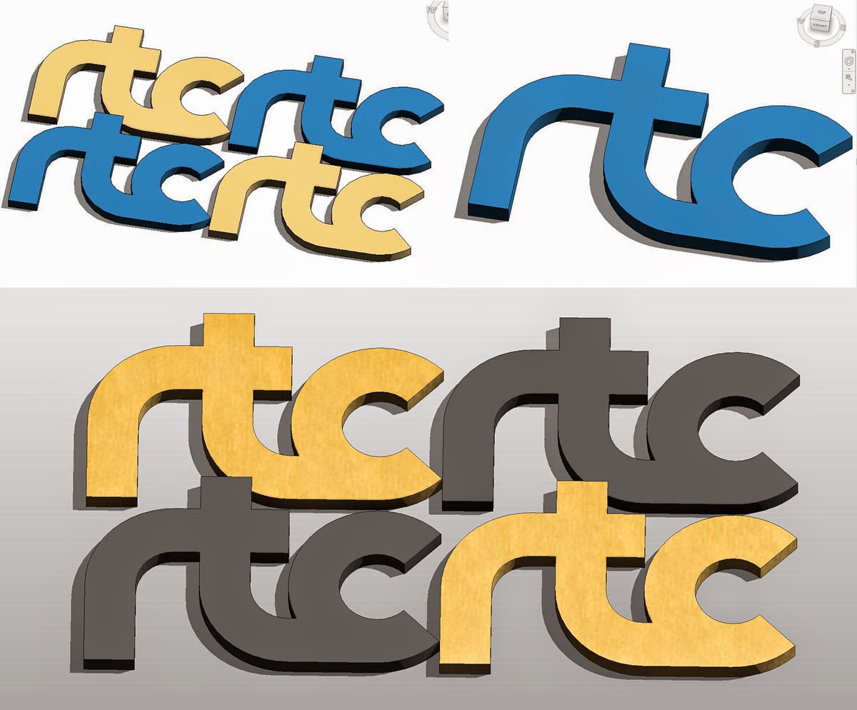
Having said that, of course I couldn't stop myself playing around with the possibilities. Lots of fun, and a good flexing exercise for my parametrics, but these are not graphic images I would actually consider using on letterheads, or presentation templates, or badges.

So let's get back to the flat logo. I placed my family on a floor, just a square, drawn with the radius option checked. Export this from a plan view and you have an image at whatever resolution you should choose and can now move on to conventional graphics programmes to play with colour combinations and add regular text.

I'm using the Calibri font that Microsoft commissioned in response to the accusation that Arial was boring (I think that's more or less what happened) This has the advantage that almost everyone has it on their machine, it's simple and bold, but with quite a lot of subtle character. My opinion, once again. Feel free to differ.
I've given a passing nod to the current RTC colours. Continuity is important in any re-branding exercise. And that's my contribution to the non-existent debate about the RTC logo. I hope I haven't offended anyone by doing this in public. It's just a bit of fun. But personally speaking, I do think this is a much crisper, cleaner, web-friendly graphic style than the existing logotype.

Just for fun I mocked up a PowerPoint template. Again this is just a personal opinion, but I dislike fussy graphics on these templates. I suppose the idea is to make a boring series of bullet-point pages look a bit more exciting, but that's pretty weedy. Shouldn't a speaker be able to come up with some compelling visual images that enhance his/her ideas ? Isn't that what we want to focus our attention on, as opposed to some background graphic frills ? So I prefer a simple, abstract template that isn't going to clash with the punchy images that a more imaginative presenter will surely put together.

At this point, I went back to Revit and punched in a couple of simple formulae to make the whole thing scale up and down based on a module. I like to hide the formula-driven parameters down in the "Other" box so the end user doesn't get confused.

Turns out that I needed one more constraint to get everything to scale properly. I had neglected to give the letter C a labelled radius, which is of course just the existing "Module" parameter.

And not I have a family that can be copied around and varied with consumate ease. Different sizes, different slenderness ratios, different thicknesses to brink colours to the front, or sent them to the back. Once again, this is not a graphic image that I would use regularly, but it is nice to have a logo that is simple enough to handle this kind of manipulation. You might want to generate a couple of these playful variations to use as accents at specific events or locations.

So that's it folks. Once again, it's just a bit of fun. I'm not trying to tread on the committee's toes or anything like that. But it's been an interesting opportunity to explore and illustrate the capabilities of Family Editor in a slightly unusual context.
And remember, if you want to recharge your Revit batteries, there's no better way than registering for RTC, now available on 4 continents. (Poor old mama Africa, left out once again)
thank for the wonderful post , lots of information gained , visit us Revit Modeling in uk
ReplyDelete