I’m going to give a shout out to Matt
Thompson whose been my ‘Project Soane buddy' for a couple of years now. He drew
my attention to an interesting post on LinkedIn about the Ammonite order.
I hadn’t come across this before. It was invented
by Soane’s mentor (George Dance the younger) for the Shakespeare Gallery, and
picked up by a father and son team of architects in Brighton who applied it to
Regency Terraces reminiscent of John Nash.
This set me off in several directions. I tidied
up and fleshed out the section of my archive that deals with Dance and his
Father. George the Elder started out as a Mason and rose to prominence with his
design for the Mansion House which is diagonally opposite the Bank of England. He
also designed a couple of churches.
Looking closely at shots of the Mansion
House, taken during one of my visits to the Bank, I was struck by its relevance
to the work I have been doing this past few weeks. It’s a fairly
straightforward Palladian design, in a similar mode to Sampson’s original block
for the Bank, also the result of a limited competition.
The more you look, the more you see.
Drawing and modelling are ways of looking more closely, interrogating something that interests you. The Corinthian capitals used on the Mansion House are quite different from those found on the Bank of England, just across the road. Soane’s favourite
version of the Corinthian derives from the Temple of Vesta, at Tivoli and I now find it quite easy to spot this variant wherever I see it. The leaves are very distinctive, compact
and muscular. Indeed, Soane compressed the whole capital. He regarded the
Tivoli order as masculine.
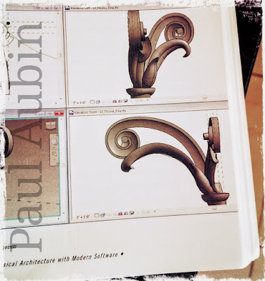
His version dispenses with the Cauliculus,
a device that I have so far ignored in my simplified Corinthian capitals. It’s
like a bouquet : leaves sprouting from a small turned vase, and curling underneath
the scrolls. I decided to draw a few.
I referred to Paul Aubin’s superb book for
the name which comes from the Latin word for stalk. Hence ‘cauliflower’. His version
has very clean, smooth flowing leaves
While poking around in my archive folders,
I came across a plaster cast from the Soane Museum. Soane accumulated hundreds
of such objects and stuck them around his house so he could keep ‘taking a
closer look’ It comes from the Forum in Rome,and the shape of the acanthus leaf
is different yet again.
My previous efforts had been modelled at ‘any
old size’ and for some reason I created my first leaflet flat on its back. This
time I decided to create a leaf that would fit seamlessly into the modular
system for classical columns that I have shared at a couple of BiLT conferences.
In the early stages it was looking a bit
like a long necked, six winged goose, trying to take off from a lake, but I
persevered. This approach of using a spline-based swept blend, cut by a void
extrusion starts to develop its own logic after a while. I felt a bit like a
sculptor, moulding clay. You make a few adjustments, load it back into context,
stand back and view from different angles... It became an iterative design
process and made me think much more deeply about the way leaves wrap around a
cylinder and overlap each other to artistic effect.
My Cauliculus is very sharp and
geometrical, in contrast to Paul’s, which will get incorporated into my system
eventually. It's all based on interchangeable, modular parts remember. And I’m getting something that
is closer to the leafy richness of true Corinthian than ever before. Far too
much detail for most purposes, but we’ll ignore that for now.
Once you’ve made one, the next variant is
much easier. You have to remember that the leaves are backed up against a
curved surface, but as they rise higher they need to curl outwards and also
turn in on themselves a little. Tricky geometry, but fascinating too.
The profile that I’m using for the swept
blends, forms a subtle crease that enhances the botanical illusion, as long as
you pay attention to its alignment. I’m enjoying the tension between stylised
forms that derive from the techniques used, and the impression of organic
complexity that can ensue. Not saying I have the balance right just yet, but questions
are being asked.
So I have new capitals that combine with
the shafts and bases I previously developed. These can be round or square, detached,
engaged or flat pilasters. I even have a corner option. So why not try mocking
up one corner of the Mansion House?
I roughed out a profile for the
entablature, leaving square recesses to insert the egg and dart / leaf
mouldings later. Scaled everything to dimensions estimated from Google earth. Such
a lot of interesting buildings on show here. Tite’s Royal Exchange, Lutyens’
Midland Bank. Hawksmoor’s St Mary Woolnoth.
In my first render the pilasters still have
the old style capital, which was never fully converted to square. My new leaves
adapt more easily to turning the corner, just because the leaflets at the sides
are nested components.
Not sure why I have opted for this antique
photo effect (Enscape3d + PIXLR) Maybe it helps to fool the eye into treating
my dramatisation as a documentary.
For my taste, the Ammonite order is too
literal. Perhaps it’s OK for a theatrical setting. Maybe also for the
picturesque fancies of a regency seaside resort. Theatre going and family
holidays were novelties of the enlightenment middle classes. I’ve enjoyed these
fresh insights into the world of Dance and Soane.


thank for the wonderful post , lots of information gained , visit us Revit Modeling in India
ReplyDeleteIMPRESSED WITH SUCH A GOOD CONTENT!!
ReplyDeleteVERY INTERESTING
GREAT WORK
CoBie adaptation in USA