Let’s start with a pretty picture that represents the model as it is right now. Then we will recap over the past 3 or 4 weeks, back in Dubai. It’s taken a little while because I went straight down with flu after the 24-hour, triple-flight back to the desert. Also had to fit in AU Middle East which meant cutting my talk down from 1 hour to 20 minutes. But in between all that the model has also progressed.
We upgraded to the latest version of Revit 2020, so the new “internal origin” icon pops up in all the views. (eye roll). Meanwhile Francois now has access to the BIM360 hub so I arrived back to find he had updated several window families. Also Alfredo had added one by Marc Zappia to the transept gable. Looking forward to more work in that area Marc.
I started looking at the ZigZag vaults. I am assuming that Alfredo will come back to these eventually and do a better version, but for the moment I just want to do a roughing out that captures how they grow out of the columns below. Almost all our work is going through several iterations and these interlocking triangles are particularly difficult to figure out.
I am testing a slightly different approach, taking a unit of 5 triangles, which repeats three times around the apse, and starting with the ribbed arches that make gothic vault technology what it is. Adjust these until they sit properly upon the supporting columns and pilasters. Make sure that there are arch/ribs to define all three sides of all 5 triangles. Embed these nested families in a conceptual mass container file and start to add connecting model lines and surfaces using the “point world” tools.
I am using a mass family rather than generic model adaptive because I want to host it on a level and have an offset parameter.
By the way, I have to share this cute little gif that Francois made while working on window tracery for the project.
I also decided that the columns need an upgrade and while in TruView, noticed that there is one with a different form along the aisles as you enter the chancel. It’s basically square with clusters of ribs at the corners. This was a chance to have a go at a stone-by-stone analysis. It’s not something we can consider for the whole model, but maybe just this once.
Then came AU Middle East, which was really great, and an image that I shared in the build-up to that. This shows the zig-zag vaults pretty much complete (for the current iteration) The ribs have lost the colour coding which emphasised the hierarchy of the different arch types. That was just a temporary move.
Just to recap, I used a three-point adaptive to define the curved ridges where three curved surfaces of the triangular vaults meet. This is my idealised version of these vault types. In practice the masons seem to have improvised a bit from vault to vault. The surfaces themselves are 9 or 10 point adaptives which rely on the lowest points being at an intersection of two arches that touch each other quite precisely. I didn’t achieve that level of perfections, but it’s not too bad.
There are two more types of “ZigZag”. Both have three triangles, but the geometry is slightly different. The strategy for covering the arches 3 point ridges and multi-point surfaces is identical.
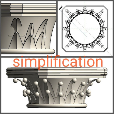
So back to the columns, and my first attempts to develop some elaboration around the capitals. I’m starting with just two variations, the reality is much more than that, but two will at least give us the impression of different treatments. One is based on a crocket motif, the other is more a series of leaves. Both of those themes are prominent in the Notre Dame capitals.
I’m alternating these two capital types down the length of the nave for the moment. I think the extra detail definitely adds something the nave elevations.
A bit of work on the ribbed arches into the side chapels and adjustments to neighbouring elements to try to get all the “rib-branches” sprouting from the symbolic “tree tunks” of the columns and pilasters below.
I ventured into the realm of material textures, feeling that the blandness of the cream stone we have been using so far was overdue for an upgrade. I wanted to give the feel of coursed stone. It’s a bit too regular right now, but we will come back to that. Also wanted to go for more of a yellowish grey, slightly streaky stone which would be closer to the original. Personally I think it’s a big improvement.
Compare these images from earlier in the same weekend. The illustration from Hunchback of Notre Dame is there because Alfredo had bought a lavishly illustrated version of that novel and I was sharing some of the earlier graphics. I think this one may be by Victor Hugo himself. He was quite an accomplished artist in this kind of atmospheric, almost expressionist mode.
More views of the model in its current livery. I prefer the colder stone ambience that it has acquired. The light shafts that Enscape3d provides look great also. The scene has a certain gravity now. Somewhat lacking in scale because Daniel has removed the people (I think) He has a plan for how to populate the scene in a better way apparently. So let’s see how that develops
He asked for some examples of how Viollet Le-Duc drew people, so I hunted down a few from the download of his dictionary that Alfredo found. You have to love the way that architects stylise the human form to blend in with their creations. He definitely had that “medieval feel” nailed down.


Tôi rất thích các thiết kế của bạn, chúng thật tuyệt vời Bọc răng sứ lúc nào là phù hợp ?
ReplyDelete