I've been neglecting the entrance building. At first I thought it was "not really Soane", and he didn't do an awful lot to it, but he did completely remodel the South front, facing on to Threadneedle street. Arguably this was the last piece of the jig-saw puzzle in his long struggle to ... the external screen into a coherent whole.

First the windows. As usual I started with semi-placeholders, quick roughed out. I think Soane was going for continuity, playing down the idea of 3 parts. He thought the entrance building was too small in relation to the wings, so better to treat the facade as a whole and the central block as just another blip in a series of modulations. One reading of the rhythmic sequence would be A B C B C# B C B A. Where A is a rounded corner, B is a large blank recess with twin "sentry boxes, and C is a row of corinthian columns.

But I'm supposed to be switching emphasis from the overarching vision and focusing on filling in the details, so I decided to tackle the decorative detail on the pilaster capitals.

The challenge is to capture the "design intent" without tripping myself up on the intricacy of the original. (My kind of challenge) My solution, and it's not the only possible one, is to create a deep extrusion then extrude it through a void with an "S" curved slot.

My first attempt at the shape looked more like a scorpion than a fleur-de-lis, so I took a couple of liberties and smoothed out the leaves a bit. The result is almost OK, but I think I the bottom part of the decoration needs to be pushed back just a little bit. The relationship between the necking just below the capital and the decorative detail itself is not quite right.

Anyway, for some reason I felt quite good about this bit of modelling and decided to have a crack at the corinthian capital in a similar vein. I think Paul's columns are a tour-de-force of modelling, and had happily placed them throughout the facade, but a couple of things were bothering me slightly.
Number one is file size. Those columns alone had more than tripled these. But also, when I look at these particular capitals, the leaves are rather compact and squared off. Some corinthian columns have fairly smooth, curvy leaves, (like Paul's) but in this case the veins and crinkles are very prominent. Apart from than, they are almost rectangular. They go more or less straight up then turn a right angle and stick out horizontally at the end.

So I just started modelling something. No measurements or anything, just using my eyes and my sense of proportions, kind of like freehand sketching. It was just an experiment really. I thought this looked promising so I nested it into another family and did an array. Then a taller variant, creates a second array, at half-lap to the first. 8 leaves in each row of course.

In the middle you put a vase, and then come the volutes. My volutes are pretty awful. They don't stand up well to close inspection, but from a distance, they do the job. On top there is an extrusion with a sweep running around the edge. This kind of tops the whole thing out. Finally we need 4 flowers to fill the gaps between the 4 volutes. It's just a revolve cut by a void extrusion.
I got rather excited and decided to use the double-nested planting family trick to scale it. There are lots of posts about this. Basically you change the category of your family to planting, then put it inside another empty planting family. Then, as if by magic you can change the height parameter and the whole thing scales accordingly.

That worked well enought to persuade me to look more carfully and adjust the proportions a bit. The bottom row of leaves needed to get a bit smaller and the upper row needed to project out a bit more. Amazingly enough this swapped out with the capital in my existing column family, just as it was. And I have a corinthian column weighing in at under 6mb that looks pretty good viewed in the context of the model.

So as you can see, I am back on the central block. The greek key pattern is a railing family that I made several weeks ago. The actual pattern is more complex than this. I was hoping someone would make it for me, but that never happened, so I bit the bullet. Actually it's still not quite right. The bottom row should be continuous like the top one. (I only just noticed that :)

From a distance this whole thing tends to go black on screen. That's one of the problems with all this fine detail stuff. You can set some parts to hide at coarse scale, but that's not really a solution for zooming in and out, or for parts that are nearer and father away in a camera view. When we drew by hand we would adjust our drawing technique almost without thinking, simplify things as they receded into the distance.

Now I'm tackling the blind arches either side of the entrance. I'm not convinced that the ones that currently exist quite match Soane's originals. His drawings are not altogether clear, but they look a bit different to me. Anyway we have a keystone effect, with diagonal grooves joining up with the horizontal coursing of the wall. I'm still using a fill pattern to simulate these. I know that there are ways to express the coursing grooves in 3d, but I want to keep this simple and flexible for the moment, at least until I get it right. For example I adjusted the spacing again this weekend. Currently I'm using 1' 3 1/8".

My recess family has a void cut that lines up with the courses and into this I place an extrusion cut by shallow grooves. Now there used to be drive-through arches in the middle at street level, but Baker's bank has steps leading up to doors. The floor level is more or less level with the top of the column base.

Next I skipped up to the top row of windows. This involved make a scrolled bracket and surmising various mouldings. I haven't seen any detailed drawings for any of this, so I've been piecing things together from various sources, including the current bank, and other extant buildings by Soane. For the bracket I was influenced by the main entrance of his Bethnal Green church.

The surround to the smaller windows between the column capitals is loosely based on the current windows by Baker. Just simple parallel grooves, very much like he used in the Stock Office. I think it's appropriate. You don't want these to compete with the columns. For the upper windows, however, the reverse is true. Windows are prominent, pilasters are almost devoid of ornament.
Based on Soane's drawings, I've added plinths under the amphora along the top parapet. This is a smaller version of the ones on the sentry boxes along the Threadneedle facade, but shorter and without the grooves. Some drawings show Vases on all of these, others show them missing at the corners. The only photo I have shows them missing so I've gone with that. There is a kind of logic, because at the corners the vase ought to face both ways, or diagonally perhaps. Simpler to just omit it. I think it's the kind of detail that Soane would have agonised about, drawing it different ways until he was happy. Seems to be what happened.

Still a few things to finish off on this elevation, but it's getting pretty close, so I decided to switch to Bartholomew Lane. The corner with Lothbury is really the origin of the curved transition. It's a neat way to handle an odd angle. I adjusted this more carefully, got the walkway around the battlements to connect up properly and almost got to the scrolled attic atop the curve itself.

I've got the new pilaster in and made it turn the corner at the recesses. Also have the key pattern and the lion's heads. These only appear on Threadneedle and Bartholomew, the other two frontages are treated more simply, at least at frieze level. Looking at this shot, the unfinished lantern to the rotunda is bugging me. I haven't fix this yet, but I did sort out the lanterns for the other two Banking halls that were part of Soane's final phase
.

First I took the small lanterns from the Stock Office and shrunk them slightly for use on the Dividend Office, which also has the little round portholes in the soffits of the corner arches. I think that trick was only used on these 2 spaces, not sure why.

Then I took the basic metal window family from the Central Block and adjusted it for the central lantern. Soane is being both modern and fire-conscious here in his use of steel framing for the glazing.

This time he has opted for a double-decker lantern and the upper level uses one of his trade-mark motifs. He also used it in the glazing to the banking hall doors, and it crops up in several of his other buildings.

Ultimately I may borrow Russell's 3D cad based caryatids for this lantern, but I decided to have a quick to at an abstracted version based on Revit blends. It's buy no means as successful as the capitals shown earlier in this post, but it was worth a try, and it will do for now.

I did one of my "combo-renders" to assess the effectiveness of the new lantern. Mental Ray render plus shaded view in overlay mode, and adjusting the transparency by eye to suit. Just for fun I decided to add some people, so I Pinched those from one of Soane's watercolours. Would be better if they cast a bit of a shadow, but at least the colours blend in nicely.

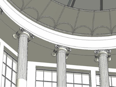
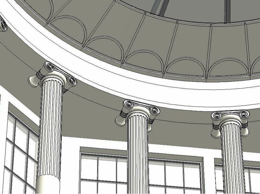
After that I got on to the Colonial Office. Here we have Ionic Columns. I took a more careful look at these and had at them. Once again, no measurements involved, just using my eyes and brain. They are not going to satisfy a purist, but I'm happy enough with them for the moment. Lots of other elements much further behind. By the way, I realised afterwards that these columns were taken down when Baker demolished Soane's lanterns and some of them are on display in the Bank Museum, so I had close up photos after all, which will come in handy if I ever get around to making better ones.

It's not at all clear how this lantern works, and whether it was modified after Soane finished but before Yerbury's photos. I think That light entered "secretly" from the sides, in between the steel trusses and illuminated a glass ceiling (frosted glass perhaps) There is definitely an opaque band around the edge, with a scalloped pattern and in one of Yerbury's shots the central portion is obviously glazed. Maybe it was glazed direct to the sky, but the drawings don't seem to show that, and wouldn't it have got very dirty ?
I went on to model some of the plaster mouldings to the upper portions of the walls and to the arched ceilings. These are indicative rather than definitive, I'm not sure I have enough information to get it "fully correct". I also upgraded the decorative surrounds to the internal doors. Arched heads with scrolled brackets, previously modelled very crudely.

At that point my weekend ran out: always a big disappointment. So much to do!


First the windows. As usual I started with semi-placeholders, quick roughed out. I think Soane was going for continuity, playing down the idea of 3 parts. He thought the entrance building was too small in relation to the wings, so better to treat the facade as a whole and the central block as just another blip in a series of modulations. One reading of the rhythmic sequence would be A B C B C# B C B A. Where A is a rounded corner, B is a large blank recess with twin "sentry boxes, and C is a row of corinthian columns.

But I'm supposed to be switching emphasis from the overarching vision and focusing on filling in the details, so I decided to tackle the decorative detail on the pilaster capitals.

The challenge is to capture the "design intent" without tripping myself up on the intricacy of the original. (My kind of challenge) My solution, and it's not the only possible one, is to create a deep extrusion then extrude it through a void with an "S" curved slot.

My first attempt at the shape looked more like a scorpion than a fleur-de-lis, so I took a couple of liberties and smoothed out the leaves a bit. The result is almost OK, but I think I the bottom part of the decoration needs to be pushed back just a little bit. The relationship between the necking just below the capital and the decorative detail itself is not quite right.

Anyway, for some reason I felt quite good about this bit of modelling and decided to have a crack at the corinthian capital in a similar vein. I think Paul's columns are a tour-de-force of modelling, and had happily placed them throughout the facade, but a couple of things were bothering me slightly.
Number one is file size. Those columns alone had more than tripled these. But also, when I look at these particular capitals, the leaves are rather compact and squared off. Some corinthian columns have fairly smooth, curvy leaves, (like Paul's) but in this case the veins and crinkles are very prominent. Apart from than, they are almost rectangular. They go more or less straight up then turn a right angle and stick out horizontally at the end.

So I just started modelling something. No measurements or anything, just using my eyes and my sense of proportions, kind of like freehand sketching. It was just an experiment really. I thought this looked promising so I nested it into another family and did an array. Then a taller variant, creates a second array, at half-lap to the first. 8 leaves in each row of course.

In the middle you put a vase, and then come the volutes. My volutes are pretty awful. They don't stand up well to close inspection, but from a distance, they do the job. On top there is an extrusion with a sweep running around the edge. This kind of tops the whole thing out. Finally we need 4 flowers to fill the gaps between the 4 volutes. It's just a revolve cut by a void extrusion.
I got rather excited and decided to use the double-nested planting family trick to scale it. There are lots of posts about this. Basically you change the category of your family to planting, then put it inside another empty planting family. Then, as if by magic you can change the height parameter and the whole thing scales accordingly.

That worked well enought to persuade me to look more carfully and adjust the proportions a bit. The bottom row of leaves needed to get a bit smaller and the upper row needed to project out a bit more. Amazingly enough this swapped out with the capital in my existing column family, just as it was. And I have a corinthian column weighing in at under 6mb that looks pretty good viewed in the context of the model.

So as you can see, I am back on the central block. The greek key pattern is a railing family that I made several weeks ago. The actual pattern is more complex than this. I was hoping someone would make it for me, but that never happened, so I bit the bullet. Actually it's still not quite right. The bottom row should be continuous like the top one. (I only just noticed that :)

From a distance this whole thing tends to go black on screen. That's one of the problems with all this fine detail stuff. You can set some parts to hide at coarse scale, but that's not really a solution for zooming in and out, or for parts that are nearer and father away in a camera view. When we drew by hand we would adjust our drawing technique almost without thinking, simplify things as they receded into the distance.

Now I'm tackling the blind arches either side of the entrance. I'm not convinced that the ones that currently exist quite match Soane's originals. His drawings are not altogether clear, but they look a bit different to me. Anyway we have a keystone effect, with diagonal grooves joining up with the horizontal coursing of the wall. I'm still using a fill pattern to simulate these. I know that there are ways to express the coursing grooves in 3d, but I want to keep this simple and flexible for the moment, at least until I get it right. For example I adjusted the spacing again this weekend. Currently I'm using 1' 3 1/8".

My recess family has a void cut that lines up with the courses and into this I place an extrusion cut by shallow grooves. Now there used to be drive-through arches in the middle at street level, but Baker's bank has steps leading up to doors. The floor level is more or less level with the top of the column base.

Next I skipped up to the top row of windows. This involved make a scrolled bracket and surmising various mouldings. I haven't seen any detailed drawings for any of this, so I've been piecing things together from various sources, including the current bank, and other extant buildings by Soane. For the bracket I was influenced by the main entrance of his Bethnal Green church.

The surround to the smaller windows between the column capitals is loosely based on the current windows by Baker. Just simple parallel grooves, very much like he used in the Stock Office. I think it's appropriate. You don't want these to compete with the columns. For the upper windows, however, the reverse is true. Windows are prominent, pilasters are almost devoid of ornament.
Based on Soane's drawings, I've added plinths under the amphora along the top parapet. This is a smaller version of the ones on the sentry boxes along the Threadneedle facade, but shorter and without the grooves. Some drawings show Vases on all of these, others show them missing at the corners. The only photo I have shows them missing so I've gone with that. There is a kind of logic, because at the corners the vase ought to face both ways, or diagonally perhaps. Simpler to just omit it. I think it's the kind of detail that Soane would have agonised about, drawing it different ways until he was happy. Seems to be what happened.

Still a few things to finish off on this elevation, but it's getting pretty close, so I decided to switch to Bartholomew Lane. The corner with Lothbury is really the origin of the curved transition. It's a neat way to handle an odd angle. I adjusted this more carefully, got the walkway around the battlements to connect up properly and almost got to the scrolled attic atop the curve itself.

I've got the new pilaster in and made it turn the corner at the recesses. Also have the key pattern and the lion's heads. These only appear on Threadneedle and Bartholomew, the other two frontages are treated more simply, at least at frieze level. Looking at this shot, the unfinished lantern to the rotunda is bugging me. I haven't fix this yet, but I did sort out the lanterns for the other two Banking halls that were part of Soane's final phase
.

First I took the small lanterns from the Stock Office and shrunk them slightly for use on the Dividend Office, which also has the little round portholes in the soffits of the corner arches. I think that trick was only used on these 2 spaces, not sure why.

Then I took the basic metal window family from the Central Block and adjusted it for the central lantern. Soane is being both modern and fire-conscious here in his use of steel framing for the glazing.

This time he has opted for a double-decker lantern and the upper level uses one of his trade-mark motifs. He also used it in the glazing to the banking hall doors, and it crops up in several of his other buildings.

Ultimately I may borrow Russell's 3D cad based caryatids for this lantern, but I decided to have a quick to at an abstracted version based on Revit blends. It's buy no means as successful as the capitals shown earlier in this post, but it was worth a try, and it will do for now.

I did one of my "combo-renders" to assess the effectiveness of the new lantern. Mental Ray render plus shaded view in overlay mode, and adjusting the transparency by eye to suit. Just for fun I decided to add some people, so I Pinched those from one of Soane's watercolours. Would be better if they cast a bit of a shadow, but at least the colours blend in nicely.

After that I got on to the Colonial Office. Here we have Ionic Columns. I took a more careful look at these and had at them. Once again, no measurements involved, just using my eyes and brain. They are not going to satisfy a purist, but I'm happy enough with them for the moment. Lots of other elements much further behind. By the way, I realised afterwards that these columns were taken down when Baker demolished Soane's lanterns and some of them are on display in the Bank Museum, so I had close up photos after all, which will come in handy if I ever get around to making better ones.

It's not at all clear how this lantern works, and whether it was modified after Soane finished but before Yerbury's photos. I think That light entered "secretly" from the sides, in between the steel trusses and illuminated a glass ceiling (frosted glass perhaps) There is definitely an opaque band around the edge, with a scalloped pattern and in one of Yerbury's shots the central portion is obviously glazed. Maybe it was glazed direct to the sky, but the drawings don't seem to show that, and wouldn't it have got very dirty ?
I went on to model some of the plaster mouldings to the upper portions of the walls and to the arched ceilings. These are indicative rather than definitive, I'm not sure I have enough information to get it "fully correct". I also upgraded the decorative surrounds to the internal doors. Arched heads with scrolled brackets, previously modelled very crudely.

At that point my weekend ran out: always a big disappointment. So much to do!

wow, absolutely beautiful work. your attention to detail is amazing. thanks for sharing.
ReplyDeleteThanks Joey. Truth be told I'm just having fun :)
ReplyDeleteI've always found your work interesting. You should publish a book based on your tutorials and/or work. Keep it up.
ReplyDeletethank for the wonderful post , lots of information gained , visit us Revit Modeling in uk
ReplyDelete