Flushed with success from my recent forays into classical ornament, I decided to tackle free flowing foliage. How on earth are we going to conquer that?

My first thoughts were to strike out boldly into point world. It had worked well for the rosette, so why not for the Acanthus leaf?
So I set off merrily lofting away but almost immediately I was mired down in the difficulty of controlling so many independent variables. Degrees of freedom in embarrassing abundance. Paradoxically it slows you down. The exact opposite of freehand sketching. No intuitive flow.
Maybe I will try again at some point, But for now, getting a clearer idea of how to break down an Acanthus leaf into manageable pieces seemed to be a more pressing need.

So I started to sketch: rapidly but analytically, tracing over my previous efforts until some kind of direction started to emerge.

Premature attempts to jump back into modelling were not encouraging so I churned out a series of sketches and thought about the many different styles of leaf carving that have been used in Corinthian capitals.

As I draw, I keep in mind the successes of previous weekends. Somehow that pretty sketch has to translate into a sensible modelling strategy. Revit doesn’t work like squeezing an amorphous lump of clay. This level of complexity implies dividing the leaf into “leaflets” How will I disguise the joins.

In many cases the lower portions of the stylised Acanthus leaves are represented as a series of parallel vertical ridges. Maybe I can draw a series of parallel stems that blossom out towards the top.

I am using two “special powers“ that SketchBook Pro gives me : symmetry and predictive stroke. I also realised, along the way that PIXLR can straighten and crop the photos I am tracing over.

But those photo layers are soon discarded as I strive to simply and clarify the underlying shapes I need. Then I can go into reverse gear and elaborate the edges. The original image is forgotten now. I’m just inventing shapes that please the eye.

That was fun, and informative, but far too flat. Most real life examples have overlapping edges. And a top bit that curls forward like a hood.
I take a good hard look at a sketch I came across. Perhaps I should take my best version and work it over a few times.

Maybe those parallel lines can taper a bit to counteract the stiffness. Maybe I should play down those curly thumbs, make them more like the other leaves.

So back to Revit. I just jumped in, without thinking about size or orientation. In retrospect, I think this was important. I needed to be casual and explorative. It’s a swept blend cut by a void extrusion. That’s a very powerful strategy for stylised organic forms.

Both path and profile use splines. I wouldn’t want to use splines very often in Revit, but when you do need them, they are super cool. Before long I have 3 versions of the nested side leaf and a directly modelled centre. Rotating the side leaves up into the vertical position was a bit messy, but definitely this approach has potential.
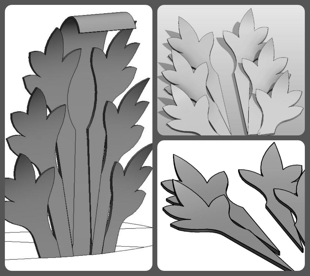
So now I have a family I can bring into the project environment and arrange into a circle. Why do this in a project? I was just impatient to see shadows, and sadly that’s not available in family editor.

Duplicate the leaf and give it a longer stalk. Add an in-place revolve. Well , well! Actually I lied about the profile. I started with a simple rectangle. But now is a good time to substitute a spline, top and bottom. Also make the leaves a bit thicker and curl the hood over more at the top.

I’m very proud of these leaflets. Quite easy to vary the form, tweak the way they curl around and overlap each other. You are bound to get some collisions at first but it’s so much fun to resolve them: to play with the proportions, the balance of light and shade. Shadows are so critical here.

And my trusty Enscape3d. Thank you once again guys, for supporting me. It’s a brilliant tool and plays very nicely with PIXLR, softening the images further and assembling them into collages. All the compilation and text was done on my phone again. The new routine for my Sunday morning lie-in.

The final tweak was to modify those waving hands slightly, making the fingers longer in proportion to the palms. It’s subtle, but effective. I feel like Revit has become my BIM chisel. I am a sculptor now, shaping stone and clay with my hands and my eye. The tools fade into the background as I work, but still they express themselves in the final work. This object has the feel of moist clay, of cold hard stone, of crisp and clunky Revit. I love it.
My final image has the feel of SketchBook Pro and PIXLR and the Samsung Note. It speaks to my determination to look more closely at an Acanthus leaf and to re-imagine it as Revit geometry.

If I ever get around to a second edition of Renaissance Revit, I am going to ask you to write the chapter on Acanthus leaves. Awesome stuff Andy!
ReplyDeletethank for the wonderful post , lots of information gained , visit us Revit Modeling in India
ReplyDeleteIMPRESSED WITH SUCH A GOOD CONTENT!!
ReplyDeleteVERY INTERESTING
GREAT WORK
CoBie adaptation in USA