Picking up from the previous Notre Dame post.
During the week I had assisted one of our architects with a tricky stair detail. The only way I could get the curved glass balustrade to reflect the design intent moderately well was to create multiple in-place swept blends. A bit of a hack, like the photoshop-compiled image shown here, but I quite enjoyed doing it.
It brought back memories of the spiral stair family that I developed in 2012, and I decided to try using this for the spiral stone stairs that occur in several places at Notre Dame. I guess these are the equivalent of the modern service lift.
The upgrade from 2012 to 2020 went smoothly enough, but it is a bit sluggish to respond to changes in parameters. Not all that surprising given that the treads are generic models nested into curtain panels on a divided spiral surface.
At the sides of the Bell Towers, I think I have the levels of the landings more or less right now. Had to drop the upper vault down so that you can squeeze a door in under the little sloping roofs.
But the 4 stairs at the outer corners of the Transepts are much more challenging in figure out. There are doors leading off in different directions at various intermediate levels, and they don’t all connect to the triforium gallery. I had to make do with a placeholder spiral from top to bottom and a few indicative doors.
A screenshot from the Revizto model we exported for BiLT EU.
I’ve been watching videos on YouTube about different French cathedrals. At some point it brought back the idea of doing comparative studies of different apse geometries. Clearly many different solutions have been tried. Here are 4 variations on apse geometry. Different numbers of half-round chapels clustered around the curve, two cases where the central one is different.
I created two more visuals from my wooden block model. One breaks down the inner core, so it comes before the other six I created, building up the aisles, buttresses and chapels around this core.
The lower portion is an RCP view, showing the distribution of 4, 6 & 8 part vaults. (Red C means Chapel.) Around the edges, photos of various vault types. The more I study ribbed vault technology, the more impressed I am. 800 years ago takes us about halfway back to the fall of Rome. Was that collapse the “reset button” that paved the way for modernity? Medieval Europe, emerging nation states, the “freedoms” of city life, the stirrings of technological innovation?
Ribbed vaults are vey different from the plain vaults that preceded them. They allow complex and highly varied geometries to be built, but at any stage in the process you only need to support one row of voussoirs with a wooden form shaped to a simple radius. You can start with a four part groin vault, then subdivide one side into two vaults, or choose any of the outer arches and raise it higher or drop it lower. It’s a very impressive technology: structurally, aesthetically, methodologically.
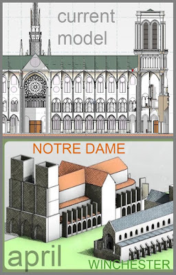
It’s interesting to compare the current model with the one I produced in that first weekend 7 months ago. Certainly, we have come a long way in that time. And what a journey, each team member finding a different area that catches their interest and pursuing it with passion.
The other cathedral in that image is, of course, Winchester. The one-day massing study that kicked this whole thing off.
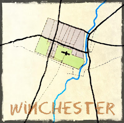
I have been telling myself since I got back from UK that it would be useful to do a comparison of the 4 cathedral towns that I visited: Winchester, Salisbury, York and Chichester. So far, I have managed one town map, drawn with the stylus of my Samsung Note 8, using Autodesk SketchBook Pro, and tweaked a bit using PIXLR.
Classic Roman town layout, rotated slightly to be parallel to the river. North/South axis is displaced from the centre by the cathedral, which occupies most of one quadrant, as cathedrals often do. The main street is East/West, perhaps reflecting the fact that London is to the East and Salisbury to the West (roughly speaking)
We have two grotesques in the model now, thanks to Ryan. The "Edge-Hiding" trick is doing good service (using MAX), and of course, the CAD mesh needs to be “bylayer” so as to pick up the material assignment under object styles (Imports in Families) CAD layers become subcategories which can be renamed within family editor. I'm using the subcategory "Statue" for this purpose, the same one used for the row of kings, lower down on the West Front.
I adjusted heights based on the TruView coordinates tool. You have to adjust the zero which is derived from the scanner position at the first survey point, tripod height above the triforium gallery. Generally everything was stretched up a bit vertically. Maybe it would be better if we were just slavishly following a point cloud. Or maybe it’s good to be forced to look carefully and to practice judging proportions by eye.
I generally take the role of impetuous pioneer, rushing ahead and clearing the undergrowth. After dropping the clerestory windows I had to adjust roof slopes in the dropped section along the nave. Lots of little adjustments actually, and zipping around the model with my new VR setup.
The zig-zag vaults on the upper level were missing and I had been thinking about my pumpkin adventures. I decided to revive my box rig and have a go. This is Alfredos territory really, but he’s not going to get around to it until after AU. Maybe it will be interesting to approach things from a slightly different angle.
The box provides a framework for reference lines and points which define geometry. Vary the XYZ of the box and everything adjusts accordingly. So this is my version of a triangular vault, made from three surfaces. Each surface is lofted from 3 arcs. That’s my interpretation.
There are offsets to vary the skew. Mid triangles in a group of 3 are symmetrical. The two sides are skewed.
The sexapartite vaults were pretty crap at the sides. These are skewed triangles, but just two surfaces. So I developed a box rig for these also and exported SAT surfaces to nest into the family, replacing the ones I had before.
The vault next to the organ has unequal side arches. It’s as if one is squashed to make way for the heavy ribbed columns that flank the organ loft.
Jumping around now trying to fix the more obvious shortcomings of the model. The steps leading up from the triforium galleries to the bell ringing chambers start out as wood, but the last few risers are in stone, formed within the thickness of the wall. So I roughed these out. Then I switched to the choir area and fleshed this out some. I had forgotten who made the altar. Turns out it was John Wehmer, back in August. Thanks John, finally brought it into the main model.
Behind the high altar is a pieta. I placed a plinth and a crucifix, we can add some statuary later. There are statues of kings at the sides. I used cut-down versions of one of the figures from the west front. Somebody could adopt this area and develop it further. I’ve just done the minimum to give some ambience. Not happy with the floor materials though. There are raised floors in the whole of the east end with extra height around the altars. I hadn’t really taken note of this before. I made a start on representing these changes in level. I have to say the space still looks a bit empty. The railings are far too plain at present, and the gates are not indicated, either in plan or 3d
The sheet set is a bit spruced up now. I cleaned up my sheets and added a few annotations. Alfredo added three splendid sheets to the set.
I think that's it for today. I wish I understood the middle ages better. So many fascinating questions.


No comments:
Post a Comment
I've been getting a lot of spam so had to tighten up comments permissions. Sorry for any inconvenience. I do like to hear from real people