Blog posts from early 2013
This was an exciting period for me. I visited New Zealand for Revit Technology Conference,
to stay with my sister in Auckland and to see something of that unique country. Alfredo Medina came up to me at the RTC
social, introducing himself and sparking a lifelong friendship. I sat in on a couple of Marcello sessions,
heckling him on the difference between Doric & Tuscan, but feeling totally
inspired and motivated. His scalable
Tuscan column (based on a spline) got me going.
I was aware of basic spline behaviour (two ways of stretching the end
point by using the TAB key) but I had never thought of using it to scale a
profile, or a revolve sketch. This was rather
early in my journey into classical architecture and long before Project Soane
took a hold on my life.
I stand by my conclusion at the time. You can do classical architecture well, and
you can do it REALLY BADLY. Take the
time to study and learn. It is a very
deep well of tradition. If you are not
to put in the hard yards, just leave it alone.
https://grevity.blogspot.com/2013/06/spline-sailing.html
https://grevity.blogspot.com/2013/06/making-glass-onions.html
And back to the Tuscan Column theme. This is not my current approach to capturing
the fundamental variety that is available using the Classical language, but it
was an important step along that road.
I really must get back to my column
collection, and get it into shape for sharing, at least with a limited
audience. The whole range of Classical
elements within Revit should be an established open source project. Paul Aubin’s book was a huge contribution of
course, but I think we could do a better job of extending this, developing
robust content and sharing it widely.
https://grevity.blogspot.com/2013/06/tuscan-rig.html
I think “Flat People” are still useful. Photoreal is great … but not always. Sometimes you want a more stylised, line-art approach
to the graphic presentation of an idea.
Early concept design for example.
You might not want to mislead the client into thinking your design ideas
are more fully developed than they actually are.
This is my second post on the topic and I
had a couple of people share their collections, so I created some more, as I
had promised.
“One thing that experienced users with a public presence can
do is to create better content and make it freely available.” Here, here! I’m still in favour of that.
And
another quote from the end. I’ve been
saying this for a long time now.
“we
should also strive to treat Revit like a pencil. Just pick it up, let it
become one with your hand, eye & brain, thinking about the vision you are
trying to capture. Let the tools become transparent. Create.”
https://grevity.blogspot.com/2013/06/more-pancake-people.html
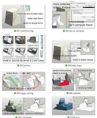
This is another “revisit”. Spiky geometry that is easier to make in Sketchup
than in Revit BUT tends to lose it’s ability to translate into a solid. Mesh objects won’t support the “mass floors”
feature which is so useful in Revit based early design. I haven’t used Formit for some time, so I’m
not sure if the conversion is more predictable or easier to handle using that
route. Another thing to get back to.
Maybe most people would use Dynamo and
direct shape geometry these days. Will
have to talk to Daniel about that.
https://grevity.blogspot.com/2013/06/spikey-stuff.html
It seems like almost every post from this
time-frame is something I want to explore further. This is a variation of the rectangular grid. This time a circular rig with radial
spokes. There is an exchange with Paul
Aubin in the comments. He has a very
elegant method for modelling volutes in his book. Currently my volutes are very abstracted and low-res. Perhaps I could combine this rig with Paul’s
approach to create a parametric volute generator. Once again, maybe dynamo would do a better
job.
https://grevity.blogspot.com/2013/06/spiral-rigging.html


No comments:
Post a Comment
I've been getting a lot of spam so had to tighten up comments permissions. Sorry for any inconvenience. I do like to hear from real people