Monday, December 16, 2013

AUX DUBAI 2014

Looking forward to attending the second edition of this event tomorrow.  Organised by Omnix International and sponsored by various technology suppliers with HP & Intel heading the list.  A number of guys will be jetting in from Autodesk again, including Lynn Allen of course.


We are sending along a core group of BIM fanatics from GAJ for the day.  Apart from the sessions themselves it's always a great opportunity to network with people from other firms as well as suppliers and resellers.  Life in Dubai is starting to get hectic again, lots of new projects coming up and of course Expo 2020 is bound to have an impact.  So it will be interesting to sound out the buzz tomorrow.

Omnix kindly invited me to act as judge in a student competition that forms part of the event.  I'm always excited to see the next generation coming through and it is great to see young designers from the Arab world expressing themselves creatively with Autodesk products.  Would love to show some images, but that would be a serious breach of protocol :-)

I am hoping to get a look at Infraworks.  I'm vaguely aware of this product, but have never seen it in action.  There are a couple of sessions tomorrow.  Dubai is well known for mega-projects and we get our fair share of master planning work, so I'm always looking for BIM approaches to this kind of work.  Sadly I think it's oriented to engineer-led "infrastructure" than architect led "urban design".  But it's worth a closer look.


Here's a link to my post earlier this year.  Experiments in using Revit for Urban Design,


Tuesday, December 10, 2013

SLIDING SASH WINDOWS

A recent post took me back to the traditional sliding sash windows that I so admired as a young man engrossed in the practicalities of building work.  I decided to set about building a typical sash window in Revit ... piece by piece.


Let's start with the sill section.  A nice chunky piece of solid wood with a fairly simple section.  You need to cut some notches out at each end to take the linings that define the boxes.  These boxes house the weights.  In the windows I dealt with, the weights were always cast iron, but we'll get to that.


Between the linings is the pulley stile, rebated down both sides to fit into grooves in the linings, and with a groove down the centre for the parting bead.  This is a slim section of wood that serves to keep the two sashes apart and guides them as they slide up and down.  The parting bead is removable to enable maintenance operations such as replacing sash cords.


The sashes themselves are moving parts, so they need to be quite robust.  You don't want the joints to shake loose.  Hence the use of mortice & tenon.  The weak point of this kind of joint is the end grain directly above the mortice which can split and open up the joint.  The best protection is to "leave horns", extensions of the sash stiles which are often given a decorative shape.


I'll come back to the mortice & tenon in another post, get into wedges etc, but for now let's move on. My model is coming together quite nicely now.  You can get quite a good idea of how the parts fit together.


Generally speaking, stiles are vertical elements, rails are horizontal. Double doors have meeting stiles, sometimes rebated so they fit together nicely.  Sliding sashes have meeting rails, which also could be rebated, to avoid a wide open gap like the one below.  Notice the stiffening blocks to support the linings along the top of the frame. If you think about the way the parts fit together you'll see why this is necessary.


Once the sash boxes are fitted into the wall, we will need a way to access the weights.  Cut out a pocket with a half-lap joint at the top and a splayed joint below.  I've actually put this on the wrong side by mistake.  As shown below it's exposed to the weather.


Made myself a little nested family to represent the pulleys.  Notche out a housing for these in the pulley stile.


Fit the outer sash first.  The sash cords are nailed into a groove in the side of the sash.  We used to use short galvanised nails with a nice flat head.  Once upon a time the weights would have been lead, but all the windows I ever worked on used mass-produced cast-iron weights.  Slot the parting beads into place to hold the outer (top) sash then you can fit the inner (bottom) sash.  This is held in place by the staff beads.  These have a nice bull-nose profile which leaves a convenient slot where you can fit a screwdriver to level them out again for future maintenance.


Now you wouldn't want to make a detailed model like this to insert into a model thirty or forty times.  I'm doing this as a research project, for didactic purposes, but it could be a "typical detail" file in a real project.  The window families deployed in the project would be somewhat simpler in their modelling, more use of symbolic lines.


You can see the rebated meeting rails clearly in the image below, and the linseed oil putty creating a weather seal around the glass.  The glass is first bedded in putty, then held in place with small glazing sprigs (nails).  The outer putty is applied and cut off clean with a glazing knife.


Moving on to how these windows fit into a wall, my example is a typical Victorian or Edwardian terrace from the north of England.  Housing for the masses during Britain's industrial heyday.  Construction is load-bearing brickwork.  A "one brick wall", ie 9 inches thick, equal to the length of one brick.  The widow sits on top of a shaped stone sill.  A rebate is formed in the other 3 sides of the opening. The window sits snugly into this rebate so that most of the frame is concealed.  The outer lintel is stone and often has a bit of decorative carving.  The inner lintel is timber.


In the next image you can see the internal plaster going on to the wall.  This will finish flush with the frame and then architraves will be applied to cover the junction.  In the houses I worked on (and lived in) the plaster was black, blast-furnace slag mixed with lime.  That was the thick levelling coat.  To finish, a thin skim coat of lime putty.  That was in the olden days.  For our renovations we were using gypsum plaster.  By the way I'm using the "Parts" feature to split the wall into its separate layers and cut back the inner plaster.  It's a great feature when you need it and living proof that the factory is still busy extending the capabilities of our favourite software in significant ways.  (I slipped that in for the moaners who think that the annual releases aren't exciting enough :-)


That's as far as I've taken it.  Not quite finished.  Shows the power of a BIM application like Revit.  If I had drafted this in 2d, the results after a couple of hours would be more impressive, but after a full day the BIM advantage is kicking in and you're starting to get "views for free".  And of course when you discover mistakes or change your mind it's much easier to make changes and update the whole drawing set.


I'm going to finish with some sash windows from my photo archive.  There are examples from New York and London in there, plus a couple of other towns.  Windows built to last, both in construction and style.  I love them, and I love knowing how they work.  But there is always more to learn so please send in your comments, corrections, snippets of knowledge about how things were done in different times & places.


Tuesday, December 3, 2013

ROOM SORTING

An interesting query came up in the office this morning.  May be old hat to you, but I thought it worth sharing.  You have a room schedule with categories of room, let's say Front of House (FOH) & Back of House (BOH).  You want the areas to display in separate, parallel columns.  Just to be clear, you don't want to sort the rooms into groups.  Instead you want to keep the rooms in numerical order and just nudge the areas across into the right column, like this.


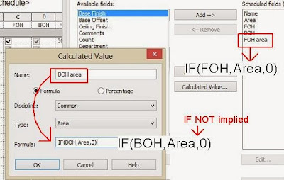
We set up four new parameters: 2 of them are "YES/NO", the other 2 are "Areas" and these ones are calculated fields.  They will either display the area, or display zero, depending on the value in the YES/NO parameter.  Pretty simple stuff really.


The formula syntax is not very hard, but I always have to look it up.  It's an IF statement ...  IF (BOH, result if true, result if false)  Where BOH is a YES/NO parameter.  Result if true is "Area", ie make this Area parameter equal to the actual room area.  Result if falce is Zero.


One interesting side issue that I hadn't noticed before.  YES/NO parameters display as Tick Boxes in the editing window.  (on the sheet they become "yes" or "no")  Before you make any choices, they are ticked but greyed out.  Let's call this the dormant state.  In this dormant state the formula will not create a result.  The calculated field remains blank.  Once you make a choice, the blanks disappear.  "No" choices now display as zeroes, in my case 0.00m2 (the default formatting for square metres)


I can see the logic behind this.  You have an instant check on whether or not you made a decision for that room.  On the other hand it would be rather cool if I could force zeroes to display as blanks (say in the field format dialogue).  This would make the final schedule much easier to read.  Legibility is what construction documentation is all about (in my view), so that would be a useful option to have.  Obviously Revit knows how to leave fields blank, as my images demonstrate, so it shouldn't be too hard to implement.  Just a thought in passing.

Monday, November 25, 2013

PLAYING CHESS WITH TERRAGNI

I am trying very hard to bring my Casa del Fascio to an uploadable status. Part of the struggle relates to the dimensions.  Have I got them right ?  Does it matter ?  With such a rigorously geometrical design it somehow seems to.

Let's start from first principles.  Take an idealised single office.  A 4m cube will do nicely.  Lay this out in a perfect square, basically a chess-board.


Stack this up 4 stories high and we have a perfect half-cube.  Obviously the rooms in the middle are starved of light and air, so we hollow out or mass.  The result is clearly related to the Italian Palazzo form.


But a renaissance palace would never have a grid line in the centre.  There would always be an uneven number of bays.  So let's adjust the module horizontally to 4.6m square so we can fit a 7x7 array on our site.  Then we can do a bit more squeezing to create a narrower bay as a circulation spine, with slightly larger offices along that side.


Next we set back the rest of the facade to make room for open balconies.  This will open up the building, create a layered transparency and also express the structural frame.
We can further enhance this effect by cutting out notches at the top and bottom, marking the position of the central void, and defining the entrance zone.  Let's also locate the vertical circulation at either end of the main spine.


Add a small balcony recess at top left and transform the central void into an enclosed, top-lit atrium, two stories high, with open galleries on 3 sides.  Again this is the palace courtyard, reinterpreted in terms of a modern, hygeinic office block.


To close the open ends of the galleries we place large meeting rooms in the middle of the left hand wing.  Then locate the washrooms, one stack next to the main stair and a smaller stack at the back close to the meeting rooms.


That's the basic scheme.  It started with a 4m cube, perfectly regular, and adapted itself to the various requirements of the brief in an apparently logical manner.  In some ways it is a very cold and formal composition, but from the inside it is also very open.  You can always relate yourself to the central space, which was also intended to house gatherings of the party faithful.  We know with hindsight that the party would turn into a monster, but can we blame Terragni for daring to dream otherwise ?


The dreams of my youth did not turn out so disastrously, but perhaps they were equally unrealistic.  Maybe I was lucky to grow up in an age of "peace & love" rather than the era of "nationalist zeal"

But back to the building.  Before I understood the internal organisation, I was dazzled by the apparent complexity of the 4 elevations; impressed by the assymetry generated within such a regular platonic solid.  But once you follow the logic of the chess-board moves, the elevations can be seen as expressions of ...


For my presentation in Auckland I developed a dimensional scheme based on multiples of 200mm, taking that to be the size of a glass block, using a column size of 400x400, a floor to floor height of 4200.  It seemed to be simple and logical, but the finer details refused to drop neatly into place.


So last weekend I hunted through my reference material, hoping for more clues.  There is an original floor plan by Terragni himself, but the dimensions are difficult to read.  The width of the facade appears to be 33250, edge to edge.  But was this the final version ?  Was it built to these dimensions ?


An Architect's Journal article from 2007 contains a claim that I have come across before, that the building his a perfect half-cube 33200 x 16600.  But several sources also claim that the width is slightly greater than the depth.


In the end I decided to shrink my model, not an easy task I might add and it consumed the entire weekend.  Sadly I have still not fully resolved the challenge of the glass-brick module and how to make this match the numbers of units clearly visible on various photographs.  But I do now have a model with a floor to floor height of exactly 4m and an edge to edge width of 33200 (give or take 50mm)


Along the way I developed my window families a little further and came to some interesting conclusions.  The internal partitions meet the columns in a rather interesting way.


I thought this was just a way of stabilising them and of disguising the position of the internal colums, but this weekend I realised that it also relates to the boxing out of the windows.


Looking more closely at my reference material I realised that the windows are fixed behind the wall.  They sit inside the room, within the slot created by that intriguing partition wall detail.  They are very large sliding sash windows, motorised versions.  Many are also L shaped.  The resulting facade is a series of layers: recesses, cutouts, external blinds,  3 bands of windows stepping back.


I used to work with sash windows in old terraced houses in the north of England.  There are wooden boxes on either side to house counterweights.


Removable flaps in the sides to access the weights, internal staff beads that can be prised off for maintenance purposes.  But that's another post.


For now I have cropped out a portion of the rear facade from my work in progress model and uploaded it to Autodesk 360.


Download from this link.


Casa Portion, RVT


Tuesday, November 19, 2013

A TALE OF 3 BUILDINGS

I have had a request from an architecture student in Italy to post my model of Casa del Fascio, so that will be coming shortly.  In the meantime, here is a post that has been sitting around for ages ... kind of a "history of everything"

My second presentation at RTC Auckland was a study of 3 buildings & an exercise in using Revit to drive a research project forward.  The theme of the converence was "embracing change".  In my mind, if we have fully embraced an idea or a technology it will become transparent.  We will no longer be puzzling over what it means or how to really set about using it.  Instead we will just get on with the job.  


My first slide was a play on words.  Why am I doing history ?  Surely History is all about studying change, trying to find pattern & meaning in the changes that occur in human societies.  So if the conference topic is "embracing change" we had better be able to see the changes we are embracing in a historical context, because human beings have been embracing & resisting changes for thousands of years.


The second slide reflects on my personal history of embracing new drawing tools & techniques.  Drawing is a very important way of thinking, analysing & reflecting, processing ideas.  Revit is my current favourite "pencil".  I aim to treat it like a pencil, something that I turn to without thinking, something that becomes an extension of my hand, eye & brain ... a natural aid to my thought processes.


The 3 buildings I chose are all corporate headquarters, and they all deliberately set out to use a bold architectural statement to advertise the credentials of the client body.  I often think that architecture walks a knife edge between advertising & art : crass commercialism and profound significance.  Interestingly enough the 3 buildings under study have stood the test of time quite well (althought it's a little early to judge the gherkin in these terms) but the organisations or types of organisation that they represent have faired less well.   The Fascist Party of Italy has sunk without trace.  Multi-National Manufacturing is not so well loved as it was in the 1950s.  As for Global Finance, well hands up all those who think they have our best interests at heart ?


Have you ever tried to draw a map in Revit ?  If so you probably discovered that the maximum scale allowed is 1 : 24000.  I wanted to draw connections between my 3 buildings by reflecting on the "long duree" of history.  I could have used some other software to draw some maps, but that would have been a cop-out.  And in any case there are advantages to the single-model approach, use of phasing etc.  So I found some jpegs to trace over and set the scale to roughly one thousandth of the real world.

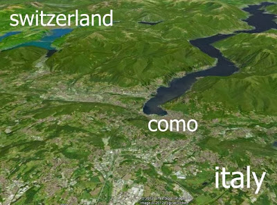
And so to tell the story, my first building is in Como, a north Italian town set on the shores of an inland lake.  This lake links Como with other towns, some of which are in Switzerland.  A  little over 2 thousand years ago, Como had recently been incorporated into the Roman Empire, an empire that thrived around an inland sea.  In this sense, Rome can be seen as a grander version of Como.


Fast forward to 1200 or so and Italy is a fragmented entity made up of numerous city states & principalities.  The Mediterranean world is divided along a line running roughly East-West into Christendom & Islam.  Northern Italy in particular still enjoys a prime position in terms of long-distance trade.  Como falls within the ambit of Milan & is participating in a rapidly expanding silk industry.  The renaissance is upon us and northern Italy is absorbing all kinds of new ideas, reprocessing them and transmitting them along the trade routes into the rest of Europe.


By 1500, the centre of gravity was shifting westwards to the Atlantic Coast.  Portugal & Spain had broken free from Muslim rule and were discovering new trade routes that would soon undermine the dominance of Venice which had long controlled the trade in luxury goods from the East.  By 1600 the centre had shifted again, Northwards to the Netherlands which had broken free from the Spanish Habsburgs and rejected the notion of absolute monarchy.  Here comes the age of the merchants, the invention of the Joint Stock Company, the mobilisation of Venture Capital.  For better or for worse we have entered a period of rapid change, huge profits, scientific breakthroughs, exploitation of resources.  Across the Atlantic a settlement called New Amsterdam is founded.  Across the narrow channel, around 1700 a Dutch Prince becomes King of England and the power of the merchants spreads.  Before long the London Stock Exchange is the centre of the financial world.


Over the next 200 years, Britain surges forward, taking control of India and the vital cotton trade.  Vast profits are made importing cheap cotton cloth from India.  The wool merchants object & force a ban on finished goods.  This stimulates the spinning & weaving trades, and sparks off a series of developments culminating in the factories of the Derwent Valley, where cotton is spun and woven in unprecedented quantities using water-powered machinery.  The combination of scientific knowledge, skilled manpower & available capital from profits sparked off a process that we now call the Industrial Revolution.  Was it a good thing ?  l don't really know.  Perhaps my grandson will be able to tell you in 50 years time if we haven't destroyed the planet by then.


At any rate, by 1900 factory production had swept away countless trades & cottage industries.  Two brothers from Lancashire had used the profits from their grocery business to establish a soap factory.  Before long they were exporting all over the globe.  Lever Brothers were pioneers in many ways.  They created one of the first Global Brands, built a modern town for their workers, promoted standards of public health & hygeine, made vast profits.


So long-distance trade had propelled Western Europe into a position of dominance, but compared to the states of the Atlantic Rim, Italy & Gernamy had missed out. Both countries experienced a surge of Nationalist sentiment and a unification movement.  Benito Mussolini  rode on the crest of this wave and inspired many a young Italian with hope and belief.  Rationalism was an artistic movement that aimed to recapture the humanist spirit of the renaissance and imbue it with modern relevance.


Guiseppi Terragni was an immensely talented young architect from Como, a town with strong physical and cultural links to Switzerland and a sense of history reaching back via the renaissance to Roman times, as noted earlier.  He was a rationalist and an idealist, he saw the Fascist party as a party of the people, by the people, for the people and he made it his business to design their Como headquarters in this spirit.


Fascism didn't turn out too well, but Italy (and Germany) managed to find its identity as an integral part of modern Europe, byword for modern style.  And the world has moved on.  Trade has graduated from the ocean waves to the air waves.  International Finance is the name of the game: electronic trading, insurance, re-insurance, hedge funds.  What better building to represent this new world order than the Gherkin, built in City of London by a Swiss finance house.


Casa del Fascio, Lever House, Swiss Re HQ.  Three buildings, three cities.  The Swiss-Italianconnection, the Anglo-Dutch connection, the rise of Europe, the role of shipping.  Just trying to see the bigger picture, put a little context to my explorations into the way we build.


But before I go a couple of thoughts.  Note how the buildings get bigger, the exponential growth in our aspirations.  The quote above is from an article in the Gulf News  by an Emarati commentator on Middle East events.  His point was that the Arab world may well have to go through some dark times before it can find it's identity, settle down to a more democratic future.  My point is that there has to be an alternative to bigger, better, faster.  So much of the BIM debate revolves around efficiency, management, putting data to work, smoother workflows, facilitating that exponential growth.


Perhaps we can also use BIM to think about our history.  Maybe we can even learn a little from the past.