Thursday, September 30, 2021

FIFTEEN YEARS AGO

Earlier this year, while pursuing the work I did on Luzern, I noticed a parallel with Kathmandu.  Both cities thrived on their position as gateways to mountain passes and long-distance trade.  Also both cities sit on land masses (Italy and India) that floated up via plate tectonics and created spectacular mountain ranges (Alps and Himalayas) as they crashed into larger objects.


The Luzern work began with a painting, so why not make the next painting about Nepal?  I reviewed my collection of photographs thinking I would tackle one of those dense urban scenes with the Newari shop-houses that so caught my imagination.  But in the end I decided that the most interesting composition from a painter’s perspective was a small row of houses in the rural hinterland of Kathmandu.  Buildings that tell the story of a way of life that has endured for centuries.


My working method is familiar by now.  Process the image to simplify and abstract so that my painter’s eye can get to work without obsessing too much about “realism”.  Then square it up (in a Revit drafting view)  Draw the same grid on a using a soft pencil.  Continue with that pencil to construct the main skeleton of the composition using the grid as a guide.


Then I block in the main areas of colour.  Stand back and reflect.  Start to add texture and detail.  Bring out the quality of the paint.  Try to be free with my brush strokes.  Look for a mood emerging.  Query my sense of unease and disappointment.  Make stuff up, or refer back to the source photo, letting my intuition lead the way.

This was a bigger canvas than my previous attempts.  That definitely felt like the right move at the right time.


I have done some Revit work based on Nepal over the years since my visit.  Studies of a Newari house.  Not a specific house, but a generic type based on photos and a couple of books that I bought during my visit.  I need to come back to that with a couple of posts, but for now here is a glimpse of the current status of that project.


After the painting I also decided to do a larger scale, urban design study, as I had for Luzern.  More on that in another post.  But let me give another glimpse here.  This time it’s an Enscape render with my trademark processing using photoshop.  Rapid overlays to make sure it’s a repeatable workflow.

I just want to emphasize here that, although I am striving to create attractive images, the primary goal is to learn.  I am engaging in a wide variety of activities, some manual and some digital, that help me to digest the experience of visiting another place and culture.  Buildings are my entry point into trying to understand the ways that human culture has evolved over the centuries in different climatic regions and political settings.  I call this quest “The Way We Build” because the way we build illuminates the kind of people that we are, and that is endlessly fascinating.


And then, after the Mental Canvas scene that I created for Luzern, I felt that I had to push that medium of expression a bit further, trying to work as rapidly as possible this time.  This is also Patan Durbar Square, but viewed from the public side, rather than the private palace garden which features in the Enscape image.

So I am continuing to expand my mixed-media approach.  Using different tools and processes to shine a light on different aspects of the human condition as it is expressed in the form of buildings and cities.


Wednesday, September 29, 2021

JUST TEASING

 Envision 21.  Online conference by the Enscape3d guys.  Big thanks for inviting me to speak at the event.  Maybe the best part of it was getting pushed into making a half-hour video of my session.  Something I have never done before, and although my video editing is a bit quirky, I'm quite pleased with the results.

Here's a first teaser, that I shared on LinkedIn yesterday. Intro plus Project Soane


And this morning I hacked together a second, dealing with Notre Dame.  

There's much more in the full talk which will be available online through the Envision21 portal and I will probably post it here also at some point.

Now if I can only find the energy to convert more of my blog posts into this kind of format ...  😕

https://fal.cn/3i5vF


Sunday, September 26, 2021

MATCHBOX BLUES

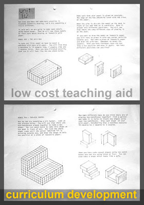
 I’m not sure exactly when I came up with the idea of the matchbox teaching aids for technical drawing.  It may have been during my teacher training course which began 37 years ago.  Maybe I invented it for an assignment set by our Maths Education/Teaching Methods lecturer.   


I was being trained to teach maths & science although they knew I would not be doing that.  It was the closest thing they had, and it was certainly a good experience.  Musical interlude no 1


I was a curriculum developer in the “Building Team”.  This was three years in to my time in Zimbabwe and I had spent the first two teaching building at an experimental secondary school where the fundamental concept was “learning by doing” … acquiring knowledge and skills about construction while building your own classrooms.  The official name was “Education With Production” as formulated by the Minister of Education Dr Dzingai Mutumbuka. 


My work at that school put me in good stead to join the Curriculum Development Unit where we updated the Syllabus, wrote low-cost textbooks (distributed free to schools), ran workshops for teachers, and other support activities.  It was a great opportunity for me, both challenging and rewarding.  I didn’t have a teaching qualification when I started, but I was one of the few people in the ministry with a degree relevant to the subject (Building Studies).  So, I was enrolled on a two year part-time course in parallel with actually doing the job.


There was an innovative programme for Science Education called “Zim-Sci” which distributed low-cost equipment kids to rural schools, allowing students do “real experiments” (hands-on science activities) working in pairs on their school desks.  Our assignment was to develop a low-cost teaching aid/activity along similar principles.  I tried my best to bend things in the direction of the Building Studies curriculum and Technical Drawing seemed like a good half-way house between Geometry and Bricklaying.  


I’m not sure whether I came up with the Matchbox idea especially for this assignment, or whether I had already thought of it during my work writing textbooks at CDU.  Either way I was about 33 or 34 years old and full of enthusiasm and confidence for developing innovative approaches to teaching building as a course that integrated knowledge from other “mainstream subjects” and helped students to apply that knowledge to real-life situations.  We were big into “problem solving”.

During this time, I first started using computers.  We gained access to a BBC Micro, owned by the Zim-Sci team, and used it to generate formatted paragraphs of text.  This was a huge step forward from typing things out on a “golf-ball” electric typewriter.  So much easier to correct mistakes, go through iterations with the phrasing, play with line widths and justification.


But the graphics remained hand drawn.  We would photocopy them, usually with a slight reduction so they looked crisper, and “paste” them onto the pages (printed out on a “daisy-wheel” printer) using cow-gum. It was only a couple of years later that Desk Top Publishing became a thing, and probably 3 or 4 before I had my own home system with the capacity to lay out fully digital pages.


During 2015 I gave a series of talks at an event in Dubai called the “BIM breakfast” … turned out to be a lot of fun.  That was around the time that I beat my type 2 Diabetes also (by losing a LOT of weight … basically starving myself for 18 months)  BIM talks for a general audience can be dreadfully boring in my experience, so I made a big effort to give my sessions and unusual twist and to inject a personal element.

The last of these talks developed the idea of using BIM tools in an educational context.  Instead of “teaching students about BIM”  let them use BIM tools and processes to learn about other stuff.  Naturally one of my examples was the Matchbox approach to orthographic projection.  I showed some of the material I had developed “in an earlier life.”  Then I produced a Revit version of same worksheets.


It’s easy enough to make a simple box family and a material that simulates grid paper.  That’s something the Ministry of Education used to have in Zimbabwe: square grids and isometric grids, which students could use as a guide for freehand drawing of simple shapes … learning to visualise in 3d and relating that back to plan, elevations & section views. 

I created 3 types to represent the box oriented to X, Y & Z planes.  These can then be nested into families that represent the various assembled shapes that I had previously made by sticking matchboxes together.  So far I am thinking in terms of a “Revit way” to generate the visuals for the worksheets.  You could also create a digital “gamified” version, which would be clever but not necessarily better for helping students to relate the abstraction of orthographic project to real-world objects.


The tricky part comes when you want to rotate the shapes into different positions.  My first pass at this was by unchecking “always vertical”, and checking “Work Plane-Based” … within Family Editor.  Then back in the project you can associate instances with a reference plane or grid line.  That works OK, but moving them around is a bit tricky.  You kind of expect all the shapes to be sitting on the same surface, but if you’ve hosted them on different work-planes that are orthogonal to each other, they will behave accordingly.  Counter-intuitive to say the least.


I created two sheets.  The first one was originally set up in 2015 with individual matchboxes placed directly in the project.  The second has the matchboxes nested into shapes.  Looks great, but setting it up was quite tricky, given the workplane issue


My answer to this is still under development but involves nesting one level deeper, having three instances, each hosted to a different plane and using visibility switches.  In the first place I created three types labelled X, Y & Z.  That seems to work well enough, but “select all instances” will see the different orientations as different shapes, which could be an issue.  So I’m looking into making the switches instance parameters, with some kind of conditional formula to reduce the number of boxes that have to be ticked and unticked.  It’s a fun challenge also. 

But I think I’ll leave it there for this post.  Hope you enjoyed the musical interludes.


Friday, September 17, 2021

VOLUBILITY


Too much working. Not enough blogging. But last week I found the time to paint a small canvas.


So far, my paintings are all based on photographs that I have taken over the past decade or so.  They deal with places that have caught my imagination: human settlements in different parts of the world.  The process of painting runs in parallel to digital work that I also share on this blog, with Revit as the primary tool for figuring things out.  But the interaction between digital and physical work runs a little deeper.  This small painting deals with Volterra, a fascinating town in Tuscanny that I visited in 2018 with a team of reality capture enthusiasts.


There are several posts from that period in my back catalogue.

Window into Tuscanny

 Just So Stories

 Tuscan Travel Tales

Painters often do preliminary studies or cartoons before attacking the final canvas.  I used two apps on my phone to develop my approach.  Pixlr and Sketchbook have been favourites of mine for long enough.  Rapid application of effects (in this case to dumb down the detail and focus my attention on the massing of the composition) … then sketching over with layers and transparency.  OK.  Now I have a somewhat abstract composition, an intention to add some vibrant colour from my imagination, and some interplay between the 2d plane of the canvas and the 3 dimensionality of the scene.  Good enough.


The second digital study was done in Revit, a drafting view.  Take the original photo. Overlay a grid with the same proportions as the canvas.  Add some detail lines and filled regions.  Now I have two images to guide me in the next stage.


Square up the canvas.  Then draft out the main lines of the composition with a soft graphite pencil.  I am not trying to represent the original scene faithfully.  I am using Volterra as an inspiration: a launching pad for my imagination.  I want to capture the liquid qualities of paint, the dream-like memories of that wonderful holiday, to balance the colours and shapes and rhythms.


There were several sessions of an hour or two each spread over 3 or 4 days.  I might go back and do a bit more.  Not quite happy with the results yet, although there is something very positive about the experience, and the new territory that I have strayed into.  The balance between free strokes with thick paint and the angular qualities of the buildings is not quite right.  There is a lot of freedom in the early blocking out which gave way to more carefully contrived interventions with a smaller brush.  It doesn’t quite mesh together.


“Practice makes perfect” and there are six paintings on my wall now. Growing in confidence with each new project. Learning to trust my instincts. Perfect may be the wrong word.  It’s just an expression.  The process of painting helps me to think about a place, and about my goals as I study “the way we build.”  It gives me a different point of view.