Wednesday, November 25, 2015

WHAT FAT LADY ?

The first stage of Project Soane is "over"... but this was never primarily a competition to me.  It was (and is) an opportunity to get involved in something interesting and important.  First and foremost it is an ongoing learning experience and I find it very difficult to turn off the tap. 


So in the absence of a fat lady screaming into my ear, I found myself doing "a bit more" last weekend.  In the first place I was preparing for a talk that I gave this week at the Address in Downtown Dubai, but I couldn't stop myself thinking "wouldn't it be nice to give a bit more definition to the roofscape in the "pink and green" zones.  This idea was given extra impetus by my discovery of an aerial view predating the demolition of "Soane's Bank".  You can see that in my previous post.


The roofscape is far from complete, but the Level of Development is far more even across the site, and especially in the areas for which Soane was solely responsible.  Looking at the updated "Zone Plan" above, you can see that I couldn't stop myself there either.  I just had to add in some indicative context, loosely based on Soane's town planning schemes and also referring to an 18th Century map that I found on line.  It's just a rough massing concept but I'm much happier seeing the "City within a City" surrounded by a jumble of streets and alleys.


In fact, we could invoke a Russian doll concept because the Bank is like a small medieval town with its battlements and watchtowers, set within that part of London we still refer to as "The City" which also used to have a perimeter wall with gates (Ludgate, Bishopsgate, the names live on) which also lives within a broader context (West End, East End, etc)  And then, within the walls of the bank we have 5 inner worlds that were once populated by groups of people who spent their lives standing behind counters and managing ledgers.  I'm referring to the 5 banking halls that Soane designed to a common theme.


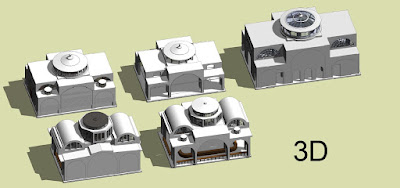
For some time I have been contemplating the idea of extracting the 5 families I made to represent these spaces and placing them side-by-sde for comparative analysis.  The classic work by Bannister Fletcher springs to mind.  Surely a BIM version is long overdue.


And I just had to include some kind of emotional response to Soane's protracted effort to impose order upon the living, breathing organism that was The Bank.  Your opinions may differ of course, but the point I'm making is that Project Soane was not so much an opportunity to show off our Revit skills as an invitation to immerse ourselves in the rich and diverse world that John Soane inhabited.  Three months of deep diving have left my mind buzzing with ideas and questions, reactions and resonances.


Check out the ceiling plans, the way he varied the treatment, playing with options, mixing and matching.  Was he searching for the perfect solution, or just enjoying himself. exploring the art of the possible?  Perhaps a bit of both.


My comparative plans need more work.  The coloring is inconsistent and the counters are missing in some cases.  More importantly I need to think more clearly about what message this diagram is trying to convey; what questions am I trying to pose?


I knocked up a quick table.  These are just columns added in to the schedule.  I didn't make the extra effort to set up shared parameters and get the information into the families themselves, another day perhaps.  There are clear benefits to doing this kind of historical research using BIM tools, but perhaps we need to work harder on the data side.  To be honest Project Soane has been mostly presented as a visualisation exercise and this will become even more pronounced as we move into the "rendering phase".  I think this is a shame.  Sofware skills are essential of course, but the real prize is contemplation of a rich historical period and a fascinating architectural personality. 


BIM is a wonderful medium for encouraging deeper understanding of complex, multi-faceted situations.  Let's embrace that and apply it to all aspects of the built environment, past and present. 
In conclusions, I'm very proud of the image below.  It represents the culmination of perhaps 200 hundred hours of concerted effort: an experience that I wouldn't have missed for anything.  And it's the product of collaboration.  There are contributions by others even in this tiny snapshot, both direct and indirect.


But when I look at that image I see things I want to improve, shortcomings and clumsiness, ideas for where next the journey might lead.  Forget the fat lady.  We may have reached a milestone, but Project Soane is far from over as far as I'm concerned.


Thursday, November 19, 2015

LAST GASP (FOR NOW)

Not sure I will get to do more modelling on Project Soane before I head off to Las Vegas for the first time ever, but I certainly intend to carry on for a while after I get back.  It would be nice to have a crack at those parts of the NE & NW extensions that are well documented: Consols Library, Residence Court, Doric Vestibule, Accountants Office & Waiting Room Court. 

But last weekend I progressed a bit further with the cellars.


I needed to see an attached the walls above so I set an underlay, and to make them stand out better used a solid fill override.  These walls are not being cut in this view of course so it's applied to the surface pattern.  I was hoping to see this over the top of an attached jpeg but this doesn't work.  Underlays seem to exist "underneath" images.


So I resorted to toggling the jpeg on and off with the sunglasses. (temporary hide)  I never remember the keyboard shortcuts for this, but this time I really needed to so I did some quick revision on that.  The keys are pretty close together so that worked well.  Also needed foundations to step out wider than the walls above, but not always centred, so drawing with an offset was useful.  That's something else I don't often do, perhaps I should.


I had a nice improved version of the groin-vault family that I made the previous weekend so filling in the bays was quite fast.  I made a section box view and set the vaults to a level of transparency using a filter based on the family name.  That gave me a nice overview of what was going on down in the dungeons. 


With a bit of trial and error I came up with a combination of colours and transparency levels that showed up well.  Basically the 4 banking halls that pre-existed Soane follow the same foundation plan with slightly differing dimensions, but the Consols Transfer Office which was built from scratch uses a more regular, cellular pattern.


One thing I hadn't thought about too much before is the way that walls inside links interact with topography.  Seems like they don't.  Perhaps I should take those walls out of the links and put them in the base file.  For the moment I just gave the topo some transparency in the view.  The hatch still goes through the walls, but at least you can see them.


So within a couple of hours I had cellars beneath all 5 banking halls and you can see how the brick vaulting works.  Imagine walking through this underground realm two centuries ago: a bit cold and damp I should imagine... time to move upstairs.

To bring this whole zone up to the same level, the rotunda needed glazing.  As usual we have rectangular windows in the lantern, and semi-circular ones at high level in the thick walls.  I made copies of some of my existing windows and adapted those.  I'm just using indicative steel sections at the moment, simple rectangles. 


The semi-circular windows have splayed reveals.  There's a drawing that shows this.  I made a profile to use in a void sweep and made a sketch path using the pick mode.  This is subtly different from picking a 3d edge which generated one of those "circular chain of references" errors.  I interpret that as meaning that the void is eating up it's own reference edge.  The sketch method still allows you to reference the existing void geometry, but it selects the whole surface rather than just the edge, so it's not upset when a part of that surface is cut away.


The end result is a shallow splay on the inside and a steeper splay to the outside.  I took the liberty of modifying the profile to create the suggestion of an arched surround on the outside.  The wall was looking a bit blank.

I could have added some sweeps (there is a hint of these on one of the sections) but.  Just wanted the rotunda to match the other halls for LOD when viewed from a distance.  It's quite an interesting roofscape now and quite amazing to reflect that I had absolutely no idea what it was going to look like until I started modelling.


But as luck would have it, I came across a rather grainy aerial photo dating back to before Baker came and trashed all Soane's work.  I'm sure there are various minor modifications showing, done after Soane retired, but it is potentially a very useful image.  If only the resolution was a bit better.  I wonder what the date is?  Remarkable lack of traffic, but quite busy with pedestrians.  I wish I had time to do a massing model of the surrounding buildings.  Put that on the list.


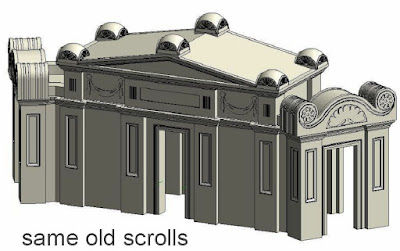
So now I was ready to hit the main target of my weekend (actually only one day because I had a presentation to complete) namely Tivoli Corner, primarily the Attic.  David Mettler was kind enough to model up the acroterian detail rather nicely about 3 weeks ago, so I copied that around.  (strictly speaking there are 2 acroterions and 4 antefixes, but they all use the same family.


The profiles for the various mouldings are based on guesswork mostly.  Time was limited so I didn't want to spend much time poring over source material.  Take this as a first pass, well second pass really.  Get the attic up to a level where it doesn't look out of place.


Once again there are functional insights that come along with the exercise.  This is the mother of all sentry boxes linking the battlements along Lothbury with those heading off down Princes Street.  Several openings to allow the guards to look out towards the street, or back inwards to the bank.


I managed to create a pair of garlands for the attic, (just a simple extrusion) but didn't get around to the one that alternates with the bulls' heads around the freize.  Nevertheless, Tivoli Corner now looks as if it belongs with the two facades that it joins together.  One thing that interests me is that from this perspective view, you can't really tell that the angle is almost 60 degrees.  I guess that justifies Soane's choice of treatment.  Actually, if you study the drawings in the online archive, he went through at least half a dozen different concepts before settling on this one. 


Looking at an old photograph I realised that scrolls were added to the ends of the sentry box.  A late decision perhaps to link Tivoli Corner with the language of the two facades.  That's about the fourth time I've copied that family and adjusted it to suit a new context. 


And finally, I copied the door from the VIP entrance and adapted that (very slightly) To sit at the back behind two layers of columns.  This was a false door I think, with a blank wall behind, but at the moment I haven't made that modification to the family.


So that's about it.  I'm going to be giving a little talk about Project Soane at an event in Dubai next week, so this coming weekend will be spent reflecting on the process and assembling images rather than more modelling.  Probably a good time to do that.


I'm looking forward to meeting up with some of the guys behind Project Soane at AU and discuss the way forward.  From my point of view it's been an incredibly valuable experience.  I've learned so much on many different levels: about John Soane, about classical architecture, about the way the bank works (worked) as a building, about the technology used. 


I've already uploaded this work to A360 so you can download the files if you are interested to pick them apart.  Don't be too critical, I've been doing what I can in the time available.  Lots of cheeky workarounds and kludges in there.


Thursday, November 12, 2015

RE-WRAPPING THE BANK


Another weekend, another random walk with  my BIM pencil.

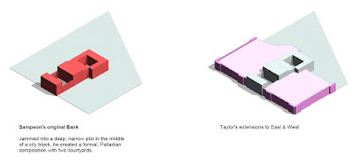
I've been thinking for some time about a simplified diagram to convey how Soane's screen wall slowly unfolded over time.  It's not very complicated really once you grasp it, but it took me several weeks of furious modelling and poring over source material before it really sank in. 

Would it have turned out the same if he had known the full extents in advance.  Surely not.  At every turn he was forced to accommodate himself to existing circumstances.  Most of his elevations were initially designed as fragments, abutting the work of someone else.  Later on they had to find a second identity, a new symmetry, rhythm & balance, as they expanded to meet a new boundary.


The detailed story of how this impacted on the sub-elements of his compositions will have to wait for another day.  For now I have simply composed a series of in-place extrusions and used Revit's phasing feature wind the calendar forwards.  We started with Sampson's formal set-piece (phase 1 = red) then Taylor's extensions to East & West (phase 2 = pink)

The screen wall makes it's first entrance in act 3 (orange) It's a simple symmetrical wall with a central gateway, wrapping around two corners at the ends, both with different angles.  The odd angles explain the radiused corners, one of which had a rather short life. 


Soon enough the Lothbury façade had to be doubled, and the rounded corner replaced by a square block. Perhaps he would have liked to make more of this new, central feature, but he was left with little room for manoevre.  Instead he lavished his attention on the hairpin bend that resulted from the straightening of Princes Street. 

We are in the green phase of the NW extension now, and another stretch of façade running down to meet up with Taylor's work.  He managed some kind of symmetry, but it was a little forced and by now he must have had a burning desire to replace Taylor's arched and pedimented creation.


The directors made him wait, and diverted his attention to other matters, but ultimately he got his way and even persuaded them to allow him to reface Sampson's central block.  Again he used the radiused, corner features.  Again he managed to extend the two side facades while maintaining their character and balance.  Ultimately he had created 4 distinct facades, each with its own character, but maintaining a continuity to the whole.


So back to some detailed modelling: the Princes Street façade, in particular the VIP entrance which opens into the Doric Vestibule.  Michael Dunn was good enough to create a family for the openings above the entrance.  They provide light and air to a portion of the battlements walkway as it passes by the dome above the vestibule.  This is an internal dome contained within a simple box.


On either side there is a variation on the "sentry boxes" used along Lothbury, so I adapted these to suit.  I need to say that much of this work is done at speed, and although it looks fairly convincing at first glance, could do with some cleaning up.

There are panels along this façade above the blind windows, nestling under the cornice, and above the door, a larger version with his favourite incised Greek Key motif, echoing the ones around the arched openings.  The door itself has scrolled brackets that are scaled up from the ones I used before.  The door is adapted from the ones I made for the Lothbury gates.


Into the second day of the weekend now, and I decided to clean up the sheets in the base model.  Firstly the Elevations, which used to have jpegs of Soane's preliminary studies as backdrops and various bits of rough setting out, done as drafting over the view.  I've cleaned that off and added some annotations so that these images now go quite well with the block diagrams at the beginning of this post.


You can see how he had to splice his elevations together, picking something up he had built a decade earlier and weaving it into a new fabric.

There are still a couple of portions that need to be brought up to the same level of detail.  The Tivoli Attic for example, and the door into Taylor's rotunda vestibule.  That will have to be next weekend though.


The ground floor plan was suffering a bit from neglect.  Rooms had lost their enclosure, and the North West in particular was lacking in definition.  I needed to feed back the insights I gained from my "Sequencing Soane" study into this model.  For the moment this is just a matter of creating walls and rooms, adjusting alignments.


The simplifications I built into the grid on day one create challenges, especially where there are long alignments to be maintained.  But I think it's important to stick to a disciplined approach.  I'm having enough problems with the 5 degrees and 61.5 degrees angles.  It's easy for small errors and irregularities to creep in.


Talking of errors, I finally figured out a couple of weeks ago why the reconstructed Stock Office is 3 steps higher than the rooms on either side.  The clue is in a picture I took of one of the display boards in the museum.  Like Soane himself they were constrained by existing conditions.  Baker had put his lanterns in at a higher level than Soane.  They were able to rebuild the lantern, but not to drop it down to its original level.  So instead they built up the floor.


I've been putting off fixing this, but this weekend I managed to fit it in.  So I dropped the Stock office down to and adjusted the undercroft below.  I took the opportunity to adjust the groin vault family I had made before.  Small adjustments but I now had a better idea how I want this to work.  I also had a go at the cellars below the Consols Transfer Office, which was interesting because he used a more cellular approach here, breaking it down into a series of square vaults instead of the longer spans he used for the "nave" of the Stock Office.  Not sure why.  Maybe it's just that he had more freedom to plan this one out from scratch, so he was able to impose a module.


So that was my weekend.  Firstly an overview session, recording my understanding of how Soane's screen wall evolved.  Then a bit of detailed modelling, fleshing out what I call the "VIP Entrance" and revisiting the "Dungeons" below two of the banking halls.


And finally some cleaning up of the plans and elevations, justifying the "BIM" nature of Project Soane (not just pretty renderings, but informative orthographic views with annotations, room objects, colour schemes, phasing diagrams)


Thursday, November 5, 2015

WEEKEND BANKING

I've been neglecting the entrance building.  At first I thought it was "not really Soane", and he didn't do an awful lot to it, but he did completely remodel the South front, facing on to Threadneedle street.  Arguably this was the last piece of the jig-saw puzzle in his long struggle to ... the external screen into a coherent whole.


First the windows.  As usual I started with semi-placeholders, quick roughed out. I think Soane was going for continuity, playing down the idea of 3 parts.  He thought the entrance building was too small in relation to the wings, so better to treat the facade as a whole and the central block as just another blip in a series of modulations.  One reading of the rhythmic sequence would be A B C B C# B C B A.  Where A is a rounded corner, B is a large blank recess with twin "sentry boxes, and C is a row of corinthian columns. 


But I'm supposed to be switching emphasis from the overarching vision and focusing on filling in the details, so I decided to tackle the decorative detail on the pilaster capitals.


The challenge is to capture the "design intent" without tripping myself up on the intricacy of the original.  (My kind of challenge)  My solution, and it's not the only possible one, is to create a deep extrusion then extrude it through a void with an "S" curved slot.


My first attempt at the shape looked more like a scorpion than a fleur-de-lis, so I took a couple of liberties and smoothed out the leaves a bit.  The result is almost OK, but I think I the bottom part of the decoration needs to be pushed back just a little bit.  The relationship between the necking just below the capital and the decorative detail itself is not quite right.


Anyway, for some reason I felt quite good about this bit of modelling and decided to have a crack at the corinthian capital in a similar vein.  I think Paul's columns are a tour-de-force of modelling, and had happily placed them throughout the facade, but a couple of things were bothering me slightly.
Number one is file size.  Those columns alone had more than tripled these.  But also, when I look at these particular capitals, the leaves are rather compact and squared off. Some corinthian columns have fairly smooth, curvy leaves, (like Paul's) but in this case the veins and crinkles are very prominent.  Apart from than, they are almost rectangular.  They go more or less straight up then turn a right angle and stick out horizontally at the end.  


So I just started modelling something.  No measurements or anything, just using my eyes and my sense of proportions, kind of like freehand sketching.  It was just an experiment really.  I thought this looked promising so I nested it into another family and did an array.  Then a taller variant, creates a second array, at half-lap to the first.  8 leaves in each row of course.


In the middle you put a vase, and then come the volutes.  My volutes are pretty awful.  They don't stand up well to close inspection, but from a distance, they do the job.  On top there is an extrusion with a sweep running around the edge.  This kind of tops the whole thing out.  Finally we need 4 flowers to fill the gaps between the 4 volutes.   It's just a revolve cut by a void extrusion. 
I got rather excited and decided to use the double-nested planting family trick to scale it.  There are lots of posts about this.  Basically you change the category of your family to planting, then put it inside another empty planting family.  Then, as if by magic you can change the height parameter and the whole thing scales accordingly.


That worked well enought to persuade me to look more carfully and adjust the proportions a bit.  The bottom row of leaves needed to get a bit smaller and the upper row needed to project out a bit more.  Amazingly enough this swapped out with the capital in my existing column family, just as it was.  And I have a corinthian column weighing in at under 6mb that looks pretty good viewed in the context of the model.


So as you can see, I am back on the central block.  The greek key pattern is a railing family that I made several weeks ago.  The actual pattern is more complex than this.  I was hoping someone would make it for me, but that never happened, so I bit the bullet. Actually it's still not quite right.  The bottom row should be continuous like the top one.  (I only just noticed that :)


From a distance this whole thing tends to go black on screen.  That's one of the problems with all this fine detail stuff.  You can set some parts to hide at coarse scale, but that's not really a solution for zooming in and out, or for parts that are nearer and father away in a camera view.  When we drew by hand we would adjust our drawing technique almost without thinking, simplify things as they receded into the distance. 


Now I'm tackling the blind arches either side of the entrance.  I'm not convinced that the ones that currently exist quite match Soane's originals.  His drawings are not altogether clear, but they look a bit different to me.  Anyway we have a keystone effect, with diagonal grooves joining up with the horizontal coursing of the wall.  I'm still using a fill pattern to simulate these.  I know that there are ways to express the coursing grooves in 3d, but I want to keep this simple and flexible for the moment, at least until I get it right.  For example I adjusted the spacing again this weekend. Currently I'm using 1' 3 1/8".


My recess family has a void cut that lines up with the courses and into this I place an extrusion cut by shallow grooves.  Now there used to be drive-through arches in the middle at street level, but Baker's bank has steps leading up to doors.  The floor level is more or less level with the top of the column base.


Next I skipped up to the top row of windows.  This involved make a scrolled bracket and surmising various mouldings.  I haven't seen any detailed drawings for any of this, so I've been piecing things together from various sources, including the current bank, and other extant buildings by Soane.  For the bracket I was influenced by the main entrance of his Bethnal Green church.


The surround to the smaller windows between the column capitals is loosely based on the current windows by Baker.  Just simple parallel grooves, very much like he used in the Stock Office.  I think it's appropriate.  You don't want these to compete with the columns.  For the upper windows, however, the reverse is true.  Windows are prominent, pilasters are almost devoid of ornament.
Based on Soane's drawings, I've added plinths under the amphora along the top parapet.  This is a smaller version of the ones on the sentry boxes along the Threadneedle facade, but shorter and without the grooves.  Some drawings show Vases on all of these, others show them missing at the corners.  The only photo I have shows them missing so I've gone with that.  There is a kind of logic, because at the corners the vase ought to face both ways, or diagonally perhaps.  Simpler to just omit it.  I think it's the kind of detail that Soane would have agonised about, drawing it different ways until he was happy.  Seems to be what happened.


Still a few things to finish off on this elevation, but it's getting pretty close, so I decided to switch to Bartholomew Lane.  The corner with Lothbury is really the origin of the curved transition.  It's a neat way to handle an odd angle.  I adjusted this more carefully, got the walkway around the battlements to connect up properly and almost got to the scrolled attic atop the curve itself. 


I've got the new pilaster in and made it turn the corner at the recesses.  Also have the key pattern and the lion's heads.  These only appear on Threadneedle and Bartholomew, the other two frontages are treated more simply, at least at frieze level.  Looking at this shot, the unfinished lantern to the rotunda is bugging me.  I haven't fix this yet, but I did sort out the lanterns for the other two Banking halls that were part of Soane's final phase
.


First I took the small lanterns from the Stock Office and shrunk them slightly for use on the Dividend Office, which also has the little round portholes in the soffits of the corner arches.  I think that trick was only used on these 2 spaces, not sure why.


Then I took the basic metal window family from the Central Block and adjusted it for the central lantern.  Soane is being both modern and fire-conscious here in his use of steel framing for the glazing. 


This time he has opted for a double-decker lantern and the upper level uses one of his trade-mark motifs.  He also used it in the glazing to the banking hall doors, and it crops up in several of his other buildings.


Ultimately I may borrow Russell's 3D cad based caryatids for this lantern, but I decided to have a quick to at an abstracted version based on Revit blends.  It's buy no means as successful as the capitals shown earlier in this post, but it was worth a try, and it will do for now.


I did one of my "combo-renders" to assess the effectiveness of the new lantern.  Mental Ray render plus shaded view in overlay mode, and adjusting the transparency by eye to suit.  Just for fun I decided to add some people, so I Pinched those from one of Soane's watercolours.  Would be better if they cast a bit of a shadow, but at least the colours blend in nicely.


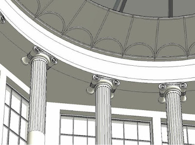
After that I got on to the Colonial Office.  Here we have Ionic Columns.  I took a more careful look at these and had at them.  Once again, no measurements involved, just using my eyes and brain.  They are not going to satisfy a purist, but I'm happy enough with them for the moment.  Lots of other elements much further behind.  By the way, I realised afterwards that these columns were taken down when Baker demolished Soane's lanterns and some of them are on display in the Bank Museum, so I had close up photos after all, which will come in handy if I ever get around to making better ones.


It's not at all clear how this lantern works, and whether it was modified after Soane finished but before Yerbury's photos.  I think That light entered "secretly" from the sides, in between the steel trusses and illuminated a glass ceiling (frosted glass perhaps)  There is definitely an opaque band around the edge, with a scalloped pattern and in one of Yerbury's shots the central portion is obviously glazed.  Maybe it was glazed direct to the sky, but the drawings don't seem to show that, and wouldn't it have got very dirty ?


I went on to model some of the plaster mouldings to the upper portions of the walls and to the arched ceilings.  These are indicative rather than definitive, I'm not sure I have enough information to get it "fully correct".  I also upgraded the decorative surrounds to the internal doors.  Arched heads with scrolled brackets, previously modelled very crudely.


At that point my weekend ran out: always a big disappointment.  So much to do!