Showing posts with label Project Soane. Show all posts

Friday, January 8, 2021

TAYLOR MADE


Hello 2021.  Catching up on work I did in mid-December.  Starting with a quote from my “LIVE” LinkedIn posts at the time.

"Assembling reference material in preparation for a model of Taylor's wall. Only need to tackle one half, given the symmetry of the two wings. Looking forward to a productive weekend on the ..." 

Bank of England / BIM360 / way-we-build # # #


Taylor built two new wings, one to the East and later on its symmetrical twin, creating a grand Palace front facing Threadneedle Street and spanning the entire city block from Princes St to Bartholomew Way.  Quite a stroke of luck, (by the way) that Sampson’s Bank was so well placed at the centre of a city block. 


The original Bartholomew Way was not at right angles to Threadneedle Street, but Taylor squared the corner up.  As a result widens considerably from South to North even today.  The SE extension came first, with four Transfer Offices to deal with the rapidly expanding market in War-loan shares issued by the Bank.


I need a column.  Start with the closest standard item from my modular library. This is a double-nested planting category RFA to allow scaling.  Open it in family editor, select the nested “INNER” and open that.  Three parts here (Base Shaft Capital)  Don’t mess with the capital unless you have to, rather complex.  The base needs to be plainer and the proportions generally taller and thinner.  So delete the void cuts on the plinth reduce the profiles of the sweeps, stretch the plinth up.  Open the shaft and stretch that up.  Now it will overlap the capital so that needs to be moved up to compensate.  So in 15 or 20 minutes I have the column I need (round fluted Corinthian with a plinth) 

The ability to have half or ¾ columns is built in to my system.  Half columns can wrap the corner with an instance tick-box but that’s not needed in this case.


So what about the spacing.  Is it completely regular?  I don’t think so.  Seems to me he had to tighten things up a little around the corner.  I do some studies with dimensioned drafting lines to come up with a spacing that works for me.  This is complicated by the position of the central door.  In reality the East wing was out of square in all kinds of minor ways.  This is not reflected in my model (A) because we don’t have reliable information, and (B) because it would be an absolute pain to force Revit to place walls at fractions of a degree, and (C) because dimensioning would also be a nightmare.

But the knock on effect is that the centre of the doorway on Bartholomew Way is probably a couple of feet further to the North than it should be.  These small discrepancies build up.  So I varied the spacing either side of the door and you don’t really pick it up.  Our eye-brain system is so used to assuming symmetry from minimal cues that our subconscious does the necessary.


Another direct quote from my LinkedIn live posts

"First mock up of Taylor's screen walls, framing Sampson's Bank of England like two bookends. It's not going to be fully symmetrical in practice. More on that over the weekend, (which starts tonight :)"

I do like the upper part of this image with most of the context unloaded.  You get a really good feel for how close the bank is to Grocer’s hall, and to the way that Taylor extended Sampson’s composition from a substantial town house, to a grand palace.  Shades of Palladio here, although his side wings were farmhouse barns.  Could there be an interesting metaphor here?  Bank of England as gentleman farmer.  Interestingly enough, several of the Bank’s directors did buy up properties in East Anglia and build themselves country homes to signal their arrival amid the landed classes.  Like the Veneto, this is relatively flat countryside with a network of drainage ditches and canals.


The corners are reinforced by doubling up the columns (free-standing columns in front of the normal engaged columns) Above this projection, a triangular pediment.  I roughed this out “in-place” to get the proportions right, then copy-pasted the geometry (while in Edit mode) to an external family template.  This gives me a stable object to place multiple times, plus an easier environment in which to tweak the mouldings and add further detail. 

The large arched recesses alternate with smaller niches which use a revolve for the void cut instead of the extrusion.  Later I will add keystones and other small embellishments to complete the effect.


Taylor's wall was removed by Soane, late on in his career, finally imposing his style on the entire perimeter of the Bank. In its turn, Soane's wall was completely rebuilt by Baker but with many similarities.  One of my first puzzles when I started on Project Soane more than 5 years ago was to try to understand the differences between the current screen wall, which I had photographed in some detail, and Soane’s phased work, for which there were a number of drawings, some of them conflicting, and no clear indication of what was actually built.  To complicate the issue, the photographs that exist date from at least 50 years after Soane’s death by which time the parapet had been butchered, railings added, plus who knows what Many layers of dirt and grime to be sure.

I digress.  I have a file called “row planting” that dates back to 2013 or so.  Combining the Planting category hack for scaling with linear arrays to do things like egg & dart or modillions, but also balustrades.  Do I dipped into this to create a wall-hosted family with variable length panels.  Another quick fix with unlimited future potential.  Modular once more, in that you can swap out different balusters at will, scale up the height as needed, vary the spacing.  By accident I had the link for Soane’s entrance block loaded on top of Sampson’s version.  Makes for an interesting comparison.  This building has changed so many times over the years.  Fascinating story.  I’ve been learning something new almost every weekend for more than 5 years now.

Linked In again

“Progress on Taylor's screen wall. Wall-hosted balustrade with parameter driven lengths/number of balusters. Smaller niches to alternate with the large arched recesses. By happy accident, Soane's remodeling of the entrance block superimposed (in blue) over Sampson's original.”


OK, so I had two L-shaped screen walls to contain Taylor’s two wings along Threadneedle Street, which was fine for a first order of approximation.  But in reality the return leg on the West side needed to be slightly longer than the East side along Bartholomew Way. 


Also, while the first extension called for a separate Entrance to the Transfer Halls (to help separate the speculative trading activities from the sober atmosphere of the Pay Hall and the Bank of England proper) The Garden Court needed to be a more secluded zone, similar to the private garden that the Director’s Parlours had overlooked when they rented the Grocer’s Hall.

I separated out the return legs, and ultimately had three links.  Two instances of the front portion (A).  One on the East, then a mirrored copy on the West.  The East wall with its central doorway becomes a separate linked file (B).  A modified copy of this becomes the West side, down Princes Street (C).  It seems that Taylor gave this wall a simpler treatment, Princes Street being more of a backwater perhaps, but mainly because this is not an entrance façade.


So I now have the exterior of the Bank quite well developed, as it was when Soane arrived on the scene.  We already had this area as it was when he retired as part of the work I did for the Project Soane competition (and beyond).  The next big “missing piece” will be the Transfer Halls, as built by Taylor.  These can then swap out with the Soane versions of those spaces as we continue to build up our timeline. 

The next post will be about the timeline itself. i.e further development of the schematic model I have been using to understand the way the building evolved, which is quite complex.  But for now let’s just enjoy the main frontage as created by the first two architects (Sampson & Taylor) over a 50 year period


Tuesday, December 29, 2020

RUSTICATING

There are several areas of the Bank of England where the bottom story is treated as a rusticated base.  So far I have been “cheating these by adding a thin extrusion created by drawing out the pattern of stone blocks.  It’s all a bit tedious but that was the choice I made.  In practice these kinds of treatments often have splayed joints which emphasise the solidity.  I decided to experiment with a different approach.


Text from a LinkedIn post I created at the time ( a couple of weeks ago)

My day today. Working on the rusticated ground floor of Sampson's Bank. Three different wall hosted families, moderately complex, with nested face-based void sweeps to get that chamfered stone block look. Dipping into my classical columns library also. A bit of attention to detail needed to get consistent alignments when turning those little corners. Classical details can be quite demanding, but also rewarding. Learnt a lot.


So far I have three different families using this approach.  None of them are really quite finished.  They tend to have a mix of the two approaches, with projecting string courses and keystones treated as veneers.  I will need to redo the families on the courtyard side also, and to sort out wrapping at all the reveals.  You can see the difference between the two approaches in the next image.


The face-based family itself has an instance length parameter and a sketch-based profile for the void sweep that does all the work.  Some day I may upgrade this to a loaded profile to allow for different joint styles.  I’m happy to have made some progress in representing this kind of masonry wall in Revit, but there’s a lot more to be done to really crack the case I think.


I added wooden doors for the three openings.  The side doors for pedestrians are straightforward enough, but the central archway needs to handle carriages so the door leaves have curved heads.  Given that these are thick walls and I have used groin vaults for all these external passages, based on buildings I know in London and thinking of security.  So when I decided to show the door leaves in an open position it became obvious that there was an issue with them snagging on the internal vaults. 

I have recessed the inner arch and pushed the vaults up higher.  Let’s try to face up to these practical issues if we can.  There are fireplaces and chimney stacks to develop further, internal paneling for the transfer offices on the upper floor.  Looks like the attic floor needs to be raised where it clashes with the central half-round window.


Lots of little details to add / resolve but I think it’s time to move on to something else and come back fresh to Sampson’s bank in the next round of updates.  I’m thinking it’s time to tackle some of Taylor’s work.  Probably start with his screen walls which I have never looked at very closely.


Sunday, December 27, 2020

GROCER JACK


Project Soane, extended version.  The Bank of England began as a group of non-conformist merchants,, many of them Huguenots, who came up with a scheme to elbow their way in to the mainstream financial world of 17th century London.  It was a variation of a proposal that had been tried before, but on this occasion, the timing was right.

They proposed to raise large amounts of money for the government to fight a war with France, by selling shares in a joint stock company.  This company went on to become the premier financial institution mediating between government and private enterprise: the Bank of England. 

They began in a small way in rented premises belonging to the Worshipful Company of Grocers, set back from the main street in an enclosed courtyard.  I started to model this building a couple of years ago but didn’t get very far and it seemed like a manageable task to occupy me for a few days taking it to a shareable level.


The family I originally made for the pointed-arch windows came before Project Notre Dame and wasn’t really parametric.  I decided this was a good time to revisit my modular door/window families and extend the system to cover different kinds of arched heads.  I also wanted a standardised approach to adapting the system for archways with no nested components visible in the project.

So now I have four variants: half round, flat, pointed and segmental.  The formula requirements for these are slightly different, but once set up they work consistently and different nested components for the frames and “doorsets” can be swapped out very easily.  Double, single, plain, panelled … frames with fanlights.  It’s a good start.


Back in the Grocer’s Hall things are shaping up.  The large triple-height central space was the great public pay hall where all the major financial transactions took place.  I don’t have much information on this, (no interior views) so it was an interesting opportunity to do some conjectural modeling, trying to conjure up the atmosphere of a medieval livery hall.


The main source of information here is Daniel Abramson’s book “Building the Bank of England” which has some hand-drawn floor plans (probably deduced from written descriptions?) and a front elevation showing the main façade and its forecourt, date unknown, I’m guessing around 1700?  One of my main goals is to understand and communicate the organisational structure of the bank in it’s earlieast incarnation.  This will help us to track how that structure was mapped onto new spaces as the bank continued to expand.


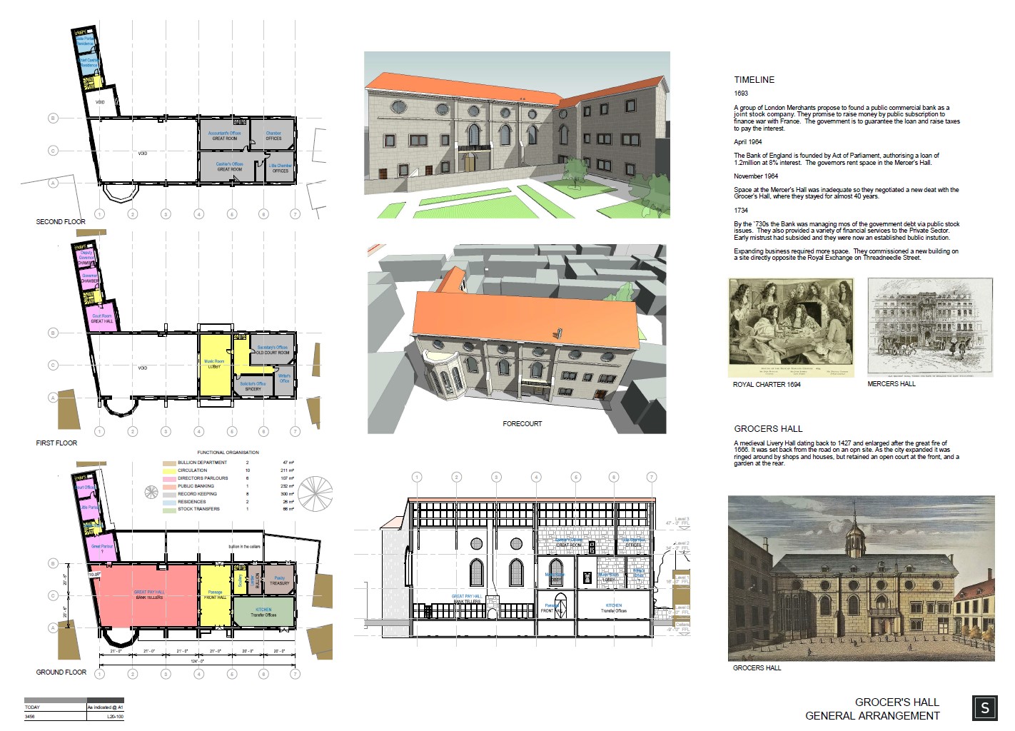
So I have managed to develop this model far enough to set up two drawing sheets with a variety of different views, some reference images and a bunch of text.  Some of it is loose text some has been embedded and tagged.  Ultimately it would be good to covert all of this into embedded data, but it’s not altogether clear where to embed some of this history. 

Be that as it may, I’m quite pleased with the way the story is conveyed.  I have linked back the context model from a previous post so that you can see the relationship of the Grocers Hall to the future site, and to the Mercer’s Hall which they rented briefly in 1694.  This illustrates very clearly how they moved closer and closer to the Royal Exchange as they grew in size and confidence.


You can download a 2 page PDF here

Grocers Hall Sheet Set


Sunday, December 13, 2020

FIFTH COLUMN

Continuing with Sampson's Bank.  Some strange families in here.

  • 1.       Project Soane (PS) is more than 5 years old
  • 2.       The geometry is complex (Corinthian capitals, bulls head motifs)
  • 3.       It’s a large group of buildings
  • 4.       The reference material is full of gaps and difficult to interpret

So many of the families are placeholders, first attempts, quick sketches. I was feeling my way, improvising and taking shortcuts. Often there was little to be gained by trying to make them parametric, every chance they would break on flexing.

The Sampson’s Bank model has inherited families of different ages.  Usually I can’t remember what I did, so if they need to be updated I come face to face with a past version of myself.  I have to work with old and clunky families that predate my current modular systems. Most likely those systems would not exist, but for the "Project Soane Experience".

 But let's start with some new “half-round” columns for the entrance façade on Threadneedle Street.  These were removed by Soane around 1820, so they don’t feature in the PS Main Model.


Four columns, same basic design, two against a flat wall, two wrapping the corner.  I have my collection of classical columns, Planting category so they scale, and modular so they mix & match.  Base, Shaft & Capital.  Put these three elements together in whatever combination you need.  Economy of effort.

So I homed in on Ionic type 1, round, smooth, no pedestal.  40-Ionic-01-X-Smooth-RD.rfa  The X stands for “no base”  The types “full”, “deep”, “half”, “shallow” are built in to all these families by changing the depth of a void cut.  Actually there are void extrusions in each of the three sub-components that flex together to achieve the results.  Finally I have an instance parameter to convert to a “corner” (Yes/No tickbox) That works on the width of the void extrusion.


When I put this family in place and adjusted the height to match the top two stories, I realised that I had chosen the wrong one.  Easily fixed.  I renamed the family in the project browser, changing X to B.  Then loaded In the other family and let it over-ride.  The complex geometry of the Ionic Capital shrinks very slightly so that the total height remains the same.  The base was a bit too high so I adjusted this in family editor, bringing the shaft and capital down to suit.  Reload and the geometry enlarges very slightly to keep the overall height the same, as set in the hardwired type parameter.  The wonders of the “Planting Category Scaling Hack”

Looking at this in 3d I realised that the entablature moulding (an in place sweep above the columns) need to come forward a bit at the front and move in slightly at the sides.  Capitals always project beyond the beams they carry, but the proportions matter, and alignments should be consistent throughout.  There is a slight problem with the string course below also, but I didn’t fuss with that just now.  Very minor and lots of more pressing issues to tackle.  Actually, if you look carefully you will see that the corner of the wall is pushing through the shaft of the column and the window is not quite centred between the columns.

Classical architecture is a wondrous system but very demanding.  I enjoy the discipline, attention to detail, deliberate proportions.


At the back of this block, facing the internal courtyard, the façade was not modified by Soane.  The ground floor arches were glazed, probably by Taylor, but otherwise the elevation in the PS Main Model remains as designed by Sampson, so I was able to copy-paste this virtually intact.  Here the columns are square and the families used predate my modular system.  I may replace these eventually, but it’s not urgent.

Interesting to open this up.  An extrusion and a couple of sweeps, placed directly in a wall-hosted template.  The volutes are two cylindrical extrusions placed in a nested family because they are at 45 degrees and they need to be locked back to the wall face.  I’m sure I knocked this family up one afternoon quickly, probably with only a couple of old photos for reference.  It is possible to achieve a passable placeholder for the classical orders using simple shapes.


In the Pay Hall we also have engaged columns of the Ionic Order, but this time they have full-blown plinths rather than a simple square base.  This one is quite interesting when you open up the family.  It’s derived from my modular system, but with a twist in the tail.  It’s a wall hosted template with a nested family.  The nested family contains a “free form element” That means I chose the family I wanted, sized it to the room, exported to acis.sat (solid CAD) then brought that back into a family template and exploded it.  At the time I did it this resulted in an object with lots of shape handles that will take a material parameter.  That behaviour changed a couple of releases ago. 

Why did I do this?  I must have been concerned about the levels of nesting.  The capital has a couple of nested components.  This is then nested into a family called “inner” which itself gets nested into the column as found in my collection.  Two levels of planting family (double nested planting) in order to get the scaling behaviour.  To make this wall hosted would mean yet another level of nesting which starts to push the file size up and can slow things down quite a bit.  That would have been my reasoning at the time.


Getting back to the 4 new columns. To fit on the ledge available, I had to make “ a small half”.  This changes the proportions a bit, and the shafts of the corner columns will look slightly wider than the others.  I think I’ve got it about right, but I will have to look more carefully at real-life examples.

I will have to work on the flat pilasters.  Not so much concerned about the simplicity of the capitals as the need for a corner version. I’m not sure how this was how Sampson built it, conflicting evidence and Taylor seems to have built scrolls up against those corners later on.  I think corner pilasters is the neatest solution for our study model.  I’m also going to express the chimney breasts on that end elevation to give the cornice mouldings something to stop against.