I spent most of my last 2 years at school painting. I was supposed to be doing Maths as well, and I had the aptitude, but this was the late 60s and the temptation to "do your own thing man" was too great. (we didn't have dudes in those days)
The past 2 weeks has been an interesting mix of "the broad sweep of history" and the tiny details that make a big difference. At first sight the topic was "what's new in Revit 2013", but thursday before last, I started my weekend by watching the Autodesk Media Day videos on You Tube.
Carl Bass link

As usual, the list of new features had left me feeling somewhat underwhelmed. Gone are the days of huge leaps forward (Mental Ray, Conceptual Massing). We have entered a period of steady progress on multiple fronts. (Revit Server, Worksharing, Conceptual Massing, Visual Styles, Materials, etc)
It's an evolutionary process, and if you read up on evolutionary theory you will know that there is a tension between long term & short term gains. In the longer term, certain changes may be "good for the species", but that will have no effect if they do not also offer immediate reproductive advantages to individuals, so that enough of them survive for the longer term benefits to kick in. (That was my quick & dirty summary of "selfish gene" theory.)
In the ecosystem that I inhabit, project architects have to meet deadlines. BIM may be good for the firm in the longer term, but it has to satisfy more immediate needs or it won't survive. Software companies have to find a balance between delivering features that architects & engineers want "now" and plotting a route towards a future that may well make those blinkered demands totally irrelevant.
To paraphrase the old joke, 'if I wanted to reach an idealised future "BIM world", I wouldn't start from here'. The reality is even worse, because our destination is not precisely defined.
If you watch the videos, Autodesk have put down some markers as if to say "we're heading somewhere in that direction" That's the broad brush part. The fine detail needs to deliver stuff that people will find helpful on a day-to-day basis, under the pressure of deadlines. Things like the way things turn transparent when you touch them in Revit 2012, or the trick of adding symbolic lines to the QAT. qat-qed post
Social, Mobile, Cloud. That's marker number 1 and it doesn't show up much in a list of new features in Revit 2013. It's there in the subscription benefits: cloud rendering for example. But it get's more exciting when you add marker number 2. Suites & Interoperability.
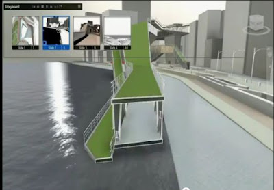
Autodesk span the worlds of entertainment, manufacturing & construction. For some time now the huge array of sofware titles that they manage have been leaking features to each other. A lot of though is going into how to make 1 + 1 = 3. One of my brightest hopes for Revit 2013 is Showcase, which is a totally separate application. Could this finally be the viewer that works ? I've tried Design Review & Navis Works Freedom, Quicktime FBX plugin, Tekla Bimsight ... People are doing clever things with Game Engines, but I need a quick and easy way of bringing a lightweight export from the model into meetings.
story telling link
The third marker is analysis & simulation. More analytical tools available in MEP this time around. Cloud based structural analysis. Thermal properties added to material definitions. Long way to go, so it's good to know that simulation is one of the major long term goals.
Simulation Link

The past 2 weeks has been an interesting mix of "the broad sweep of history" and the tiny details that make a big difference. At first sight the topic was "what's new in Revit 2013", but thursday before last, I started my weekend by watching the Autodesk Media Day videos on You Tube.
Carl Bass link

As usual, the list of new features had left me feeling somewhat underwhelmed. Gone are the days of huge leaps forward (Mental Ray, Conceptual Massing). We have entered a period of steady progress on multiple fronts. (Revit Server, Worksharing, Conceptual Massing, Visual Styles, Materials, etc)
It's an evolutionary process, and if you read up on evolutionary theory you will know that there is a tension between long term & short term gains. In the longer term, certain changes may be "good for the species", but that will have no effect if they do not also offer immediate reproductive advantages to individuals, so that enough of them survive for the longer term benefits to kick in. (That was my quick & dirty summary of "selfish gene" theory.)
In the ecosystem that I inhabit, project architects have to meet deadlines. BIM may be good for the firm in the longer term, but it has to satisfy more immediate needs or it won't survive. Software companies have to find a balance between delivering features that architects & engineers want "now" and plotting a route towards a future that may well make those blinkered demands totally irrelevant.
To paraphrase the old joke, 'if I wanted to reach an idealised future "BIM world", I wouldn't start from here'. The reality is even worse, because our destination is not precisely defined.
If you watch the videos, Autodesk have put down some markers as if to say "we're heading somewhere in that direction" That's the broad brush part. The fine detail needs to deliver stuff that people will find helpful on a day-to-day basis, under the pressure of deadlines. Things like the way things turn transparent when you touch them in Revit 2012, or the trick of adding symbolic lines to the QAT. qat-qed post
Social, Mobile, Cloud. That's marker number 1 and it doesn't show up much in a list of new features in Revit 2013. It's there in the subscription benefits: cloud rendering for example. But it get's more exciting when you add marker number 2. Suites & Interoperability.
Autodesk span the worlds of entertainment, manufacturing & construction. For some time now the huge array of sofware titles that they manage have been leaking features to each other. A lot of though is going into how to make 1 + 1 = 3. One of my brightest hopes for Revit 2013 is Showcase, which is a totally separate application. Could this finally be the viewer that works ? I've tried Design Review & Navis Works Freedom, Quicktime FBX plugin, Tekla Bimsight ... People are doing clever things with Game Engines, but I need a quick and easy way of bringing a lightweight export from the model into meetings.
story telling link

The third marker is analysis & simulation. More analytical tools available in MEP this time around. Cloud based structural analysis. Thermal properties added to material definitions. Long way to go, so it's good to know that simulation is one of the major long term goals.
Simulation Link


