Tuesday, August 21, 2018

SCORCHED EARTH - TAKE 1

The first thing I did when I got to St Louis for #BILTNA was to take a stroll down town to see the Wainwright Building. In the flesh, the balance between plain surfaces and luxuriant terracotta reliefs is quite impressive.


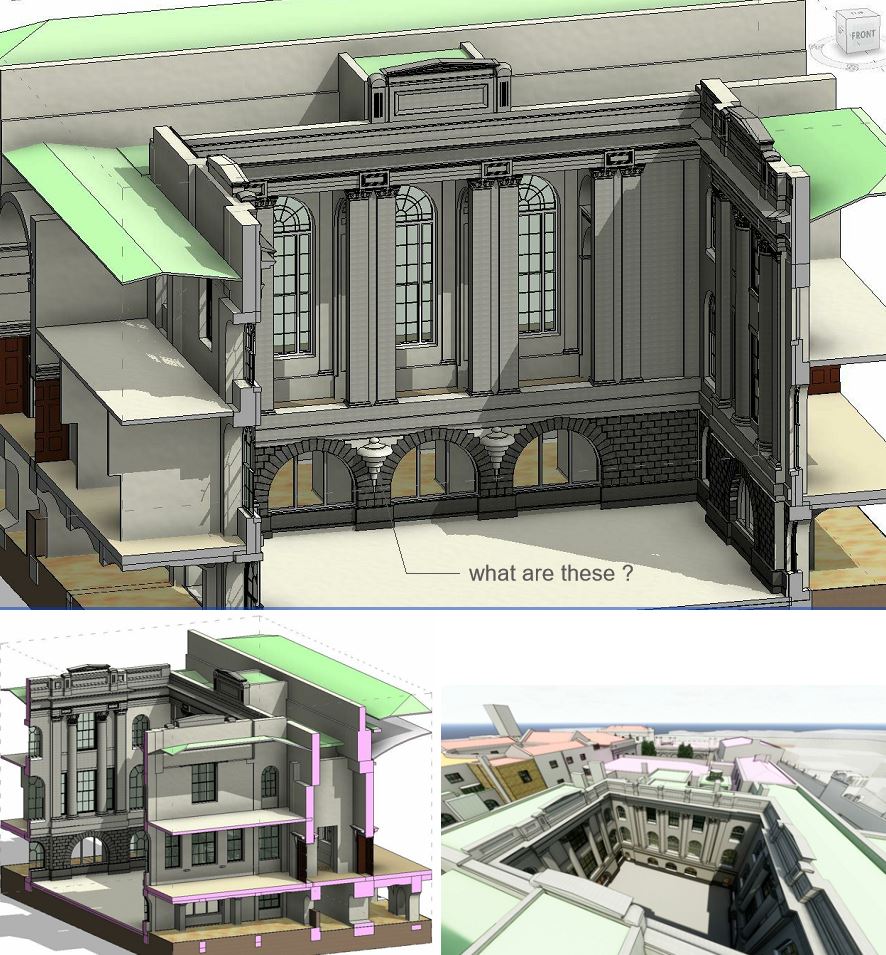
I will have more to say about this building in a future post. For now the focus is on terracotta as a building material, and how best to represent these kinds of elements in Revit. It's an LOD issue and I don't think we have a truly definitive answer at this point in time.

But Paul Aubin posted an interesting contribution to the debate at the end of the conference.


https://recap360.autodesk.com/project/0f4c83feb3894f64b2a5ad3b646ee15c

His session had been about Reality Capture, a topic which embraces a number of techniques for digitising 3 dimensional objects. He used photogrammetry in this case and displayed the results in the Recap cloud. I responded to his tweet with a suggestion to process the mesh in 3d Max, hiding edges and feeding the results into a line-based family...

Which he did in the blink of an eye, and shared the family so I could also play around with it.


This technique evokes the texture of the original terracotta cladding material very successfully when presented in realistic views. It's also OK in shaded views, and even hidden line with shadows turned on. But without shadows the decorative motif doesn't pick up at all in traditional building elevations (line drawings)  You would have to add detail lines to the family and manager their visibility carfully.


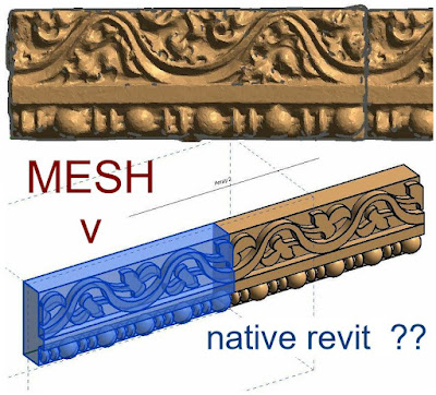
I decided to make a native Revit version for comparison. The result is very crisp and impressive in hidden line elevations, but doesn't really evoke the particular texture of well crafted terracotta.  I'm not advocating either approach as universally superior.  You need to think about what you are trying to achieve: who is using the model. and for what purposes?


In my mind, this is an important debate, very relevant to my ongoing attempts to model classical elements in a BIM friendly way.  A similar discussion crops up when thinking about the role of Art in the modern world.

"Abstraction" and "Representation" : are they opposite poles of a spectrum? or are they just two sides of the same coin: necessarily present in any process of exploring reality and meaning?


The terracotta element that Paul captured was part of the amazing displays at the City Museum which was opened up to the BiLT delegates on Thursday Night. It's more of a cross between an art exhibit and an adventure playground than a traditional museum, but full of fascinating salvaged bits and pieces. George Elmslie was responsible for much of the terracotta that enlivened Sullivan's buildings. Examples of his work were piled up in great heaps and interspersed with his delicate pencil design sketches.

https://www.citymuseum.org/


I can't help feeling that we have lost something magical. Imagine skilled artisans using those pencil sketches to guide their muscular fingers and thumbs as they shaped wet clay into flowing foliage. With Sullivan in the background judging the balance between bold massing and expressive detail.
Last night I started to sketch over another image from the museum.  It's an interesting challenge to translate these convoluted forms into flat extrusions, and it may well be the key to creating placeholder objects within a BIM model.


Surely the wild, twisting forms were a rebellion against the ordered formalism of classicism.  There is a refusal to submit to mechanical order, a revelling in the fluid ambiguities of wet clay, a return to the primitive entanglements of celtic art.  History tells us that mechanical purity won out.  Art Nouveau and Expressionism ran out of steam in a way that abstraction and minimalism never have.  But still there is an emptiness in the mechanical solution that so often leads us back to the trap of nostalgia.


Maybe there was something to be said to the measured tones of a classical language after all.  I can't help feeling that the charm of the Wainwright Building lies in the fact that, although it flirts with wild, decorative excess while embracing new, disruptive technologies that presaged the skyscraper age; it actually lies within the classical tradition.  Essentially it is a highly abstracted Corinthian column, complete with plinth, fluted shaft, and luxuriant capital.


The closing keynote at BiLT featured Sabin Howard talking about maintaining the human touch while using cutting edge technology to support the production of monumental sculpture. It's a challenge that resonates with me and echoes through the pages of this blog at regular intervals.

BIM is fantastic, but let's not forget the thousands of years of drawing by hand that preceded it.  The human touch is vital.


A lutta continua. The struggle continues.

Saturday, August 18, 2018

BACKWARD COMPATIBILITY

I'm back from the BiLT conference in St Louis. Now staying in Florida with my daughter, & I've just spent three solid days working on the Bank of England model.  It feels good to get back in the saddle after a longish pause.  I decided to start with the windows of the court room.


Problem is that the Bank of England model is in Revit 2017 and I already upgraded my classical columns collection to 2018 for the BiLT NA lab.  Couldn't face upgrading a whole bunch of linked models in C4R just now.  Might eat up most of the time I wanted to spend modelling.


Sometimes adversity can have positive results. It sounds bizarre but I now have a workflow that converts classical columns from Revit 2018 back to 2017, via 2016 !!! It also reduces nesting and eliminates the planting hack.  Here's how.


Basically I assemble the column I need, using my 2018 collection. This will have at least 3 levels of nesting, two of them planting families (for SCALING).  Export this to 3d cad in SAT format. Now that it's no longer native Revit geometry, you can bring it into a family created with an earlier version of Revit. 2016 is good because it comes in as an explodable object. At this point you can upgrade to 2017. The exploded "free form" geometry will take a material parameter.


I used this method six times to create columns and pilasters to order. There aren't many circumstances where I would use this method to "fake" backward compatibility, but complex decorative elements that need to be scaled up or down (eg Classical Columns) ... Works a treat!


Monday, August 13, 2018

PANO HEAVEN

This is another post I started preparing in April that has gone on hold while I plunged into the Volterra reality capture experience.  "Flashback begins"

Over the past three months or so we have spent many hours raising the level of detail in our Revit Model of the Bank of England, as it was in 1833 when Soane retired.  The "map" below shows the area that has been our main focus, and the numbers represent panoramas created using the awesome power of

Enscape3d.  


If you aren't using it, you should be.  Instant gratification.


Much remains to be done, and some of the panoramas shared below have obvious faults, but the character of Soane's masterpiece, (building upon the work of two previous architects) is beginning to shine through.  And so we proudly present a series of panoramas generated via the awesomeness of Enscape3d.  This is a work in progress, a labour of love, a collaborative effort, a lost moment in history, our gift to the world.

First of all a key to camera locations


We start in the Accountant's Office, a large rectangular room associated with the distribution of paper money to the "general public" in England, offering an alternative to metal coins for the first time. It divides the Printing Court (where that new form of daily currency was magically created), from the Waiting Room Court with the window of the Governor's office in the far corner.


The Printing Court is designed in Soane's "Economy Mode" with stock brick in place of Portland Stone and round headed arches setting up a regular rhythm.  The external facade of the Accountant's Office is shown are plain render, but may well have been brick-faced also.  On the opposite side, the entrance to the new Barracks is marked by sturdy Doric columns topped by pyramids of cannon balls.


Separating the Accountant's Office from the Waiting Room Court is the Loggia: an open sided corridor featuring a dramatic sequence of tall arches.  This is a part of a new route from a new entrance in Princes Street to the Directors Parlours, created by Soane for the convenience of priveleged clients and directors of the Bank.


The Waiting Room Court itself is a grand composition in stone, with Corinthian pillars and a rusticated base.  This panorama is somewhat spoiled by the incomplete material treatment, but we are getting there.


Proceeding down the route from the Loggia (known as the Long Passage) we take a sharp right turn, keeping the WRC to our right.    Dive through a door on your left and you are in the Chief Cashier's Office, not his private office, the general office which he supervised. The Chief Cashier was one of two senior employees who lived within the premises.  It was a short stroll from his apartment to the gallery overlooking this space where his clerks recorded the internal finances of the Bank: the salaries and expenses, coal for the many fireplaces, whale oil for the lamps.


Now let's return to the Long Passage. A little further down we come to a portal on our right hand side, with light filtering in from above.  This lobby leads to the Discount Office and here we encounter the rusticated wall finish that helps to define the character of the Long Passage and the Directors Parlours.  I love the three-dimensionality of this space: typical Soane with light streaming in from unexpected angles and "sneak peeks" into adjacent spaces.


Continuing down the passage, we reach three large round-headed windows overlooking the Bullion Court on the left.  This is part of the original building designed by Sampson in the 1730s.  Just ahead of us, on the right, is a shallow curved recess which leads into the Directors Parlours, which date back to Taylor, but were extensively remodelled by Soane.  The original parlours were located above Sampson's pay hall and overlooked the Bullion Court.


The Entrance Lobby is a cube with a dome and lantern.  It was designed by Taylor, with minor modifications by Soane.  The fireplace and the clock above are placeholder families awaiting further elaboration when our little team can get around to it.


In the next panorama we are in the centre of a low, narrow corridor.  As always, Soane is bringing light in from above.  There is no other way in this case.  One one side are doors to two small waiting rooms which I regard as among Soane's best compositions.


This small waiting room is quintessential Soane.  The classical detail is underplayed but the use of space and light is very inventive. It features one of his "starfish" vaulted ceilings: basically a groin vault with the diagonal ribs flattened out into sender curved triangles, like starfish limbs.  Here you might sit and wait for your appointment with the Governor or his Deputy.  The fireplace is rather special also: highly stylised and instantly recognisable.


Emerging from the narrow confines of the waiting rooms corridor, we find ourselves in a lofty, vaulted space lit from both sides by large semi-circular windows.  It would be nice if someone would volunteer to make furniture for these spaces, because they are starting to look a bit empty.  Multiple doors, some of them not leading anywhere (perhaps a cupboard, but primarily there for symmetry)


But the first door on the left as you enter from the corridor leads to a very important room.
This is the governor's office.  Through the window in one corner, you can see the Loggia on the far side of Waiting Room Court.  Sadly we don't yet have furniture to bring this space to life, but we do have the large segmental windows, sitting below the vaulted ceiling, and a hint at the elaborate mouldings and dentils running around at cornice level.  I think Soane & Taylor can take equal credit here.


The deputy governor's room (next door) is less grand, but more completely Soanian in character.  Again you can see the Loggia across the Waiting Room Court.  Note how carefully Soane has divided up the wall and ceiling surfaces to create a main space centred on the fireplace and the window, with a secondary circulation space along the inner wall, with doors to the Governor's Office and Centre Hall.


The Rustic Lobby is basically the last public space within the Director's Parlours, giving access to yet more waiting rooms, and down a passage to the toilets.  At the end of that passage you get a tiny glimpse into the Garden Court.  The name refers to the stone coursing effect which is a recurring theme in the circulation spaces at the bank and very prominent here.  The central space is a top-lit tower using another common Soane motif: narrow, arched openings, grouped in threes.  Doors are confined to secondary, barrel vaulted spaces at the sides.


Backtracking through Centre Hall we come to the committee room, shown in pink because it was designed and built by Taylor.  The "Wedgewood Blue" that I'm using for the panels is a bit of poetic license on my part.  The space is an elongated octagon with bookcases in the four corners.  We will proceed through the doors opposite the fireplace.


The Court Room has been recreated in the current Bank buildings by Sir Herbert Baker, but in a different location.  It is designed in Taylor's typical, ornate style: somewhat pompous perhaps, but a place where momentous decisions were debated.  Its grand Palladian windows overlook the garden court, formerly the graveyard of St Phillip's church.  They don't look like Palladian windows at present, but that's on my modelling list for this week.


Tuesday, August 7, 2018

NORTH WEST PASSAGE

This was written 3 months ago, before I went to Tuscany and got carried away by a new obsession.  My conscience is nagging and I want to pick up the Bank of England model again.  Anyway here is a report of where things stood in March/April ...  "Open quotes"

Recent work has centred around Soane's North West Extension.  Perhaps now is a good time to present an overview of this phase of the Bank's development in the context of the whole scheme.  Right at the beginning of the Project Soane adventure I decided to invent a grid to act as a skeleton and allow the various spaces to be constructed to regular dimensions.  This is necessarily a fictitious abstraction but it really was the only way to prevent the work from becoming totally  chaotic.


There are three overlapping grid systems, coded as AB, CD & EF.  The individual grids then are numbered as A1, A2, A3 etc.  Clearly some walls are set at fractions of a degree to the grid, but we have resisted the temptation to introduce these irregularities.


In the first diagram, the colours are only there to clarify the areas where one of the three grid system is dominant.  But the colours can be used to indicate the main phases of the Bank's growth over time.  We need to add some red in the middle for Sampson's original double-courtyard block.  Then the pink on either side represents the work of his successor Taylor.  Soanes contributions included many alterations to these earlier building phases, but here we are concerned to identify his two major expansions of the Bank's area: to the North East and the North West.  As mentioned in the last post, the North-West extension required the acquisition of new land and the realignment of Princes Street.  This diagram also contains red chain lines that pick up some of the major axes and alignments.


We have been working on the Long Passage and the Waiting Room Court.  These are the major organising elements in this phase of Soane's work.  The long passage itself is a new route leading to the Director's Parlour from a new, discrete entrance in Princes Street and spiraling around the WRC to enter the Parlours via Taylors original entrance lobby.  The parlours themselves show up in an aerial view as an irregular pattern of small rectangular volumes, jammed between the old and the new.  We can imagine this as a necessary fracturing of the planning process in this collision zone.


At the opposite extreme we have Tivoli Corner, a formally planned device to terminate the whole scheme in a grand gesture of classical order.  I quite like this image which captures the sharp spike of Wren's St Margaret Lothbury alongside Soane's very different treatment of an acute angle in plan.


A birds eye view from behind Wren's spire puts things into a broader perspective.  The North West Extension is in effect a double courtyard block, like Sampson's original modest container.  That second courtyard is the Printing Court, a significant place in the spread of paper money to everyday use.  To the left we can see Lothbury Court, the central feature of Soane's earlier North-East extension (in orange)  We will get back to that eventually, but for the moment there is plenty to do, progressing the North West, home of the Long Passage.


The loggia was a new construction, but the second long run, turning sharp right, evolved from a major circulation route down the side of Sampson's rear courtyard.  To mark the entrance to the Director's Parlours, Soane added a shallow concave recess with rustication below a broad "picture rail" moulding. Above this is a very shallow part-dome below a flat arch, with a central reeding motif typical of Soane.  The rest of the passage is quite a complex composition that we are gradually working out based on incomplete information.


This last section features three ceiling bays split by beams with scrolled brackets, supported on fluted columns.  These are actually the three bays that look into the Bullion Court, via large arched windows.  The work on the Long Passage is heavily dependent on Section Boxes and it struck me that a section box around the WRC would give a very interesting insight into the relation between the  courtyard and the spaces around it, some of which are poorly understood at present.


Meanwhile the rusticated base of the WRC is shaping up very nicely.  Not sure what to call those two features like spinning tops that link the three arched windows.  You would imagine they were lighting fixtures if electricity had been around in Soane's time.


To the north of the Loggia is a large rectangular space labelled Chief Accountant which is also very under-developed.  A quick revisit has refined the spacing of the columns and replaced half cylinders with more accurate, (and rather grand) Ionic columns. The shallow vault of the ceiling should be coffered.  I wonder if I can persuade someone else to tackle that?


I managed a quick foray into the Printing Court which has an interesting doorway/portico with cannon balls in a pyramid stack.  This symbolises the barracks which moved into the basement of the Printing Court from its previous location.  Actually the basement is more of a ground floor in this location as the natural ground level slopes away towards Tivoli Corner.


So the Loggia and the Accountant's Office lie sandwiched between the two courtyards, which have a very different feel.  The WRC is very much a formal show-piece, viewed from the loggia by VIP visitors as they head towards the Directors Parlours.  Printing Court is much more "back of house" using Soane's face brick mode with round arched windows.  Lots of unfinished business in these images if you look closely.


It seems that I managed to make a start on the coffers of the accountant's office.  Probably there is scope for someone else to finish the job.  Also I managed a basic cornice moulding around the room above the columns tying everything together, and to rough out the two different "temple front" motifs that give character to the end walls.  I think that must have been my last spurt of effort on the bank before I turned my attention to Tuscany and then preparations for the BiLT conference in St Louis.