Thursday, December 29, 2011

TERMINOLOGICAL ILLNESS

An interesting debate has been taking place around the term "BIM model".  Personally I think that Luke Johnson is closer to the truth than James Van.  Both do excellent work in the Revit Blogosphere, but if you want to venture into the world of linguistics, it pays to do your homework. 

I recommend "The Unfolding of Language" by Guy Deutscher.  It's a cracking read and full of deep insight into the slippery nature of words.

"BIM model" has caught on because "Building Information Model" is too long to use repeatedly, and "BIM" on its own is too short/ambiguous.  "BIM model" makes it absolutely clear that you are talking about a thing, not a process.  If you don't like it come up with a better term.


The crucial point to remember is that literal translations will always sound clumsy.  (try Google Translate)   For example "crucial point" translates to "cross-shaped dot" or perhaps "cross-shaped sharp thing".  Neither of these sounds very clever, but should that discourage me from using a very useful phrase ?


Guy Deutscher cites the wonderful example of French for "today".  Literally speaking, "aujourd'hui" expands to "on the day of this day" ("hui" is a contraction of the Latin "Hodie", itself a slurred version of Hoc Die) 

I'm not sure if James has children, but if he does he probably tells them bedtime stories that begin with "once upon a time" ... which is essentially the same as saying "one-time-up-on-one-time".  Pretty stupid when you dissect it, but a wonderful phrase that has enchanted countless generations of children.


I guess what I'm trying to say is that language is a wonderful, elusive, contradictory, adventure.  There's no point in complaining, you may as well enjoy the ride.

Wednesday, December 28, 2011

WIGGLY TOPO

Park Guell sits in a horseshoe shaped basin nestled into the foothills of the mountains behind Barcelona.  At 148m above sea level, the main terrace has stunning views over the city and out to sea.  How to get this into my Revit model ?  Can I grab contours from Google Earth ?


A quick search throws up references in Revit Forum and CAD addict, two excellent sources of information.  There is a plug-in for AutoCAD available as a free download on Autodesk LABS.  This creates a mesh.  Save to DWG, link into Revit and create topography by import instance: click, tick, done.


This is wonderful, but I want to see trees and houses, and those wonderful elevated roadways that snake around the folds of the hills, supported on random stone pillars. vaults and buttresses in trademark Gaudi style.  As you can see I was successful.  The challenge was to create a material from Google Earth imagery, scale it correctly, and map it onto the topography.


If you switch to realistic view in AutoCAD, you will see that the mesh already has a low-res image draped over the terrain.  This is useful.  I can inspect the corners carefully to decide where to crop my image.  The image itself comes from Google Earth Pro which allows you to save at higher resolutions.  If you only have the free version that's fine, the results will still be useable.


My aim is to create a Russian Doll effect.  A site, within a site, within a site.  The inner portion will be fully modelled in Revit. The next shell will be fairly high resolution topography and imagery.  As we proceed outwards the resolution will necessarily become coarser.  No problem.  All I need is the impression of the city spreading out over the coastal plain with the sea shimmering out on the horizon.
My Russian dolls are linked Revit files with shared coordinates and levels.  The main file, is modelled directly in Revit.  There is no imagery mapped onto the topography here.  Instead I have subregions with materials for grass, footpaths, etc.  This is topo 1. 


Topo 2 is a linked Revit file with a larger rectangle of topography.  I have carefully cropped an image to match the rectangle that was grabbed by the Autocad Plug-in, and set up a plan view that allows me to decide on the real-world size of this "rectangle" ... which is actually somewhat distorted as it wraps over the contours.


Next step is to create a material based on the cropped image and scale it up to life size.  For some crazy reason I had to mirror all my images (rotate canvas, flip horizontal in Photoshop)  It's almost as if the topography turns itself inside out during the "create from import instance" process.  Also had to rotate 90 in most cases and to adjust the X & Y offsets.  If you are not familiar with these features in appearance tab of the materials dialogue, now is a good time to explore.  They are hidden in a secret room, accessed by clicking on the image.  To choose a new image you have to click on its name.  It's easy once you know how.


Be aware that the mesh is quite crude.  If you are a real architect doing a real job for a real client ... better get a real survey done by a real land surveyor.  But for early concept work, (or explorations into Gaudi) it's certainly much better than guess work.


I decided to record some levels and coordinates from Google Earth to check against my Revit model.    This is all useful information when it comes to setting up a shared coordinates and levels system.  My first attempts to creat meshes were incorrectly scaled.  Need to set units in both Google Earth and AutoCAD, then check the results before moving on, 


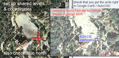
It is well known that Revit hates DWG style Real World Coordinates.  You have to accept centre-to-centre imports.  I am sure many of you have struggled with this.  In this case the DWG files are Revit friendly if you accept the default values when creating the mesh (enter, enter = place at 0,0 with zero rotation)  Vertical heights will be correct, but to locate X & Y you will need Northings and Eastings for a known feature. 


In practice this meant some manual adjustment when linking Topo 1 into Topo 2 (for example)  Once you have linked any 2 files together and shared coordinates, you are in business.  You can now link any 2 files by shared coordinates, load and unload at your pleasure.  Once again, if you are not too familiar with shared coordinates yet, get your hands dirty.  Experiment and learn.  It may seem hard at first, but it's wonderful, powerful stuff "once you know how". 


One problem with multiple nested sites is going to be 3 sets of topography in the same place.  The larger pieces are extremely crude and will obscure the more detailed modelling of the smaller ones.  My solution is to create resizeable holes: voids that allow the Russian Dolls to sit inside each other.  Resizeable is especially important in the middle because I want to gradually eliminate the crude Google Earth topograhy as I replace it with Revit objects.  What do you call a resizeable hole in Revit topography ?  Yes, it's a pad.


If you check out some of my images you will see where Topo 1 and Topo 2 are weaving in and out of each other.  I am gradually reducing this effect by editing topo 1, moving individual points up and down.  It's all very ad-hoc, but in the absence of highly detailed survey information ... it works for me.  I ended up with 4 topo surfaces, the biggest being almost 8km wide. 


Don't know if anyone else has used this method, or can suggest improvements.  At the moment I am quite excited by the potential.  Can't wait to put Corb's chapel on its hill overlooking the village of Ronchamp and identify the paths that pilgrims take up the hill.  When is a pilgrim not a pilgrim ?  (think Tourist, but then maybe tourism is the modern form of pilgrimage.  Worship the sun and the sand, the wilderness, the historic creations of past architects.  Restore your soul with a journey to some metaphoric Canterbury)


And so my last image is of Gaudi's hypostyle hall at dawn with shafts of light streaming in to wake the oracle.  And my oracle is telling me that there are many more mysteries to be uncovered at Park Guell if I have the patience and endurance to continue to model.  So far my representations are as crude as topography I grabbed from Google Earth.  There are so many avenues to be explored: wrought iron railings and gates, the gatehouses, the raised roadways, how to represent the broken tile patterns ? how to model the rough stone work ?


Behind it all the deeper issue of how to abstract something highly complex into a simpler version that is managable, recognisable and useful.  It's sometimes called seeing the wood from the trees and it's "what Architects do." 


Monday, December 26, 2011

WIGGLY SEATS

Truth be told Gaudi has always been my favourite architect.  As a teenager, this was a reaction to orthodoxy, much the same as my decision a few years later to abandon architecture and become a bricklayer.  But towards the end of my bricklaying period I made a pilgrimage to Barcelona and was much struck by the inherent practicality of his work.  Another decade passed, and I was back at University seeking to rejoin the profession I had abandoned.  The extract below is from an essay I wrote then at the age of 40.


The seats at the Guell Park are not a whimsical creation.  They are a highly integrated solution to a complex practical problem, right down to the little tiled domes at the rear of the seat that keep your backside  away from any vestiges of dampness lingering at the low point of the section.  To model them in Revit, you need a profile.  Some of you may not realise that you can drag a jpeg image into a family to use as a reference.  It has no other effect.  You can delete it later if you want, but it doesn't stop the profile from working.  In this case it's a snap I took with a cheap analogue camera in 1979. 


My first inclination was to sweep this profile along a spline as shown above, but further study showed that Gaudi's deck actually follows a very strict geometry.  I have used a 3.6m grid (estimated by scaling from Google Earth) There is an underlying octagonal theme, expressed in the column capitals, which sets up a strong diagonal. The path for the sweep is easily created by dividing the diagonal into quarters and then striking semicircles that meet at the quarter points.  So easy to construct with Revit's built-in drafting tools.  Hard to imagine that I struggled with Revit's 2D capabilities limiting when I first made the transition from Autocad.


Just a reminder that I am using Revit as an investigatory tool here.  More concerned with learning how the inner secrets of Park Guell than making a faithful replica.  So I'm setting aside the difficult problem of how to represent the infinite variety of the broken tile patterns.  You're going to have to accept the default blue mosaic that comes with Revit for now.  The next shot is a fine illustration of what I hate about RPCs (wonderful though they are in many ways)  Poor old Cynthia looks so fake and uncomfortable, unlike me as a youthful bricklayer in 1979.


I've talked about bringing jpegs into families.  For a task like this I line up photos with matching camera views on a sheet.  This often reveals shortcomings in the model and sometimes leads to unexpected discoveries.


Gaudi's free interpretation of a doric column has an octagonal abacus and 12 fluted shaft, with a round tiled base section.  After a while I realised that the columns around the edge taper towards the top, but inside they are all straight. For the moment, mine are all straight. Also, there are some missing columns. Not sure why yet.  So one day's work took me to the stage shown below.  Lots of shortcomings and quick cheats in there, but Working in Revit is a bit like sculpting out of a block of stone.  Rough it out first, get some crude families in there so you can start to visualise, then progressively refine and update.  Keep chipping away.


Couldn't resist one of my cheeky little combination renders to finish off.  Here are some clues: the walls with rounded tops are actually railings; Floor slab edges between the columns and the seats; wall hosted generic model to cut the voids out for the castellated wall top, red tiled wall sweep just below that.


Sunday, December 18, 2011

RONCHY IMAGES

This all started while I was looking at materials that Jason Grant posted, from a session he gave at Autodesk University with David Light.  It was called Graphics that Pop and you should take a good look because there's some nice stuff in there.   LINK TO GRAPHICS THAT POP

But I went off at a complete tangent while looking at Jason's file.  There was a massing model in there of a few city blocks which included a church.  To be honest I still struggle a bit trying to make shapes like this in the conceptual massing environment.  I want to go back to old fashioned pink lines.  Obviously Jason got over this long ago, so I felt challenged to try harder.


I did quite well at first. Made a little porch and learnt some new tricks.  Found "edit profile" which is very nice, but couldn't resist adding some curves and next thing you know I was thinking about a different church, about my age, sitting on top of a hill in France.
So I spend the weekend modelling Ronchamp and in the process getting sidetracked again, enhancing images with Photoshop.  I will go into more depth on Le Corbusier's chapel in another post. Today the focus is on image processing


It used to bother me that my most popular page is the one about combining images.  After all this is a Revit blog.  But then I realised that these are Revit users, people who maybe haven't plunged deep into photoshop, but seriously need to enhance their output from Revit. 


My normal rule is "15 minutes of pain".  Pain means making an image that doesn't automatically update when you change the model. If it takes less than 15 minutes to do this, you can balance the pain against the gain.  Even if you have to do it 2 or 3 times with 5 or 6 images.  Sometimes though it is worth breaking the rule.  Maybe for one killer image, or perhaps you just want to explore the software and improve your skills; learn new tricks you can use again and again on the 15 minute production line.


Modelling the roof was quite a challenge. I had a sheet where I was placing jpegs side by side with Revit views.  This really helps you to judge scale and proportion.  But that roof is quite tricky.


So half way through I decided to treat myself to a bit of rendering and photo-editing.  I had two images which I put together in the normal way on separate layers with a mask to make the shaded view transparent in the middle and gradually becoming dominant towards the edges. 
You just need a big soft brush with low transparency.  Gradually make the brush smaller (press the square bracket keys) and keep dabbing the brush on so the mask gets darker in the middle.  You could use a gradient fill, but the brush gives me more control.  Each image is a bit different and I might want to add some darker spots at points of interest so that the render shows through.


Next I decided to add in the missing roof overhang.  I created a selection around the area, using the lassoo tool, then applied a gradient fill (from black to white).  Looks very crude, but we can fix that.  I had placed the gradient on its own layer, so it's easy to make this slightly transparent and adjust the colour balance.


The whole roof is too light, so I made another lasso selection set.  This time I saved the selection (as a channel) so I can get it back later.  Used levels and colour balance adjustments on both the layers.


Now I had an image from the web that I used to set up this perspective in the first place.  I was using it to check the proportions as I was modelling.  My roof is far from perfect but it would have been far worse without this little trick.  So I brought in this photo.  Just drag it into photoshop. Ctri-A (select all) Ctrl-C (copy to clipboard, switch to the other window and Ctrl-V (paste into new layer) Make the layer 50% transparent, hit Ctrl-T (free transform) and drag the corner with the shift key held down to scale the image to fit.


You can see that my roof is still way off, but I'm going to accept that for this image.  All I want from the photo are a few little details around the edges to create the illusion of reality. So I create a mask and fill it with grey. If I made it all black the photo would be completely transparent so I couldn't see what I was doing.  Now I add white to the mask for the areas I want to show.  I need the trees, the external balcony and altar and the path.  Once I have the white (or pale grey) in place I can crank up the levels so the darker grey areas turn to black hiding the rest of the photo.


I have a library of people & trees etc on white backgrounds that I have collected over the years.  If I drag these in onto a new layer and set it to "Multiply" the white will disappear.  Take care with placement and scaling of figures.  I always site their layers to about 75% transparency to blend in better.  Add some trees and some birds.  Scaling and placement are crucial.  You can learn all the software tricks you like, but it's never a substitute for composition.  You need a good eye and that usually comes from drawing by hand.  The digital world is great, but don't neglect your own hand-eye skills.  The computer inside your head is the sine qua non of successful image making.


The birds have gone in at about 30% transparency.  Everything fades with distance.  Just for fun I added a lens flare to the edge of the roof over the entrance.  Actually this is quite an interesting composition because the main centre of interest is the chapel entrance way over to the bottom left.  I'm using the girl and the tree to bounce your eye into the four guys.  Also the birds and the lens flare act as vertical markers.  I wasn't really thinking about this consciously at the time but that's how it works.  Then there's a second focus of interest way over to the right, and again I'm using trees and people to guide you in to the altar.


By the way, one trick to placing people is to have a thin horizontal shadow line where they touch the ground.  Needs to be subtly done, with transparency.
I like the subtle colours of this image, very misty with faded browns and blues.  But after saving the image I decided to play around with some filters.  Cranking up the saturation and contrast, then using chalk & charcoal effect.  You can also combine these on different layers and use masks again to fade from one to the other.  The are plenty of choices.  You need to have a clear idea of the image that suits your design concept.  You also need to ask yourself whether your images bear any relation to reality.  Smoke and mirrors is all very well, but at some point your client is looking for a real building.


Next one uses "graphic pen" flter, then an interior shot that needed quite heavy processing to disguise the crudeness of the render.  Using pixelise as well as the usual masks and layering to create an image that captures the idea of a minimalist space that glows with filtered light.


Last 2 images feature inverting one of the layers and making a feature of the transparency to reveal structural elements, then one with coloured pencil effect that fades to white at the edges. 


I have been referring to Photoshop, but there are freeware offerings out there (Gimp for example) that can do most of the same stuff.  I sometimes feel a bit guilty when I spend two or three hours building up an image with a dozen or more layers, but it's a learning experience and you need that depth of learning to hone your skills for the 15 minute factory that will take the multiple views that Revit can churn out and convert them into really compelling and atmospheric images.

Sunday, December 11, 2011

MORE SOAP PLEASE

Second bite at the Iconic New York offices of industrial soap giants Unilever. My initial massing model raised various questions and I was able to answer most of these with a bit of web research.  Google street view and Great Buildings.com were particularly useful.  To confirm this new knowledge I constructed a second massing model, coloured up to highlight the main functional elements.
This is a series of old-fashioned extrusions modelled in-place.  I chose the Mechanical Equipment category because I'm not expecting to use this later.  This provides a simple way to isolate or hide this second massing model in different views.


Now I have a pretty good grasp of the 3 dimensional form and incidentally the model that comes up in Google 3d buildings is very misleading in this regard.  I wonder who vets these models.  Did anyone think of approaching SOM ?  My next goal was to quickly flesh the massing model out with curtain walls & floors.


The horizontal mullions are unevenly spaced with 2 small opaque spandrels below each clear glass panel.  You can't create this directly from the dialogue box.  It would be possible to add in extra grid lines, then select rows of panels and change their type, but this is tedious.  Instead I made a custom panel with embedded "transoms".  This worked like a treat and was easily adpated to make a second panel family for the first floor glazing. 


A third panel family has 4 equal panes of opaque material.  Tab-select a single panel, right-click/select horizontal row, unpin (wait for this to take effect) and change the panel type in the type selector.  For the plant room louvres I made a sub-type of the original family and changed the glass material to "louvres".  The material uses a horizontal fill pattern in shaded views and a cut-out for rendering.  You can go to the trouble of making fully 3 dimensional louvres if you like, but it's a lot of effort for little gain and will slow your model down.


I don't think I have the mullion spacing 100 percent correct yet, but it renders up quite convincingly.  Would be more life-like with some internal lighting and blinds pulled down to various different heights.  But that will have to be another weekend.


For now I will finish with a couple more renders.  If you look carefully at the last one you will see a vertical mullion near the corner that shouldn't be there.  But remember, my goal is to use Revit as a research tool.  Success is not judged by the perfection of the model, but by the learning process it enables.


Tuesday, December 6, 2011

BITS & BOBS

Just in case you think I spend all day preparing posts on St Mary Axe, I'm going to share a few snapshots from my "day job".  These are all from projects I've been assisting with Revit support over the past few weeks..

First some walls & railings based on a well known islamic pattern.  Just quick design-development images knocked up in a couple of hours or so.


Second one is a very nice project that I hope will go ahead soon.  These images were created from a quick model I made for some training sessions.  It's a very steep site overlooking the sea.


Third project is apartments in a more urban setting.  I had fun here using a kind of lego-blocks approach to quickly compare different massing options and then adding a bit of facade detail to generate visuals.  An interesting exercise in early concept design work.  I will explain this a bit better when I get time.


The fourth project was a quick masterplanning exercise. Again it was a chance to explore new ways of using Revit at concept stage and some useful lessons learnt.  Simple massing model of  a housing unit.  Schedules that count them up as you go.  Linear & Radial arrays to space them out quickly along the streetscape. 


Another image of the islamic pattern wall placed in context.  This is ongoing development of a project that I've been working on for just over a year now.


Finally another shot of the hillside resort.  Some early attempts to study the way that the room blocks and interlinking pathways interact with the hillside.  I've enjoyed focussing my attention on how to model in a schematic, semi-abstract way so that the design remains flexible and options can be explored rapidly.