Wednesday, April 24, 2019

WEEKEND ON FIRE


I am not religious. I look for spirituality in visual and musical explorations.

Musically I was drawn to the blues, improvisation around simple themes, finding complexity in happy accidents and the mood of the moment. My visual side has been entwined with the practicalities of building for so long that it’s difficult to disentangle the bricklayer from the artist.


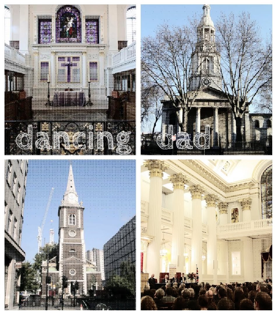
Sacred buildings loom very large in the histories of architecture and building technology. In this blog I have explored the churches of Hawksmoor and Soane: Borromini and Corb.  Formally and culturally there is great diversity in these examples. The world of Gothic Cathedrals is something else entirely.


One recent, happy accident was my decision to model Winchester Cathedral under extreme time pressure. That experience collided with current events and online conversations to goad me into attempting a similar exercise on Notre Dame. There are ambitious ideas floating around, but for the moment my focus is on a personal learning experience and the opportunity to share that via the Internet.


For the Winchester model, I created a generic pointed arch controlled by 3 main parameters. (width, height and pointiness) I am able to create new types on the fly as I blunder my way to a deeper understanding, extrapolating from a few reference images.

These days it’s not hard to find a floor plan, a partial section and a couple of dozen photographs covering the main features of any well known building, inside and out.


There will probably be a scale bar that you can crosscheck against a screen grab from Google Earth. With luck you can turn on the 3d button and orbit around a crude textured mesh.

I always start with grids and levels. This implies simplifying, ignoring minor irregularities. I’m fine with that. My purpose is to understand the underlying logic, to burn the fundamental structure of a building into my brain. To know it “like the back of my hand”  (or Highway 51)


I used to spend several hours, obsessing over conflicting information. These days I prefer to make quick decisions and get on with the job. Get stuck in. Learn by doing.

Notre Dame starts off as a nave with double aisles down each side. Then you add a row of hefty buttresses to resist the thrust of the vaults above. Eventually the spaces between these buttresses become roofed over and incorporated in to the main space, almost like a third aisle.


It’s very interesting to link in the Winchester model and compare. When I was there it felt like such a soaring, lofty space. But compared to Notre Dame it seems to lie prostrate on the ground. Is there a cultural difference here? Pragmatists and Purists perhaps? English compromise v French passion? 


The flying buttresses at Winchester are rather tame compared to those of Notre Dame.  (a bit like comparing a grouse to an eagle perhaps)  But the same strategy works well enough, at least for these early stages of exploration .  Set up a section view with a reference image placed and scaled.  Apply some transparency to the view so you can see the image behind the walls.  “Edit profile” and trace away to capture those soaring arches.


At some point, that generic arch needs to be differentiated into a series of more specialised families. The first of these is an archway perching on round columns. Usually each arch needs just one column, but sometimes at the end of the row you might need two, and at right angles, a type with no columns to connect between two rows. 


The floor plan from Bannister Fletcher seems to show a small half-round chapel at the apex of the apse, but Street View suggests otherwise.  Every time I attempt a model like this from a jumble of source material, I come across conflicting information.  Is this a mistake?  Was there a change at some point in time?  Interesting questions, but for now we will go with Street View and plow onwards.


The triple ambulatory at the east end is quite tricky. I came to a solution for widths and angles, based on trial and error. It will be interesting to analyse this more carefully some time and to make customised families with splayed reveals perhaps.  The vaulting here will also present a fascinating challenge.  Seems to be a “concertina” in plan, with three arches along the outer curve and two on the inner,


I made the the “all purpose” arch family using the “Door” category.  As I proceed to diversify these, some must become windows.  “Save as” with a new name, delete the types you don’t need.  Load back into the project.  Swap out the types you are replacing with this new family.  Go back to Family Editor and change to a window.  Load it in again and overwrite.  Those instances have now become windows.  I created a nested “Infill” component for the windows.  Ultimately most of them will become a detailed family with only one type and very limited parametric behaviour.  No point in trying to make all that Gothic tracery parametric.  For the moment it’s just a sheet of coloured glass.


Essentially, the original parametric family is a learning tool.  My model evolves along with my understanding of the building (its 3d form, the underlying relationships, functional factors driving these, historical context, etc.)  Perhaps we could think of the arch family as “scaffolding” or the temporary formwork that allows you to build a stone vaulted ceiling.  It serves its purpose in the grand scheme of things and is put aside for the next project.


So the model is shaping up, and I’m discovering all kinds of interesting features.  There are spiral stairs in at least 4 places, hiding inside buttress-like forms that project out from the exterior walls.  And the roof around the ambulatory seems to be much flatter than the normal aisle roof.  Is there are step at the meeting point of these two slopes? Difficult to be sure from Google Earth 3d.

Maybe I will find answers by inspecting the mesh model inside Assassins Creed.  I don’t normally play games, but this one has been made available as a free download for a week, so I decided to take a look.  40gb wow! 


One day left. Need to have a go at the vaults. I remembered the term Sexpartite from my schooldays, and looked that up online.  Some useful images, but nobody explains in any detail how to set out the geometry.

Well, that will have to wait for another weekend.  I ran out of time and only managed a basic gothic cross-vault.  At least this allowed me to set up a camera angle that makes the model look more complete than it really is.  Instant render from Enscape3d, process the image in PIXLR and that’s a wrap for a very intense weekend of learning by doing.


Thursday, April 18, 2019

DANCE & DRAMA


I’m going to give a shout out to Matt Thompson whose been my ‘Project Soane buddy' for a couple of years now. He drew my attention to an interesting post on LinkedIn about the Ammonite order.

I hadn’t come across this before. It was invented by Soane’s mentor (George Dance the younger) for the Shakespeare Gallery, and picked up by a father and son team of architects in Brighton who applied it to Regency Terraces reminiscent of John Nash. 


This set me off in several directions. I tidied up and fleshed out the section of my archive that deals with Dance and his Father. George the Elder started out as a Mason and rose to prominence with his design for the Mansion House which is diagonally opposite the Bank of England. He also designed a couple of churches. 


Looking closely at shots of the Mansion House, taken during one of my visits to the Bank, I was struck by its relevance to the work I have been doing this past few weeks. It’s a fairly straightforward Palladian design, in a similar mode to Sampson’s original block for the Bank, also the result of a limited competition. 


The more you look, the more you see. Drawing and modelling are ways of looking more closely, interrogating something that interests you.  The Corinthian capitals used on the Mansion House are quite different from those found on the Bank of England, just across the road.  Soane’s favourite version of the Corinthian derives from the Temple of Vesta, at Tivoli and I now find it quite easy to spot this variant wherever I see it. The leaves are very distinctive, compact and muscular.  Indeed, Soane compressed the whole capital. He regarded the Tivoli order as masculine.


His version dispenses with the Cauliculus, a device that I have so far ignored in my simplified Corinthian capitals. It’s like a bouquet : leaves sprouting from a small turned vase, and curling underneath the scrolls. I decided to draw a few. 


I referred to Paul Aubin’s superb book for the name which comes from the Latin word for stalk. Hence ‘cauliflower’. His version has very clean, smooth flowing leaves


While poking around in my archive folders, I came across a plaster cast from the Soane Museum. Soane accumulated hundreds of such objects and stuck them around his house so he could keep ‘taking a closer look’ It comes from the Forum in Rome,and the shape of the acanthus leaf is different yet again.


My previous efforts had been modelled at ‘any old size’ and for some reason I created my first leaflet flat on its back. This time I decided to create a leaf that would fit seamlessly into the modular system for classical columns that I have shared at a couple of BiLT conferences. 


In the early stages it was looking a bit like a long necked, six winged goose, trying to take off from a lake, but I persevered. This approach of using a spline-based swept blend, cut by a void extrusion starts to develop its own logic after a while. I felt a bit like a sculptor, moulding clay. You make a few adjustments, load it back into context, stand back and view from different angles... It became an iterative design process and made me think much more deeply about the way leaves wrap around a cylinder and overlap each other to artistic effect. 


My Cauliculus is very sharp and geometrical, in contrast to Paul’s, which will get incorporated into my system eventually.  It's all based on interchangeable, modular parts remember.  And I’m getting something that is closer to the leafy richness of true Corinthian than ever before. Far too much detail for most purposes, but we’ll ignore that for now.


Once you’ve made one, the next variant is much easier. You have to remember that the leaves are backed up against a curved surface, but as they rise higher they need to curl outwards and also turn in on themselves a little. Tricky geometry, but fascinating too. 


The profile that I’m using for the swept blends, forms a subtle crease that enhances the botanical illusion, as long as you pay attention to its alignment. I’m enjoying the tension between stylised forms that derive from the techniques used, and the impression of organic complexity that can ensue. Not saying I have the balance right just yet, but questions are being asked. 


So I have new capitals that combine with the shafts and bases I previously developed. These can be round or square, detached, engaged or flat pilasters. I even have a corner option. So why not try mocking up one corner of the Mansion House? 


I roughed out a profile for the entablature, leaving square recesses to insert the egg and dart / leaf mouldings later. Scaled everything to dimensions estimated from Google earth. Such a lot of interesting buildings on show here. Tite’s Royal Exchange, Lutyens’ Midland Bank. Hawksmoor’s St Mary Woolnoth. 


In my first render the pilasters still have the old style capital, which was never fully converted to square. My new leaves adapt more easily to turning the corner, just because the leaflets at the sides are nested components.

Not sure why I have opted for this antique photo effect (Enscape3d + PIXLR)  Maybe it helps to fool the eye into treating my dramatisation as a documentary.

For my taste, the Ammonite order is too literal. Perhaps it’s OK for a theatrical setting.  Maybe also for the picturesque fancies of a regency seaside resort.  Theatre going and family holidays were novelties of the enlightenment middle classes. I’ve enjoyed these fresh insights into the world of Dance and Soane. 


Sunday, April 14, 2019

DENSE FOLIAGE


Flushed with success from my recent forays into classical ornament, I decided to tackle free flowing foliage.   How on earth are we going to conquer that?


My first thoughts were to strike out boldly into point world. It had worked well for the rosette, so why not for the Acanthus leaf?


So I set off merrily lofting away but almost immediately I was mired down in the difficulty of controlling so many independent variables. Degrees of freedom in embarrassing abundance. Paradoxically it slows you down. The exact opposite of freehand sketching. No intuitive flow.


Maybe I will try again at some point, But for now, getting a clearer idea of how to break down an Acanthus leaf into manageable pieces  seemed to be a more pressing need.


So I started to sketch: rapidly but analytically, tracing over my previous efforts until some kind of direction started to emerge.


Premature attempts to jump back into modelling were not encouraging so I churned out a series of sketches and thought about the many different styles of leaf carving that have been used in Corinthian capitals.


As I draw, I keep in mind the successes of previous weekends. Somehow that pretty sketch has to translate into a sensible modelling strategy. Revit doesn’t work like squeezing an amorphous lump of clay. This level of complexity implies dividing the leaf into “leaflets”  How will I disguise the joins.


In many cases the lower portions of the stylised Acanthus leaves are represented as a series of parallel vertical ridges. Maybe I can draw a series of parallel stems that blossom out towards the top.


I am using two “special powers“ that SketchBook Pro gives me : symmetry and predictive stroke. I also realised, along the way that PIXLR can straighten and crop the photos I am tracing over.


But those photo layers are soon discarded as I strive to simply and clarify the underlying shapes I need. Then I can go into reverse gear and elaborate the edges. The original image is forgotten now. I’m just inventing shapes that please the eye.


That was fun, and informative, but far too flat. Most real life examples have overlapping edges. And a top bit that curls forward like a hood.


I take a good hard look at a sketch I came across. Perhaps I should take my best version and work it over a few times.


Maybe those parallel lines can taper a bit to counteract the stiffness. Maybe I should play down those curly thumbs, make them more like the other leaves.


So back to Revit. I just jumped in, without thinking about size or orientation. In retrospect, I think this was important. I needed to be casual and explorative. It’s a swept blend cut by a void extrusion. That’s a very powerful strategy for stylised organic forms.


Both path and profile use splines. I wouldn’t want to use splines very often in Revit, but when you do need them, they are super cool. Before long I have 3 versions of the nested side leaf and a directly modelled centre. Rotating the side leaves up into the vertical position was a bit messy, but definitely this approach has potential.


So now I have a family I can bring into the project environment and arrange into a circle. Why do this in a project? I was just impatient to see shadows, and sadly that’s not available in family editor.


Duplicate the leaf and give it a longer stalk. Add an in-place revolve. Well , well!  Actually I lied about the profile. I started with a simple rectangle. But now is a good time to substitute a spline, top and bottom. Also make the leaves a bit thicker and curl the hood over more at the top.


I’m very proud of these leaflets. Quite easy to vary the form, tweak the way they curl around and overlap each other. You are bound to get some collisions at first but it’s so much fun to resolve them: to play with the proportions, the balance of light and shade. Shadows are so critical here.


And my trusty Enscape3d. Thank you once again guys, for supporting me. It’s a brilliant tool and plays very nicely with PIXLR, softening the images further and assembling them into collages. All the compilation and text was done on my phone again. The new routine for my Sunday morning lie-in.


The final tweak was to modify those waving hands slightly, making the fingers longer in proportion to the palms. It’s subtle, but effective. I feel like Revit has become my BIM chisel. I am a sculptor now, shaping stone and clay with my hands and my eye. The tools fade into the background as I work, but still they express themselves in the final work. This object has the feel of moist clay, of cold hard stone, of crisp and clunky Revit. I love it.


My final image has the feel of SketchBook Pro and PIXLR and the Samsung Note. It speaks to my determination to look more closely at an Acanthus leaf and to re-imagine it as Revit geometry.


Sunday, April 7, 2019

EGG & SPOON RACE


Apparently the ubiquitous “egg & dart” motif was inspired by the Greek fighting formation or “phalanx”. That’s one theory anyway, implying that those ‘eggs’ are really ‘shields’. Certainly there are Greek vases that use rows of soldiers as rhythmic decorative elements. Actually this reminds me of the Guilloche also.


I do think the connection between vase painting and architectural ornament is worth pursuing. But we have a race to run, so let’s move on.


Like many other elements in classical design, what appears to be a simple formulaic device turns out to be capable of much variety. So I started out by reviewing the versions in my archive.  The differences may be quite subtle, but when you look carefully, almost every example takes a slightly different approach.


During my third pumpkin adventure I veered off into the animal kingdom, feeling that I had already “done vegetables “.  Along the way I developed a family that I called “the universal egg “


https://grevity.blogspot.com/2013/10/egg-on-my-face.html


The core feature is a revolve, using two quarter ellipses that share a common radius. Imagine a globe whose equator is set by this shared radius. The northern hemisphere then has its own radius so it can be made rather flat, or more pointed. Similar rules apply  to the southern hemisphere.  Now you could set these three radii one by one, but I prefer to set Slenderness,” “Eccentricity” & “Width”. In other words, you have two parameters to define the shape of the egg, and a third to scale that shape up and down.


The egg is hollow (although it doesn’t need to be for the current purpose) This is achieved by having a smaller ‘void egg’, inside the solid one, and adding a parameter for ‘Thickness’ of the shell. We also have an ‘Undercut’ parameter to shave a slice off the bottom and give it a flat base.


The result is a family that can assume a wide variety of shapes and proportions, each of which can then be scaled to whatever size you like.  If the slenderness and Eccentricity are both set to 1, you will have a sphere.  Give it an undercut of 0.5 and you have a hemisphere.  Low slenderness values will give you a relatively flat disk.  Slenderness of 2 will be something like a rugby ball.


The eggs sit in a nest, hollowed out from an ovolo moulding (ie a sweep).  The nest has sloping sides, so that means a void blend. A second blend cuts away the space between two nests. In this case it leaves a solid sliver in the middle of the gap. (the dart)


In other cases, a separate component is used to place arrow heads in the gaps. So by duplicating and adapting my first attempt, I created two more versions of the egg and dart pattern.   Eventually I will nest these as arrays into line-based families, or as balusters in “railings,” using the “double-nested planting hack” to scale the geometry to suit project needs.


But right now I want to tackle another theme commonly used in classical ornament.

Some of these examples look similar to the egg and dart, but closer inspection reveals that they are all based on plant leaves. This time the range of variations is much greater.


My first example is based on wood carving technique. Almost 50 years ago a friend of mine demonstrated how this is done with a few deft strokes of a gouge, cutting away a series of crescent shaped chips. Very impressive.


As the variations mount up, you can see the advantage of using a nested dart component which can easily be adapted to new situations, gradually building up a library of mix and match modular items.


The possibilities are almost endless, as a second set of images from my archive illustrate. Some are simple and highly stylised. Others present a more elaborate, organic impression.  There is a fascinating tension between abstraction and a more faithful representation of reality: a tension that eventually gave birth to modern art.


I’m not going to explain all my modelling efforts in detail. If you are interested in this kind of thing, then half the fascination lies in developing your own strategies. I will just present one more that uses a ‘sweep and cookie cutter’ approach. There are two sweeps, one with an offset profile for the recessed surface effect.


And here is a nice YouTube link I found on carving egg & dart mouldings in wood.


This is the first blog post where I have assembled the images on my phone. I normally spend half of my weekend working in Revit and taking snapshots of my progress along the way. To weave these into a story involves grouping two or three images together and annotating them. I like my readers to be able to get the main gist of my message visually.  The narrative is an optional bonus.


I’ve been using Pixlr to process digital sketches for a while, but had been ignoring the collage function, which turns out to have a really neat touch interface. So now I can take a break from mouse & keyboard to create most of my text and images on the phone.  Friday morning lie-ins suddenly became productive as well as a way of relaxing after a busy week in my day job.


That’s a shot from the One Drive folder for this post. Of course, it’s accessible from all my devices.  The cloud is great for enabling fluid and intuitive work flows that link workstation grade machines to touch-screen phones and tablets.  Seems like the human touch is coming back into my work in all kinds of ways.


I’m going to finish with a screen grab of Pixlr adding text to a snapshot of Pixlr assembling a collage. Worlds within worlds, very “Alice” (and Humpty Dumpty)