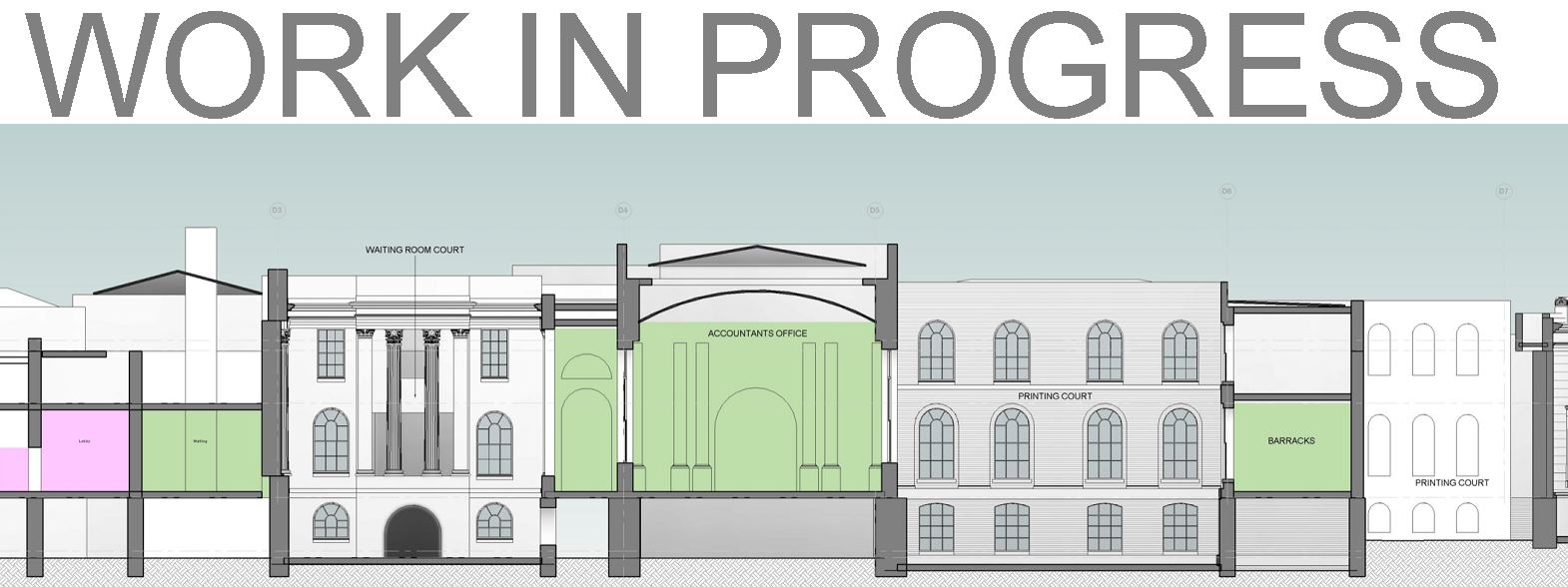
So last week I was busying myself with fleshing out Soane's N.W. extension which is different from his earlier work at the Bank in some interesting ways. The banking halls (ultimately 5 of them) were all top lit and built using domes and vaults. The N.E. extension (orange in my diagrams) was something of a jigsaw puzzle, or perhaps a Rubiks Cube, where the various elements had to be shuffled around in space and time in order to make the best use of the available space while keeping the bank operations going.

The land acquired to the North West was not at all rectangular, but there was more room to maneuver this time, and much less need to reconfigure or relocate existing functions. So he was able to come up with a scheme that was essentially a series of rectangular rooms arranged around two rectangular courtyards. As a result he was able to use conventional side lighting and pitched roofs for most of this work.

I spent a small amount of time developing the facades of the garden court and the entrance court, which by now were looking a little blank. Soane did some work in these areas, but their character still owes a great deal to Sampson and Taylor, so I didn't want to linger two long.

I decided that the sash window families I had developed for the two N.W. courts could be adapted for use in the N.E. extension, which is also inward looking. Here the two courtyards are really one space, but partially divided by a row of columns and a change of levels.
Soane's first schemes for this extension show a narrow strip of residential accommodation along Lothbury (R), an awkward 5-sided lump subdivided into Banking Halls (B) and an even more awkward passage to bring in the bullion deliveries. He had to move the passage so that he could connect the new banking halls to the existing ones that he had just rebuilt.

His solution to this geometrical puzzle was to move the Library (L1 to L2). Now he could create two nice rectangular areas. The smaller one (on top of the existing passage) would become the Consols Transfer Office. The larger one would become the two-part courtyard. As a bonus, he was able to move the Bullion Gate over to the centre of his new screen wall and strike a perpendicular axis straight into the centre of the Bullion Court. His final trick was to rebuild one wall of this Court as an arc with its centre point at the end of the new axis. You may want to applaud at this point.

In passing we can note the wedge of green property which was to be bought later on, and the section of Princes Street which would be closed off and incorporated into the bank.
The next picture is a section through the Residence Court, which I had to flesh out with windows, and the window family that I developed for the ground floor. I've roughly sketched in the smaller ones that will be needed for the upper levels. The Bullion Gate comes in a couple of metres below ground floor level and about a metre above the cellar floor. Hence the split levels between Lothbury Court and Residence Court, skillfully handled with a row of columns as mentioned before. These are residences for senior staff, by the way. Four storey houses were common for the upper middle class in London. Kitchens in the basement, living rooms on the ground, bedrooms above, and servants in the attic.

The Residence Court has a sharp corner, and as usual Soane negotiates this with a curve. As a result, one of the windows on the end wall overlaps into this curve and creates some rather odd Revit behaviour. The cut opening fails to break through the curved portion, fair enough, but when I made a section box view to look at this area more closely, the straight bit of wall flips into wireframe mode. This doesn't happen in other views, so I haven't let it distract me just yet.

The next image shows the residence court with the row of columns and the grand stairs at the level change. The curve at the sharp corner is opened up with two Corinthian columns, flanked by pilasters on the walls. Take a sharp right to enter the Secretary's House (small red arrow) Beyond the entrance passage, there are basically three rooms per floor and a stair at the back (st)

Just a quick shot of my working plan for the ground level. This has a large jpeg below it of a plan by C R Cockerell, who succeeded Soane as architect to the Bank. It's probably the best record we have of the state of the bank just after Soane retired. I have set walls to transparent pink so that it's easy to compare my work with that plan. You can never get things to line up 100% but I don't think I'm doing too badly.

Eventually the Residence Court is shaping up quite well. Still a couple of windows missing on the curve (marked with a cross) I think I will try replacing the opening cut with a void to see if that will penetrate the curve. Also there is a parapet with stone balusters to work out, but first I wanted to tackle the Porter's Lodge.

Not too much to say about this. Like the Printer's Court, it's deliberately downplayed architecturally. Round headed recesses and shallow pilasters with very simple mouldings, top and bottom. Plus a very simple shallow pediment. Interesting to compare the external and internal facades of this small rectangular block. Grandiose and formal versus plain and somewhat domestic. Once more I have left some of the openings as plain voids, just to keep things moving in the time available.

Another of my working views shows greyed out walls, and pads in thick dark red. The ground slopes diagonally across the whole of the bank, with Tivoli Corner as the low point. The cellars cut into this natural level to different degrees and some of the courtyards may even lift it up a little. I have to figure this out as I go, so I will have multiple pads, some touching each other and sometimes irregular in shape. As you probably know, pads are very sensitive to even the tiniest overlap, so it's useful to have a view where you can see them clearly.

Here's a shot from Lothbury Court towards Residence Court. At some point I realised that the stairs going down to cellar level were not central, amazing how you can miss things in a photograph that you have looked at dozens of times. Then once you've seen it you wonder how.

I had actually done a study of the Consols Library in December, in a separate file. Never quite got it to the stage where I could load it into the main file, or do a post around it. So I went back to this, loaded it up and did some minor adjustments

This is basically like an archive, rows and rows of files on four levels. Soane basically copied the existing building in a new location. It's very repetitive: rows of arches and groin vaults with a light well slot going down the middle. Basically 4 slices of cellar stacked on top of each other.

Once more you can see the working views: transparency applied to model elements, jpeg scaled up to life size.

Section through the library showing how it buts up to the screen wall. On the left-hand side you can see the Consols Transfer Office which is separated from the library by a small triangular court.

I'll finish off with a sliced off 3d of the whole area. You can see three banking halls in the bottom right. 1 = Stock Office, 2 = Old Shutting Room, 3 = Consols Transfer Office. I've framed the two rounded corners that Soane used to mask the different angles of the Screen Wall. Remember this section of wall was to be the model for the entire enclosing structure that he was only to complete in his late 70s. And notice how the curved corner at the top right has become swallowed up by the works of the N.W. extension. Letter R represents the Residence Court and the arrows down the middle show the Bullion route.

Actually, that's not quite the end. I want to show you this plan view with an applied colour scheme. Pale Pink is for Banking Halls, Pale Blue is the Court Suite, Grey is Back of House/Offices/etc. Yellow highlights circulation space. Note the way that the Rotunda organises the South-East banking halls while skillfully linking the entrance court to the side entrance of Bartholomew Way. Also note the Long Passage that Soane created to link a discreet but Grand "back door" to the Court Suite. And in orange we have the primary reason for this plan: to mark the position of staircases, points of vertical circulation. These are restricted to the north and west for a simple reason. The south and east is dominated by single storey Banking Halls.

And the very last image is an update of the birds-eye view that I created long ago to give an overview of the bank, expressed as 5 zones. You can see that I've started to place simple markers to represent chimney stacks from the many fireplaces and solid fuel stoves. Once again I am struck by the way this building has become an old friend, a familiar story book, packed with nuance and intrigue.


The land acquired to the North West was not at all rectangular, but there was more room to maneuver this time, and much less need to reconfigure or relocate existing functions. So he was able to come up with a scheme that was essentially a series of rectangular rooms arranged around two rectangular courtyards. As a result he was able to use conventional side lighting and pitched roofs for most of this work.
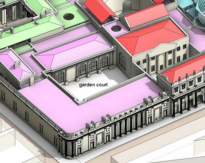
I spent a small amount of time developing the facades of the garden court and the entrance court, which by now were looking a little blank. Soane did some work in these areas, but their character still owes a great deal to Sampson and Taylor, so I didn't want to linger two long.

I decided that the sash window families I had developed for the two N.W. courts could be adapted for use in the N.E. extension, which is also inward looking. Here the two courtyards are really one space, but partially divided by a row of columns and a change of levels.
Soane's first schemes for this extension show a narrow strip of residential accommodation along Lothbury (R), an awkward 5-sided lump subdivided into Banking Halls (B) and an even more awkward passage to bring in the bullion deliveries. He had to move the passage so that he could connect the new banking halls to the existing ones that he had just rebuilt.

His solution to this geometrical puzzle was to move the Library (L1 to L2). Now he could create two nice rectangular areas. The smaller one (on top of the existing passage) would become the Consols Transfer Office. The larger one would become the two-part courtyard. As a bonus, he was able to move the Bullion Gate over to the centre of his new screen wall and strike a perpendicular axis straight into the centre of the Bullion Court. His final trick was to rebuild one wall of this Court as an arc with its centre point at the end of the new axis. You may want to applaud at this point.

In passing we can note the wedge of green property which was to be bought later on, and the section of Princes Street which would be closed off and incorporated into the bank.
The next picture is a section through the Residence Court, which I had to flesh out with windows, and the window family that I developed for the ground floor. I've roughly sketched in the smaller ones that will be needed for the upper levels. The Bullion Gate comes in a couple of metres below ground floor level and about a metre above the cellar floor. Hence the split levels between Lothbury Court and Residence Court, skillfully handled with a row of columns as mentioned before. These are residences for senior staff, by the way. Four storey houses were common for the upper middle class in London. Kitchens in the basement, living rooms on the ground, bedrooms above, and servants in the attic.

The Residence Court has a sharp corner, and as usual Soane negotiates this with a curve. As a result, one of the windows on the end wall overlaps into this curve and creates some rather odd Revit behaviour. The cut opening fails to break through the curved portion, fair enough, but when I made a section box view to look at this area more closely, the straight bit of wall flips into wireframe mode. This doesn't happen in other views, so I haven't let it distract me just yet.

The next image shows the residence court with the row of columns and the grand stairs at the level change. The curve at the sharp corner is opened up with two Corinthian columns, flanked by pilasters on the walls. Take a sharp right to enter the Secretary's House (small red arrow) Beyond the entrance passage, there are basically three rooms per floor and a stair at the back (st)

Just a quick shot of my working plan for the ground level. This has a large jpeg below it of a plan by C R Cockerell, who succeeded Soane as architect to the Bank. It's probably the best record we have of the state of the bank just after Soane retired. I have set walls to transparent pink so that it's easy to compare my work with that plan. You can never get things to line up 100% but I don't think I'm doing too badly.

Eventually the Residence Court is shaping up quite well. Still a couple of windows missing on the curve (marked with a cross) I think I will try replacing the opening cut with a void to see if that will penetrate the curve. Also there is a parapet with stone balusters to work out, but first I wanted to tackle the Porter's Lodge.

Not too much to say about this. Like the Printer's Court, it's deliberately downplayed architecturally. Round headed recesses and shallow pilasters with very simple mouldings, top and bottom. Plus a very simple shallow pediment. Interesting to compare the external and internal facades of this small rectangular block. Grandiose and formal versus plain and somewhat domestic. Once more I have left some of the openings as plain voids, just to keep things moving in the time available.

Another of my working views shows greyed out walls, and pads in thick dark red. The ground slopes diagonally across the whole of the bank, with Tivoli Corner as the low point. The cellars cut into this natural level to different degrees and some of the courtyards may even lift it up a little. I have to figure this out as I go, so I will have multiple pads, some touching each other and sometimes irregular in shape. As you probably know, pads are very sensitive to even the tiniest overlap, so it's useful to have a view where you can see them clearly.

Here's a shot from Lothbury Court towards Residence Court. At some point I realised that the stairs going down to cellar level were not central, amazing how you can miss things in a photograph that you have looked at dozens of times. Then once you've seen it you wonder how.

I had actually done a study of the Consols Library in December, in a separate file. Never quite got it to the stage where I could load it into the main file, or do a post around it. So I went back to this, loaded it up and did some minor adjustments

This is basically like an archive, rows and rows of files on four levels. Soane basically copied the existing building in a new location. It's very repetitive: rows of arches and groin vaults with a light well slot going down the middle. Basically 4 slices of cellar stacked on top of each other.

Once more you can see the working views: transparency applied to model elements, jpeg scaled up to life size.

Section through the library showing how it buts up to the screen wall. On the left-hand side you can see the Consols Transfer Office which is separated from the library by a small triangular court.

I'll finish off with a sliced off 3d of the whole area. You can see three banking halls in the bottom right. 1 = Stock Office, 2 = Old Shutting Room, 3 = Consols Transfer Office. I've framed the two rounded corners that Soane used to mask the different angles of the Screen Wall. Remember this section of wall was to be the model for the entire enclosing structure that he was only to complete in his late 70s. And notice how the curved corner at the top right has become swallowed up by the works of the N.W. extension. Letter R represents the Residence Court and the arrows down the middle show the Bullion route.

Actually, that's not quite the end. I want to show you this plan view with an applied colour scheme. Pale Pink is for Banking Halls, Pale Blue is the Court Suite, Grey is Back of House/Offices/etc. Yellow highlights circulation space. Note the way that the Rotunda organises the South-East banking halls while skillfully linking the entrance court to the side entrance of Bartholomew Way. Also note the Long Passage that Soane created to link a discreet but Grand "back door" to the Court Suite. And in orange we have the primary reason for this plan: to mark the position of staircases, points of vertical circulation. These are restricted to the north and west for a simple reason. The south and east is dominated by single storey Banking Halls.

And the very last image is an update of the birds-eye view that I created long ago to give an overview of the bank, expressed as 5 zones. You can see that I've started to place simple markers to represent chimney stacks from the many fireplaces and solid fuel stoves. Once again I am struck by the way this building has become an old friend, a familiar story book, packed with nuance and intrigue.