We're going to walk around the edges of the Bank towards the North & the West: a series of narrow triangular spaces just behind the screen wall that need to be tidied up, elevated, re-assessed.
We looked at the Reduced Annuities (upper and lower) in the last post but one. I'm not happy with the narrow passage between the battlements and the Reduced Annuities Upper. Was it really like that? Could it be made wider by supporting the upper wall on the joist ends below? Flitch beams perhaps to support the load of masonry offset from the wall below? If the walkway was blocked here, how did the guards get around to the battlements along Threadneedle Street? Hmmm. Note the parapet and stair behind the barracks that I am trying to keep apart. Lots of questions, but we are definitely moving forward. Oh yes, those windows in the tower above the Rustic Lobby, groups of three in each side, but I guess the ones facing back into the upper storey were blind recesses. Something else to get around to.

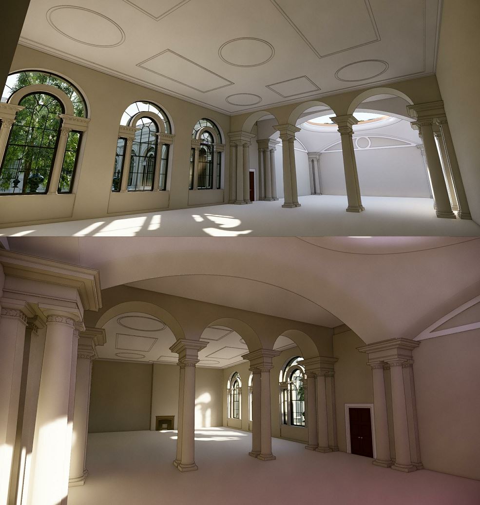
Moving North again to the Doric Vestibule, what I like to think of as the VIP entrance. Off to the sides there were two semi-circular stairs. What were these for? The levels are difficult to reconcile again. There are small adjacent rooms to access, and the upper floor of the Printing Court, but what about the screen wall battlements? I'm starting to think that the two stairs have different functions: one is connecting to the Printing Court, the other takes you up to a flat roof and from there to the wall. More work is needed to figure that one out, or at least to arrive at a plausible solution.

Once again I am trying to resolve alignments, anomalies, overlaps etc as it becomes clearer how the spaces fit together. We may never really know exactly what was built, but my goal is to make it believable, and to be consistent with work Soane did elsewhere. Sometimes it's just a matter of splitting walls in different places or making slight setbacks to resolve 3-way junctions in a cleaner manner. Ultimately I want to be able to tell an interesting story about the history of the Bank and its architects. That's not going to be possible as long as the model remains awkward and incomplete as soon as you stray away from the major spaces that are well documented.

The walkway around the top of the screen wall has been modelled with parapet walls on both sides. That is correct in some cases, and I based it on drawings from the archive. But other drawings show it as open to the inside. In fact it seems to be a stone slab cantilevered out over those narrow internal yards. I know they didn't have health & safety regulations in those days, but this seems unduly reckless. My guest is that there was a basic iron railing, which is not showing up on those sketches. That's the interpretation I'm going for anyway, adding railings and supporting the cantilever with a bit of corbelling below.

When we get to Tivoli Corner I have decided to create a flat terrace behind the "attic sentry box" I think that's the only solution that makes any sense. The area is too small and oddly shaped to accommodate a small piece of pitched roof. There are a number of small rooms in the space below that need to be looked at, but for the moment I am cleaning up the exterior. Let's move on.

So next we come up to the Soldier's Gate and the yard behind which gave access to Soane's New Barracks Block. Based on my current levels we need a few steps down from the street into the yard, so that's what I'm showing. No corroborating evidence for these but the alternative would be to drop Lothbury down much lower. Maybe I will take a look at that possibility later on, but for the moment we are having steps down into the yard.

The elevation of the new Barracks was a mess. All I have to go on here is the floor plan but I think the solution shown below is a big improvement. So once again I am taking an educated guess and moving on. Maybe some additional evidence will catch my eye. now I know what I'm looking for.

So on we go, heading East down Lothbury we come to another triangle. This is where Princes Street used to terminate before the NW (green) Extension was built. That's the reason for the curved corner. That was the outer edge of the screen wall when Soane first enclosed the properties that were acquired for his NE (orange) Extension. I think that portion probably remained blank after it was incorporated into the site. But the Printing works was new, and needed to get light and air from both sides. It's quite scary when you look inside parts of the model that have lain neglected for a year or more.

The central decorative feature of the Lothbury screen wall clearly backs into an attic bedroom in the residence court. but has been modelled as if it was open to the world on all four sides. Then there are walls that stop half way up an upper room. I also spent some time adding placeholder fireplaces to these spaces and converting rectangular openings into "real" doors.
At the far end of Lothbury we come to the Consols Library, a structure that was rebuilt as a copy of Taylor's original: four storeys of brick vaulted storage around a central light shaft. This is a linked file, built originally as a study one weekend. One corner was sticking out int the apse at the end of Lothbury Court and another overlapped with Russell's C.T.O (Consols Transfer Office) which is also a link.

I've learnt a lot since Russell built this. Photos and survey drawings show that some of the drawings he used were early design schemes, so there are some small adjustments to be made. I made a start on this, modifying the niches for example. For the moment I'm just doing what is needed to clean things up at the junctions with the main model. Will come back later to give this space a more thorough review.

The toothed stonework shown on some of the window surrounds was taken from site progress sketches. Photos show that the final treatment was much simpler. Once again there are triangular light courts to elevate and stairs to resolve. Lots of residual spaces to review. You see a semi-circular lobby in plan and place the wall, then a couple of years later think about the ceiling above. Perhaps it should be hemispherical. What about a lantern? Not sure about that though. Half a lantern? Would he do that?

Russell had a lunette at the West End of the CTO. I think that's based on a Soane archive sketch, but photos show a wide window with a segmental head and 5 divisions. Now that we can see everything in context it becomes clear that a staircase clips the lunette. I guess there's a reason for everything.
That staircase is giving access to Sampson's rear courtyard block which had three floor above ground (plus cellars) This is at the corner where the original Bullion Passage came in from the East. It's fascinating to know my way around this jigsaw puzzle of a building so well, considering it was demolished almost a century ago, and that the passage I just mentioned was moved more than a century before that. I really do feel that this is an immensely powerful way of studying the past, ( i.e. getting inside the spirit of a period by way of a BIM authoring package) and something that more people should be doing.

The last post featured hand sketches attempting to analyse Soane's design development process in framing the façade around the Bullion Passage. Future posts will deal with the passage itself and with further development of Residence Court. After that, who knows?
We looked at the Reduced Annuities (upper and lower) in the last post but one. I'm not happy with the narrow passage between the battlements and the Reduced Annuities Upper. Was it really like that? Could it be made wider by supporting the upper wall on the joist ends below? Flitch beams perhaps to support the load of masonry offset from the wall below? If the walkway was blocked here, how did the guards get around to the battlements along Threadneedle Street? Hmmm. Note the parapet and stair behind the barracks that I am trying to keep apart. Lots of questions, but we are definitely moving forward. Oh yes, those windows in the tower above the Rustic Lobby, groups of three in each side, but I guess the ones facing back into the upper storey were blind recesses. Something else to get around to.

Moving North again to the Doric Vestibule, what I like to think of as the VIP entrance. Off to the sides there were two semi-circular stairs. What were these for? The levels are difficult to reconcile again. There are small adjacent rooms to access, and the upper floor of the Printing Court, but what about the screen wall battlements? I'm starting to think that the two stairs have different functions: one is connecting to the Printing Court, the other takes you up to a flat roof and from there to the wall. More work is needed to figure that one out, or at least to arrive at a plausible solution.

Once again I am trying to resolve alignments, anomalies, overlaps etc as it becomes clearer how the spaces fit together. We may never really know exactly what was built, but my goal is to make it believable, and to be consistent with work Soane did elsewhere. Sometimes it's just a matter of splitting walls in different places or making slight setbacks to resolve 3-way junctions in a cleaner manner. Ultimately I want to be able to tell an interesting story about the history of the Bank and its architects. That's not going to be possible as long as the model remains awkward and incomplete as soon as you stray away from the major spaces that are well documented.

The walkway around the top of the screen wall has been modelled with parapet walls on both sides. That is correct in some cases, and I based it on drawings from the archive. But other drawings show it as open to the inside. In fact it seems to be a stone slab cantilevered out over those narrow internal yards. I know they didn't have health & safety regulations in those days, but this seems unduly reckless. My guest is that there was a basic iron railing, which is not showing up on those sketches. That's the interpretation I'm going for anyway, adding railings and supporting the cantilever with a bit of corbelling below.

When we get to Tivoli Corner I have decided to create a flat terrace behind the "attic sentry box" I think that's the only solution that makes any sense. The area is too small and oddly shaped to accommodate a small piece of pitched roof. There are a number of small rooms in the space below that need to be looked at, but for the moment I am cleaning up the exterior. Let's move on.

So next we come up to the Soldier's Gate and the yard behind which gave access to Soane's New Barracks Block. Based on my current levels we need a few steps down from the street into the yard, so that's what I'm showing. No corroborating evidence for these but the alternative would be to drop Lothbury down much lower. Maybe I will take a look at that possibility later on, but for the moment we are having steps down into the yard.

The elevation of the new Barracks was a mess. All I have to go on here is the floor plan but I think the solution shown below is a big improvement. So once again I am taking an educated guess and moving on. Maybe some additional evidence will catch my eye. now I know what I'm looking for.

So on we go, heading East down Lothbury we come to another triangle. This is where Princes Street used to terminate before the NW (green) Extension was built. That's the reason for the curved corner. That was the outer edge of the screen wall when Soane first enclosed the properties that were acquired for his NE (orange) Extension. I think that portion probably remained blank after it was incorporated into the site. But the Printing works was new, and needed to get light and air from both sides. It's quite scary when you look inside parts of the model that have lain neglected for a year or more.

The central decorative feature of the Lothbury screen wall clearly backs into an attic bedroom in the residence court. but has been modelled as if it was open to the world on all four sides. Then there are walls that stop half way up an upper room. I also spent some time adding placeholder fireplaces to these spaces and converting rectangular openings into "real" doors.
At the far end of Lothbury we come to the Consols Library, a structure that was rebuilt as a copy of Taylor's original: four storeys of brick vaulted storage around a central light shaft. This is a linked file, built originally as a study one weekend. One corner was sticking out int the apse at the end of Lothbury Court and another overlapped with Russell's C.T.O (Consols Transfer Office) which is also a link.

I've learnt a lot since Russell built this. Photos and survey drawings show that some of the drawings he used were early design schemes, so there are some small adjustments to be made. I made a start on this, modifying the niches for example. For the moment I'm just doing what is needed to clean things up at the junctions with the main model. Will come back later to give this space a more thorough review.

The toothed stonework shown on some of the window surrounds was taken from site progress sketches. Photos show that the final treatment was much simpler. Once again there are triangular light courts to elevate and stairs to resolve. Lots of residual spaces to review. You see a semi-circular lobby in plan and place the wall, then a couple of years later think about the ceiling above. Perhaps it should be hemispherical. What about a lantern? Not sure about that though. Half a lantern? Would he do that?

Russell had a lunette at the West End of the CTO. I think that's based on a Soane archive sketch, but photos show a wide window with a segmental head and 5 divisions. Now that we can see everything in context it becomes clear that a staircase clips the lunette. I guess there's a reason for everything.
That staircase is giving access to Sampson's rear courtyard block which had three floor above ground (plus cellars) This is at the corner where the original Bullion Passage came in from the East. It's fascinating to know my way around this jigsaw puzzle of a building so well, considering it was demolished almost a century ago, and that the passage I just mentioned was moved more than a century before that. I really do feel that this is an immensely powerful way of studying the past, ( i.e. getting inside the spirit of a period by way of a BIM authoring package) and something that more people should be doing.

The last post featured hand sketches attempting to analyse Soane's design development process in framing the façade around the Bullion Passage. Future posts will deal with the passage itself and with further development of Residence Court. After that, who knows?