Showing posts with label Visualisation. Show all posts

Saturday, September 23, 2017

OLD PROJECTS : NEW LOOK

It's always interesting to turn the clock back half a dozen years.  How crap were my Revit skills in 2008?  I was quite proud of myself of course, but it's revealing to open a file that's been lying dormant since then.  One such project is the William Morris's house in Bexley Heath ... the famous Red House designed by Phillip Web.


I didn't get very far with it really, just the bare outlines of the shell, and I haven't taken it much further this weekend.  The idea was to open a bunch of old files in Enscape and see how quickly I could generate some interesting images.  It's a continuation of what I started last weekend.  Part of the motivation is to try out some of the planting families I have been working up for my presentation in Arhus.  Put them through their paces.


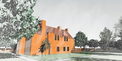
So I just threw a whole bunch of trees on the site, made a couple of small tweaks to the roof and fired up Enscape3d.  This gives you a pretty decent render quality in a live window, with some useful settings sliders to help you find a suitable ambience for the image in question.  Then you can take screenshopts, or export panoramas if you like.  In practice I can generate useable images in less that a quarter of a time it would have taken using Revit's internal render engine.


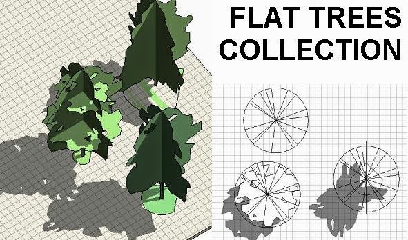
In this case I'm not using RPC trees so Enscape is not substituting them with its own 3 dimenionsal versions.  Instead I have families that incorporate 3d CAD mesh geometry, picked up here and there on my travels.  These come out surprisingly well in Enscape and as a bonus I can export black and white images with sketchy outlines to merge with shaded views to create images that match the Enscape renders.  That wouldn't really work with RPC content.


These families have some other tricks up their sleeves with I will explain in my session and post here soon after.  Embedded plan symbols, instance scaling etc.  I was quite impressed by the shadows that some of them cast.  I'm not trying to do away with RPC trees.  I think they are great (That's why I took the time to make my own customised versions).  But it's also good to have other options up your sleeve.


Another project that's been lying dormant for many years is the Tunendhat house by Mies van der Rohe, featuring his famous "cross-section" columns.  I guess this is one of the very first houses to feature a wall of glass occupying the entire length of an open-plan living space.  Actually this one was motorised and retracted into the basement when the weather was suitable.  The house was built on a steep slope, so the view would have been quite spectacular.  Still is I imagine.  I really must find the time to push these two research projects further.  What an incredibly contrast in design approach.


In 2013 I attempted something rather ambitious for the RTC in Auckland.  I took 3 memorable 20th century office developments, modelled them in Revit and used those the models to present a comparative analysis, attempting to set each within its social and political context.  I had a mixed response, ranging from intense enthusiasm to total bewilderment.  It was an immensely rewarding project for my personally on so many levels.  One of the buildings was Lever House in New York.  This model was developed in some detail, but I haven't done much with it since 2013.  Comes out nicely in Enscape though.  I've done a bit of post-processing here, just for fun


I showed some images of Casa del Fascio, not long ago.  So I won't show that again here.  But the third office was the Gherkin, which I did develop further for a while, trying to turn it into a tutorial for architecture students who wanted to build the model for themselves.  That was also lots of fun, but after three lengthy posts I ran out of steam.  The model as it stands is a bit like a semi-peeled onion, revealing the underlying structure.  My intention, in all this work is educational: to use BIM as a tool for understanding our built history.  So it's not always necessary to create a complete replica of the original.  It's all about the thought processes that kick in while you are modelling.   Learning by doing.

Tuesday, September 19, 2017

ENSCAPE MEETS RONCHAMP

In finalising my preparations for the BiLT Europe conference coming up in Denmark shortly, I opened up some of my old projects with Enscape3d active and saved a few screenshots.  It's amazing what you can do in just half an hour with almost no editing at all, just selecting viewpoints and sliding the shadow angle around to different times of day.


There are other controls of course and I made some use of the white mode and the black outlines slider.  Depth of field has some potential but I couldn't get it to do anything particularly interesting in this case.

The model is le Corbusier's famous chapel at the top of a hill of course.  The roof is a hollow ferro-cement shell, inspired by aircraft wing construction techniques.  There are blog posts from several years ago that go into these issues in a bit more depth, but I have never really got around to taking this work to a reasonable conclusion. 


I do have a plan to follow up my Project Soane website with something more general which features analysis of a wide variety of buildings in the context of the societies that gave birth to them.  It will be called "The Way We Build" and it's a project that's been at the back of my mind for at least 20 years.  I thought it was going to be a book, but that never happened.  A website is easier to start up in a small way and gradually enhance so let's hope I can find the time and energy to do it well.
I am open to collaboration of course.  It would be wonderful if students of building /architecture /history, the old and the young, could work together to create an open resource of models and analytical diagrams, available over the internet. 


I think this is one of the great missed opportunities of BIM: using the technology for education and research.  There are lots of courses ABOUT BIM, but far too little use of BIM to actually DO education and research.  Why aren't students and teachers of architecture bowled over by the incredible power of the BIM pencil to reveal how buildings work?

By the way, that last image shows the village church at the bottom of the hill in relation to the chapel of "Our Lady up top" Not the kind of image you normally expect to get from Revit (sadly) but as an architect, and a student of the history of buildings I do like to use my favourite "drawing tool" to convey these kinds of relationship.  Ultimately it becomes boring to talk about technique all the time instead of just using BIM software as if it was a pencil, in a natural, uncomplicated way to explore and express ideas.


So this is just a tribute to Enscape3d, and another thankyou to the guys for letting me use it for educational purposes, plus a bit of a teaser for what I am planning to do, moving forward.  I have modelled lots of interesting buildings over the past few years: Robey House, bits and pieces of Gaudi, Casa del Fascio, the Gherkin, Lever House, Newari houses of Kathmandu, Temple of Poseidon, Pantheon, Borromini, Soane of course, Hawksmoor churches, Palladio (the last 2 as urban design studies)  I will try to generate some more Enscape images from these models and share them here.

Maybe you will get inspired to join my mission.

Monday, May 16, 2016

RENDERED SPEECHLESS

John Soane was a collector.  His Dulwich Picture Gallery is arguably the first such institution aimed at the general public.  He built a museum around himself collecting everything from the contemporary social commentary of Hogarth to an Egyptian sarcophagus.  He was part of a group that pioneered the idea of freeze-drying history, preserving, dissecting, framing and mounting.  It seems a commonplace to us.  We now capture and share the most banal personal moments and embalm them in digital databases.


What is a rendered image?  The Building Information Models that I spend much of my time constructing and navigating are living, breathing things: tools for thinking with, records of human interaction.  A screenshot from Revit captures the transient nature of this process, hints at the blundering activity that we call design.  But clients now demand photo-realistic rendering at every stage of a project. 

In a way these are much more dynamic and emotive than the crude axonometric world that we inhabit while we work.  But on another level, they are stiff and frozen, products of many man-hours spent arranging a single, carefully composed view.  They are stage-managed and window-dressed, but deliberately contrived to look like casual snapshots of the real world. 

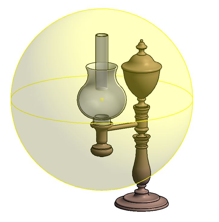
This week I decided to model a strange little item from the Bank Stock Office.  I based my work on a fake.  It's a very nice fake, but it's an electric lamp that imitates an oil lamp, and it lives in a museum that pretends to be a banking hall.  This room inhabits the same physical space as the Bank Stock Office (almost, it's been raised 3 steps higher) but it's a reconstruction.  Don't get me wrong.  It's a wonderful place, and I'm glad it's there, but we need to be aware of the distortions that occur when we fossilise things.


This screenshot from Family Editor shows a picture that I took of the fake lamp, with a series of revolves in wireframe mode over the top.  Then there's a light source (not a real one, a digital fake)  That's a front elevation, as you can tell from the reference planes.  A 3d view shows the 4 revolves more clearly.


I'm guessing that the urn-like shape is a reservoir for oil (whale oil?) with a lid for topping it up.  Gravity feed seems like a good idea, but how do you stop the oil from just draining away?  In a way it reminds me of a chess piece, the Red Queen perhaps, holding a lamp in her outstretched arm.  I suppose there is some merit in not having the flame directly above the reservoir as is the case with many lamps. 


You see what's going on here.  On one hand I'm concerned with creating an image: playing with the material parameters, adjusting the lighting effects.  Cranking up the lumens of the artificial light source so that it becomes visible in the render, giving the glass a self-luminance value so that it looks opal, like the one in the museum.  But in the back of my mind I keep wondering how it works, what the historical significance is, why I am actually doing all this.


There is a tension between the "fake-ness" of the whole museum-collector thing, and the hunger for knowledge that motivates it.

How was the lamp made, I wonder.  Soane was working at the dawn of the industrial age.  Mass production was about to obliterate the traditional craft processes that generated elegant forms.  The generation after Soane would agonise about this (William Morris etc)  Clearly these shapes are inspired by the wood-turning lathe, and more distantly the potter's wheel. 


Ironically, the current fakes may actually be made this way.  I never touched them to check whether they are metal.  But as I started to render the images it became clear that the delicate, gilded lines that catch the highlights so well are very important. 


And I couldn't help but wonder whether there is any evidence for this in the originals.  Is this just more inspired fakery perhaps.  (like my decision to place a ceiling with a hole in it above the lamp in my pretend world, so as to create an atmospheric effect around the highlights the glitter)


Should I model the little levers and knobs that allow the lamp to function ?  They are there on the current replicas (let's stop calling them fakes)  but probably don't actually do anything.  Why would they, on an electric light fitting?


Actually this is an Argand lamp, invented by a Swiss contemporary of Soane who came to England, met up with Boulton & Watt of steam engine fame, and had them manufactured in Birmingham.  This was cutting edge technology, and Soane was lapping it up.  There is a slightly different one, still sitting in the study of his museum/house.  You can see the little wheel for adjusting the wick.


Argand's insight was to make a cylindrical wick and have air pass through it from below, drawn up by the chimney effect caused be a glass cylinder above.  The result was a much brighter flame, more efficient burning of the oil.  I found a diagram of the gravity feed mechanism, but I still don't fully understand it.  Something to do with atmospheric pressure and vacuums I suppose.


I'm struggling hard to imagine the world that Soane inhabited: fascinated by ancient history, in thrall to classicism, but studying it all through the lens of scientific enquiry, analysing and measuring.  And all around him things are changing.  Suddenly you can work at night in a much clearer light: drawing, writing letters, studying your specimens while outside the London fog swirls around the lamplighters busy adjusting the new fangled street lights paid for by the joint contributions of all the property owners of Lincolns Inn Fields.


So I added more golden rings, tweaked the luminance, fiddled with the background, placed a second lamp and adjusted the composition of my image.  Chiairoscuro, shades of Rembrandt perhaps, allusions and illusions of the unconscious mind.


Or does a diagrammatic approach better represent my thinking processes here?  Hand-drawn notes and arrows, more cubist collage than baroque theatrics ...  But spare a thought for the whales, whose numbers were decimated by Argand's creativity and Soane's enthusiasm for new technologies to illuminate his workaholic evening labours.


On the other hand perhaps their several species may well outlast the sole surviving hominid (sole, if you choose to discount our close cousins Pan Troglodytes and Pan Paniscus)


Sunday, May 11, 2014

VISUAL WORKAROUNDS

A couple of workarounds that came up by accident in the office recently.

I was doing some renders at short notice.  It's a sizeable villa in a big garden with lots of trees.  One of my standard tricks for making renders pop out is to combine a render with a shaded view.  Because of all the trees I decided to use "realistic" instead of "shaded". 
It had never struck me before, but it seems that trees in a realistic view don't cast shadows. 


One of the keys to good presentation images is composition.  It helps a bit if you have some experience of painting landscapes.  Think about how the shadows fall, the balance of the composition, framing the view.  Screw your eyes up and see the pattern of light and dark.  In a painting you can cheat a bit with the shadows.  With a rendering you need an object in order to cast a shadow.


Shadows can help to liven up a boring foreground and enhance the framing of a view.  The actual trees in the view were not giving me the shadows I wanted so I decided to put a big tree behind the camera so it would cast an angled shadow across the foreground.  Using an OOTB RPC tree this worked for the renders, but not for realistic mode.  In the final combined image the shadows were too pale.


Planting families have an option in the "Other" properties.  You can base the render appearance of "Third Party" or on "Family Geometry".  With an RPC tree, "Third Pary" means the RPC image.  By switching to "Family Geometry" and modelling some geometry in the family you can create a family that casts shadows in realistic mode. 


I decided to simply mimic one of the RPC objects that shows up in shaded views.  If you want this geometry to scale up and down with the height of the tree, it needs to be double nested.  In other words, open up the family called "Deciduous Base" and put your extrusions in there.  Of course the RPC object doesn't exist in this nested family, so you can't trace over it.  I made my extrusions in the RPC family and copy-pasted them into the Deciduous Base.  It turns out that the ref planes in an RPC family don't have names, so if you want to draw in an elevation view, you need to name the ref planes first so you can set the workplane of the view.


Ultimately I elaborated on the default form so as to create a more interesting shadow.  It might be useful to have a small collection of these families.  Apart from their use in creating fake shadows,


The other thing about realistic view is that some materials just come out too dark.  Chrome for example interprets as almost black.  If you want to do the trick of combining 2 types of image ... the black is a pain.  I discovered a way around this by accident. One of my stone materials was not showing up properly in Realistic mode. I was getting a flat colour instead of the bitmap texture.
After a while I realised that it was because surface pattern was set to a solid colour.  I had never noticed this behaviour before, not sure if it is a deliberate feature, but it came in useful.  It provides an easy way to overcome the dark appearance of shiny metals in realistic mode. 


It can also help with glass.  You might want realistic mode elevations that show glass as a shade of blue-gray, but in the renders you might want relatively clear and transparent glass.  The surface pattern trick will sort this one for you also.


While I'm sharing visual trickery I might as well mention this courtyard view.  It's set to realistic but the ambient light has been cranked right up so all the walls and furniture etc get burnt out and the presence of greenery in the heart of the house is emphasised.  To get the effect I wanted, I also had to make tweak the surface transparency of the window glass.  Sadly you can't do this in visibility graphics using the glass subcategory.  Those subtleties are not available for sub-categories, it's all greyed out.


I tend to feel that the Factory has over-emphasised photorealism at the expense of more stylised & artisitc modes of visualisation.  But there are workarounds if you are prepared to make the effort. 
I already mentioned combining different types of image.  You can take this further by using masks to control the transparency of different layers.

By the way I find it a bit annoying that transparent objects don't cast shadows.  I have a "Default Planting" material which is set to grey-green with 50% transparency.  This looks much better than the opaque battleship grey that you get out of the box.  Would be nice if they cast  a 50% shadow though.


Just to finish off, I should mention that I gave Lumion a run around the block on this project.  In the end we didn't use any of the images, but there is no doubt that it has a lot going for it, especially the way that it handles landscape objects.


Thursday, October 17, 2013

PUMPKIN TIME AGAIN

This is the first post of my 2013 Parametric Pumpkins Series (PPS)

So let's start in the middle, where else ?

Which is to say, I've been working on this for a while, but let me show you something I did on Tuesday.  It's based on a print by Maurits Cornelis Escher and it touches on a number of themes that overlap with my previous pumpkin explorations.


Reality & Illusion, Infinity, Biomimicry ... Escher was an artist craftsman.  Where does techique end and imagination begin?  Why is the intersection between 2 dimensional images & 3 dimensional reality so fascinating ?  Last year I took the renaissance painter Archimboldo as my point of departure.  This yeare it will be 20th Century Escher.  Both dealt with ambiguity in a big way.  Both used plants & animals, mimicry, metamorphosis.  Let's start with the fish.


My 2011 entry featured pumpkins that morph into doric columns.  Then last year I broadened the field to all manner of fruit & vegetables.  In both cases almost everything was based on conceptual massing.  This year I am driftng into the animal kingdom, and I am making a deliberate effort to make more use of vanilla Revit modelling.


The eyeball is a nested component I had already made. (Part of the main thrust of my work, but more of that later)  It has been set up so that everything scales with the radius of the eyeball itself.  The origin is intended to be the centre of a skull.  The eye is attached to a reference line which will sweep it along an arc of variable radius using an angle parameter.  There is an iris and a pupil.


We've been using a lot of repeaters of late, but vanilla Revit has fantastic dynamic array tools.  Start off with a linear array. You can adjust the spacing and number of elements at any time. Pick one member of the array and "select all instances"  Now you have the whole array and you can array this in the other direction.  Use the same trick to select this 2 dimensional array and array again into the 3rd dimension.


Place a camera, look around, looking good, let's try a render, maybe a bit of post-processing.


But how do I get that "fading into the background" look. I tried the haze setting in the render dialogue.  You'd think that would make thing's fade more with distance.  Doesn't work for me.  Never seen the point of that setting actually.  Probably I should learn to use Max, but for now my simple workaround is to place some sheets of glass in the model.  Works pretty well.


While REVIT is busy rendering I'm doing a bit of free association on Notepad, thinking about the themes that will be interwoven into this year's exploration.


The images are blended from 3 jpegs, all saved to the same resolution.  The render, a hidden line with ambient shadows, and a realistic view.  The hidden line goes on top ... with the layer set to "overlay".  In between goes the realistic, set to "colour burn" and about 50% transparency.


Cook up a couple of custom materials, tweak the view a bit, not bad.


Maybe I should back up a bit.  How did I get here?  Let's rewind through the day.  The previous image (before I went fishing) was an assortment of Escher ideas thrown together.


We're gonna skip over the tesselation for now.  Also the various beasties scattered around.  (That's the main theme for this year actually)  But the diversion of the day was "Distorting Mirrors".


The mirror is a double-nested family.  All the geometry is in one family, which is nested into another just to rotate it through 90 degrees.  That's how you get the two versions in the image.  It's all vanilla again.  Just an extrusion and a sweep, but quite interesting.  Actually I didn't realise you could do sweeps as 3 dimensional as this in vanilla.  There should be some mileage in that later.


Also the control of the curves is quite neat.  The idea is to get an S curve with fixed width and variable curvature.  Just lock the ends of the arcs to ref-planes and the radius parameters will float around (ie the centre points will drift freely)  Started with a simple circle, then elaborated the profile.  Because of the non-planar path the mitred corners are a bit twisted, doesn't break though.


Before that I had been playing with convex lenses.  This is another Escher theme, but it doesn't quite work the way I hoped.  Actually I had to use mirrors.  Tried a solid glass lens, but didn't pan out.


There are several Escher pieces that use one large convex lens/mirror centre stage.  I got into the multiple copies because my single circle image was a bit boring.  You can see my beasties fairly clearly though, and what about that weird looking tower in the background?


That's quite a long story.  It dates back to my second spell at architecture school, as a 40 year old in Joburg.  I was examining the idea of an African style of architecture.  What did that mean in today's world ?  We all know that many people in many places resent the cultural domination of the west.  You know the syndrome, tin-pot dictators erecting bizarre, mis-scaled versions of vernacular motifs in the belief that they are upholding national pride.


It's easy to poke fun, but actually the problem of identity is a serious one in today's globalised world.  There is a viewpoint that architecture is like a mirror, reflecting the values of a society.  Looking around at most global cities today you would have to say that our values have become pretty confused, or maybe scrambled up and homogenized.  Hence the distorting mirror idea and the link back to Escher.

As an aside ... I took a shot of my chair.  People talk about a "home from home"  Well I'm an economic refugee living in the desert and my apartment is more like an "office from office"  Of late I've been making a big effort to go touch-screen.  I bought a surface earlier this year.  I liked it from day one, but as with anything new it takes a while to acquire fluency.  I'm starting to use One Note more and more.  Great little programme, and nicely adapted to touch.


I also have a touch-screen laptop now, and used Sketchbook Designer for the ANC HQ image. Good to get some value from the design suite.  I suspect that is also under-used.  Not sure why ?   Don't know why people are knocking Windows 8 either.  Yes it's a bit disorienting at first, but didn't take long to get hooked.  I can draw on the screen !  The same screen that I use for Revit.  I can flip to metro & swipe through my images full-screen.  I can re-render a scene, export to jpeg, drag it into Sketchbook, sketch over by hand ... but back to the ANC HQ.


Mass family (I want to place floors later so generic model adaptive won't do.  Place a point, work plane visible, set, place another point on top, set offset, parameterise, spline through points.


Host points on spline. Host mass profiles on points.  (I borrowed one of the profiles I made last year)  Just in case you hadn't noticed I'm making a multi-storey office tower inspired by an african round hut.  It needs to be irregular and organic.  Give it a bit of a twist, vary the curvature, vary the diameter.  Curtain System, Floors, Roof ... by face.


Notice the parallel to the Adolf Loos tower from my 2011 pumpkin posts ?  Chicago Tribune Competition in shape of a Doric column.  Actually that one kind of worked.  Irony, but not slapstick.  Maybe I could work up the ANC concept into a serious architectural proposal too ... not now though.  For now it's just an interesting detour on the way to infinite fishing space.


More to come.  Pumpkins 2013 ... let the (whatever) begin.