The first stage of Project Soane is "over"... but this was never primarily a competition to me. It was (and is) an opportunity to get involved in something interesting and important. First and foremost it is an ongoing learning experience and I find it very difficult to turn off the tap.

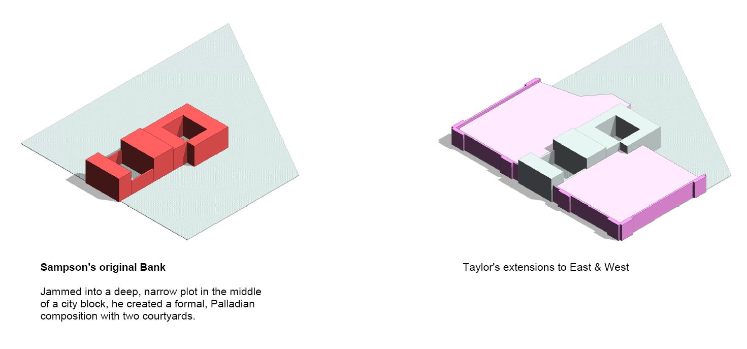
So in the absence of a fat lady screaming into my ear, I found myself doing "a bit more" last weekend. In the first place I was preparing for a talk that I gave this week at the Address in Downtown Dubai, but I couldn't stop myself thinking "wouldn't it be nice to give a bit more definition to the roofscape in the "pink and green" zones. This idea was given extra impetus by my discovery of an aerial view predating the demolition of "Soane's Bank". You can see that in my previous post.

The roofscape is far from complete, but the Level of Development is far more even across the site, and especially in the areas for which Soane was solely responsible. Looking at the updated "Zone Plan" above, you can see that I couldn't stop myself there either. I just had to add in some indicative context, loosely based on Soane's town planning schemes and also referring to an 18th Century map that I found on line. It's just a rough massing concept but I'm much happier seeing the "City within a City" surrounded by a jumble of streets and alleys.

In fact, we could invoke a Russian doll concept because the Bank is like a small medieval town with its battlements and watchtowers, set within that part of London we still refer to as "The City" which also used to have a perimeter wall with gates (Ludgate, Bishopsgate, the names live on) which also lives within a broader context (West End, East End, etc) And then, within the walls of the bank we have 5 inner worlds that were once populated by groups of people who spent their lives standing behind counters and managing ledgers. I'm referring to the 5 banking halls that Soane designed to a common theme.

For some time I have been contemplating the idea of extracting the 5 families I made to represent these spaces and placing them side-by-sde for comparative analysis. The classic work by Bannister Fletcher springs to mind. Surely a BIM version is long overdue.

And I just had to include some kind of emotional response to Soane's protracted effort to impose order upon the living, breathing organism that was The Bank. Your opinions may differ of course, but the point I'm making is that Project Soane was not so much an opportunity to show off our Revit skills as an invitation to immerse ourselves in the rich and diverse world that John Soane inhabited. Three months of deep diving have left my mind buzzing with ideas and questions, reactions and resonances.

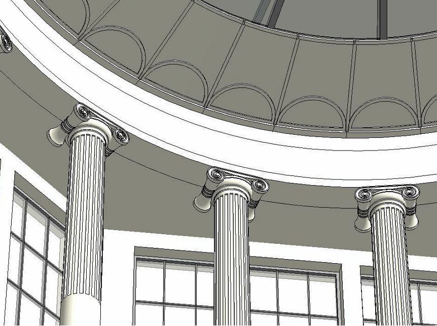
Check out the ceiling plans, the way he varied the treatment, playing with options, mixing and matching. Was he searching for the perfect solution, or just enjoying himself. exploring the art of the possible? Perhaps a bit of both.

My comparative plans need more work. The coloring is inconsistent and the counters are missing in some cases. More importantly I need to think more clearly about what message this diagram is trying to convey; what questions am I trying to pose?

I knocked up a quick table. These are just columns added in to the schedule. I didn't make the extra effort to set up shared parameters and get the information into the families themselves, another day perhaps. There are clear benefits to doing this kind of historical research using BIM tools, but perhaps we need to work harder on the data side. To be honest Project Soane has been mostly presented as a visualisation exercise and this will become even more pronounced as we move into the "rendering phase". I think this is a shame. Sofware skills are essential of course, but the real prize is contemplation of a rich historical period and a fascinating architectural personality.

BIM is a wonderful medium for encouraging deeper understanding of complex, multi-faceted situations. Let's embrace that and apply it to all aspects of the built environment, past and present.
In conclusions, I'm very proud of the image below. It represents the culmination of perhaps 200 hundred hours of concerted effort: an experience that I wouldn't have missed for anything. And it's the product of collaboration. There are contributions by others even in this tiny snapshot, both direct and indirect.

But when I look at that image I see things I want to improve, shortcomings and clumsiness, ideas for where next the journey might lead. Forget the fat lady. We may have reached a milestone, but Project Soane is far from over as far as I'm concerned.

So in the absence of a fat lady screaming into my ear, I found myself doing "a bit more" last weekend. In the first place I was preparing for a talk that I gave this week at the Address in Downtown Dubai, but I couldn't stop myself thinking "wouldn't it be nice to give a bit more definition to the roofscape in the "pink and green" zones. This idea was given extra impetus by my discovery of an aerial view predating the demolition of "Soane's Bank". You can see that in my previous post.

The roofscape is far from complete, but the Level of Development is far more even across the site, and especially in the areas for which Soane was solely responsible. Looking at the updated "Zone Plan" above, you can see that I couldn't stop myself there either. I just had to add in some indicative context, loosely based on Soane's town planning schemes and also referring to an 18th Century map that I found on line. It's just a rough massing concept but I'm much happier seeing the "City within a City" surrounded by a jumble of streets and alleys.

In fact, we could invoke a Russian doll concept because the Bank is like a small medieval town with its battlements and watchtowers, set within that part of London we still refer to as "The City" which also used to have a perimeter wall with gates (Ludgate, Bishopsgate, the names live on) which also lives within a broader context (West End, East End, etc) And then, within the walls of the bank we have 5 inner worlds that were once populated by groups of people who spent their lives standing behind counters and managing ledgers. I'm referring to the 5 banking halls that Soane designed to a common theme.
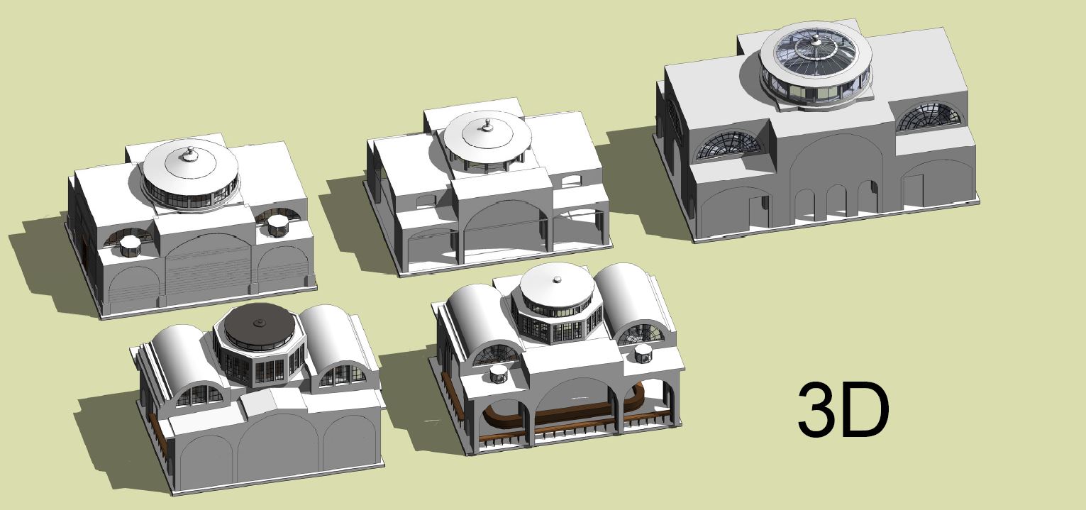
For some time I have been contemplating the idea of extracting the 5 families I made to represent these spaces and placing them side-by-sde for comparative analysis. The classic work by Bannister Fletcher springs to mind. Surely a BIM version is long overdue.

And I just had to include some kind of emotional response to Soane's protracted effort to impose order upon the living, breathing organism that was The Bank. Your opinions may differ of course, but the point I'm making is that Project Soane was not so much an opportunity to show off our Revit skills as an invitation to immerse ourselves in the rich and diverse world that John Soane inhabited. Three months of deep diving have left my mind buzzing with ideas and questions, reactions and resonances.

Check out the ceiling plans, the way he varied the treatment, playing with options, mixing and matching. Was he searching for the perfect solution, or just enjoying himself. exploring the art of the possible? Perhaps a bit of both.

My comparative plans need more work. The coloring is inconsistent and the counters are missing in some cases. More importantly I need to think more clearly about what message this diagram is trying to convey; what questions am I trying to pose?

I knocked up a quick table. These are just columns added in to the schedule. I didn't make the extra effort to set up shared parameters and get the information into the families themselves, another day perhaps. There are clear benefits to doing this kind of historical research using BIM tools, but perhaps we need to work harder on the data side. To be honest Project Soane has been mostly presented as a visualisation exercise and this will become even more pronounced as we move into the "rendering phase". I think this is a shame. Sofware skills are essential of course, but the real prize is contemplation of a rich historical period and a fascinating architectural personality.

BIM is a wonderful medium for encouraging deeper understanding of complex, multi-faceted situations. Let's embrace that and apply it to all aspects of the built environment, past and present.
In conclusions, I'm very proud of the image below. It represents the culmination of perhaps 200 hundred hours of concerted effort: an experience that I wouldn't have missed for anything. And it's the product of collaboration. There are contributions by others even in this tiny snapshot, both direct and indirect.

But when I look at that image I see things I want to improve, shortcomings and clumsiness, ideas for where next the journey might lead. Forget the fat lady. We may have reached a milestone, but Project Soane is far from over as far as I'm concerned.