Showing posts with label Plumbing. Show all posts

Thursday, January 16, 2020

GREY STORY 5: NEW FEATURES & TOILETS


Continuing with the story of my blog.  April 2012 and I had been doing some interesting work on a project in our office.  In those days I was trying very hard to convince the “designers” that Revit could produce compelling images. My go-to method involved combining shaded & rendered images with the same resolution in Photoshop, then using transparency, masking & filters to achieve “artistic” effects.  Part of the trick is to limit your processing time to 10 or 15 minutes so that the images are repeatable when the model changes.


I backed this campaign up with demonstrations of the power of a “single building model” to rapidly generate multiple view types which can be arranged on a sheet to explain a sub-assembly and progress detailed design work.  Problems can be solved more effectively because all the views update in sync as the design is refined.  


One of the images here shows a particularly thorny design puzzle involving headroom under a ramp and structural alignment/continuity.  The relatively new ability to assign transparency to elements proved helpful here.


https://grevity.blogspot.com/2012/04/snapshot-of-today.html


I have always seen my blog as slightly different from the “tips & tricks for Revit” style of blogging.  But from time to time I have posted about technical issues, and in this case I was commenting on the release of Revit 2013.  Interesting to read this again.  People were complaining about the lack of “game-changing” new features and I used an evolutionary analogy to argue that the small productivity improvements may be what allows BIM to survive in the face of considerable skepticism (8 years ago) and that if you don’t survive you can’t go on to deliver the game-changing new features which eat up a lot of development time and money.


Carl Bass was preaching the “Cloud, Mobile, Social” mantra in those days and those three elements have certainly grown in importance in my work here as it went through the Pumpkin era, Project Soane, and now Notre Dame.  Our work on Notre Dame would be inconceivable without BIM360 & Slack for example.  In 2012 I was hoping that Showcase would be the viewing engine that would allow Revit to undercut the Sketchup guys.


Could this finally be the viewer that works ?  I’ve tried Design Review & Navis Works Freedom,  Quicktime FBX plugin, Tekla Bimsight ... People are doing clever things with Game Engines, but I need a quick and easy way of bringing a lightweight export from the model into meetings.


Well that was a disaster, but in a way it pointed us towards Enscape3d which has been a resounding success, prompting Unreal & Unity to become serious contenders also.


https://grevity.blogspot.com/2012/04/broad-brush-fine-detail.html


So I got my hands on the new release and spent a couple of weekends trying out the new features. Of course the new stairs & railings are still a source of disappointment.  “why doesn’t everything just work the way you want it to?” people say.  If we were capable of perfection, I think I would start with world poverty, not Revit, but in truth I remain optimistic on both fronts.  


I went on an interesting detour into the interface and how it would be great to be able to “teleport” to relevant settings sometimes instead of aborting what you are doing to create a new arrow style or profile.  These thoughts eventually morphed into a whole presentation I did at RTC Washington in 2015 called “Sharpening the BIM pencil” starting with the little things that annoy me about the Revit interface and gradually broadening out to reflections on the wider BIM landscape.  I should do a couple of posts on that some time. (only 5 years too late)


https://grevity.blogspot.com/2012/04/playing-with-my-new-toys.html


The next post is fascinating.  I suddenly started to see the “Show Workplane” feature as something like the UCS was when I used CAD.  Does anybody use workplanes like that?  I dabbled for a weekend but it never caught on.  I do occasionally show the workplane, or set it to a surface, but it’s not become a regular part of my workflow.


https://grevity.blogspot.com/2012/04/catching-plane-to-work.html


And so we come to “parts”.  Once again I had high hopes, and I guess there are people who use parts all the time.  I think it would be interesting to do some studies on Notre Dame using parts to set up views where the construction layers peel back, as in this post here.  But the truth is that I very rarely use these techniques in practice.  Maybe I’m just lazy.


https://grevity.blogspot.com/2012/04/breaking-up-is-hard-to-do.html


There have been lots of toilet posts over the years.  There is much better content available for plumbing fittings now, but back in 2012 this was one of my pet peeves, and I have to say that my reaction was mostly to try to show how the problem could be tackled, rather than waste my time complaining.  I agree with Marcello Sgambelluri on this.  The factory has given us a foundation, it’s up to us to show what we can build on top of it.


https://grevity.blogspot.com/2012/04/my-weekend-on-toilet.html


And another post along the same theme.  I tried very hard to create acceptable urinal geometry using Revit and Autocad to generate solids.  These days I would probably find a mesh object on the manufacturer website and hide the edges in Max.  Quite possible one of the “content providers” will already have done this for me by now.  But back in 2012 it seemed like the best way forward was to try to build this stuff myself and to share my efforts on this blog.


https://grevity.blogspot.com/2012/04/more-punishment.html


A new feature crept into point world with Revit 2013.  What could I do with “divide & repeat”  Zach Kron hadn’t yet morphed into “Dynamo man” so he was giving us some of his funky posts about this new feature.  My mind was running in a slightly different direction.  I ended up with a series of objects that looked like a cross between a UFO and a Luigi Nervi sports stadium.  Playing with the new visual styles and subconsciously choosing the right colours I found myself in some kind of “Rupert Bear World” which brought back all kinds of childhood memories.


https://grevity.blogspot.com/2012/04/first-division.html


I’m quite amazed that I managed to create 9 posts during April 2012.  Normally I would manage between 3 & 5 per month.  Basically I have settled into the “long form conversation” type of blog-post, based on a couple of days doing stuff in Revit (mostly) then best part of a day compiling/formatting images and writing a story that links them all together.  


When I switched to a 4 day working week (at age 65) my intention was to increase the number of blog posts.  To some extent that has happened, but the intent has been undermined by my commitment to large, complex modeling exercises (Project Soane & Project Notre Dame).  I   made several attempts to create shorter, more focused posts, but the longer form seems to creep back.  I wonder what happened in April 2012 though.  Were there some long weekends in there?  Did I just have a backlog of unfinished posts?


Anyway, let’s finish this.  I wanted to create a shade structure.  These are commonly used for children’s play areas here in Dubai because the sun is really fierce.  We have used this family on real projects, a couple of times.  It’s a bit of a cheat because the surface is perfectly flat, it doesn’t sag.  Strangely enough, our brains are expecting to see the effects of gravity, so you don’t really notice the flatness from most viewpoints.  The curved edges are sufficient to fool the eye.  If I was making this again I would be able to introduce a “sag factor”.  But at the time, my “point world” skills were still somewhat tentative.  


Actually, I rarely use point world these days.  I don’t like the fact that you can’t make the families “work plane based”.  They won’t attach to a level and respond to an offset from that level which is such a basic feature in most everyday work.  The only way around this, as far as I know, is to use the Mass category, which leads to a different set of disadvantages. 


https://grevity.blogspot.com/2012/05/sailing-free.html


Sunday, October 1, 2017

PLANTING SEEDS IN DENMARK

I'm in Denmark, attending the BiLT conference.  (Revit, BIM, other related stuff)  I am leading one session, called "Planting Seeds".  It's about the Planting category in Revit and the seeds part implies that I am presenting exploratory work that will continue to grow and hopefully stimulate others to build on my ideas.  In the course of my preparations, I opened up some of my early Revit work.  I showed some of the blog-related stuff a couple of weeks ago.  This one is focused on my day job at GAJ Architects, Dubai.


The first version of Revit I ever had was 7.0 so I spend quite some time using the Accurender version of raytracing before Mental Ray was introduced with Revit 2009.  (We also got the swept blend, colour fills in Sections, sloping pads, shape editing floors ... heady days) Accurender had very interesting Planting objects.  They looked a bit wierd in shaded views, but they rendered as genuine 3d objects. If you look carfully at the palm trees in the image above you will see this.  We are looking up into the canopy of the nearby ones, but at a distance you get a side view.


They also had some interesting controls, like "Trim Height" which allowed you to have a tall canopy on a short trunk, or vice-versa.  My next image shows an early example of mixing rendered and shaded images using layers in Photoshop, blending and filtering the image to simulate more of a hand-drawn look.  This can be especially effective to convey the softness of landscape elements.  But of course the "partner in charge" wasn't always convinced that Revit could "do" client-friendly images, so at times we just printed out Revit views and had our pencil and paper guys trace over them. Don't knock it.  Apart from producing very effective images, some useful design ideas can emerge along the way.


For a while I experimented with "Impression" which was free software for processing CAD files.  You could take a hidden line camera view, export it to CAD and use impression to turn the lines into a pencil effect.  This was hard work compared to say Sketchup which gave you a similar effect live, at the click of a button.  But I gave it a go and lived in hope.


The introduction of Mental Ray was quite exciting.  This is one of my very early attempts to exploit its potential.  The way it represents building elements if much more convincing than Accurender.  The shadows are more subtle and realistic with light bouncing around from surface to surface.  But the trees have moved in the reverse direction.  They look flatter, less volumetric, which is probably why I downplayed them so much in these views.


Opening one of the files and viewing with Enscape3d, the planting families that I placed back in 2008 immediately convert into fully volumetric objects.  Some of the custom materials have got screwed up, but that's nothing to do with Enscape, just the fact that my laptop doesn't have the right images on the paths set up under Options/Rendering.  Now this image isn't quite as impressive as some of the others I've been showing, but I'm pretty sure that if I spent half a day gathering together and tweaking the various linked files that were created for this project, I could create a couple of dozen images that represent it far better than the ones we generated in 2008.


Villa Savoye is a project I built around the same time.  It was partly motivated by my own fascination with the history of architecture and building technology, but I also used it as the subject for several training sessions, most notably a brief attempt to teach basic Revit skills to the partners at GAJ.  The image here compares a "realistic" view to the same shot in Enscape (top)  This is informative.  The tree shapes are quite different, although they obviously represent the same species.  The effect in Enscape is much sparser. The trees don't fill out the background as they did in the original.  I think part of the problem may be that some of the families are just not getting picked up in Enscape.  Maybe I have some dodgy RPCs in there.


But generally speaking, the Enscape trees are impressive and fully 3d.  You can view them from above and they look great.  They cast realistic shadows even when the sun is coming from the side. (RPC trees are flat billboards, so shadows from the side are very thin.)  In a realistic view you don't actually get any shadows at all.  Again I am not trying to criticise RPC families.  They are incredibly useful, lightweight and versatile, plus you can do a lot with the free starter pack that comes with a Revit installation.


The final image is not mine, and it's not Revit.  It was produced by the same team at GAJ that did the hand drawn image earlier on, this time using Sketchup and Photoshop.  I was helping a guy working on the same project, but using Revit.  It was early concept design stage, and we really struggled to compete with the Sketchup team.  We were quite proud of the images we came up with, but the partners thought they were awful.  I'm sure many of you have had similar experiences.  Plugins like Enscape3d definitely go a long way towards closing that gap, especially if you have the versatility and imagination to do a bit of mix and match with blended and processed images. 

I will be sharing some of the families from my session at Aarhus in coming weeks, so stay tuned.

Saturday, February 25, 2017

DEHOSTING

Via Project Soane I have come into contact with a young gentleman called Karam Baki who began using Revit as a teenager. He is an architecture student, based in Jordan, and you can get a feel for the breadth and energy of his enthusiasms at this link.

Karam's Gallery


I was particularly impressed with his model of Gerrit Reitveld's Schroder House, a building that has fascinated me for about 50 years now. I did start to model it on 2011, but didn't get very far.


Karam appears to have captured it in the most exquisite detail. I would love to talk about this topic at length, but that will have to be another day.  Here is Karam's version


I did write a short piece about the house in 1991 as a History assignment when I was a "mature student" in Joburg, returning to Architecture after a 16 year detour through bricklaying and education. Here is my analysis of the site (hand drawn though I had started to use AutoCAD by then). Mrs Schroder was a young widow, living on the edges of middle class society, both literally and metaphorically. She an Reitveld collaborated to create a very unusual house for a single parent.  It turned it's back to the conventional world, looking out over open fields and catching the sun through open corners.


A second, hand-drawn diagram describes the planning: a dense, cellular ground floor, with an open-plan, flexible living space above.  As I remember, she rented out the guest room at the back to a lodger for extra income, which is why it is isolated from the rest of the house with its own entrance.


I couldn't resist including the concluding paragraph of my assignment here, which conveys the significance I attached to this project at that time when I was coming in from the wilderness to rejoin the profession, somewhat reluctantly after an extended period of teenage rebellion.


But back to Karam. He has developed a method for switching the hosting style of Revit families which is well worth a look. I first became aware of this via a post by Luke Johnson. It's based on a  hack that's been around for many years which allows you to create loadable families that belong to system categories.

What Revit Wants

You start by creating an in-place family. Let's say you choose to make it a ceiling. If you make a group within that family, that group will appear in the Project Browser (under Groups). Now you can save a group out to an external file, and normally this would be a project. This is the basis of the "binding" workflow that allows you to convert links to groups and vice versa.

But, if you save the group while in edit mode, it becomes an RFA file, with the same category as the in-place family from which it originated. Voila! A most ingenious trick with unknown and potentially dangerous consequences.
Karam has created 4 such families and nested them into a generic model template.


Now if you load a ceiling hosted family, it will attach itself to the ceiling object. Delete the other 3 system elements, adjust the origin and save. You now have an un-hosted version of your original hosted family. You can watch Karam's video for further clarification.

Kconvert Video

It's very useful if you want a window to lie in the plane of a sloping wall or roof, for example.  The down side is that you have to link through all the parameters (something that Karam does at lightning speed in his video) and of course you get an extra layer of nesting, plus the fact that this is an unsupported hack. 

Actually you get two extra layers of nesting if you want it to be face based.  The saved "Kconvert" with the wall-hosted object trapped inside will come in perpendicular to whatever face you place it on.  Haven't quite figured out the logic of this, but Karam recommends nesting this into a face-based template and adding a void extrusion to cut your hole.  More linking of parameters, and it will insert itself into almost anything.  Quite neat.


Give it a go and see what you think. It may come in handy if you have a number of families that you really don't want to remake from scratch.  Let's say they are wall-hosted windows that you want to convert to roof lights.

Just in passing, my own approach to flexible hosting is to make families as un-hosted elements in the first place, then nest these into whichever template you need. There are two solutions to the parameter linking chore. You can make your nested component a shared family, or you can develop a system of standardized parameters and fixed naming of nested elements.


This is the basis of my modular door families which I  presented as a lab in Porto and will also be sharing at BiLT Asia in Singapore.

Returning to Karam's method, I wondered if this would help me to unhost the Duravit families I reviewed recently. You might not want these to be wall hosted. Let's say you want to mount them on timber panels for example. Or maybe you want to nest them into a family that incorporates a concealed system, boxed out with a tile facing and a marble shelf.


Unfortunately the Duravit families have dozens of text parameters, which would be very laborious to link. My first thought was to make the nested component shared, but that resulted in some rather odd behaviour. The nested component becomes invisible when shared. I guess the logic is that it is actually a wall-hosted element, but you have made it's host invisible. If you disable the visibility of an element from within family editor, you are basically excluding it from the project. It won't schedule for example. If you delete a wall, you will also delete any hosted elements. So Revit is refusing to recognize a wall-hosted element that has no host.

Now both Luke and Karam mention another hack for switching hosting behaviour. This uses the Copy-Monitor feature, and was described by Dave Baldaccino way back in 2014

http://do-u-revit.blogspot.ae/2014/03/creating-non-hosted-families-from.html

This turned out to be a very simple way of converting my  Duravit content because I already have a collection file. Simply link this into a blank project and run copy-monitor in batch mode for the plumbing category only. This creates a new collection file where all the wall-hostel elements have become face-based.


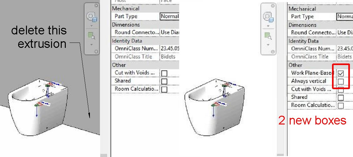
Now for the magic part. Dave mentioned in his post that if you delete the extrusion in a face-based family, it becomes a normal unhosted element. You can see this immediately in the properties dialogue which sprouts two new parameters. (tick boxes for workplane based and always vertical)


This set me off on a little adventure, cleaning up one row of my collection to make them "how I would have done it ". There are several steps.

 1. Delete the extrusion
 2.  Adjust the origin
 3. Standardise layer names
 4. Shorten family names


For the families that are already un-hosted I only needed steps 3 & 4. Similarly for the face based"vanity basins" which have a void in them to cut a hole into whatever surface they are placed on. I saw no reason to make a second version of these without the extrusion.

Just for fun, I took one of the unhosted families and nested it into a wall based template, making the nested element shared so that you get all the parameters. Seems to me that's how they should all be made. Then you can have wall hosted and free-standing versions in the same project that schedule correctly as being the same item. You could even make a third, floor hosted version if you really wanted. Perhaps you might need to place several of them on areas of raised flooring, split level bathrooms if you like.


Since I developed my modular door families I have started to see other applications for the same principles. Windows, obviously, but also classical columns where you might want to mix and match shafts and capitals, switch between different templates (architectural v structural, one level v two level) That's another post I think. Probably several. There will be another soon about classical columns, but also I think I should develop a modular approach to plumbing families.
Let's just set the scene with a little teaser.

Aaron Maller has weighed in with his firmly held belief that all symbolics are bad. Not sure if he extends this as far as door swings, that may be the one exception that puts his rule "to the test". (the original meaning of proves)

I agree with him that native geometry should be used for plans and elevations wherever possible. Don't spray masking regions and symbolic lines all over the place for no good reason. The geometry will always give you more predictable results. You won't see the front when it should be the back for example.

Using the geometry will work for relatively simple geometry and sharp edges. It won't look so good with smooth, rounded forms and complex curves. These are common shapes plumbing fixtures and soft furniture, resulting in lines of variable thickness that fade away to nothing in places. Your client on the other hand may be expecting crisp, even lineweights.


Another advantage of symbolics is the level of control you get for different scales. You can express a narrow groove as a single line at medium scale, and as two lines at fine. In the geometry, that groove is probably not a separate element. You can't control it's graphics independently for different scales. The whole thing is either on or off.

I doubt that I have convinced Aaron yet and I'm open to learning how to further reduce the need for symbolics, but here's  a diagram of my idea for modular plumbing families.


You separate out the geometry and the symbolics as two nested families. That way it's easy to switch off the symbolics if you prefer. For the geometry you can have different versions that you swap out depending on need and preference. Heavyweight v Lightweight, Mesh v Solid, CAD import v Native Revit, fixed v parametric.  The resultant plumbing family can stand on its own, or you could choose to nest it into a hosted template.  This hosting family would be a kind of ghost object, not counted in schedules.


I intend to develop this further in a future post. The idea is to make families more flexible, easy to change the hosting behaviour, easy to switch between lightweight and heavyweight versions, respond to individual preferences & project requirements.

So thankyou Karam, and all the other guys who contributed to this thought process which has progressed my understanding of hosted families considerably and occupied me productively, playing with Revit for a couple of days.  What joy!

I will sign off with a compilation of pictures from my only visit to Jordan, which was in 2011.  I really enjoyed the city of Amman, although my stay was far too brief.  It has a sense of history and culture that is harder to find here in Dubai.


Sunday, February 19, 2017

STANDARDISED IDEALS

This is an older, dormant post from last year. I am posting it now as a follow-on to last week's discussion of Duravit families.  It's about the largest sanitary ware group in the UK who have made a huge commitment to BIM. Brands include Ideal Standard, Armitage Shanks & Twyford.  This post is mostly about Ideal Standard.


There are three distributions available, one through the NBS, one through BIMobject and one through bimstore.  The differences are minor but interesting. All the objects cite the manufacturer as Author.  The NBS versions also carry an NBS Certification number.  The bimstore versions carry a "distributed by" label.

They are all sourced from the same geometry, most of which is not native Revit.  The exceptions are the accessories (eg flush button & seat)  I am guessing that the curved geometry was created using Inventor, but it could be from Rhino or some other software.  Whatever the case, it came into Revit as a CAD import.  The main difference between the two versions is that bimstore have exploded the import to create freeform geometry. 


This makes the file slightly heavier, but removes some unsightly seams.  This makes for much cleaner elevation views, which can be very important on projects with an Interior Design component.


It would also make it possible to apply material parameters, but this opportunity has not been taken up.  In both versions, the material for the pan and cistern is baked in to the family.  Rather oddly, it is named "Snow".  I thought this might have been a manufacturer's euphemism, but the catalogues actually list the colour as "white (01)" 


That's the only colour option that is available so baking it in seems reasonable.  Except that the seat and the flush button have been given material parameters in some cases, and the material naming conventions are quite varied.  It's not obvious to me why you would need so many different material names for what is basically the same white glazed porcelain in different fittings from the same manufacturer.


Both versions have a detail item placed in floor plan view, which is also based on a CAD import.  This makes for crisp floor plans, but if you want to use over-rides it can be tricky.  Changing the colour of the category (Plumbing Fixtures) has no effect.  You have to go to "imports in families" and choose the subcategory "0"  If you want to control the lineweight or colour for plumbing fittings, you don't expect to go detail items or "imports in families" to do it.  Even worse, making changes in these other locations might effect objects in completely different subcategories.


The other point to note is that there is no masking region in the detail item, so tile patterns will show through.  That may be what you want, but it's not the way that I like it.  Also, because the symbolic work is in a nested detail item, graphics control gets complicated.  You have to look in 3 places to check on lineweights and colours.  Furthermore, in elevation views we see the solid geometry (not drafting) This results in uneven line quality, as well as visible seams.


Ideal Standard are quite right to boast "Ready When You Are".  They have released a very extensive range of products as Revit families and a lot of care and skill has gone into the preparation.  But of course it's not perfect, and I make these comments in the belief that a third party review is always helpful.


While I'm on this topic I should mention that the National BIM Library website is improving every time I visit it.  It's now very easy to see which families you have downloaded before, and whether or not there is an update available.  Selecting multiple objects to download as a single zipped package is also well implemented.  They are obviously in for the long haul, and committed to the idea of careful review and improvement based on user comments. 


The WC objects are packaged up so that the whole object reads as a WC pan, with cistern and seat as shared, nested families.  So you can schedule these separately.


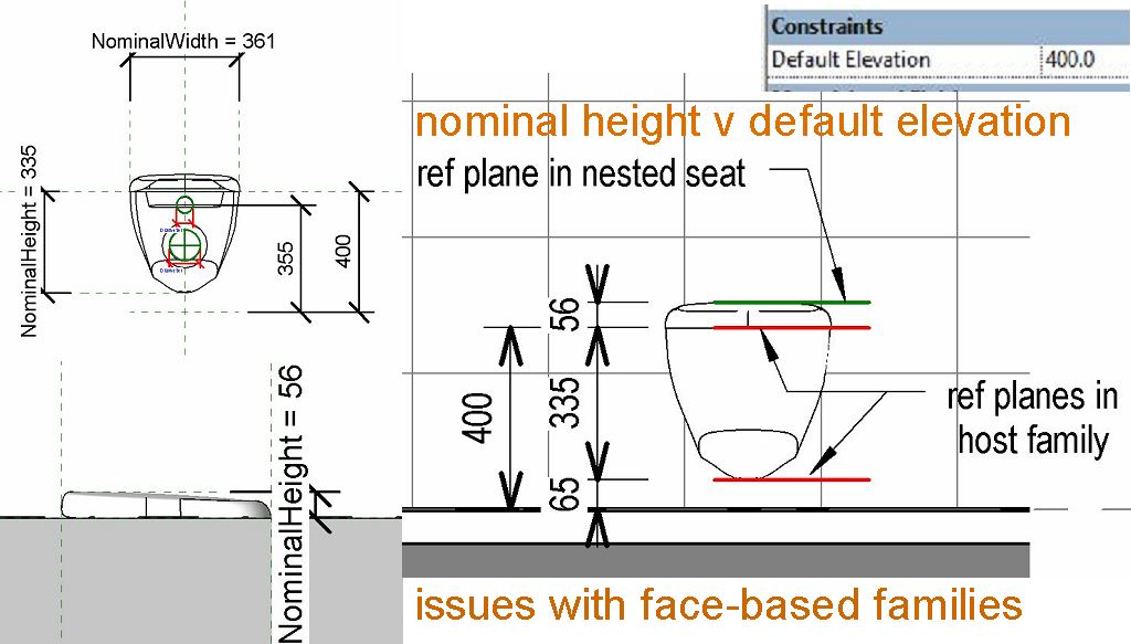
I don't really understand why these families have been made as "Face Based"  Nor why the symbolic lines are nested as "Detail Items"


I would prefer to have a family that sits at floor level, rather than having to search for the correct "nominal height" then check that each instance in the project is correct.  I know there can be problems with wall-hosted families when copy-monitoring between disciplines.  I would be inclined to make all my plumbing families free-standing.  After all, you can always make it shared, then nest it into a blank face-based (or wall-hosted) template if you really want to.


Some of the families have visibility switches to allow for different combinations: optional configurations. Full pedestal v Half pedestal for example.


One of the big differences between these families and the Duravit collection is that these are based on solid geometry, rather than the surface meshes employed by Duravit.  Strangely, I have previously downloaded solid geometry from the Duravit website (SAT files) and used it to build families of my own.  Solid geometry tends to be heavier, especially if you round off all the edges.  Possibly this is why the Ideal Standard families contain sharp edges.  Even so, the average file size is higher than for Duravit.  Of course you get smoother curves, no faceting at all.  But perversely there are more unsightly seams.  So it's an interesting comparison but I think I'm inclined to go for the mesh.


I did some simple tests with 1500 instances of a WC family, timing the process of selecting them all with a window, and moving them by a few metres with two picks of the mouse.  The Ideal Standard families and Duravit families gave very similar results: about 35 seconds to select, and another 35 to move.  Setting the view to coarse scale had very little effect, despite the fact that the Duravit families display only a simple cuboid.  Also the results were almost the same, whether in plan view or default 3d.  The third test was made with a simple generic WC family.  It contains native Revit geometry: extrusions softened by void sweeps.  I made it two or three years ago and am very proud of it, but have never tested it's performance systematically before.  The results were dramatic.  About 1 second to select, 2 seconds to move.
 
These tests reinforce my suspicions.  Coarse scale representations are very useful in making drawings legible different scales, but much less effective in improving performance.  I don't see much point in the use of boxes to represent a WC at coarse scale.  Simple, generic, placeholder families however, do seem to be very effective.  In other words, the families we have been examining for Duravit and Ideal Standard are all very well, but in a large hotel or hospital project with hundreds of instances, it may be better to use a simple placeholder, with appropriate embedded data. 

Of course the geometrically accurate families would be really useful for Interior Design studies, detailed development of typical room layouts, and of course for any project where large numbers of fittings are not required.

But a word of caution.  Are these tests really meaningful?  Out of interest, I placed 20 instances of the Duravit family into a blank family template, loaded this into a project and copied it out 70 times.  When grouped like this 1400 instances respond almost as rapidly as my simple generic placeholder.  So maybe the tests say more about the behaviour of very large selection sets than the usefulness of these detailed families.


Finally I did a close study of one particular fitting, comparing the three versions in some detail.  Undoubtedly they are all based on the same geometry.  NBS and BIMobject simply organised their product data slightly differently, whereas bimstore chose to eliminate seams by exploding the CAD imports.


The naming conventions for the parent families vary somewhat, but the nested components retain their original names, which seem to match the NBS convention.  I added suffixes so that they would not overwrite each other. This could cause some confusion if you mixed families from different sources. The shared nested components could have the same name but different geometry (exploded in the case of bimstore)  Could be a toilet seat or a pedestal, any component that is common to several different products.  Seems to me it would be good to have a three letter code in the name of all families indicating the source.  This would protect against cross-contamination of shared nested components.  


When it comes to naming of materials and render appearances, once again there are long elaborate conventions.  Seems to me if you have a 3 letter code for the manufacturer (ISI) you don't need to follow up with the full name.  As you can see the names end up far too long to fit in the default dialogue boxes.  Then, just for a laugh, most of the white porcelain is just called "snow".  Wouldn't it make sense to have a target length for names, 32 characters perhaps?


Taking the bimstore families as an example, I have drawn out a full nesting diagram.  It's surprisingly complex.  I'm not sure why it was necessary for have separate detail items for the sub-components, basically duplicating the information in the parent family which has a detail item for the entire assembly.  Personally I wouldn't use detail items at all, nor would I use 2d CAD imports.  I would rather have a plumbing family with 2d symbolics inside, nested into the parent just as the detail item is.  Keep everything under the Plumbing Fixtures category to simplify graphics control.


The "fine print" in this diagram shows a set of jpegs contained in the bimstore package, including the suffix "bragbox".  I take this to mean they are proud of the better appearance resulting from exploding the CAD imports.

Final comment?  Everyone involved might reflect on the complications arising from three different organisations distributing the same content with minor variations.  I'm not blaming anyone, just saying that we need to acknowledge the learning curve still facing us all in the effort to create truly consistent content.


Oh, and the file sizes.  Solid geometry seems to result in almost double the file size, when compared to mesh.  Exploded geometry doubles the size again.  I'm voting for mesh.