Running short of time so I will attempt a quick one.
I've spent a couple more weekends moving from space to space through the Directors Parlours bringing up the layers of detail. Centre Hall is what its name implies, the space that links together the rooms where all the major decisions were made: Governor's Office, Deputy Governor, Court Room, Committee Room. Lots of interesting Family Editor challenges. The coffered arch with ceiling roses is one I'd like to explain in detail when I have the time.
Beyond the Centre Hall is another impressive circulation space, the Rustic Lobby. Like the Centre Hall, there are coffered arches either side of a lofty central volume. But instead of a groin vault you get a tower with top lighting. And of course the walls are rusticated, hence the name. Working my way through these spaces I get a tremendous feel for the way Soane could ring the changes. Notice the different treatment of the coffered arch motif.
As you know, I'm not alone in this task. A couple of active collaborators chipping in at the moment. The next image is one that I shared to Slack to explain some of the available tasks, and how they fit into the scheme of things, the functional arrangement of spaces. X marks the spot ... an open court with toilet cubicles.
This whole area is a terrific sequence of spaces, opening up and closing down, letting in light from all kinds of angles, arches, domes, vaults ... I'm really excited by the way it's starting to shape up now, culmination of two and a half years of dogged effort (off and on)
To say I've learned a lot is a huge understatement. Modelling challenges, history of capitalism, spatial creativity, Soane's vision of classical abstracted modernity. Sometimes it's appropriate to use parametric families, formulas, nesting. Sometimes simple direct modelling does the trick. Take this groin vault for example. It's a one off situation: four extrusions, two solid & two void.
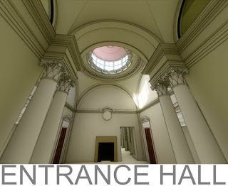
That was for the lobby leading in to the Entrance Hall, a space designed by Soane's predecessor, Taylor. Very easy to spot the difference, much more heavy-handed decoration. (my bias is showing) You get a glimpse of some of the more elaborate families here, no parametrics really, but a good deal of complexity and nesting.
Still a fair bit of work to do. The clock and the fireplace are simple placeholders, to be developed further by "others". There are some tricky door families to add also, two of them matching, with semi-circular fanlights: one a real door, the other blind ... or maybe a cupboard.
This weekend I moved on to the Court Room, also by Taylor and heavily decorated. The heavy plaster cornices are sweeps, modelled in place. This is a pretty good example of a situation where modelling in place is the only realistic option. These days you can do a lot more stuff in a perspective view. It was my first attempt to edit a sweep profile in perspective though. Quite impressive. Can't wait for the long awaited free perspective navigation now (aka "Do Not Crop View")
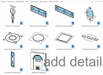
Much of the weekend has been spent building decorative plaster panels: wall based and ceiling based. They may look like they are finished, but believe me they are fairly crudely modeled at present. Lots of scope for collaborators to step in here.
The families are all packaged up in folders on a Box account. It's an interesting exercise in collaborative work in an educational context. Starting to get a good process going.
That process includes the super laptop HP gave me for my work in the original competition (thanks Sean) access to A360 and C4R (thanks Kyle) a license for Enscape3d (thanks Guys) and of course the wonders of "free" cloud services (Slack and Box)


Hi Andy,
ReplyDeleteI am a student, final year interior architecture, I'm trying to find free files last minute for a project that is due, im looking for decorative ceiling, wall panelling and arches etc...
I was admiring and impressed by what you have done and knowing how hard it is to achieve this level of detail takes time and effort in revit, many trials. (which I've run out of) I was wondering if you would share some of your files with me? Thanks KK
thank for the wonderful post , lots of information gained , visit us Revit Modeling in India
ReplyDelete