Project Soane has been woefully neglected so far this year. I had hoped to keep my momentum going, but it hasn't quite worked out that way. Not enough hours in the day, or days in the week. But I have managed to put in a little work over the past 2 weekends, tackling the North West extension that completed the territorial expansion of the bank.

The new build of the NW Extension is colour coded green. The Pink areas towards the bottom left are parts of the building that predate Soane. And bottom right, outlined in cyan is the corner of the NE Extension , basically the original junction between Princes Street and Lothbury. One result of the NW Extension is that Princes St gets straightened out so that it meets Lothbury further along at Tivoli Corner. The Lothbury facade gets doubled up, mirrored about a hinge point indicated by the asterisk here.

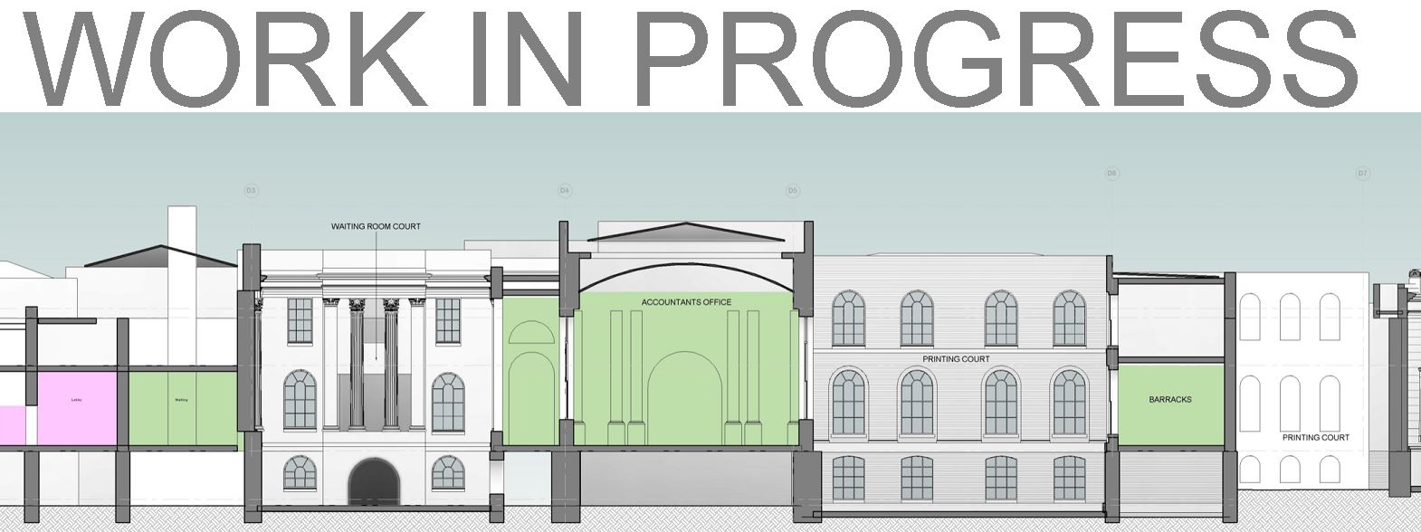
The mirrored copy of the Bullion Gate becomes the soldiers gate (small arrow to the right) which gives access to the Barracks (B) This is down at the lower level. Above the barracks are new printing works, fitted into the angle behind Tivoli Corner and arranged around the Printing Court (PC). This court is closed off to the south by the new Accountants Office (A), a rather grand space with large Ionic columns and a shallow barrel vaulted ceiling.

Top middle is the new VIP entrance, leading into the Doric Vestibule, and a long passage that eventually takes a dog-leg to the right. Eventually another right turn takes you to some waiting rooms in the old part of the bank, and a new Governor's suite. The governor's new office faces into Waiting Room Court (WRC) so that he can watch visitors as they start their journey down the long passage, accompanied by one of the pink-coated beadles.

This is a classic piece of Soane originality. The passage is open to the court on one side, framed into bays by pairs of highly abstracted giant pilasters. He explored several more conventional treatments before hitting on this solution. This is typical of Soane. He did the same thing with Tivoli Corner, trying out all kinds of treatments before the problem settled down in his head and he achieved the clarity of vision he was seeking.

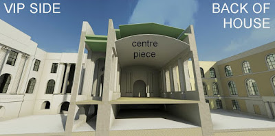
The stern Greek formality of the Waiting Room Court contrasts sharply with the much more homely, brick arches used in the Printing Court. Here Soane adopts his standard "low-rental" mode, as you would expect in a back-of-house area. The image below is far from complete, but it gives an indication of the difference in feeling.

When I work on this kind of project, exploring a historical period or a vernacular style, I find that many of the same issues come up as when working on a fee-earning job in an architectural office, but the difference in context is informative. In that sense it becomes a very useful learning experience, quite apart from its intrinsic value.
For example there is the whole question of how to quickly sketch things out using a tool like Revit. In this case I started out by representing the various openings as simple voids cut out of the walls. These can easily be parametric families because of the simplicity of the shapes, so it's possible to "feel your way" to the correct size and proportions if that information is not readily available as legible dimensions on the drawings.

This is exactly how Soane set about tackling the same problem. Most of the "design development" drawings in his archives show windows and doors as black holes. It can be quite frustrating at times, because you often have quite a detailed understanding of a particular facade, except for the design of the doors (unless you happen to stumble across and old photo) The image above shows 5 versions of the open side of the long passage as it passes by the Waiting Room Court. I have lined them up as an evolutionary sequence culminating with something very close to the implemented design. How I wish that I could eavesdrop on a day in his office when he was debating with his pupils the pros and cons of these five schemes. Notice how the idea of expressing the 3 central bays starts off in the basement and gradually spreads through all 3 stories. See also how the idea of a super-flat pediment creeps in half way and then gets rejected. Ultimately that was to re-emerge atop the attic feature that crowns the central bay (much smaller of course)

The next stage in my "design process" typically involves building non-parametric families for the sizes that I have established in stage 1. My second stage, "fleshed out" families for the arched windows use extrusions for the glazing bars. These are modelled directly in the family (no nested components) and each extrusion contains perhaps 30 line segments.

So this would quickly break if you tried to flex the family, as you can see in the next image, which also illustrates the "trace-over" method. I'm using images from the archive, dragged into family editor, scaling them to match the size deduced in stage 1 and cross-checking against any stated dimensions in the archive drawings. This snapshot image is also the source of my assertion that Printing Court is predominantly face-brick whereas photos of Waiting Room Court show it to be Portland Stone just like the rest of the Bank.

We are getting to a 3-stage process of family development in order to accommodate the demands of a rapidly evolving design, or in this case a rapidly evolving "understanding" of whatever it is that I am studying with my BIM pencil. Stage 1: highly abstracted, parametric families. Stage 2: directly modelled, highly specific families. Stage 3: more detailed parametric families.

In this case, the third generation families use nested components for the sliding sashes, and a series of sweeps for the glazing bars, in place of a single extrusion. The sweeps have two advantages. They are easy to lock to reference planes, and you can start with a simple rectangular profile, knowing that it's easy to elaborate this later on. The first image shows me locking the end of a "path sketch" to a reference plane, and you can also see the angled reference LINES whose ends are locked to the centre point of the arch, and to which radial glazing bars are locked.
Just in passing, here is my rig for controlling the centre point as the width and height vary.

By the way, I typically make one sweep, copy this around and edit it, rather than starting from scratch with the sweep command. This saves me the effort of repeatedly assigning a profile, subcategory and material parameter. I guess there are other ways to approach this.

Controlling the end points of these radial elements is quite tricky. I opted to use a detail component which is rendered invisible in the project environment by unchecking the box. Looking back at this I can't quite understand why I used straight lines when circles would have been simpler. (plus more adaptable should the angle change) Anyway you just lock the detail item to the centre point and link its parameters up to the width parameter via simple formulas.

I tackled the sliding sash window in an earlier post from a rather different angle: direct modelling of the way this technology works, in some detail. More than 2 years ago, and I said then that I hoped to explore how I would make a family for this kind of window that could be flexed, and used in a real project.
sash windows post
So it was very interesting to come back and take a stab at developing a parametric version. The level of detail has to be lower of course, so what is realistic for a project that might contain dozens of instances ? That's always an intriguing question.

This brings up an interesting issue which I will use to conclude this post. What is the relationship (if any) between a detailed model of a typical item like this, and the simplified version (family) that is placed in a project. It seems inherently "UN-BIM" to model these completely separately. But how would we build digital links so that they are both kept in sync, automatically.

The current paradigm for fine detailing is to draft over a callout view in 2d. Now that's fair enough in many cases, but sometimes it really would be beneficial to develop a detail in 3 dimensions. It seems to me that one of the fundamental challenges as we move forwards with BIM is how to automate the synchronisation of design as we jump up and down the scale from "cupboard detail" to "typical hotel room" to "400 key hotel" to "urban district" and beyond.

More on the continuing saga of Project Soane very soon.


The new build of the NW Extension is colour coded green. The Pink areas towards the bottom left are parts of the building that predate Soane. And bottom right, outlined in cyan is the corner of the NE Extension , basically the original junction between Princes Street and Lothbury. One result of the NW Extension is that Princes St gets straightened out so that it meets Lothbury further along at Tivoli Corner. The Lothbury facade gets doubled up, mirrored about a hinge point indicated by the asterisk here.

The mirrored copy of the Bullion Gate becomes the soldiers gate (small arrow to the right) which gives access to the Barracks (B) This is down at the lower level. Above the barracks are new printing works, fitted into the angle behind Tivoli Corner and arranged around the Printing Court (PC). This court is closed off to the south by the new Accountants Office (A), a rather grand space with large Ionic columns and a shallow barrel vaulted ceiling.

Top middle is the new VIP entrance, leading into the Doric Vestibule, and a long passage that eventually takes a dog-leg to the right. Eventually another right turn takes you to some waiting rooms in the old part of the bank, and a new Governor's suite. The governor's new office faces into Waiting Room Court (WRC) so that he can watch visitors as they start their journey down the long passage, accompanied by one of the pink-coated beadles.

This is a classic piece of Soane originality. The passage is open to the court on one side, framed into bays by pairs of highly abstracted giant pilasters. He explored several more conventional treatments before hitting on this solution. This is typical of Soane. He did the same thing with Tivoli Corner, trying out all kinds of treatments before the problem settled down in his head and he achieved the clarity of vision he was seeking.

The stern Greek formality of the Waiting Room Court contrasts sharply with the much more homely, brick arches used in the Printing Court. Here Soane adopts his standard "low-rental" mode, as you would expect in a back-of-house area. The image below is far from complete, but it gives an indication of the difference in feeling.

When I work on this kind of project, exploring a historical period or a vernacular style, I find that many of the same issues come up as when working on a fee-earning job in an architectural office, but the difference in context is informative. In that sense it becomes a very useful learning experience, quite apart from its intrinsic value.

For example there is the whole question of how to quickly sketch things out using a tool like Revit. In this case I started out by representing the various openings as simple voids cut out of the walls. These can easily be parametric families because of the simplicity of the shapes, so it's possible to "feel your way" to the correct size and proportions if that information is not readily available as legible dimensions on the drawings.

This is exactly how Soane set about tackling the same problem. Most of the "design development" drawings in his archives show windows and doors as black holes. It can be quite frustrating at times, because you often have quite a detailed understanding of a particular facade, except for the design of the doors (unless you happen to stumble across and old photo) The image above shows 5 versions of the open side of the long passage as it passes by the Waiting Room Court. I have lined them up as an evolutionary sequence culminating with something very close to the implemented design. How I wish that I could eavesdrop on a day in his office when he was debating with his pupils the pros and cons of these five schemes. Notice how the idea of expressing the 3 central bays starts off in the basement and gradually spreads through all 3 stories. See also how the idea of a super-flat pediment creeps in half way and then gets rejected. Ultimately that was to re-emerge atop the attic feature that crowns the central bay (much smaller of course)

The next stage in my "design process" typically involves building non-parametric families for the sizes that I have established in stage 1. My second stage, "fleshed out" families for the arched windows use extrusions for the glazing bars. These are modelled directly in the family (no nested components) and each extrusion contains perhaps 30 line segments.

So this would quickly break if you tried to flex the family, as you can see in the next image, which also illustrates the "trace-over" method. I'm using images from the archive, dragged into family editor, scaling them to match the size deduced in stage 1 and cross-checking against any stated dimensions in the archive drawings. This snapshot image is also the source of my assertion that Printing Court is predominantly face-brick whereas photos of Waiting Room Court show it to be Portland Stone just like the rest of the Bank.

We are getting to a 3-stage process of family development in order to accommodate the demands of a rapidly evolving design, or in this case a rapidly evolving "understanding" of whatever it is that I am studying with my BIM pencil. Stage 1: highly abstracted, parametric families. Stage 2: directly modelled, highly specific families. Stage 3: more detailed parametric families.

In this case, the third generation families use nested components for the sliding sashes, and a series of sweeps for the glazing bars, in place of a single extrusion. The sweeps have two advantages. They are easy to lock to reference planes, and you can start with a simple rectangular profile, knowing that it's easy to elaborate this later on. The first image shows me locking the end of a "path sketch" to a reference plane, and you can also see the angled reference LINES whose ends are locked to the centre point of the arch, and to which radial glazing bars are locked.
Just in passing, here is my rig for controlling the centre point as the width and height vary.

By the way, I typically make one sweep, copy this around and edit it, rather than starting from scratch with the sweep command. This saves me the effort of repeatedly assigning a profile, subcategory and material parameter. I guess there are other ways to approach this.

Controlling the end points of these radial elements is quite tricky. I opted to use a detail component which is rendered invisible in the project environment by unchecking the box. Looking back at this I can't quite understand why I used straight lines when circles would have been simpler. (plus more adaptable should the angle change) Anyway you just lock the detail item to the centre point and link its parameters up to the width parameter via simple formulas.

I tackled the sliding sash window in an earlier post from a rather different angle: direct modelling of the way this technology works, in some detail. More than 2 years ago, and I said then that I hoped to explore how I would make a family for this kind of window that could be flexed, and used in a real project.
sash windows post
So it was very interesting to come back and take a stab at developing a parametric version. The level of detail has to be lower of course, so what is realistic for a project that might contain dozens of instances ? That's always an intriguing question.

This brings up an interesting issue which I will use to conclude this post. What is the relationship (if any) between a detailed model of a typical item like this, and the simplified version (family) that is placed in a project. It seems inherently "UN-BIM" to model these completely separately. But how would we build digital links so that they are both kept in sync, automatically.

The current paradigm for fine detailing is to draft over a callout view in 2d. Now that's fair enough in many cases, but sometimes it really would be beneficial to develop a detail in 3 dimensions. It seems to me that one of the fundamental challenges as we move forwards with BIM is how to automate the synchronisation of design as we jump up and down the scale from "cupboard detail" to "typical hotel room" to "400 key hotel" to "urban district" and beyond.

More on the continuing saga of Project Soane very soon.