Project Soane started in mid 2015. It would be interesting to do a graphic of the burst of activity and pauses. My guess is that there have been 4 or 5 extended sessions (maybe 6 months each) , separated by gaps of 2 or 3 months when I switched to something else.

At the end of the Triumphal Arch post, I updated the model to BIM360 This process exports mesh geometry with attached data, plus 2D sheets and views , making the project available to non-Revit users through a web browser.
It’s called "publishing" the model, borrowing language from the UK standards with their four stage sequence (WIP to Shared to Published to Archived.) WIP and Shared are essentially the same thing if your model is in the cloud. But if consultants are modelling in their own silos you will need to "Share" on a regular basis. "Publishing" is a bit more formal. Usually it means a formal issue of deliverables to the client. Archiving is automated in BIM 360 in the form of versioning. You can retrieve any previously published version from a drop-down list.

Haven't done much work on the sheets for ages and ages, but of course the model itself has moved on, so it was interesting to see what they are looking like now.
Will I ever achieve the mythical goal of a set of crisp record drawings and visuals for Soane's bank, as if he had designed it on Revit just a few weeks ago? We live in hope. However that may be, I am certainly learning an unbelievable amount about a great variety of topics along the way. About BIM, about drawing, about history, about John Soane, about the Bank of England ... not least the history of its evolution.

The model is quite heavy now, and typically I work with most of the links unloaded. But sometimes it's nice to load everything up and save out some images.
I took screen shots of the model from various angles, firstly in Revit, then from the A360 viewer itself. Revit gives you more visual options: cast shadows and ambient occlusion for example. But the web viewer is accessible to more people on more devices.
The size and complexity of the model presents quite a challenge to the A360 viewer but it holds up remarkably well. Like most viewers it seems to convert Revit solids to a surface mesh. I'm intrigued by the “finger joints” that are sometimes visible, splicing surfaces together like carpentry.

I have been reading a book called the master and his emissary which suggests that the two halves of our brain deal with different kinds of attention. One is focused on the task at hand while the other stands back and reflects. The idea is that this split dates back to animals and birds which needed to perform precise behaviours while keeping an eye out for predators.
I think this duality is always present when I work on the Bank, dealing with modelling challenges while reflecting on the historical context, or Soane’s design rationale. But a more formal distancing is also helpful: publishing the model, writing up a blog post. My fallow periods perform a similar reflective function but spread out in time.

Coexisting dual perspectives are characteristic of Soane's work. He was a classicist with an strong attraction to "the picturesque". How do you balance order and chaos? Quite a topical question I think.
I have a strong memory from the initial modelling phase of puzzling over the screen wall. Long hours were spent comparing the various conflicting sources of information, trying to understand the development sequence and striving for a consistent level of simplification and abstraction in the modelling. Why did he design it like that? What were the early decisions that tied his hands later on? How did he gradually crank up the architectural grandeur without creating any obvious break in style?

I've said before that Soane's Bank is like a medieval walled city with it's irregular maze of circulation routes. Evolution over time has been one of the major themes. It strikes me now that the gates facing North South East and West are another city like feature.
It's been a lonely effort at times, puzzling over the history of this fascinating building, but I'm very conscious of the many contributors and collaborators who have participated along the way.

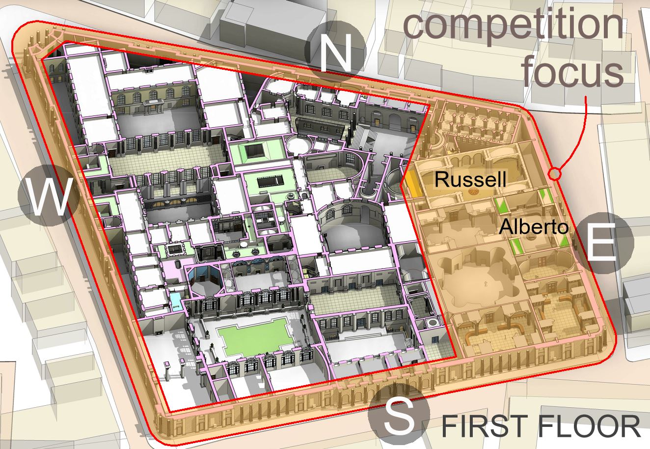
The initial modelling and rendering stages focused on the transfer halls of the SE quadrant, plus the screen wall in its final state. Heartfelt thanks to the many sponsors, judges and competitors who kick started this whole process. From the beginning I was obsessed with understanding how the Bank evolved over time: how Soane's work related to that of his predecessors. Meanwhile, Russell & Alberto in particular did a fantastic job of setting a standard to aim for, in two specific areas that had been identified by the founders of the competition.

For almost three years now, we have been fleshing out the labyrinth of spaces that comprise the rest of Soane's Bank. Here the levels are much more complex and the information more patchy. Given how hard it has been to figure out this 3d jigsaw puzzle, imagine the titanic effort involved in design development.
The first floor rooms were quite extensive, but the highest cut plane intersects just three isolated areas.

Firstly there is the upper room at the West End of Garden Court. Then there is the top floor of Sampson's rear courtyard (curved North wall be Soane) and finally the attic floor of Residence Court (servants' quarters?) I'm pretty chuffed with the section through the Accountant's Office, extending through to the Residence Court. Feels like we are really getting there.
If I can get the site upgraded to 2019 we will be able to access recently added new BIM360 features. These are not really designed for the kind of work we are doing on Project Soane, but I am curious to see how they can enhance our efforts.

At the end of the Triumphal Arch post, I updated the model to BIM360 This process exports mesh geometry with attached data, plus 2D sheets and views , making the project available to non-Revit users through a web browser.
It’s called "publishing" the model, borrowing language from the UK standards with their four stage sequence (WIP to Shared to Published to Archived.) WIP and Shared are essentially the same thing if your model is in the cloud. But if consultants are modelling in their own silos you will need to "Share" on a regular basis. "Publishing" is a bit more formal. Usually it means a formal issue of deliverables to the client. Archiving is automated in BIM 360 in the form of versioning. You can retrieve any previously published version from a drop-down list.

Haven't done much work on the sheets for ages and ages, but of course the model itself has moved on, so it was interesting to see what they are looking like now.
Will I ever achieve the mythical goal of a set of crisp record drawings and visuals for Soane's bank, as if he had designed it on Revit just a few weeks ago? We live in hope. However that may be, I am certainly learning an unbelievable amount about a great variety of topics along the way. About BIM, about drawing, about history, about John Soane, about the Bank of England ... not least the history of its evolution.

The model is quite heavy now, and typically I work with most of the links unloaded. But sometimes it's nice to load everything up and save out some images.
I took screen shots of the model from various angles, firstly in Revit, then from the A360 viewer itself. Revit gives you more visual options: cast shadows and ambient occlusion for example. But the web viewer is accessible to more people on more devices.
The size and complexity of the model presents quite a challenge to the A360 viewer but it holds up remarkably well. Like most viewers it seems to convert Revit solids to a surface mesh. I'm intrigued by the “finger joints” that are sometimes visible, splicing surfaces together like carpentry.

I have been reading a book called the master and his emissary which suggests that the two halves of our brain deal with different kinds of attention. One is focused on the task at hand while the other stands back and reflects. The idea is that this split dates back to animals and birds which needed to perform precise behaviours while keeping an eye out for predators.
I think this duality is always present when I work on the Bank, dealing with modelling challenges while reflecting on the historical context, or Soane’s design rationale. But a more formal distancing is also helpful: publishing the model, writing up a blog post. My fallow periods perform a similar reflective function but spread out in time.

Coexisting dual perspectives are characteristic of Soane's work. He was a classicist with an strong attraction to "the picturesque". How do you balance order and chaos? Quite a topical question I think.
I have a strong memory from the initial modelling phase of puzzling over the screen wall. Long hours were spent comparing the various conflicting sources of information, trying to understand the development sequence and striving for a consistent level of simplification and abstraction in the modelling. Why did he design it like that? What were the early decisions that tied his hands later on? How did he gradually crank up the architectural grandeur without creating any obvious break in style?

I've said before that Soane's Bank is like a medieval walled city with it's irregular maze of circulation routes. Evolution over time has been one of the major themes. It strikes me now that the gates facing North South East and West are another city like feature.
It's been a lonely effort at times, puzzling over the history of this fascinating building, but I'm very conscious of the many contributors and collaborators who have participated along the way.

The initial modelling and rendering stages focused on the transfer halls of the SE quadrant, plus the screen wall in its final state. Heartfelt thanks to the many sponsors, judges and competitors who kick started this whole process. From the beginning I was obsessed with understanding how the Bank evolved over time: how Soane's work related to that of his predecessors. Meanwhile, Russell & Alberto in particular did a fantastic job of setting a standard to aim for, in two specific areas that had been identified by the founders of the competition.
For almost three years now, we have been fleshing out the labyrinth of spaces that comprise the rest of Soane's Bank. Here the levels are much more complex and the information more patchy. Given how hard it has been to figure out this 3d jigsaw puzzle, imagine the titanic effort involved in design development.
The first floor rooms were quite extensive, but the highest cut plane intersects just three isolated areas.

Firstly there is the upper room at the West End of Garden Court. Then there is the top floor of Sampson's rear courtyard (curved North wall be Soane) and finally the attic floor of Residence Court (servants' quarters?) I'm pretty chuffed with the section through the Accountant's Office, extending through to the Residence Court. Feels like we are really getting there.
If I can get the site upgraded to 2019 we will be able to access recently added new BIM360 features. These are not really designed for the kind of work we are doing on Project Soane, but I am curious to see how they can enhance our efforts.


