I made it up (the NAME)
Is there a “real” name for it? Was the bond invented by P.V. Jensen-Klint as a variation on a local bricklaying tradition? Not clear to me. There is a variant of Monk bond, that was used in Denmark, according to photos I took in Aarhus in 2017. But it’s not quite the same as this one.
I was looking at my photos of Klint’s famous Grundtvig's Church in Copenhagen. Zooming in on the brickwork I was intrigued by the bond.
Very difficult to discern the pattern at first so I decided to draw it. Seems to be the logic behind the bonding used in his churches, although it’s usually broken up by vertical projections, recesses, windows & doors. Also the bricks are old and worn, on top of the natural variation in colour and shape.
Drawing has always been one of my primary
tools for solving problems, discerning patterns, separating order from chaos.
It’s a physical, embodied process, something that underpins all our cognition
in my view. I sketched this out on my
phone while lying in bed. Two stretchers, then a header, two stretchers then a header. But the devil is in the details: how that pattern stacks up vertically. Klint used a sequence that I haven't seen anywhere else.
It’s useful to have a logical abstraction lodged in your brain when trying to make sense of the chaos of the real world. Visual patterns have always been important to me. Over the past week or so I’ve been doing internet research on my phone while failing to drop off to sleep. (I know, bad idea, but I prefer counting bricks to counting sheep)
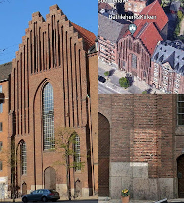
I took a couple of thousand photos in Denmark in 2017. At the time I didn’t realise that there were two Klint churches just a short walk from where I was staying. Turns out that I took a snap of the brickwork of one of these as I walked past, eager to cross the bridge into the town centre. I’ve no idea what motivated me to take this shot, but it makes for a fascinating analysis.
It's just a mish-mash of old bricks, right?
I had to put a colour overlay on the pattern of headers in order to see it clearly. This is a great illustration of how a vertical reveal impacts the bond. You can’t put a quarter brick on an external corner. One of the first rules you learn as a bricklayer. Very dodgy to expose a small cut piece in this way. So to maintain the overlap (1/4 lap) you end up using a three-quarter bat, and placing a header next to it to make the maths work. (1/2 + 3/4 = 1 ¼)
Don’t worry about it. Just notice how there are subtle variations as the bonding pattern meets up with the edges of this pier.
It’s worth spending a bit of time studying
this example. When I first looked at the
photo I couldn’t see any logic at all.
The fact that there are a full ten courses between repeats, (plus the need to
insert headers and three-quarter bats in different locations in response to the
return edges) makes for quite a complex puzzle.
Hats off to the bricklayers who did this work. I wonder how many architects could match the
problem-solving skills required here, while doing very
demanding physical work, outdoors. Now that's real multi-tasking.
This is the Bethlehem Church and it uses a lot of the same architectural language as his larger and more famous design, Grundtvig’s Church. Given the angle of the previous snap, you can’t really tell how far that pier projects, but with a bit of Google Earth detective work I worked out the location of the shot, and it seems to project by a full brick length (say 9 inches)
I’m slightly embarrassed that I walked past
this church without registering its provenance.
Maybe if I had been walking on the other side of the street.😊 I’m not sure I will ever get the opportunity
again. The interiors seem to be very
impressive in their simplicity. Would love to have had that experience.
To conclude for today, I will show a study that uses my individual Revit bricks, (from the exercises I was doing about a year ago). The top two elevations are the same piece of wall, with different view filters. The first image emphasises the logic of the pattern which repeats itself every third course. The second elevation gives an impression closer to real life: a much more subtle effect with the natural variation of the clay.
Monk Bond is not very common you do see it sometimes in garden walls where the greater proportion of headers makes it easier to keep both faces presentable, compared to Flemish. The variant shown below is one I spotted a couple of times in my photos from Aarhus and that’s the local tradition that I suspect Klint adapted in such an interesting way for his churches in Copenhagen.


No comments:
Post a Comment
I've been getting a lot of spam so had to tighten up comments permissions. Sorry for any inconvenience. I do like to hear from real people