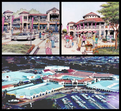
The striking thing for me about the shopping centre was it's resemblance to
Westgate in Harare, Zimbabwe. That was a project in the office of Clinton and
Evans during the early days of my employment there. My own involvement was
quite minor, but I remembered that the client was inspired by a shopping centre
in Florida and that they employed American concept design architects for the
basic layout, theming and signage.
I still have some low-res pictures taken from the booklet they produced some
years later when I acquired a digital camera. I doubt that it was the same
firm. I'm sure there are several design practices in Florida that use this
idiom from time to time. But it stirred up old memories from 30 years ago.
To my mind this kind of scheme is preferable to the rectangular parking layout
with shops around the perimeter which is so common here. This brings me back to
the topic of the relentless pursuit of efficiency which is such a marker of
"the American way" On the one hand this has produced great wealth and
launched a spirit of remarkable innovation.
On the other? Well there seems to be something in the older European cities and
the way of life they represent that strikes a deep emotional chord. It's there in
spades in a place like Volterra, and in a small way it's echoed in "the
Shops at Wiregrass".
A weekend jaunt to St Augustine. an ancient historic town by
American standards. And it does have a special feel, a depth of layering and a
walkability that is very appealing. Of course this makes it a tourist magnet,
which is what we are, honestly.
It's not the ideal way to see a town. Surely it would be better to come in the
off-season and book a room for a couple of months. Not going to happen though
so I accept this brief cameo for the gift that it is.
Two styles stand out at first glance. I will call them "Early
Settler" and "Spanish Mission" (in my ignorance) The Spanish is
all clay roof tiles, broad round arches, generous ground floor arcades.
Meanwhile the Settler look has timber balconies at the upper level, sliding
sash windows with external shutters, weatherboarding and timber shakes.
No two buildings are the same but there is a harmony to the whole. This is a place with character and those few crass-models structures that were inserted perhaps 50 years ago offend the senses. Perhaps they are a useful reminder of how lacking in "life" the average American suburb is. I mean no offence. I have great admiration for the many great blessings this country has brought to the world.
But life is full of irony. No solutions, only trade-offs. St Augustine has made some good ones.
What could be more fun than playing tag team on a Revit
model with Paul Aubin? I
have done a couple of posts recently about the San Giusto model that I started
in 2018,while attending the Reality Capture workshop in Volterra. This week I
have been checking out the updates that Paul made to that model, leading
eventually to a 3d printed version that was part of the Volterra display at hashtag#AU2024
in San Diego.
I think it's fair to say that my forte is diving in with "no fear"
and quickly mapping out a new project. AKA the broad brush approach. Paul on
the other hand is a master of taking things to the next level and especially of
using Family Editor to represent historical detail.
At this stage we are maintaining two models, one on the Volterra hub (Paul) , and one on the Way We Build hub (me). Paul's version is based on the current state of the building. Mine is an imagined earlier version of the church, before the clerestory windows were blocked up, and before one of the lean-to structures was built at the east end.
So I've been going through the families that Paul built and copying them back into my model where appropriate. In the reverse direction I have added more notes and photographs to the sheets in Paul's model. This morning I also did an upgrade to the window at the west end and applied that to both models (additional detail to the internal surround)
White compiling the text for this post, I have been using a new pair of reading glasses. They are super minimalist and slot into a sleeve on the back of my phone. Not a complete replacement for normal reading glasses, (which are the best option when working at a desk) but definitely a useful complement. (ThinOptics)


It’s amazing how a simple design detail can stir memories from 30 years ago. Architecture truly connects us to our past.
ReplyDeleteInvest in Brands
franchise Expo Delhi
Your observation about older European cities having a deep emotional chord resonates. Sometimes efficiency needs to make room for character!
ReplyDeleteAutomatic Bag Slitting Machine
Micro feed screw delhi
I agree with you on the tourist experience! Visiting off-season is always better, but sometimes, we just have to enjoy the moment as it comes.
ReplyDeleteWarehouse Storage rack
mezzanine floor
I love how you highlight that even with different architectural styles, there’s a harmony to the overall design. That’s a sign of thoughtful planning.
ReplyDeleteheavy duty rack delhi
Multi tier rack delhi
Your point about the lack of “life” in typical American suburbs is thought-provoking. It makes me appreciate places with authentic character even more.
ReplyDeleteSlotted Angle rack delhii
Pallet rack manufacturer
Even short trips offer a glimpse of beauty. Your acceptance of this brief visit as a “gift” is a lovely perspective on travel.
ReplyDeleteDust Collector
Franchise for sale in India