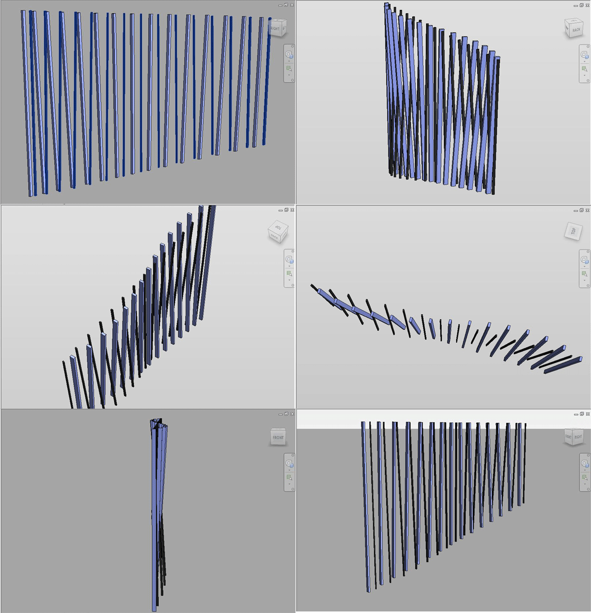
I just want to share some of the Revit-based work that has been coming out of our office recently. At GAJ we have been using Revit since release 7, installing our first copies 8 years ago. The journey has been quite challenging, with more than a few twists & turns, but over the past couple of years BIM has become the dominant methodology in the office.

The images are taken from 3 quite different projects. One is an art gallery which re-interprets a heritage area in a modern manner. Construction drawings were done using Revit, and the project is now on complete and ready for occupation. This is a type of work for which we are well known in the region.

There is a perception that Revit is a documentation tool & other softwares are more effective during the early phases of the design process. Wise warriors choose their battles, so I kept my protests down to a token mumble. The first priority was to build a strong core of experienced users.

Of late though we have been using Revit much earlier in the process & the second project here is a competition submission put together in a few days by a small team. This work has made quite a splash in the office and has gone a long way towards convincing the remaining sceptics.

The third project is the only one where I was directly involved. It's more of a bread & butter project: a concept design report for a complex of 9 buildings produced by a small team working under a tight programme. The client has already remarked that he is impressed with the amount & quality of work produced.

We used a couple of techniques here that I will discuss in a separate post: attempts to use BIM in a "diagrammatic" mode. This allowed us to resolve basic space-planning issues before embarking full-blown BIM, using "real building elements" (walls, doors, rooms) But what I want to show here is just the end product.

We were able to show that Revit can produce attractive imagery, appropriate to the stage of work & effective in it's ability to convey our design intent to the client.

Along the way I also revisited our furniture library & produced some simple, "generic" families that help to keep the presentation style clean & focussed. We don't want to distract the client with irrelevant detail. That's one of the reasons that architects go for a minimalistic style of drawing.

Far too often BIM looks clunky because users haven't figured out how to achieve that lean & hungry look. That's what we were aiming at here, and I think we have made good progress. But at the same time (and with very little extra effort) the appendix to the report is packed with conventional drawing sheets: fully coordinated plans, elevations & sections that match the simper representation shown earlier.


The images are taken from 3 quite different projects. One is an art gallery which re-interprets a heritage area in a modern manner. Construction drawings were done using Revit, and the project is now on complete and ready for occupation. This is a type of work for which we are well known in the region.

There is a perception that Revit is a documentation tool & other softwares are more effective during the early phases of the design process. Wise warriors choose their battles, so I kept my protests down to a token mumble. The first priority was to build a strong core of experienced users.

Of late though we have been using Revit much earlier in the process & the second project here is a competition submission put together in a few days by a small team. This work has made quite a splash in the office and has gone a long way towards convincing the remaining sceptics.


We used a couple of techniques here that I will discuss in a separate post: attempts to use BIM in a "diagrammatic" mode. This allowed us to resolve basic space-planning issues before embarking full-blown BIM, using "real building elements" (walls, doors, rooms) But what I want to show here is just the end product.

We were able to show that Revit can produce attractive imagery, appropriate to the stage of work & effective in it's ability to convey our design intent to the client.

Along the way I also revisited our furniture library & produced some simple, "generic" families that help to keep the presentation style clean & focussed. We don't want to distract the client with irrelevant detail. That's one of the reasons that architects go for a minimalistic style of drawing.

Far too often BIM looks clunky because users haven't figured out how to achieve that lean & hungry look. That's what we were aiming at here, and I think we have made good progress. But at the same time (and with very little extra effort) the appendix to the report is packed with conventional drawing sheets: fully coordinated plans, elevations & sections that match the simper representation shown earlier.