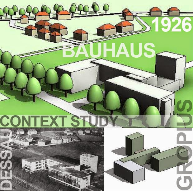
About 9 months ago while working on my Urban Design presentation for RTC chicago I did a study of the Dessau Bauhaus in context. Just a simple massing model of the famous building itself, and lots of schematic mapping out of the surrounding landscape.
For some reason my BIM pencil seems to like drawing maps. Who am I to argue ? But what an intense piece of history lurks beneath this landscape. All these avant-garde artists and social dreamers cooking up their recipes while Adolf and his cronies sneak their way into power, perfecting propaganda as an art form along the way.
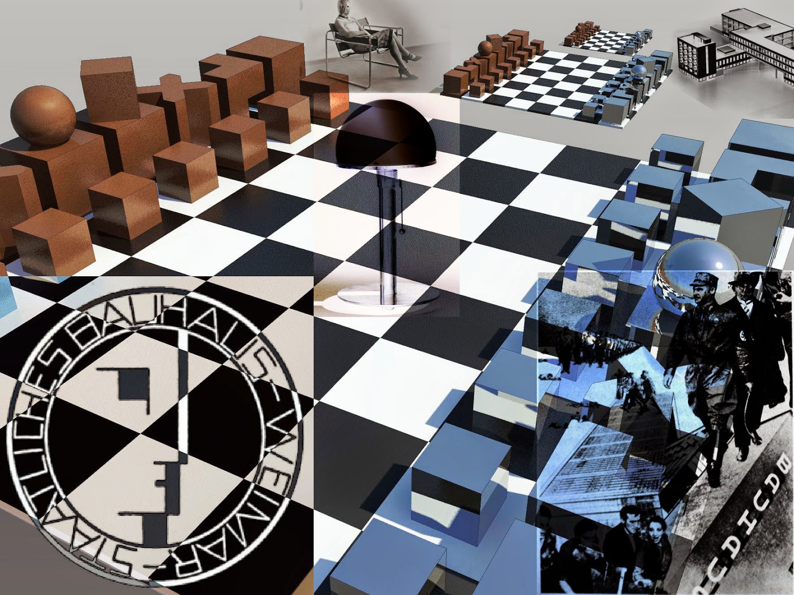
I'm not going to go any further into that right now, but while doing the research I stumbled across a Bauhaus Chess Set which struck me as a wonderfull little exercise in Vanilla parametrics.
I love the way this chess set is abstracted down to the simplest of geometric forms. Classic Bauhaus design: break things apart, analyse them, rebuild from first principles.
My initial analysis suggested that I needed 3 families to cover all the pieces. The Knight and the Bishop are basically one-offs. They don't have to be, but I wanted to keep things fairly simple. The other 4 pieces are covered by a family with 4 types and some visibility controls.
The plan is to make everything fully scalable. Mostly this is done by equalisation constraints and simple formulae linking everything back to a module (usually the width parameter) For example in the Bishop family the thickness of the cross (T) is expressed as Width/3.
The knight is a big solid cube with two half-sized void cubes biting away diagonally opposite corners. I guess this is an abstraction of the dog-leg manner in which knights move across the chess board.
The multi-purpose chess piece is very simple. Notice the use of root 2 for the diagonally placed crown, and of course the visibility controls that I mentioned before. And that completes the chess pieces.
Let's go ahead and place them on a board. Lots of equality constraints here to make our 8x8 grid. We need 4 material parameters: 2 for the board and 2 for the pieces. Also 2 parameters will suffice to control all the pieces: one for the pawns, the other for all the rest. Everything is now expressed as a fraction of the board width.
So of course the whole thing scales endlessly. Well not quite. We still have Revit's built in aversion for the extremely small and the ridiculously large. It's optimised for buildings, stop complaining. But I do feel able to complain about the lack of intelligent symbols for North Points and Scale Bars. I once came up with a workaround for scale bars that uses ordinate dimensions referencing a detail component. Maybe the logic is that drawing sheets will become obsolete so why waste the energy ? I like drawings (you probably know that) Whether we print them or not is another issue, but orthographic views arranged on sheets are very powerful means of communication. You can't figure out how a building works just by doing a walkabout.
We have to get past this illusion that BIM is about making everything realistic. The tension between realism and abstraction is as old as the hills and will be with us until we drive ourselves extinct. The paradox of visualising reality on 2 dimensional surfaces has informed art for 30 thousand years. Let's not fool ourselves with this nonsense about the end of history. The end of history is armageddon. Trust me, you don't want to go there.
So I'm happy to shift in and out of 1d/2d/3d space, exploring ideas, shuffling data, imagining impossible worlds. Piet Mondrian took a journey around the time that the Bauhaus was built that has always blown my mind. He started out with still lifes and landscapes that were partially abstracted, a bit like Cezanne. Then he just went on flattening out and abstracting, form-finding in a way ... endless variations until all that remained was shape and colour.
Bauhaus students were also encouraged to simplify and abstract, but the logic now was to create forms that reflected the realities of industrial production. These seem like trivial ideas now, but 90 years ago they were much more revolutionary than all the little consumer toys we label as "disruptive technology" today. For that matter, the minimalism that Mr Jobs tried to copyright was really plagiarised from people like Mondriaan, Picasso, Gropius, Mies. (It's OK I'm just being provocatively naughty)
But be careful what you wish for. The 1920s and 1930s were stirring times. Everything seemed to be changing. Technology was something to love or hate, worship or despise. Bauhaus masters like Johannes Itten reacted by immersing themselves in meditation and the mystical pull of ancient religions. Dear old Adolf had a different plan in mind. Technical solutions and aesthetic movements are wonderful in their way but hard economic realities and political turbulence have a knack for sweeping all that away overnight. The Bauhaus was closed down. Many creative minds fled Germany. I have experienced hyper-inflation first hand. It changes everything. It drove me into the desert in search of gold.
Just a few reflections on History, Art, Politics ... and of course the game of chess.


nice post, reminds me of this :http://revitoped.blogspot.fr/2011/12/unconventional-revit.html
ReplyDeleteThanks for the link. I'd forgotten all about that. Maybe minimalism extends to my brain cells :-)
ReplyDeletethank for the wonderful post , lots of information gained , visit us Revit Modeling in uk
ReplyDeleteOur Learn to Swim kids program gives uninterrupted learning for your children all year round. Kids Swimming Lessons are accompanied 49 weeks of the year to support for consistent training and to present students with the possibility to grow through levels at a quicker rate. The Star Swim Schools provides you peace of mind that your kid will receive a high-quality swimming education. Women's Private Swimming Lessons
ReplyDeleteApeiro Construction sets the benchmark in London, ON, with quality work, a skilled workforce, and outstanding project management.
ReplyDeleteBuilding and Construction Experts in London, ON