This was my presentation for AUX Dubai 2014 last week. It's partially based on my rigs & profiles session at RTC Chicago, but with some new stuff ... mostly about using rigs in form-finding studies for high-rise towers. Two slides to introduce myself. Day job ...
Blog persona ...
Then we get to the observation that there are now 2 ways to make stuff in Revit: the "traditional family editor" and the "conceptual massing environment" which for simplicity I like to refer to as "Vanilla" and "Point World"
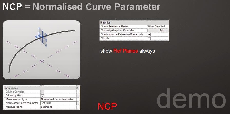
Cue for a quick demo of basic concepts: Hosting points on lines, Normalised Curve Parameter, Show ref planes always, loaded Mass families that act as profiles, rehosting points, global scale parameters.
And this leads us straight into the "Straight Line Rig" which is a simple device for maintaining relationships between a series of profiles that define a lofted form (or in some cases 2 or 3 forms)
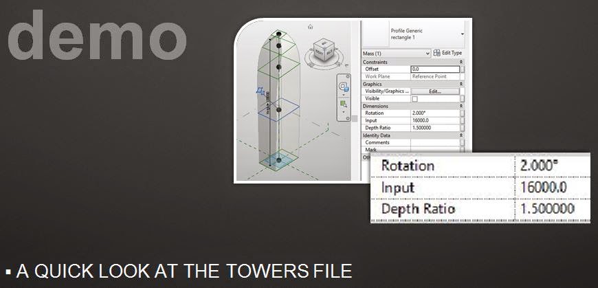
I usually use an ellipse as my first mass profile example. Nice and simple but good for illustrating the concepts of an "Input" value, a Global "Scale" Factor (via parameter linking) and a "Depth Ratio". These concepts will then transfer smoothly to a whole range of more complex profiles.
So we move on to the first of our tower examples, adding a rectangular profile into the mix. Basically there are two components to the form finding process. You set out several instances of your family in a matrix, using different heights and varying other parameters like "slenderness" and "flatness". These are properties that are exposed as instance parameters within the project environment. The second component involves opening the family up and varying the relative size, shape and position of the various profiles via their input values and normalised curve parameters.
Reload into project and all your towers update to a new set of shapes. If you want to preserve these experiments, you just keep saving the project under different names. To make this more valuable it is useful to set up your views and sheets at an early stage so that the experiments can be compared in a common format.
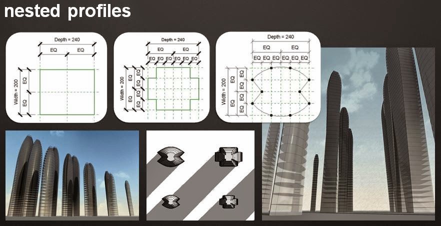
My first set of towers comrised 4 different profiles, each coming in 3 different sizes.
Once you have made a few of these profiles, it's relatively easy to come up with more variations. These explorations contain a new idea that I stumbled across while preparing my talk. Because the input values are all instance parameters, they are lost when you swap out the profiles for another family. The subtle curves of your tower revert to a crude extrusion.
But this can be solved by having a "generic profile.rfa" container and nesting the different profiles inside. Not these different profiles appear to Revit as types of the same profile. You can swap new shapes in while preserving the relative sizes and shapes that you so carefully set up.
This technique also makes it quite easy to add in a rotation parameter so that you can make those twisty towers that seem to have become popular these days. Ah the follies of youth :-)
I opened up one of my towers files at this point to give people a better feel for the families than a set of images ever can.
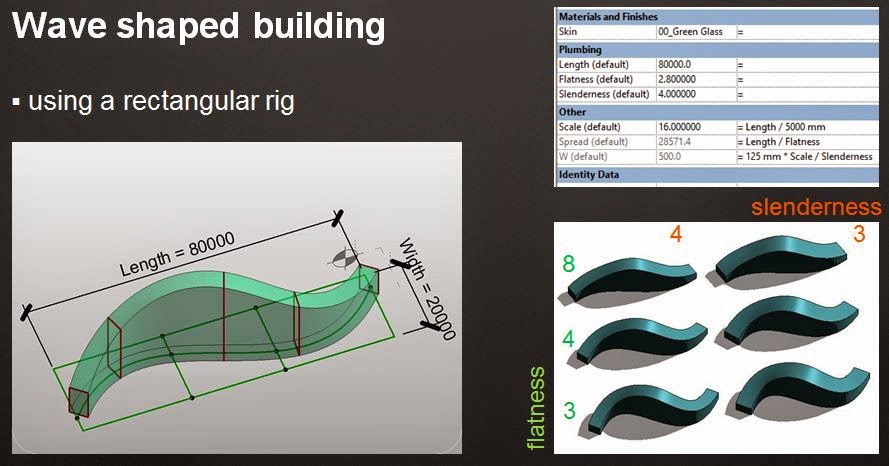
And then we move on to the Rectangular Rig. Historically speaking this was my first big "Rig Moment", dating from the 2012 pumpkin papers, when I did an Arcimboldo take on Snow White. It was only some time later that I realised that the Doric Pumpkins I had made the year before were really crying out for a Straight Line Rig. Be that as it may, the Rectangular Rig allows you to bend the straight line rig into curves and "S" shapes as well as having 2 or more lines held in a constant relationship to each other.
I used a wave-shaped building to illustrate the basic concept in action. This is vaguely inspired by the Jumeirah Beach Hotel, which is next to the Burj Al Arab, just down the road from where I work. You can use the rig to straighten out the curvature, or emphasise it. I call this parameter "Flatness"
There are many possible applications for the Rectangular Rig. One of my favourites is Oscar Niemeyers cathedral in Brasilia which uses an adaptive version of the rig, hooked into a circular repeater.
For RTC Chicago I made a funny little desk lamp family which can be pushed and pulled into a variety of shapes.
Line, Rectangle, Box ... seems to be some kind of sequence there maybe. This time the rig is an extrusion with visibility turned off. We could have made a box from 12 reference lines (one for each edge) but the extrusion is easier to make, and less confusing to use. An extra bonus which I haven't exploited very much as yet, is the ability to place points of the faces of the box.
For Chicago I made a whole range of comfy seats. Sofas are not the easiest things to make with Vanilla Revit. Point World takes us a step or two nearer, but still baulks at some of the lumpy, bumpy forms I tried to throw at it. It's more forgiving if you stick to surfaces, but for these examples I used solid forms.
Actually I did do one based on surfaces. It's a wall-mounted uplight. 3 profiles, each comprising 3 arcs. These are not loaded profile families, just reference lines drawn directly in the family. You can vary the proportions quite alarmingly, and by changing the position of the middle profile switch between concave and convex versions.
The box rig can also be used for form-finding studies of high-rise towers. In this example the box is kept visible and forms the central mass of the building. There are secondary projections to front and rear whose size and proportions are defined relative to the main mass. In this way the height once more controls all other dimensions. You can generate any number of alternate version and all of them will remain scalable, simply by typing in a new height value.
In the developed version, I have 12 instances, with independently configurable front and rear projections. In one case, a bow-fronted profile has been used for the front projection.
I finished off with a variey of examples, some of them using a combination of rig types, some of them informed by the ideas behind the rigs, but drawn "freehand" so to speak. It all depends on what you are trying to achieve. Sometimes scalability and parametric control are very important, sometimes less so, sometimes not at all.
My approach is to build up a repertoire of techniques and principles, then take each case on its merits and try to develop an instinctive feel for the most appropriate way to tackle each new challenge as it arises.
The spout of the jug is a classic case. I've come across this type of situation a couple of times now. If you are using profiles to loft a form and there is a transition from a profile with say 5 segments to another with say 8 ... consider making both profiles with the higher number. That way the various surfaces with join together in a more predictable fashion. Otherwise you are likely to end up with a form that appears to have its knickers in a twist.
The Brancusi birds don't really need to use a box rig. You could make a reasonable version based on a rectangle, but the box allows the extra subtlety of a slight spiral twist, a bird twisting its head slightly to one side perhaps. When I have time I will go back to these and develop some of my own sculptural ideas taking Brancusi as a point of departure.
The stone flowerpots one the other hand are good examples of the virtues of "freehand" profiles. Sometimes it's much more effective to draw profiles directly in the family as reference lines, That way it's easy to nudge them around and massage the form into shape, more like clay modelling. Typing numbers into dialogue boxes can be very effective, but it's not always the best solution.
Nothing to say about the toilets in this post. Plenty of other recent posts to refer to if that's what turns you on.
I'm very proud of the cushion I made for Chicago. It's quite simple really, but with just enough variation and subtlety to come across as an irregular, "natural" form. Not 100% photoreal, still a little stylised, but perhaps that's the true nature of BIM.
And now we're into more territory that I have been exploring in recent posts. Whole buildings as families. This time simplification has to be taken much further. That's the whole point. Don't get drawn into the fine detail. Get a feel for the building as a whole composition. Try to tease out it's inner essence. That way we can make useful comparisons between buildings of a similar type perhaps. I would love to do an analysis of the French Gothic Cathedral using these techniques. Anyone care to sponsor me for a six month sabbatical, including a six week tour of the sites ? Dream on !
I finished with this years pumpkin. Lots of posts about this, just go to October if you missed them first time around. But the point here is that I made use of all 3 rig types to support a design process. Yes folks, Rigs can be design tools, they're not just for geeks.


thank for the wonderful post , lots of information gained , visit us Revit Modeling in uk
ReplyDeleteGreat read! This blog provided clear and valuable insights — truly appreciate it.
ReplyDeleteIf someone needs more info on Girls Hostel Islamabad options, shaheenhostels.pk is a great place to explore.